
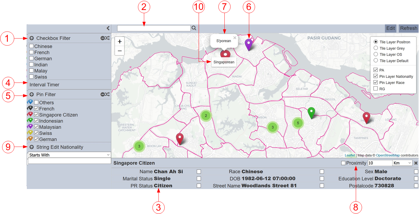
Controls
Description
Filter controls provide highly customizable ways of controlling the data displayed on the explorer.
Managing and configuring an explorer’s controls are done through the GIS Explorer Designer. A control can be linked to multiple pin layers in the explorer and a layer can also be linked with multiple controls. The guide also covers how to link controls to layers.
There are 2 types of controls, one type are visible to users in the Filter Control Panel for selection in the GIS Explorer and GIS View. The other type are not visible to users and works in the background.
It is useful to create and add the filter controls to the pin layers to customize and control the information of the pins. Such as colour of the markers, information to be displayed in the Information Panel of a marker, a popup when hovering over a marker, etc.
Do note that some filter controls need to be created or set up prior creating other control. For example, Pin filter control need Pin Icon filter controls as options, thus Pin Icon filter controls need to be created first, else Pin filter control will not have any options for selection.
Types of Filter Controls
Filter controls are typically used to directly apply field-specific filters to the dataset used by the GIS Explorer. The datasets used by the control and GIS Explorer must share the same field name to successfully integrate the filter mechanism. In other words, a filter control can filter any linked explorer’s data as long as the field identified on the control’s properties also exists in the datasets used by the explorer. In addition, the data types must also be the same to be able to effectively use the filter.
This below list the filter controls for the GIS Explorer. These filter controls are used in the “Pin Layers” properties. There are several types of filter controls:
- Checkbox Filter
- Free Text Filter
- Info Filter
- Interval Filter
- Pin Filter
- Pin Icon
- Popup
- Proximity
- String Edit Filter
- Tooltip
Common Control Properties
The properties below are those that are common to most types of filter controls.

| Field | Description | Mandatory | Input Type | Constraints | Default Value |
|---|---|---|---|---|---|
| Type | Selects the type of filter control. | Y | Drop-down list | Select from drop-down list | “Pin Filter” |
| Name | Unique name of the filter control. | Y | Text field | Any text | “[New Control]” |
| Collapsible | Indicates if the control, if displayed on view mode, can be collapsed and expanded. This also acts as the “switch” to enable or disable the control. If collapsed, the control is disabled. If expanded, the control is applied. Selected options are retained when collapsing and expanding controls. |
Y | Checkbox | Enable or disable | Enabled |
| Visibility | Indicates if the control would be displayed on the explorer. One value can be selected. Available options: - Always (always displays the control on the explorer, regardless of usage) - When Used (only displays the control on a page if at least one explorer on the same page is linked to it) - Hidden (won’t be displayed regardless of usage) |
Y | Drop-down list | Select from drop-down list | “When Used” |
The “Collapsible” field is selected by default. This will allow the filter control to be expandable and collapsible. If you wish to display the filter control in expanded mode at all times, unselect this field.
In “Visibility” field, select “When Used” if you wish the filter control to appear only when it can be used, in this case the pin layer that includes this filter control. If “Always” is selected, the filter control will always appear even when the pin layer is selected off.