
Layout Designer
The Layout Designer allows you to design a new layout from scratch or edit existing layout.
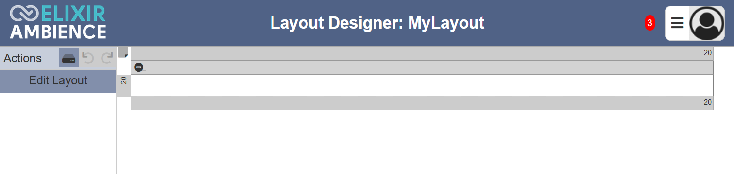
The Layout Designer page is divided into two parts, the Actions Panel and the Layout Design Area.
The Actions Panel on the left displays the available actions for the selected item in the layout. The list of available actions vary according to the item selected. It also consists of the “Save”, “Undo” and “Redo” icons. The “Undo” and “Redo” icons will grey out if there is no action to undo or redo.
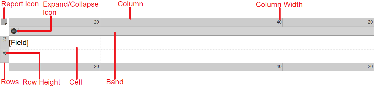
The Layout Design Area on the right displays the designed layout, allowing you to visualise the layout of the report. In the Layout Design Area, you can select the following items in the layout:
- Report (entire layout)
- Row
- Column
- Band
- Cell
The Layout Design Area also includes two icons, the “Report” icon and the “Expand” or “Collapse” icon for the band.
Actions
The table below list of available actions for the items in the layout.
| Item | Highlight | Actions Available |
|---|---|---|
| Report | No highlight | Edit Layout |
| Band | Blue border | Add Band Above/Below, Delete Band, Edit Band |
| Row | Blue border | Insert Above/Below, Delete Row, Edit Row |
| Column | Blue border | Insert Left/Right, Delete Column, Edit Column |
| Cell | Grey border | Add Cell, Delete Cell, Edit (through dialog box if cell is added prior) |
Report Layout
The only action for the report layout is “Edit Layout”. This action allows you to edit the width (in pixels) of the report layout.
Click on the “Edit Layout” button in the Actions Panel and the “Edit Layout” dialog box will appear.
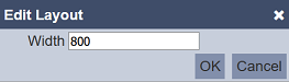
You can edit the width of the layout. The default value is 800. Click on the “OK” button to save the change. Clicking on the “Cancel” button aborts the action.
If the Actions Panel does not display the “Edit Layout” button, click on the  “Select Report” icon at the upper left corner of the Layout Design Area.
Band
The actions available for band is add, delete and edit the height (in pixels) of the band. By default the layout has only one band. More bands can be added.
Add Band
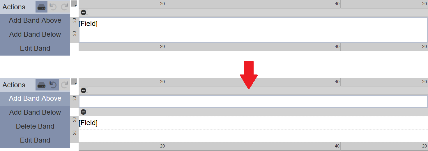
This action allows you to add a band above or below the selected band. The default layout has only one band.
To add a new band, select the band in the Layout Design Area. A grey rectangular box will appear around the band.
In the Actions Panel, click on the “Add Band Above” or “Add Band Below” to add a new band. In the example below, a new band is added above the selected band.
Delete Band
To remove a band from the layout, select the selected band on the Layout Design Area and click on the “Delete Band” button in the Actions Panel. To undo this action, click on the  “Undo” icon in the Actions Panel.
Do note that if there is only one band in the layout, the “Delete Band” button will not appear in the Actions Panel.
Edit Band
This action allows you to define the name and height of the band. The default value is 30 per row. If there is more than one row in the band, the height is the multiple of the number of rows.
To edit the height of the band, select the desired band in the Layout DesignArea and click on the “Edit Band” button in the Actions Panel. The “Edit Band” dialog box will appear.
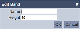
In the “Name” field, key in a name. In the “Height” field, change to the desired value. Click on the “OK” button to save the changes. Click on the “Cancel” button to aborts the action.
Row
The actions available for row is insert above/below, delete and edit. The default layout has one column and one row. More rows can be added. The height (relative ratio) is indicated at the upper left corner of the row. If there are two rows, both having the same height, whether it is 20 or 200, it will produce the same result. These row heights are ratios of the height of the band they reside in.
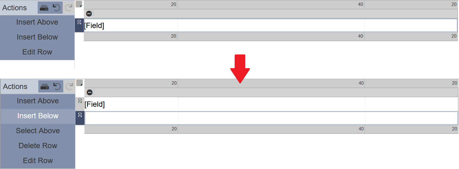
Insert Row
Select the desired row in the layout in the Layout Design Area. The selected row will be highlighted with a blue on the left.
In the Actions Panel, click on “Insert Above” or “Insert Below” to insert a new row on the above or below the selected row respectively. In the example below, a row (highlighted in blue) is added on the below the selected row.
Delete Row
To remove a row in the layout, select the desired row in the Layout Design Area and click on the “Delete Row” button in the Actions Panel. To undo this action, click on the “Undo” icon in the Actions Panel.
Do note that if there is only one row in the layout, the “Delete Row” button will not appear in the Actions Panel.
Edit Row
This action allows you to define the height of the row. The default value is 20, which is indicated on the upper left of the row.
To edit the width of a row, select the desired row in the Layout Design Area and click on the “Edit Row” button in the Actions Panel. The “Edit Row” dialog box will appear.
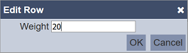
In the “Weight” field, key in the desired value and click on the “OK” button to change the row height. The height is indicated at the upper left corner of the row.
Column
The actions available for column is insert left/right, delete and edit. The default layout has one column and one row. More columns can be added. The weight or width (relative ratio) is indicated at the upper right corner of the column. If there are two columns, both having the same weight or width, whether it is 20 or 200, it will produce the same result. These column weights are ratios of the width of the report layout.
Insert Column
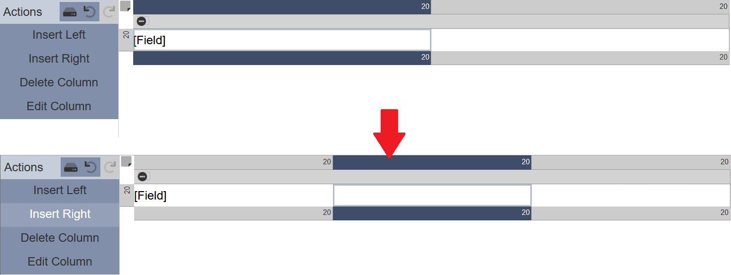
Select the desired column in the layout in the Layout Design Area. The selected column will be highlighted with a blue border.
In the Actions Panel, click on “Insert Left” or “Insert Right” to insert a new column on the left or right side of the selected column respectively. In the example below, a column (highlighted in blue) is added on the right of the selected column.
Delete Column
To remove a column in the layout, select the desired column in the Layout Design Area and click on the “Delete Column” button in the Actions Panel. To undo this action, click on the “Undo” icon in the Actions Panel.
Do note that if there is only one column in the layout, the “Delete Column” button will not appear in the Actions Panel.
Edit Column
This action allows you to define the width of the column. The default value is 20.
To edit the width of a column, select the desired column in the Layout Design Area and click on the “Edit Column” button in the Actions Panel. The “Edit Column” dialog box will appear.
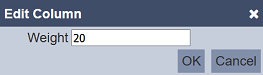
In the “Weight” field, key in the desired value and click on the “OK” button to change the column width. The weight or width is indicated at the upper right corner of the column.
Cell
The actions available for cell is add, delete and edit. The default layout does not have any cell in its row and column. A cell can be added onto the layout. with its the cell type and properties defined. The number of cells that can be added is the multiple of rows by columns. Two or more cells can be merged together as well.
Cell Type
There are several different cell types, namely Blank, Field, Image, Label and RichText. Each cell type has their own set of properties.
Blank
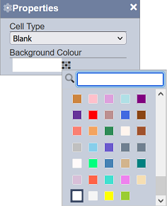
This cell type allows you to leave the cell empty and define only the colour of the cell. This is the default cell type.
| Field | Description | Input Type | Default Value |
|---|---|---|---|
| Cell Type | Defines the cell type. | Drop-down list | “Blank” |
| Background Colour | Defines the background colour of the cell. | Colour palette | “White” |
In the “Cell Type” field, select the desired cell type from the drop-down list. In the “Background Colour” field, click on the “Colour Palette” icon and select the desired colour from the list. Click on the “X” icon at the upper right corner of the dialog box to close the “Properties” dialog box.
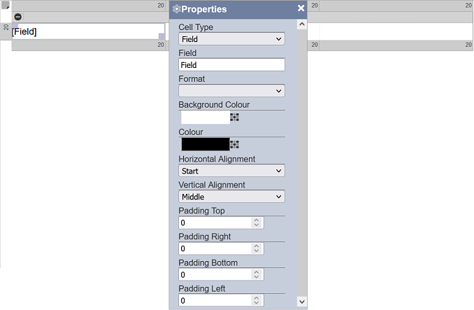
Field
This cell type allows you to define the name, format, colour and alignment of the cell.
| Field | Description | Input Type | Default Value |
|---|---|---|---|
| Cell Type | Defines the cell type. | Drop-down list | “Field” |
| Field | Defines the name of the cell. | Text field | “Field” |
| Format | Defines the format of the cell. | Drop-down list | Not selected |
| Background Colour | Defines the background colour of the cell. | Colour palette | “White” |
| Colour | Defines the colour of the text in the cell. | Colour palette | “Black” |
| Horizontal Alignment | Defines the horizontal location of the text in the cell. Options: - Start - Centre - End |
Drop-down list | “Start” |
| Vertical Alignment | Defines the vertical location of the text in the cell. Options: - Top - Middle - Bottom |
Drop-down list | “Middle” |
| Padding Top | Defines the distance of text from the top of the cell. | Text field | “0” |
| Padding Right | Defines the distance of text from the right of the cell. | Text field | “0” |
| Padding Bottom | Defines the distance of text from the bottom of the cell. | Text field | “0” |
| Padding Left | Defines the distance of text from the left of the cell. | Text field | “0” |
In the “Cell Type” field, select the desired cell type from the drop-down list. The default name for the “Field” field is “Field”. You can change the name to your desired name. Select the desired format of the text by selecting one of the options from the drop-down list in the “Format” field.
In the “Background Colour” field, click on the “Colour Palette” icon and select the desired colour for the background from the list. In the “Colour” field, click on the “Colour Palette” icon and select the desired colour for the text from the list.
To align the text, use the “Horizontal Alignment” and “Vertical Alignment” fields, as well as the four padding fields.
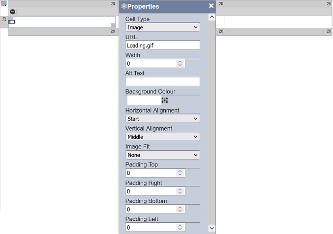
Image
This cell type allows you to add an image into the layout.
| Field | Description | Input Type | Default Value |
|---|---|---|---|
| Cell Type | Defines the cell type. | Drop-down list | “Image” |
| URL | Defines the location of the image. | Text field | “loading.gif” |
| Width | Defines the width of the image. | Drop-down list | “0” |
| Alt Text | Defines the alternative text to display when the image cannot be found (optional). | Text field | Any text |
| Background Colour | Defines the background colour of the cell. | Colour palette | “White” |
| Horizontal Alignment | Defines the horizontal location of the text in the cell. Options: - Start - Centre - End |
Drop-down list | “Start” |
| Vertical Alignment | Defines the vertical location of the text in the cell. Options: - Top - Middle - Bottom |
Drop-down list | “Middle” |
| Image Fit | Defines how the image is to fit in the cell. Options: - None <br.- Contain <br.- Cover - Fill |
Drop-down list | “None” |
| Padding Top | Defines the distance of text from the top of the cell. | Text field | “0” |
| Padding Right | Defines the distance of text from the right of the cell. | Text field | “0” |
| Padding Bottom | Defines the distance of text from the bottom of the cell. | Text field | “0” |
| Padding Left | Defines the distance of text from the left of the cell. | Text field | “0” |
Select the appropriate cell type in the “Cell Type” field. In the “URL” field, key in the location of the image to be used. The “Image Fit” field allows you to define how the image is to be fit the cell.
In case the image cannot be found, you can use the “Alt Text” field to fill in the cell.
In the “Background Colour” field, click on the “Colour Palette” icon and select the desired colour for the background from the list.
To align the image, use the “Horizontal Alignment” and “Vertical Alignment” fields, as well as the four padding fields.
Label
This cell type allows you to add a label into the cell.
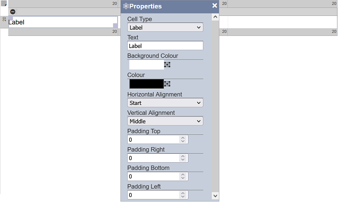
| Field | Description | Input Type | Default Value |
|---|---|---|---|
| Cell Type | Defines the cell type. | Drop-down list | “Label” |
| Label | Defines the name of the label. | Text field | “Label” |
| Background Colour | Defines the background colour of the cell. | Colour palette | “White” |
| Colour | Defines the background colour of the text. | Colour palette | “Black” |
| Horizontal Alignment | Defines the horizontal location of the text in the cell. Options: - Start - Centre - End |
Drop-down list | “Start” |
| Vertical Alignment | Defines the vertical location of the text in the cell. Options: - Top - Middle - Bottom |
Drop-down list | “Middle” |
| Padding Top | Defines the distance of text from the top of the cell. | Text field | “0” |
| Padding Right | Defines the distance of text from the right of the cell. | Text field | “0” |
| Padding Bottom | Defines the distance of text from the bottom of the cell. | Text field | “0” |
| Padding Left | Defines the distance of text from the left of the cell. | Text field | “0” |
In the “Cell Type” field, select the desired cell type from the drop-down list. The default name for the “Label” field is “Label”. You can change the name to your desired name.
In the “Background Colour” field, click on the “Colour Palette” icon and select the desired colour for the background from the list. In the “Colour” field, click on the “Colour Palette” icon and select the desired colour for the text from the list.
To align the text, use the “Horizontal Alignment” and “Vertical Alignment” fields, as well as the four padding fields.
RichText
This cell type allows you to add rich text into the cell.
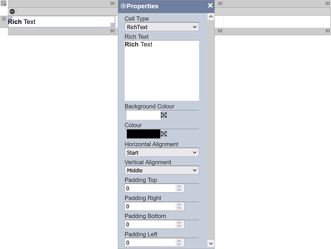
| Field | Description | Input Type | Default Value |
|---|---|---|---|
| Cell Type | Defines the cell type. | Drop-down list | “Label” |
| Rich Text | Defines the rich text to be used in the cell. | Dialog box | “Rich Text” |
| Background Colour | Defines the background colour of the cell. | Colour palette | “White” |
| Colour | Defines the background colour of the text. | Colour palette | “Black” |
| Horizontal Alignment | Defines the horizontal location of the text in the cell. Options: - Start - Centre - End |
Drop-down list | “Start” |
| Vertical Alignment | Defines the vertical location of the text in the cell. Options: - Top - Middle - Bottom |
Drop-down list | “Middle” |
| Padding Top | Defines the distance of text from the top of the cell. | Text field | “0” |
| Padding Right | Defines the distance of text from the right of the cell. | Text field | “0” |
| Padding Bottom | Defines the distance of text from the bottom of the cell. | Text field | “0” |
| Padding Left | Defines the distance of text from the left of the cell. | Text field | “0” |
In the “Cell Type” field, select the desired cell type from the drop-down list. In the “Rich Text” field, click onto the text box to display the “Edit Rich Text” dialog box.
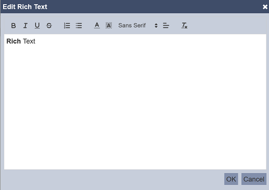
Key in the desired text and format it as required. Click on the “OK” button to save the rich text. To abort the action, click on the “Cancel” button.
In the “Background Colour” field, click on the “Colour Palette” icon and select the desired colour for the background from the list. In the “Colour” field, click on the “Colour Palette” icon and select the desired colour for the text from the list.
To align the text, use the “Horizontal Alignment” and “Vertical Alignment” fields, as well as the four padding fields.
Add Cell
This action allows you to edit the cell in the layout and define its properties.
To add a cell, select the desired empty cell in the Layout Design Area and click on the “Add Cell” button in the Actions Panel. The “Properties” dialog box will appear.
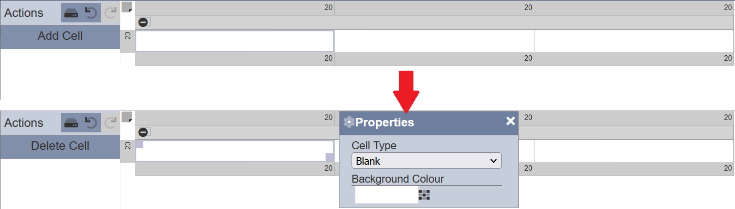
Edit the properties as required and click on the “X” icon to close the dialog box after setting up the properties. Refer to Cell Type for more information on the different cell types and their properties.
Do note that if the cell has been defined prior, the “Add Cell” button will not appear, instead the “Delete Cell” button and the “Properties” dialog box will appear.
Edit Cell
To edit a cell that has been added prior, simply click on the desired cell in the Layout Design Area. The selected cell will be highlighted with a grey box with 2 handles (one at the top left and another at the bottom right) and the “Properties” dialog box will appear.
The “Properties” dialog box will appear, allowing you to edit the cell properties. Refer to Cell Type for more information on the different cell types and their properties.
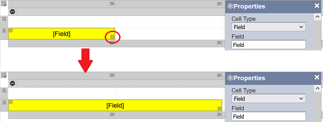
The handle at the top left allows you to re-locate the cell by drag-and-drop the cell to the desired location.
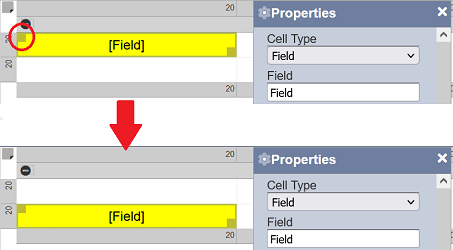
The bottom right handle allows you to resize the cell by dragging it across the cells or reduce to a single cell.
To exit the cell edit, click on the “X” icon at the upper right corner of the “Properties” dialog box or simply click on other items in the layout.
Delete Cell
This action allows you to remove the properties defined in the cell, leaving the cell empty.
To delete a cell, select the desired cell in the Layout Design Area. The “Properties” dialog box and the “Delete Cell” button in the Actions Panel appear.
Click on the “Delete Cell” action in the Actions Panel. To undo this action, click on the “Undo” icon in the Actions Panel.
Do note that if the cell is not defined (i.e., empty), the “Delete Cell” button will not appear in the Actions Panel, the “Add Cell” button will appear instead.