
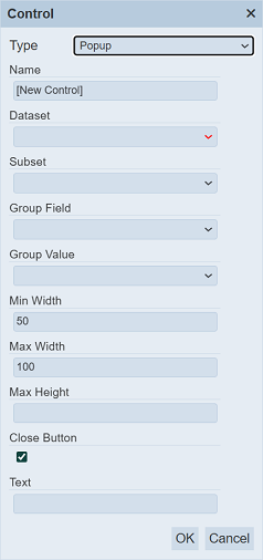
Popup
The Popup filter control allows you to define a popup for a particular group of pins.
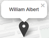
Visual Usage
To view the popup, click on the pin and a popup will appear. To close the popup, click on the “x” icon at the upper left corner of the popup.
Do note that the close button may not be defined in the filter control, thus the “x” icon will not appear in the popup. In this case, click on anywhere on the map to close the popup.
Control Properties
Below are the fields for this filter control:
| Field | Description | Mandatory | Input Type | Constraints | Default Value |
|---|---|---|---|---|---|
| Type | Selects the type of filter control. | Y | Drop-down list | Select from drop-down list | “Pin Filter” |
| Name | Unique name of the filter control. | Y | Text field | Any text | “[New Control]” |
| Dataset | Dataset to be used in the filter. | Y | Drop-down list | Select from drop-down list | None |
| Subset | Subset of the dataset selected. | Y | Drop-down list | Select from drop-down list The dataset must be selected first. |
None |
| Group Field | Field of the selected dataset to be filtered. | Y | Drop-down list | Select from drop-down list | None |
| Group Value | Value of the field selected in Group Field. | Y | Drop-down list | Select from drop-down list | None |
| Min Width | Minimum width of popup. | Y | Text field | Integer greater than 1 | “50” |
| Max Width | Maximum width of popup. | Y | Text field | Integer greater than 1 | “100” |
| Max Height | Maximum height of popup. | Y | Text field | Any text | None |
| Close Button | If selected, popup will include a close button. | Y | Checkbox | Enable or disable | Enabled |
| Text | Defines the text to appear in the popup. | Y | Text field | Any text | None |
The text to appear in the popup can be defined with the format ${<value>}.