Edit Tabs
When a record editor is initially created, a four-tab page will appear.
This page is the same as the “Edit” panel, which displays the selected record editor’s attributes and scripts in several tabs:
- Fields
- Properties
- Layout Scripts
- Row Scripts
Fields
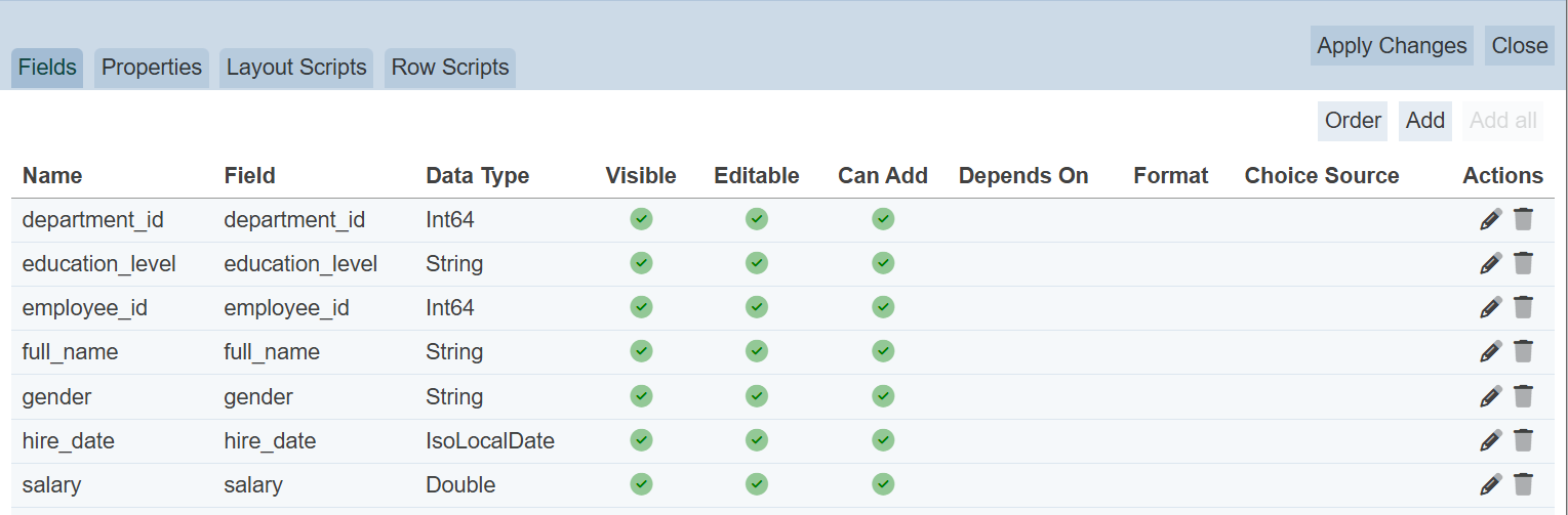
By default, the “Fields” tab is displayed. This tab allows you to add, order, edit and delete the fields in the dataset.
Add All Fields
The “Add All” button at the upper right corner of the tab allows user to add all fields of the dataset. This button only appears when there are fields that are not added onto Fields tab.
Add Field
To add a field for editing, click on the “Add” button at the upper right corner of the panel. The “Add Field” dialog box will appear.
| Field | Description | Mandatory | Input Type | Constraints | Default Value |
|---|---|---|---|---|---|
| Field | Name of field in dataset. | Y | Drop-down list | Select from list | First option |
| Data type | Data type of select field. | Y | Textbox | Not editable | According to selected field |
| Name | Name of selected field. | Y | Textbox | Any text | As per selected field |
| Editable | If selected, allows the field to be editable. | Y | Checkbox | Select or unselect | Selected |
| Can add | If selected, allows the field to be added. | Y | Checkbox | Select or unselect | Selected |
| Visible | If selected, allows the field to be visible in the Editor page and vice versa. | Y | Checkbox | Select or unselect | Selected |
| Format | Selects the format of the field. | N | Drop-down list | Select from list | None |
| Choice source | Selects the source for the field. This field is only available for string type. |
Y | Drop-down list | Select from list | None |
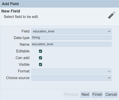
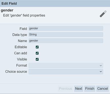
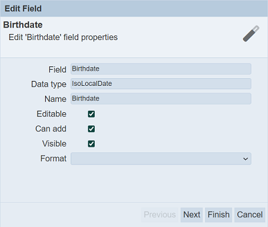
Select the desired field from the drop-down list in the “Field” field. Change and edit the other properties as desired. The “Editable” is disabled and unselected for the _id field of the dataset.
Name
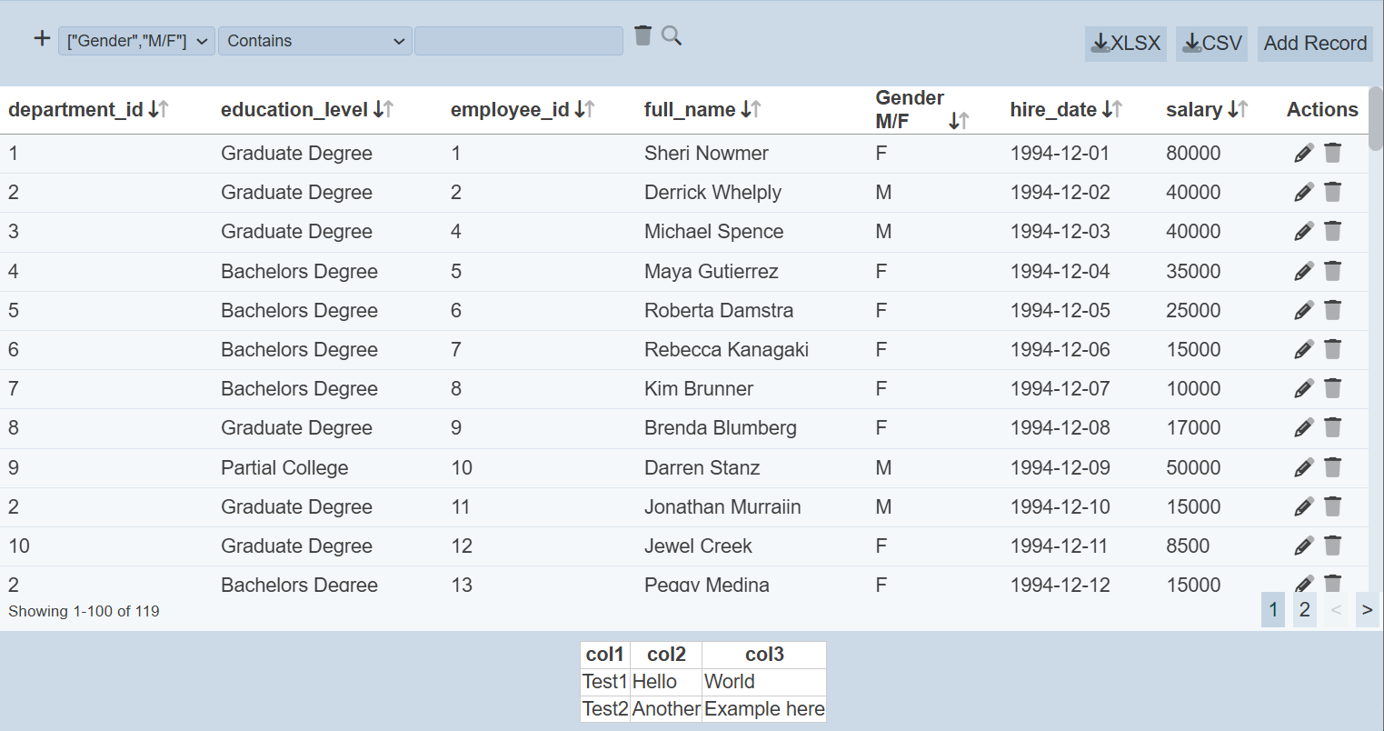
The name of the field to be displayed in the Editor is defined in the “Name” field. This field uses the name of the selected field by default. You can changed the name as desired. You can also define the “Name” field as a JSON string array.
In the example below, the “gender” column should accept values that is “M” or “F” only. Since it is a string field, any value can be accepted (such as “Male”). You may wish to indicate the standard values (i.e., M and F) at the column, so that users will not enter the wrong value.
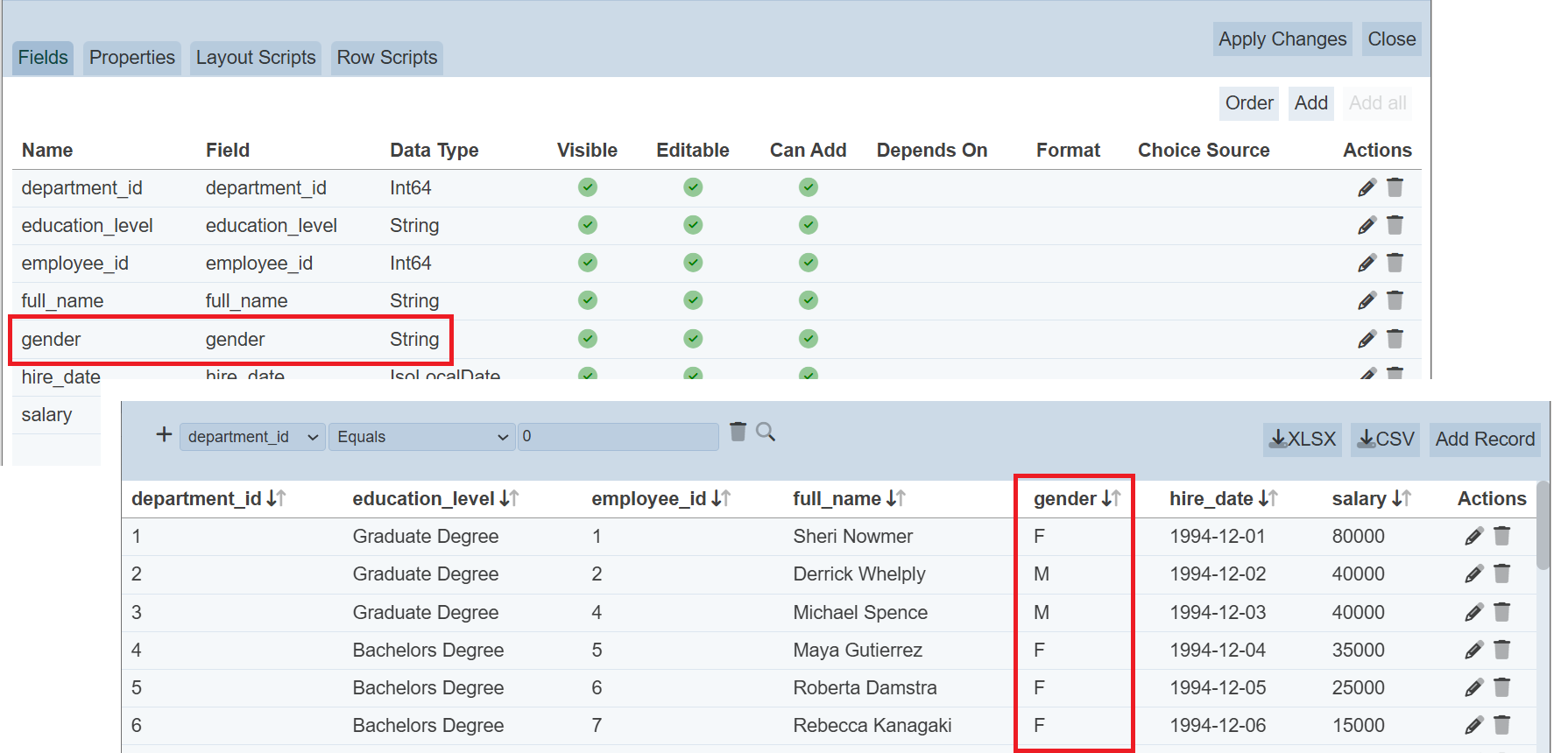
To do so, select the “Fields” tab. select the  icon under the “Actions” column corresponding the field “gender”. The “Edit Field” dialog box will appear.
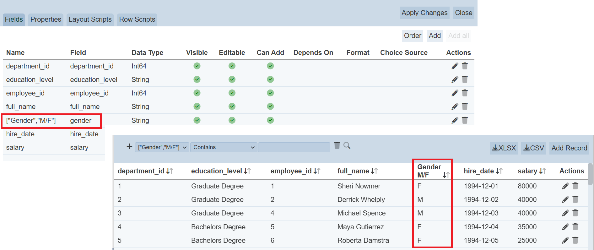
In the “Edit Field” dialog box, change the “Name” field as follows:
["Gender","M/F"]
Save the change. In the Editor page, the “gender” column is now displayed in two lines, Gender on the first line and M/F on the second line.
Visible
The “Visible” field allows you to hide the field in the Editor page. When editing a record the field value which is hidden will not be changed. However, an error will occur when a new record is added as the hidden field requires a value.
To avoid this, a script must be supplied to add a value into the hidden of the new record. Pre Edit Script can be used for this purpose. Below is an example:
var cell = $(this.tr.find("td").get(hidden_field));
var field = cell.find("input");
if (field.val()==="") field.val("default_value");
where hidden_field is the order number of the hidden field in the “Fields” tab and default_value is the default value to be used for the hidden field.
Choice source
The “Choice source” field is available only for string type and it allows you to restrict the values using the several options available:
- No Choice (blank) - Users can set any value in this field (default)
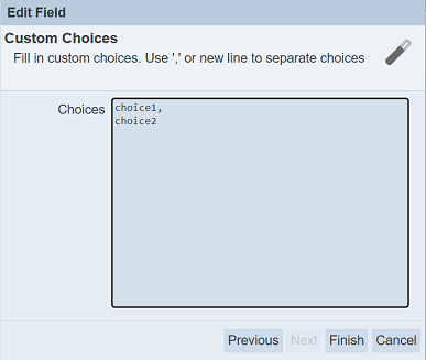
- Custom Choices - Enter own choices (separated by commas) in the “Choices” field
- Other Collection - Allows selecting choices from another dataset
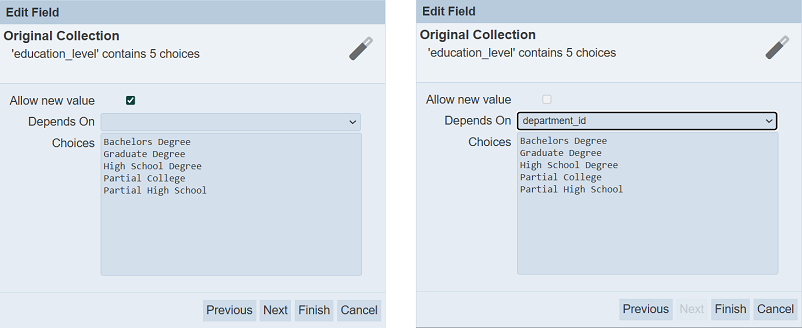
- Original Collection -
- Either uses its own source as choices (allows new value) (default)
- Depends on a selected field from the schema, thus limiting the input values of another field
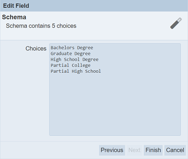
- Schema - Uses the schema;s choices as the choices
Click on the “Next” button and the “Constraint” screen appears in the dialog box. The types of constraint that appear depends on the type of field.
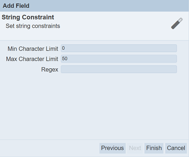
Key in required value for the fields and the “Finish” button will appear.
Click on the “Finish” button to add the field. Clicking on the “Previous” button (if available) bring you back to the previous screen. Click on the “Cancel” button to abort the action.
The added field will appear in the “Fields” tab. The “Choice Source” column will reflect the option selected earlier.
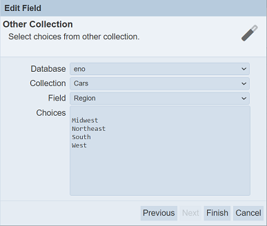
In the example below, the Region field selects Original Collection option. The state field selects Original Collection option that depends on Region field and city field selects original Collection option that depends on state field.
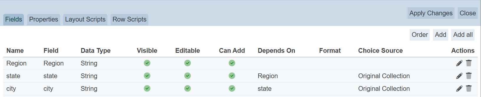
When adding new records, depending on the value selected in the Region field, the values for state will be limited to those that belongs to the value selected in Region. In the screenshot below, West is selected in Region field, the values in the state field are those that belongs to West. When Midwest is selected in Region field, another list of values will appear in the state field.
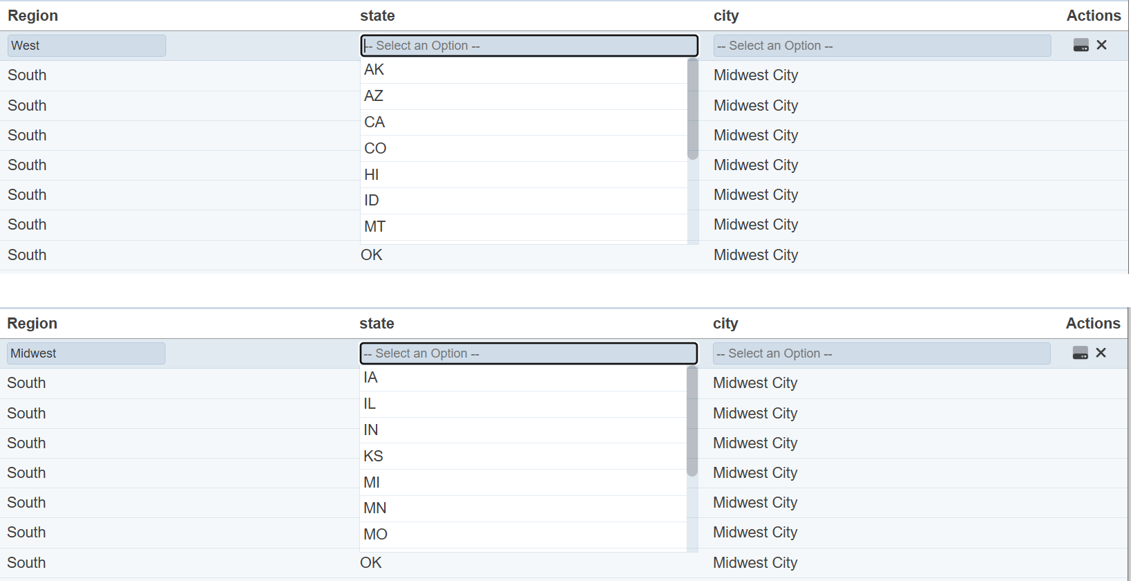
In the same way, the values for city will be limited to those that belongs to state field. In this example, city depends on state and state depends on Region. If the “Depends On” field is not selected, all values for city and state will be available for selection, regardless of the value selected from other fields.
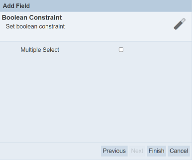
Multiple Select
The record editor allows multi-boolean editing if the “Multiple Select” field if selected.
To do so, when a boolean field is to be added, a “Next” button will appear clickable.
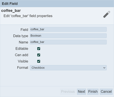
After selecting the desired settings, click on the “Next” button. The “Boolean Constraint” page will appear. By default, this field is unselected.
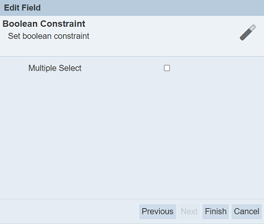
Select the checkbox to enable multiple select. This will allow all records to be select or unselect together in the Editor mode. Do note that this action is un-reversible. If this is not the action you desire, do not select this field.
Click on the “Finish” button to save the settings.
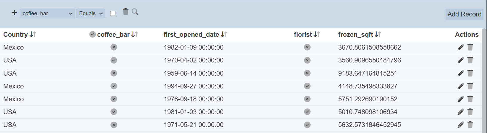
When Editor mode, the boolean field that allows multiple select has a  icon at the column title. This icon allows you to select or unselect all the records by clicking on the or
  icon respectively.
Do note that this action is un-reversible, proceed with caution.
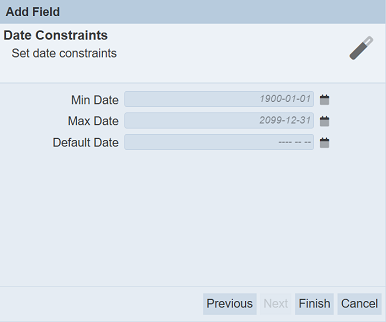
Date Constraint
For IsoLocalDate data type, a data constraint can be applied onto it.
To do so, when a IsoLocalDate data type is added, a “Next” button will appear clickable.
After selecting the desired settings, click on the “Next” button. The “Last Stock In Date” page will appear.
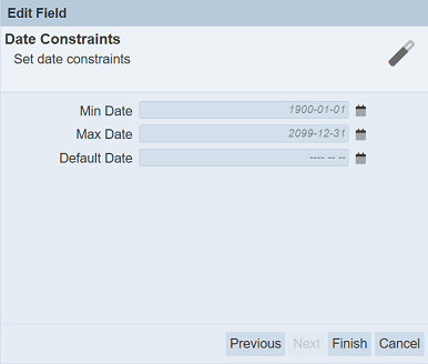
| Field | Description | Mandatory | Input Type | Constraints | Default Value |
|---|---|---|---|---|---|
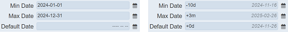
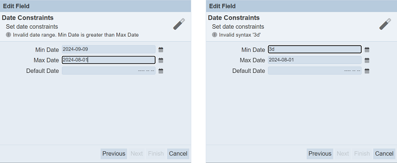
| Min Date | Defines the smallest date. | Y | Text field or Date picker | Date before default value is invalid. | “1990-01-01” |
| Max Date | Defines the largest date. | Y | Text field or Date picker | Date after default value is invalid. | “1990-12-31” |
| Default Date | Defines the default date. | N | Text field or Date picker | Date must be within the the default value of “Min Date” and “Max Date” fields. | Empty |
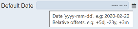
To see the required format, hover over the text field and a pop-up message will appear.
There are two ways to input a date:
- Key in the date in the text field
- Click on the
 “Date Picker” icon to select a date
To manually key in a date, key in either:
- Absolute date in the required format
yyyy-mm-dd(e.g.,2022-08-10) - Relative date which is an offset from current date with syntax
[+/-][0-9][dmy](e.g.,-3d,+3mor+1y).
To use the “Date Picker”, click on the icon.
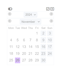
The Date Picker is disabled by default. To enable the Date Picker, click on the  “Enable” icon at the upper left corner of the Date Picker.
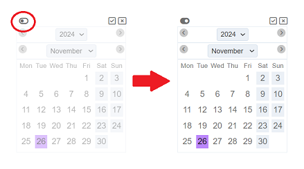
By default current date is selected. Select the desired date and click on the “Ok” icon at the upper right corner. Click on the “Close” icon to abort the action.
If the date entered is incorrect or the syntax is wrong, an error message will appear in red above the fields.
Order Field
By default, the fields are listed according to the sequence the fields are added. This function allows you to sort the order of the fields.
To do so, click on the “Order” button at the upper right corner of the Edit panel.
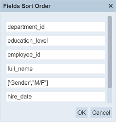
In “Fields Sort Order” dialog box, drag-and-drop the fields to their desired location. Click on the “OK” button to save the changes. Click on the “Cancel” button to abort.
Edit Field
To edit a field, click on the icon under the “Actions” column corresponding the desired field.
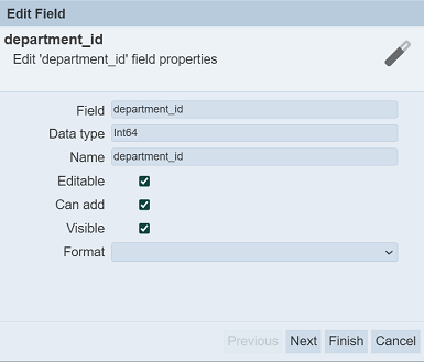
In the “Edit Field” dialog box, make the necessary changes. Click on the “Next” button and edit the “String Constraint” fields (if applicable). Then click on the “Finish” button to save the changes.
Delete Field
To delete a field, click on the  icon under the “Actions” column corresponding the desired field. Do note that there is no notification when a field is deleted. You can simply add the field back into the list.
Properties
In the “Properties” tab, there are four sections. Each section allows you to change or edit the record editor.
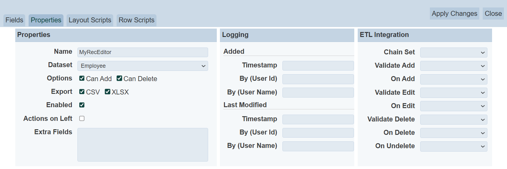
Properties Section
| Field | Description | Mandatory | Input Type | Constraints | Default Value |
|---|---|---|---|---|---|
| Name | Unique name assigned to the record editor. | Y | Text field | Any text (case-sensitive) | Name of record editor |
| Dataset | Defines the dataset to edit. | Y | Drop-down list | Select from list | Selected dataset |
| Options | Consists of three selections. If selected, allows user to add, delete and/or enable the record editor. Available options: - Can Add - Can Delete - Enabled |
N | Checkboxes | Select or unselect | Not selected |
| Export | Allows user to export the record editor in the selected option(s). Available options: - CSV - XLSX |
N | Checkboxes | Select or not selected | Not selected |
| Enabled | If selected, enable the record editor. | N | Checkbox | Select or unselect | Selected |
| Actions on Left | If selected, displays the Actions column on the left of the editor instead of on the right by default. | N | Checkbox | Select or unselect | Not selected |
| Extra Fields | Lists the extra fields to be used by others. | N | Textbox | Any text | Empty |
Options
The “Options” field consists of three selections.
If the _id field of the dataset is string type, the “Can Add” field will be enabled for editing. In this case, if the “Can Add” field is selected, the _id will be available to be as a normal field in the “Fields” tab. For non-string type _id fields in the dataset, the “Can Add” field will be disabled (not selected).
If the “Can Delete” field is not selected, no records are allowed to be deleted in the “Editor” page.
You can allow or disallow adding or deleting records in the dataset by selecting or deselecting the “Can Add” and “Can Delete” feilds respectively.
To enable or disable the record editor, select or deselect the “Enabled” field respectively. By default, the record editor is enabled and allows adding and deleting of records. Disabled record editors will not be able to access Editor page.
Export
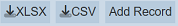
The “Export” field allows the user to export the record editor in the selected options (either in CSV and/or XLSX format). The Record Editor will display the buttons for the selected options that the upper right corner of the page.
Logging Section
The Logging section consists of two portions, the Added portion and the Last Modified portion. These fields allow you to change or edit the timestamp, user ID and/or user name when the record editor is created and/or when the record editor is modified. They are optional fields.
| Field | Description | Input Type | Constraints | Default Value |
|---|---|---|---|---|
| Timestamp | Date and time of creation or modification. | Text field | Any text | Empty |
| By (User Id) | User ID of creation or modification. | Text field | Any text | Empty |
| By (User Name) | User name of creation or modification. | Text field | Any text | Empty |
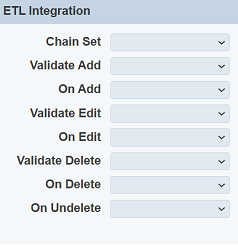
ETL Integration Section
The ETL Integration section allows you to select the ETL chainset and select when the ETL is to be triggered.
| Field | Description | Input Type | Default Value |
|---|---|---|---|
| Chain Set | Selects the ETL chainset to be used. | Drop-down list | Empty |
| Validate Add | Selects the ETL step to validate the field value to be added. | Drop-down list | Empty |
| On Add | Selects the ETL step to be used when adding record. | Drop-down list | Empty |
| Validate Edit | Selects the ETL step to validate the field value to be edited. | Drop-down list | Empty |
| On Edit | Selects the ETL step to be used when editing record. | Drop-down list | Empty |
| Validate Delete | Selects the ETL step to validate the field value to be deleted. | Drop-down list | Empty |
| On Delete | Selects the ETL step to be used when deleting record. | Drop-down list | Empty |
| On Undelete | Selects the ETL step to be used when undeleting record. | Drop-down list | Empty |
Layout Scripts
The Layout Scripts tab consists of three portions. The upper portion (grey) consists of the “Layout Scripts Enabled” field and a drop-down list. The “Layout Scripts Enabled” field is selected by default, which enable any scripts in this tab. The drop-own list consists of three options:
- Display Script - runs each time the record editor is displayed, or if a record is added or edited
- Header Script - customise the header and will be re-run any time the header is rebuilt
- Search Setup Script - customise search panels
- Search Results Script - filters and display the search results
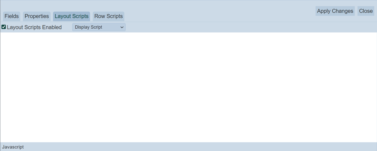
The middle portion (white) allows you to key in the code for the selected script from the drop-down list.
The lower portion (grey) shows you the location of the cursor in terms of lines.
Row Scripts
The “Row Scripts” tab allows you to add scripts to customise the record editor for each individual editable cell.
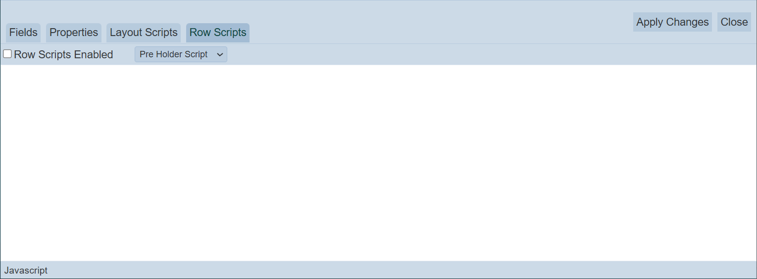
This tab consists of three portions. The upper portion contains a “Row Scripts Enabled” field and a drop-down list. The “Row Scripts Enabled” field is not selected by default. If selected, the scripts in this tab will be enabled. The drop-down list consists of several scripts:
- Pre Holder Script - TBD
- Pre Display Script - this script is called for each row when shown
- Pre Edit Script - this script is called for each row when edit is clicked
- Post Edit Script - this script is called for each row when save is clicked
- Post Holder Script - TBD
The middle portion (white) allows you to key in the code for the selected script from the drop-down list.
The lower portion (grey) shows you the location of the cursor in terms of lines.
Examples
Using Display Script
In the simple example below, a table is to be displayed at the bottom of the record editor.
To do so, in the “Layout Scripts” tab, select “Display Script” from the drop-down list and key in the following code.
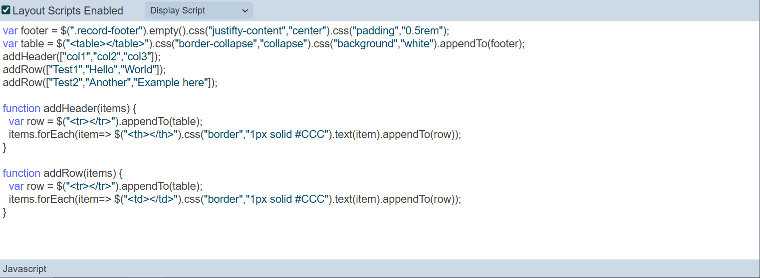
Click on the “Save” button to save the code. In the record editor page, a small table is displayed at the bottom.
The script runs after each update. A HTTP endpoint can be called to extract updated summary information (such as summation of a column) and format it for display in the table.
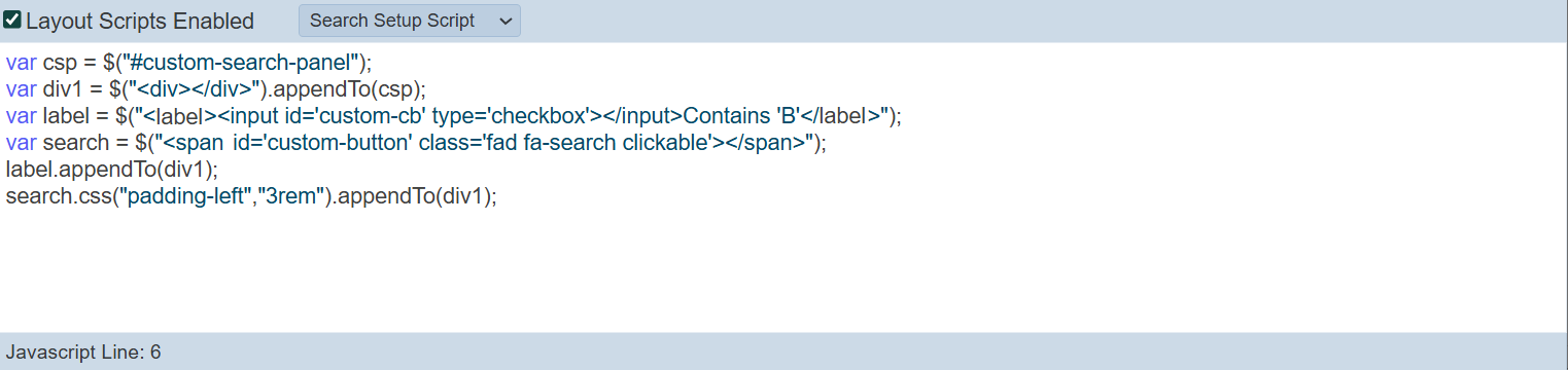
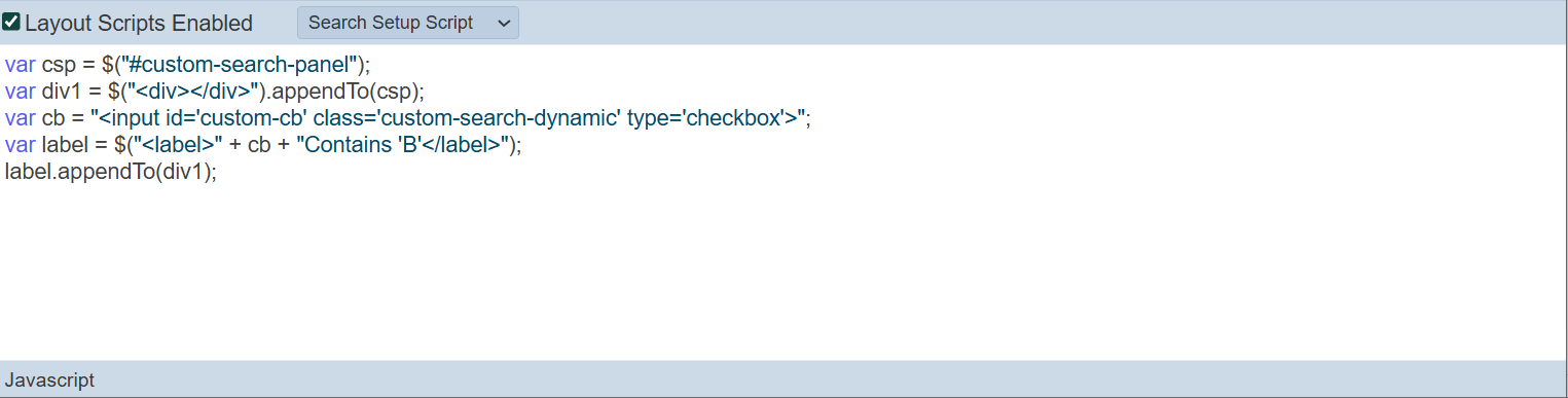
Using Search Setup Script and Search Results Script
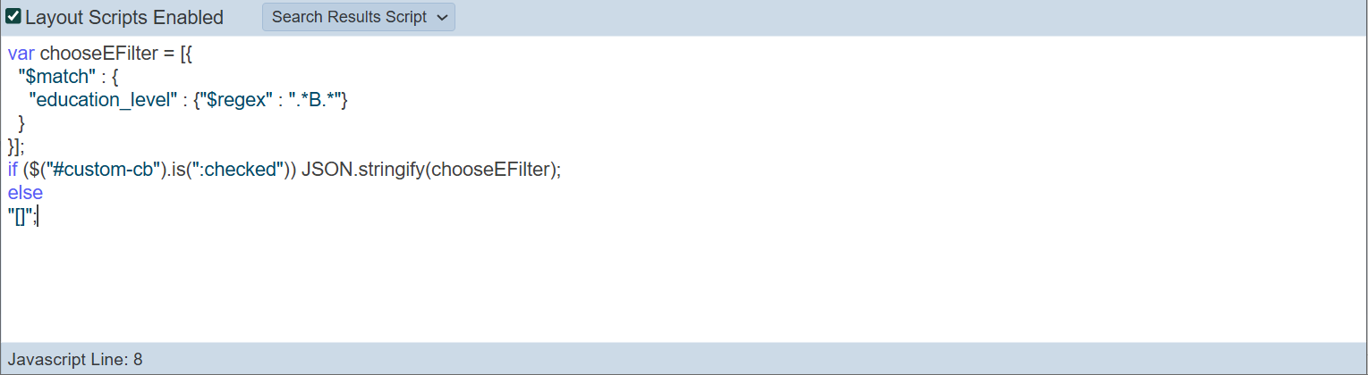
Below is an example of customising a search for records in “education_level” that has a “B” in it. For the “Search Setup Script”, the code is as shown below.
For the “Search Results Script”, the code is as shown below.
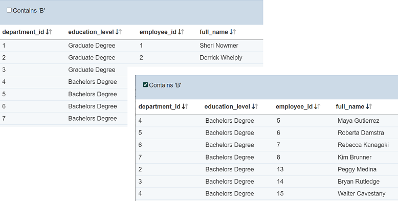
To use the customised search function, select the “Contains ‘B’” field and click on the  icon. All records with values that contains ‘B’ in the
 education_level field are displayed.
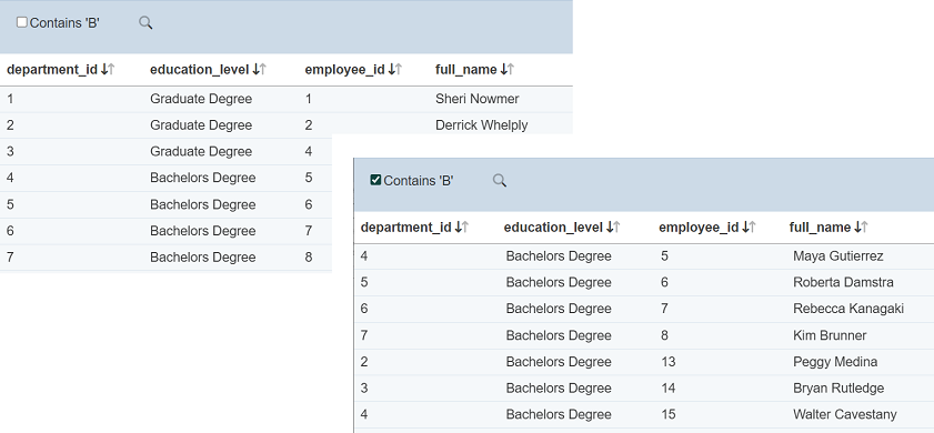
To revert, unselect the “Contains ‘B’” field and click on the icon.
You can also create a more dynamic search using the following script in the “Setup Script”.
The script removes the icon. Once the checkbox is selected, the search is triggered.
Using Pre Edit and Post Edit Scripts
In this example, the record editor has three fields, namely “City”, “Country” and “Region”. When editing the field “Region”, it is desired to limit the choices to just “Asia” and “Europe”. You can use “Pre Edit Script” to limit the choice to these two values via radio buttons and “Post Edit Script” to accept the change and save into the database.
To do so, key in the code as shown in the screenshot below for the “Pre Edit Script”.
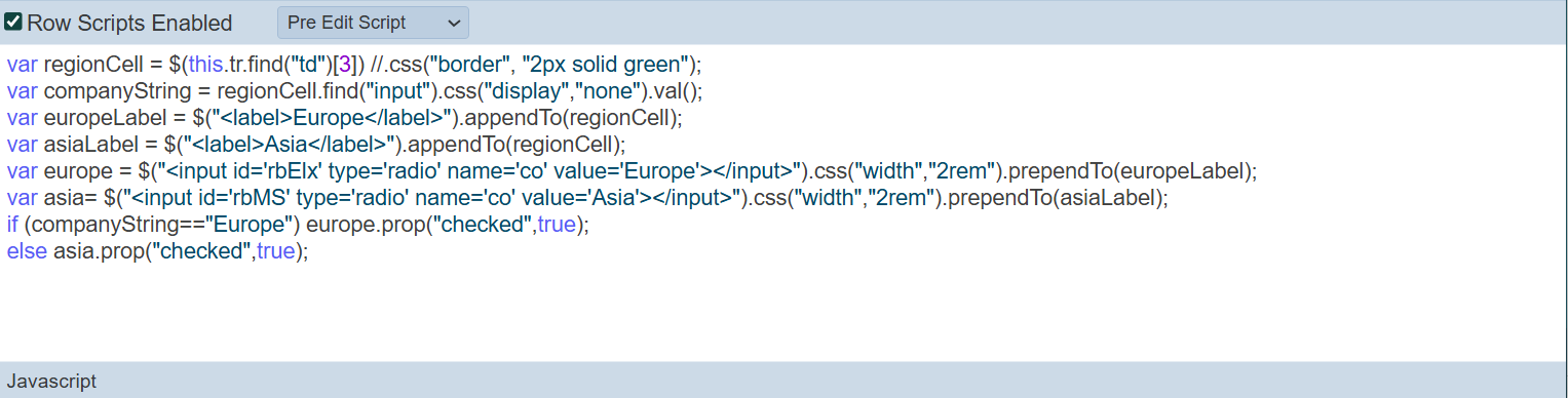
The code in the “Pre Edit Script” access the Region field and displays the options as radio buttons instead of textbox. It allows for the user to select when the “Edit” icon in the Record Editor is clicked.
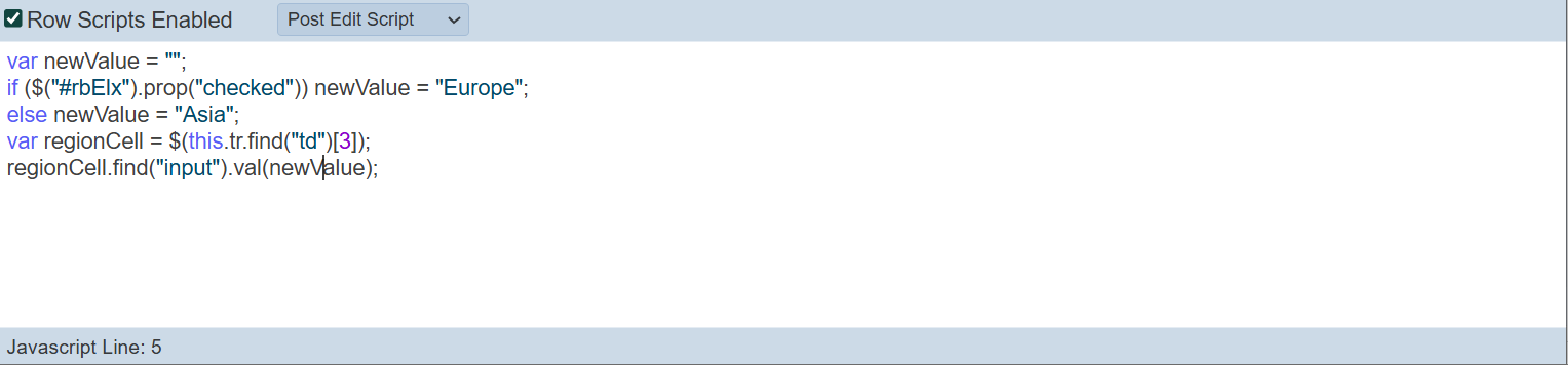
For the “Post Edit Script”, key in the code as shown below. The code in the “Post Edit Script” saves the newly selected value back to the record.
Ensure the “Edit Scripts Enabled” field is selected.
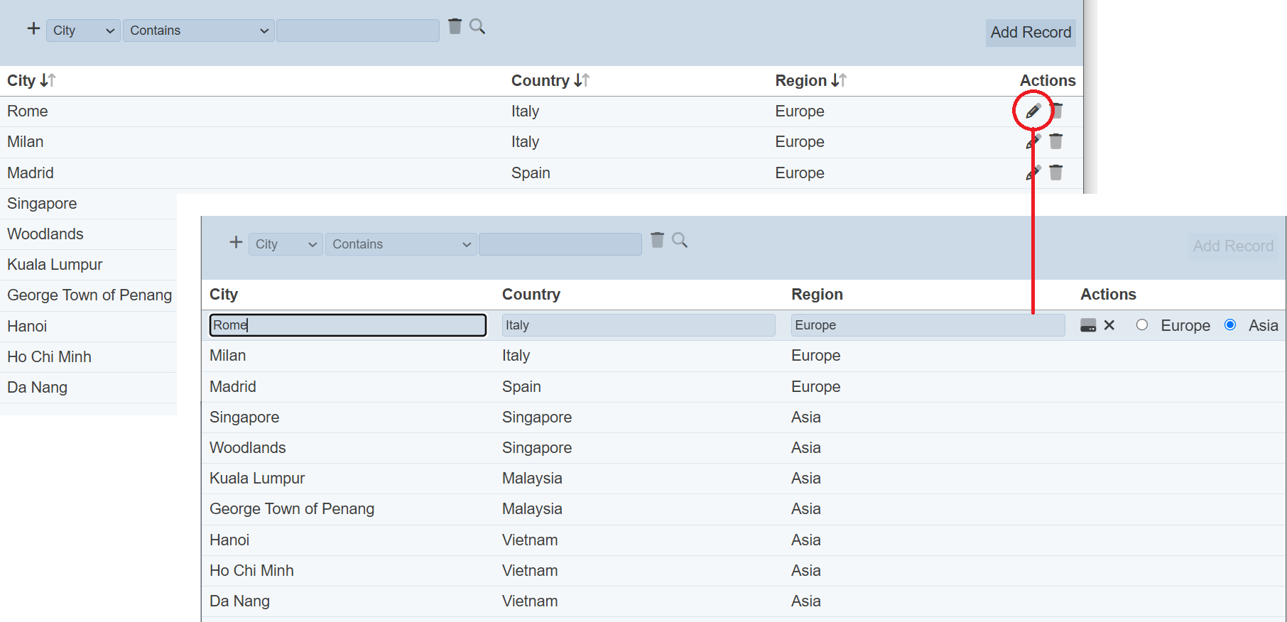
In the Record Editor, when the user clicks on the “Edit” icon under the “Actions” column for a row, the options defined in the “Pre Edit Script” will appear as radio buttons. Without the code, a textbox will appear for the “Region” field as per “City” and “Country” fields.
This allows the user to select one of the two options for the “Region” field in just one click via radio buttons, rather then typing it in a textbox.
Using Pre Display Script
In this example, the data has two columns; namely “Color1” and “Color2”. “Color1” shows the name of the colour it holds and “Color2” shows the code of the colour it holds. But both does not show the colour in the cell, making it difficult to To allow the user to change the colour easily, “Pre Display Script” and “Pre Edit Script” can be used to display the color selected.
To do this, key in the code as shown in the screenshot below for the “Pre Display Script”.
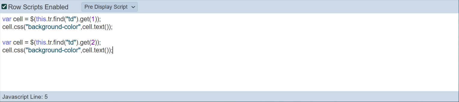
The code in the “Pre Display Script” access the CSS of the cells of the field required and displays the colour of the text in the cell.
In the “Pre Edit Script”, key in the code as shown below. The code in the “Pre Edit Script” gets the colour of the cell when the “Edit” icon in the Record Editor is clocked.
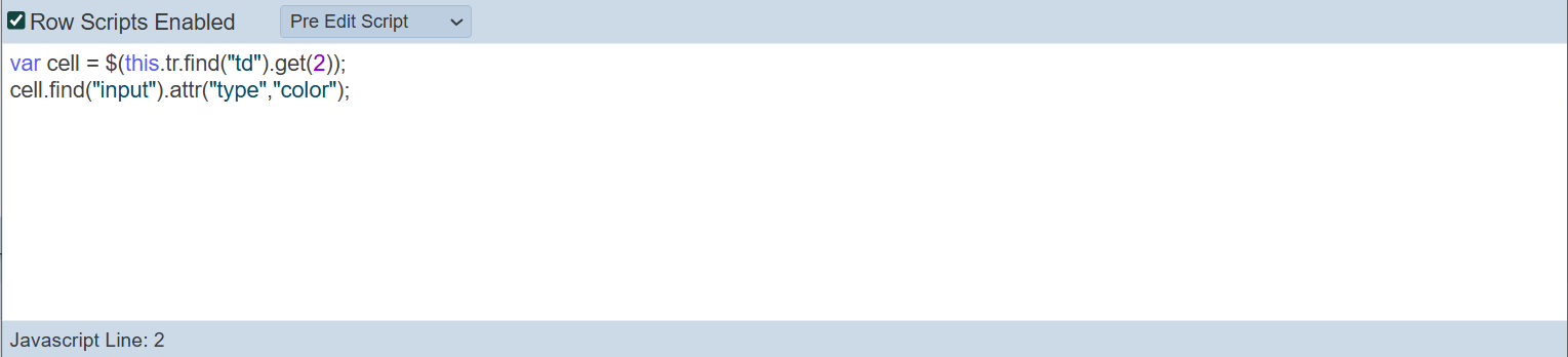
Ensure the “Edit Scripts Enabled” field is selected.
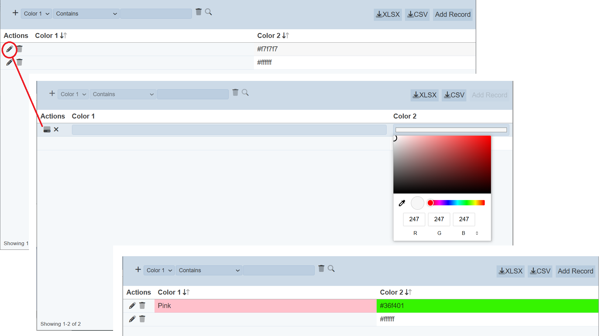
In the Record Editor, when the user clicks on the “Edit” icon under the “Actions” column for a row, the cell under “Color1” is empty, so no colour is displayed while “Color2” displays the colour as defined by the code in the cell. Click onto the cell of “Colour1” and key in a colour, in this example, Pink is used. Click onto the cell of “Color2” and the colour chooser appears. Choose the desired colour, in this case, green is selected. Click on the “Save” icon and the cells now display the colour selected.
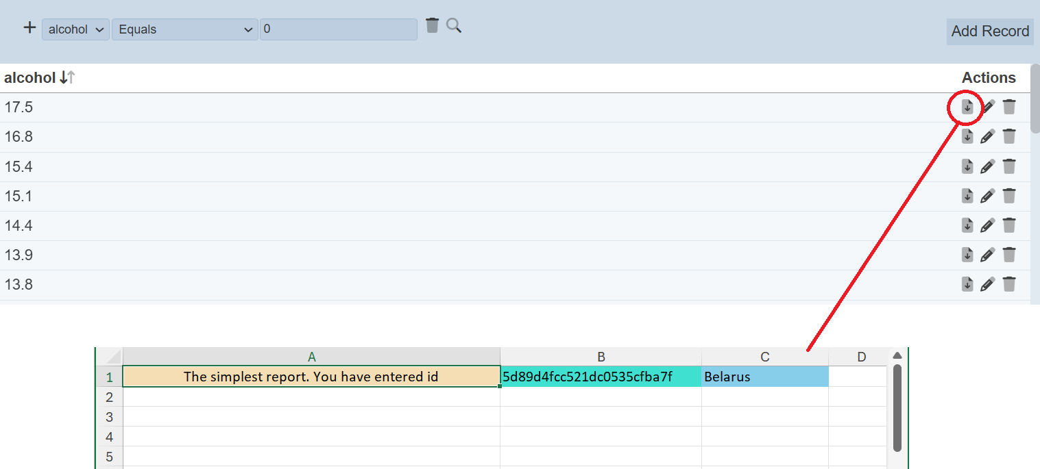
Using Extra Fields
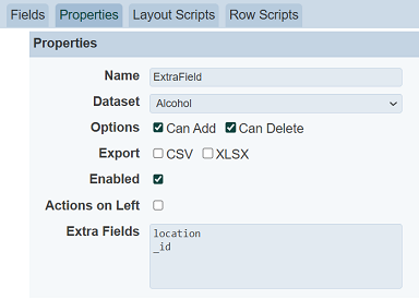
In this example, we use the “Extra Fields” property in the Properties section in the Properties tab. The “Extra Fields” property allows you to list the fields in the selected dataset to be used by other modules, such as ETL and Layouts modules.
In the Properties tab in Edit mode, key in the desired fields that are allowed to be used by other modules. In this case, _id nd location are entered.
In the Row Scripts tab, select “Pre Display Script” and enable row scripts by selected the checkbox next to the “Row Scripts Enabled” field. Key in the script code and click on the “Save” button to change the edit.
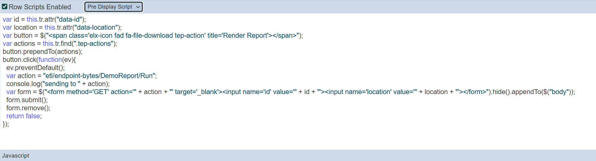
The code performs two functions:
- Displays a “Render Report” icon for each row under the “Actions” column in the record editor
- Runs the ETL, reads in the values in the fields and generates the report
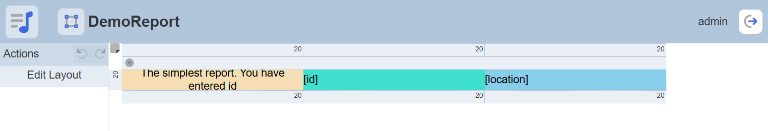
In the Layout module, create a simple report that uses the fields listed in the “Extra Fields” property.
In the ETL module, create an ETL chainset with the following ETL steps and settings:
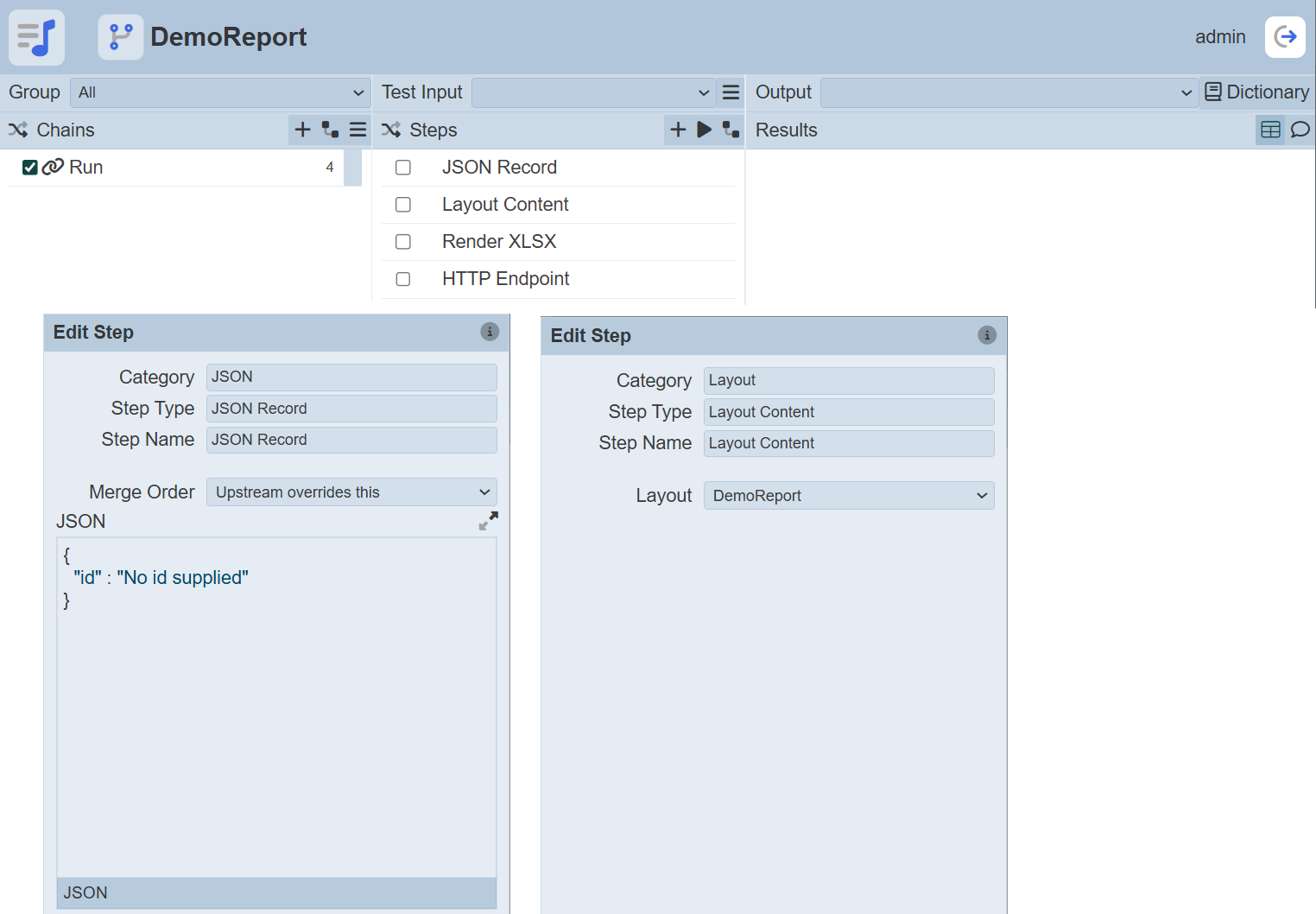
This ETL chainset uses the layout and generates a report.
In the Record Editor, click on the “Render Report” icon under the “Actions” column corresponding the desired row. A report will be generated with the columns in the layout.