
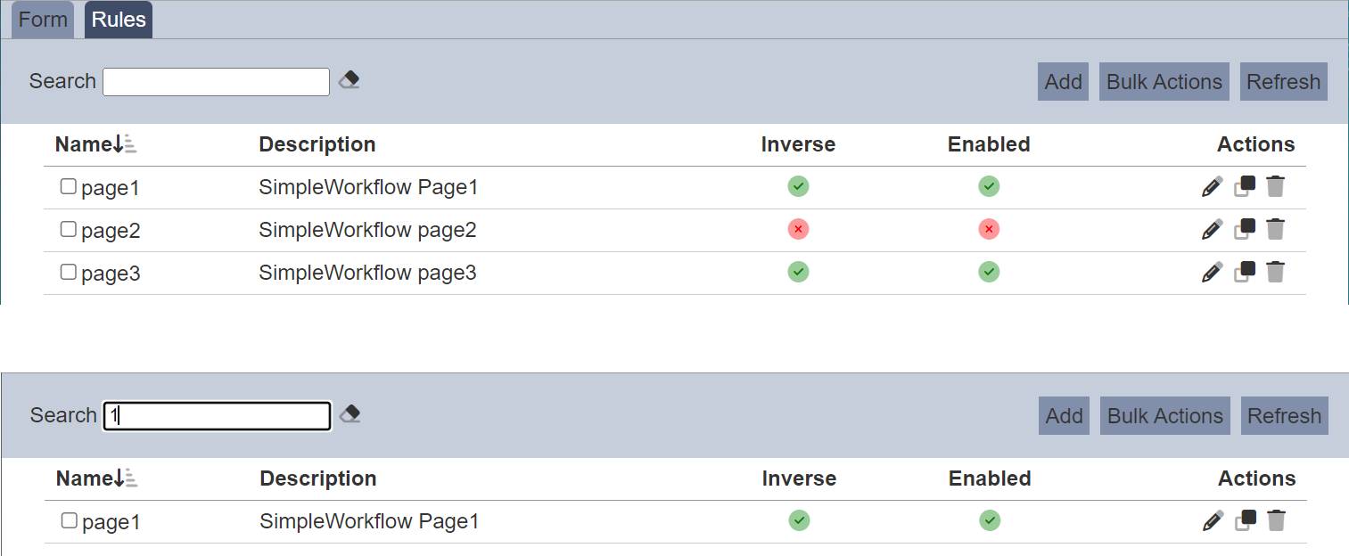
Rules
A form can consist of multiple pages and components. Rules define how a form reacts to user input — showing or hiding pages and components, marking fields mandatory or optional, and enabling or disabling elements. Each rule has a condition expressed as a logic tree and a list of actions that run when the condition is met.
Description
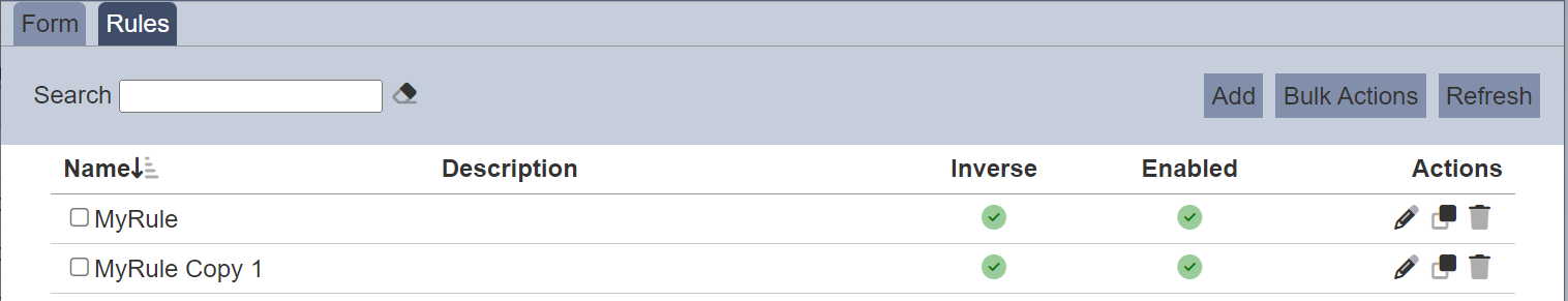
The Form Designer Rules tab allows you to create and manage rules for the form.
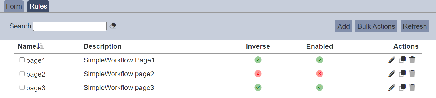
From the Rules tab, you can add, edit, clone, delete, enable, and disable rules.
Add
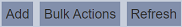
To add a new rule, click Add in the upper right corner.
The Add page will appear.
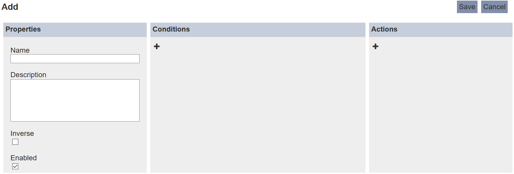
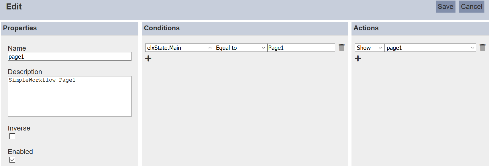
In the Properties panel, enter a unique name in the Name field and a brief description in the Description field. Selecting the Inverse field reverses the overall logic result — the rule triggers when the condition is not met. For example, if your condition is “Department equals Sales”, Inverse makes the rule trigger when Department is anything except Sales. Enabled is selected by default, enabling the rule for the form immediately.
In the Conditions panel, define when the rule triggers using a logic tree. The left palette contains four block types:
| Block | Description |
|---|---|
| Decision | A single field condition — evaluates a form field against a specified value |
| And | Groups child blocks; the condition is met when all children are true |
| Or | Groups child blocks; the condition is met when at least one child is true |
| Not | Negates its child; the condition is met when the child evaluates to false |
When to use And vs Or: Use And when all conditions must be true (e.g. “Show if Role = Approver AND Status = Pending”). Use Or when any single condition being true is enough (e.g. “Show if Role = Admin OR Role = Manager”).
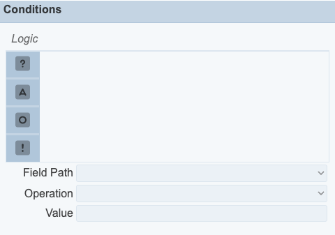
To add a block, drag it from the left palette to the desired position in the tree. When the tree is empty, clicking a block type adds it as the root. The tree label shows each block’s nested condition count, for example “And (2 conditions)” or “Not (1 condition)”. Nested conditions are the logic branches attached underneath a block.
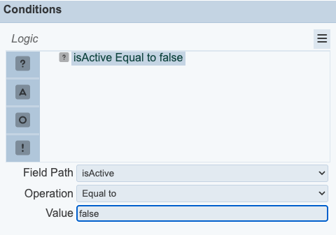
When a Decision block is selected, the Field Path, Operation, and Value fields at the bottom of the panel become editable:
- Field Path — select the form field to evaluate.
- Operation — select the comparison operator (see the table below).
- Value — enter the value to compare against. Value substitutions such as
${username}and${#fieldId}are supported; see the Examples section for the full list.
Available operators:
| Operator | Description |
|---|---|
| Equal To | Field value equals the specified value |
| Not Equal To | Field value does not equal the specified value |
| Greater Than | Field value is greater than the specified value |
| Not Greater Than | Field value is ≤ the specified value |
| Less Than | Field value is less than the specified value |
| Not Less Than | Field value is ≥ the specified value |
| In | Field value matches one of the specified values |
| Not In | Field value does not match any of the specified values |
When an And or Or block is selected, only the Operation field is active, letting you switch between AND and OR logic. Not cannot be set as the root of the logic tree — only And and Or are valid at the top level. A rule’s root condition must define what should happen; Not only makes sense as a modifier of other conditions (e.g. “NOT (Status = Draft)”).
To remove a block from the logic tree, select it in the tree and click the  More Actions icon:
- Delete Selection — removes the selected block only.
- Delete Subtree — removes the selected block and all its children.
In the Actions panel, click + to add a new action.
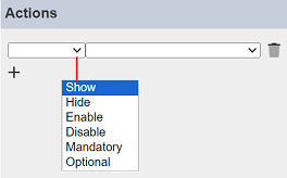
Select the desired action from the first drop-down list, then select the target page or component from the second. To add more than one action, click + again.
To remove an action, click the  Delete icon to the right of the action.
Click Save to save the rule, or Cancel to discard it.
If the name is already in use, an error message appears.

More Actions
Use More Actions to apply an action to multiple rules at once.
To perform a bulk action, select one or more checkboxes next to the desired rules, then click More Actions in the upper right corner.
Select the desired action from the list.
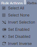
The action is applied to all selected rules.
If no rule is selected, only the first three options appear: select all, select none, and invert selection.
Edit
To edit a rule, click the Edit icon in the Actions column for the desired rule. The Edit page will appear.
The fields are the same as on the Add page, including the logic tree in the Conditions panel. Edit the rule as desired and click Save to save the changes.
Clone
Use Clone to copy an existing rule without creating one from scratch.
To clone a rule, click the  Clone icon in the Actions column for the desired rule. A new rule is added to the Rules tab with the name
 <rulename Copy 1>, inheriting the conditions and actions from the original.
Delete
To delete a rule, click the Delete icon in the Actions column for the rule. There is no confirmation prompt and the action cannot be undone.
Refresh
The rules list reloads automatically after your own changes. Use Refresh when other users may have made changes on the same page.
Refresh is in the upper right corner. Click it to reload the list.
Search
The search box at the upper left corner filters rules across all visible fields. It is case-insensitive and matches rules that contain the entered value in any of:
- Name
- Description
Examples
Using rules to show or hide form components
The rules in the form can be used to control the show/hide or enable/disable of components based on values selected by users. You can also use rules to limit the users from using part of the form.
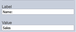
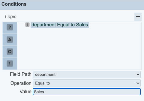
Below is an example using a fixed value to show/hide certain components in the form. In this case, the “ContactNo” field in the form is only visible by those with the role Sales. In the one of the component properties in the form, add a hidden field whose “Id” field indicates role and the “Value” field indicates Sales.
In the Rules tab, add a new rule.
In the Properties panel, enter a unique name for the rule. Ensure the Inverse and Enabled fields are selected.
In the Conditions panel, add a Decision block. Set Field Path to the hidden field (role), Operation to Equal To, and Value to Sales. In the Actions panel, configure the action to show or hide the ContactNo component.
Click on the “Save” button to save the new rule. Test the form using the “Run Form” option in the Form tab with two different users, one with the Sales role and one without.
There are other substitutions that are supported. Below are some examples:
${username}${userid}${email}${roles}${privileges}${URLParameter}— substitutes the value of a URL query parameter; replaceURLParameterwith the parameter key${#id}— substitutes the current value of another field in the form; replaceidwith the target field’s ID
For a more dynamic case, take a leave application for example. Employee A applies to take leave and Employee A’s manager (Employee B) needs to approves it. The ETL in the “Submit” transition looks up Employee B and inserts that into elxPublic.
{
  "approver":"B"
}
The hidden field “approver” in the form dynamically gets the value “B”.
A rule can be added that says “shows the ”Approve“ button if username is B”. In the Conditions panel, add a Decision block with Field Path set to approver, Operation set to Equal To, and Value set to ${username}.
Using a hidden component to show or hide a form
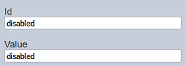
In the form created, add a Hidden component. In the properties of the Hidden component, set the “Id” and “Value” as “disabled”.
In the Conditions panel, add a Decision block. Set Field Path to the hidden field (mode), Operation to Equal To, and Value to disabled. In the Actions panel, add an action to disable the form.
This rule states that if ${mode} is disabled, the entire form will be disabled. Run the form and you will get a normal editable form.
Add mode=disable to the end of the URL of the form. For example:
http://localhost:1740/form-runtime/c6f8307b-2f2a-464c-83ec-3940fba6881e/index.html?mode=disable
The form is now disabled and is not editable.
Using AND logic for multiple conditions
You can combine multiple Decision blocks under an And block to create a rule that only fires when all conditions are true simultaneously.
For example, to show an “Approve” button only when the form status is Pending and the current user is the designated approver:
- In the Conditions panel, drag an And block into the tree.
- Drag two Decision blocks under the And block.
- Configure the first Decision: Field Path =
status, Operation = Equal To, Value =Pending. - Configure the second Decision: Field Path =
approver, Operation = Equal To, Value =${username}. - In the Actions panel, add an action to show the Approve button.
The rule now triggers only when both conditions are met at the same time.
Using the mandatory and optional options in rules
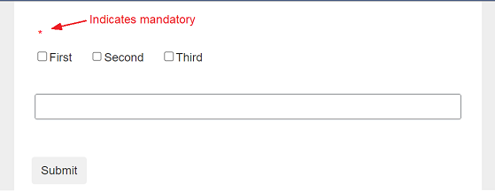
If the “Mandatory” option in the Form Rules is selected for a component, regardless whether the “Mandatory Field” in that component is selected or not, the component input becomes mandatory. If the “Optional” option in the Form Rules is selected for a component, regardless whether the “Mandatory Field” in that component is selected or not, the component input becomes optional.
When the field is mandatory, a red dot all appear above the field.
Version compatibility
When an existing form is opened in the Form Designer, its rules are automatically migrated to use the new logic tree format. Once the form is saved it is stored as version 2 and is no longer compatible with earlier versions of Ambience.
If a form that was created in a newer version of Ambience is opened in an older installation, both the Form Designer and the form runtime display the message: Form was created in a later version of Ambience and is not supported in the current version.