This algorithm decides the colour scheme that will be used to fill each region of the base map.
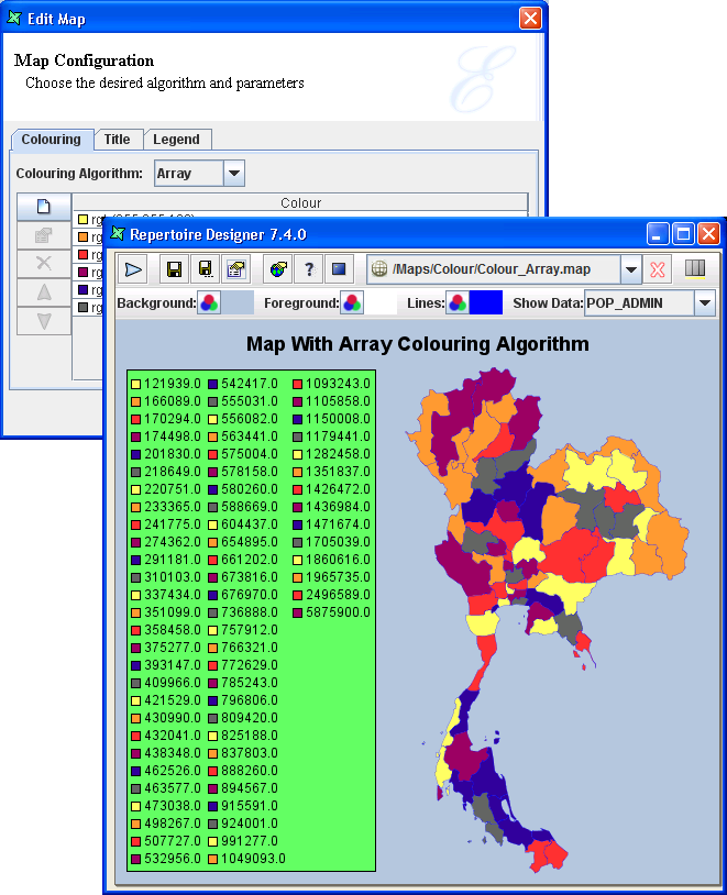
The Array algorithm allows user to specify a number of colours and use each in turn for a data item. This works best when the number of colours chosen is greater than or equal to the number of unique data values. Else, there will be some repetition of the colours.
For the field name selected in Show Data,
the first region will take the first colour and so on until the 6th colour
is utilised by the 6th region. The 7th region will have the same colour as the 1st
region.
Note
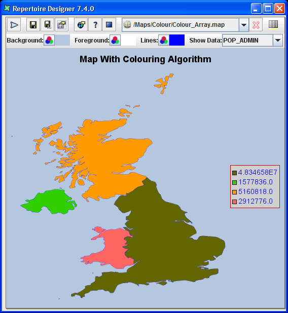
- It is useful to apply in a map with only a few regions to fill the colour scheme as shown in Figure 6.13, “Colouring Algorithm - Array (with few regions)”.
- An example of inappropriate usage of this colouring algorithm is shown in Figure 6.14, “Colouring Algorithm - Array (with numerous regions)”. This colour scheme can still be used if specific colour type is important but not critical to differentiate each region.
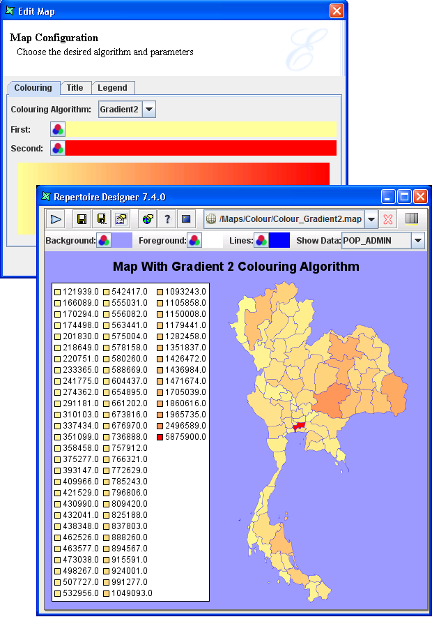
A range of colours will be blended from the first colour specified
to the second colour specified as shown in the Map Configuration page,
Colouring tab.
For the field name you selected under the Show Data
combo box, the first region will take on the first colour
specified, subsequent regions will take on the increasing colour
tone down the line until the last region will usually take on the
second colour specified.
Note
The legend displayed in Figure 6.15, “Colouring Algorithm - Gradient 2” is for the purpose of explaining the effect of the Gradient 2 on the colouring of the regions. There is no need to display such legend on map.
Tip
- This colour scheme is useful if user wishes to see an increasing colour tone in data to reflect the gradual effect of the regions.
- An example like in Figure 6.15, “Colouring Algorithm - Gradient 2”POP_ADMIN is selected to show the regions of increasing population size compared to the size of the regions.
- There are many lighter tone coloured regions as compared to the darker ones, which indicates that 'small-sized populations' regions are very prominent in the base map.
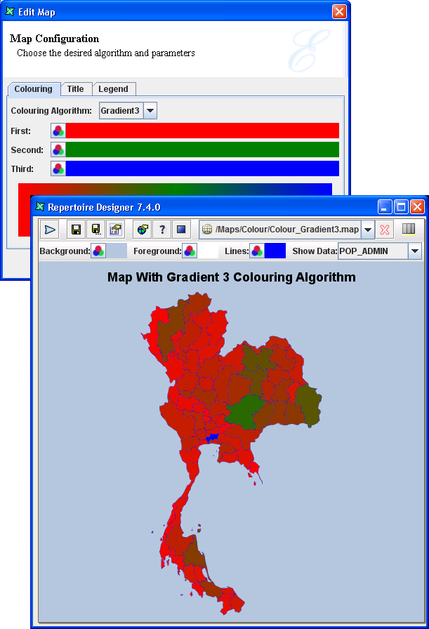
Gradient 3 is similar to Gradient 2, but the range of colour will be blended from first colour to second colour (median) to third colour instead.
This colour scheme is useful if user wishes to see a increasing colour tone for data reflect the gradual effects of the regions, especially to highlight regions that fall in the median range.
An example like in Figure 6.16, “Colouring Algorithm - Gradient 3”, SQMI_ADMIN is selected to show the regions of increasing area in square miles. Select a totally different colour tone as the median so as to differentiate from the first and third colour. At a glance, user will be able to see the green tone regions which indicates that they are about the same size each.
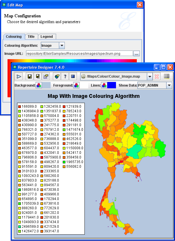
User can create their own images to choose exactly the gradient that they want. For example, user can create a “4-gradient” image with a dark green to medium green to light blue and then to white. Before using this option, ensure that the image file is available in the Repository.
In the Map Configuration wizard, in Colouring tab,
select Image from the drop down list. Enter the URL
of the image in Image URL: field.
Tip
- If user requires each region to have its own unique colour, then a spectrum image which has a wide range of blended colours will be able to differentiate all the individual regions.
- It is useful if user only wants some of the regions to appear coloured and the rest can follow the foreground colour of the base map. In Figure 6.13, “Colouring Algorithm - Array (with few regions)”, all categories are coloured. Thus if the user only needs a few particular categories to be coloured, this option can be used.
Note
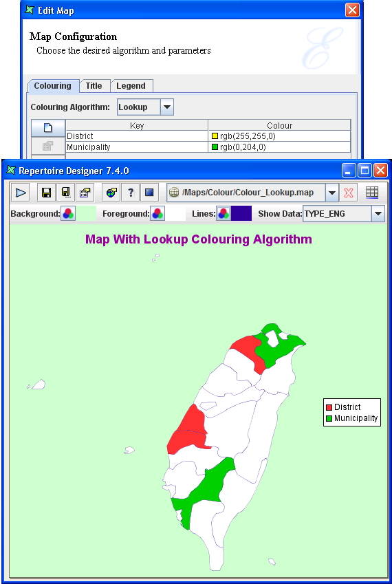
The labels entered for each colour specified under the key option must tally with the data of the particular region's field name required.Legend will appear as a box on the map, to show the contents (in the form of text or continuous range format) of all the regions.
In the case of Figure 6.15, “Colouring Algorithm - Gradient 2”, the population size of all the regions are shown in the Legend box. Therefore, the map might not look presentable. By enabling the Continuous option, the legend becomes smaller and shows only a range of blended colours with default major tabs.
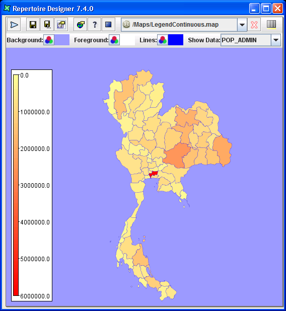
Start At Zero option is a preference whether to show
the range from zero or from the a rounded up figure nearest to the
minimum and maximum 'fill-regions' data.
Note
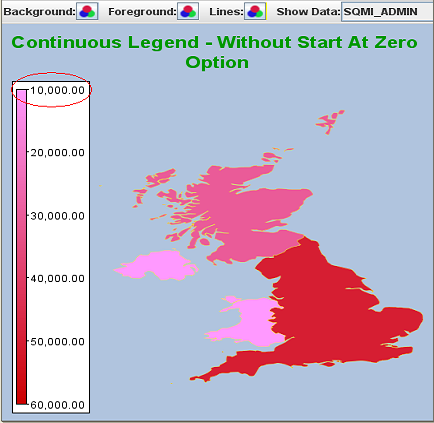
- The Continuous and Start At Zero option can only be used when you select a numeric field name.
- The Start At Zero option will only be effective when the Continuous option is enabled too.
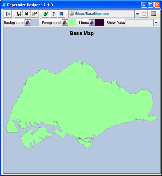
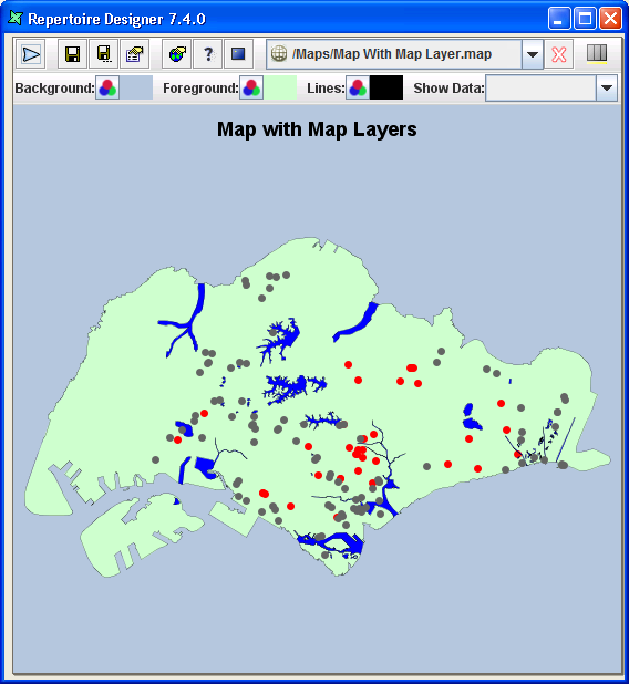
They are the add-on maps over the base map (the first map that user wants to appear as the outline first, as shown in Figure 6.21, “Example of Base Map without Map Layer”.
These add-on maps can be additional graphics like canals, road routes, shopping malls, libraries, etc.
From Figure 6.21, “Example of Base Map without Map Layer”, the blue strips are the Singapore canals, the black line represent the major highways and the red dots represent the hospitals and polyclinics whereby you can see the specific names when you hover the cursor over the red dots.
This key is a fieldname with non-duplicate data. It is necessary to select which key you intend to use as a primary key in order to show as meaningful “hovering legends” when you place your cursor over any region. By default, it will select the first fieldname (Column 1) as the primary key.