This section lists the properties that are common to the Data components.
The View tab lets you see the views name and type and also set the initial visibility and z-index.
The Image Server provides a static image of your view.
The Show Image Server Url option allows
you to set the image height and width, and the cache duration.
You can copy and paste this URL anywhere else (for example, in Adhoc Reports) to display the image.
Show action bar: Determines whether to display the action bar or not.
Title: Fill in the title.
Show info button: Fill in the information and customise its format. On clicking, the information you have entered will display in a text field, guiding the user on how to proceed.
Show render button: A render button will display, which allows you to render into the desired output format, including HTML, PDF, XLSX and CSV. You can choose from the following output targets: Browser, Repository and Mail. You can also specify the render details, including page size and orientation (portrait or landscape).
Show filter button: A filter button will display. On clicking, a filter editor will open.
Show maximise button: A maximise button will display allowing you to maximise or restore the component in the browser.
URL: On selecting the Source, the related URL will automatically appear.
Source: Select from universe, view or embedded. A window will pop up, showing the available tables under universe, or the available views under the view options, with an option to use all data from that view or only the selected items, or display the schema under the embedded option.
Parameters: After the Source and URL are set, parameters will display (if any).
Add: In the
Add Filterwindow, you can specify the field name, filter type and condition, as well as edit or delete the views. Refer to Table 7.1, “Filter Types”.

Adhoc Report displays reports with file extension
.report.
Adhocreport
View: See the section called “View”
URL: Click Repository to select the repository that contains the data for the report.

Allows the dashboard designer to write custom HTML and Javacript code to completely control the visual aspects of the view.
Scriptable can be used to develop quick simple solutions that the current set of dashboard views cannot yet handle.
View: See the section called “View”
Actionbar: See the section called “Action Bar”
Data: See the section called “Data”
Scriptable
Use Data Array When checked, the system treats the data received as a Javascript array of arrays. Else, the system treats the data received as a Javascript array of objects.
HTML/Javascript: Enter your custom HTML or Javascript code here.
Ensure that you use the special div element
<div class='elx-datahtml-script'></div>
and write any required html elements above that.
To access the data from the parent element, use code as shown in the following sample:
var parent = $("#"+viewId).;
var data = parent.data("data");
Filter: See the section called “Filter”

Allows you to display a custom label containing the result of a statistical operation such as Sum, Average or Count of the data in the selected table.
View: See the section called “View”
Actionbar: See the section called “Action Bar”
Data: See the section called “Data”
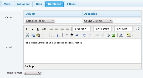
Datalabel
Value and Label: Select the column and the statistical operation. Customize the label text as desired. An example is shown in Figure 7.3, “Datalabel Example”.
Result Format: Format for displaying the result. For example, selecting
0.00as the format, will cause all numbers to be displayed with two decimal points
Filter: See the section called “Filter”

Datepicker is used for date fields and allows you to either type in a date or select it from a drop down calendar.
View: See the section called “View”
Actionbar: See the section called “Action Bar”
Data: See the section called “Data”
Type
Type:
single: This displays a single date.
range: This displays a range of dates.
Label1: The label is customisable. The default label name is From. If you want to display a single date, only Label1 is necessary.
Label2: The label is customisable. The default label name is To. If you want to display a date range, both Label1 and Label2 are necessary.
Mode:
datetime picker: Allows you to select a date and a time.
For example, you can use this mode to filter data to show records pertaining only to 23/08/2004 at 9:00 pm.
time picker: This displays a calendar combo box and a slider with hours, minutes and seconds for you to choose the exact time.
date picker: This displays a calendar combo box for you to choose the date.
month picker: This displays two drop-down lists with months and years for you to choose the month.
year picker: This displays a drop-down list with years for your selection.
Column: Specify a column from which the Datepicker will read data.
Date Format: Select a date format. Some date formats are as follows:
yy-mm-dd: e.g. 2012-06-01
D, dd M y: e.g. Fri, 01 Jun 12
D, d M y: e.g. Fri, 1 Jun 12
DD, dd-M-y: e.g. Friday, 01-Jun-12
D, d M yy: e.g. Fri, 1 Jun 2012
Selection:
Value: One of Fixed or Relative. You can select a fixed date when set to fixed. When set to relative, the selection you make is relative to the current date.
For example, if you set the relative date as 1 month, and the current date is 25 March 2015, the actual date that the date picker refers to is 24 April 2015.
Filter: See the section called “Filter”

Grid view shows unique values from a particular column in the universe. A grid is a selection mechanism to narrow down the range of values, and is used to view a summary of the data.
View: See the section called “View”
Actionbar: See the section called “Action Bar”
Data: See the section called “Data”
Type
Single Select / Multiple Select: Set whether the user can have single selection or multiple selections in the
Runmode.Enable Select All: Allows you to select all entities at once.
This is only available in multi select mode and for checkbox and grid.
Type: Select from the following options.
Grid: Display the grid directly.
Select: Display the grid as a drop down list.
Checkbox: Display the grid as check boxes.
Radio: Display the grid as radio buttons.
Count: Set the number of rows or columns in the grid.
Direction: Select from the following options.
Down: Display the grid using the down then across direction.
Across: Display the grid using the across then down direction.
Sort: Sorts the data for the grid in either Ascending or Descending order. Set it to
noneto omit sorting.Sort Column:The column to sort on.
Format: Format for display. For example, selecting
0.00as the format, will cause all numbers to be displayed with two decimal points.Column: Select the column from where the grid will read data.
Use Enumeration Values: Specify the values to be enumerated.
This is only available if enumerations have been defined in the Universe for the column you want to use in the Grid.
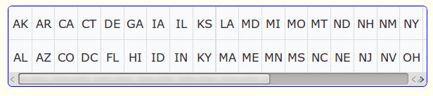
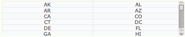
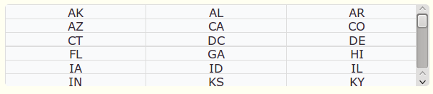
The following screen shots illustrate how the grid
displays with differing counts and directions. The data for the
grid is taken from the universe named US
State.
Grid with Count set as 2 (Grid with two rows) and direction set as Down:
Grid with Count set as 2 (Grid with two columns) and direction set as Across:
Grid with Count set as 3 (Grid with three rows) and direction set as Down:
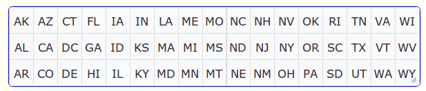
Grid with Count set as 3 (Grid with three columns) and direction set as Across:
Selection: Specifies whether the first value or all values in the grid should be selected by default.
Filter: See the section called “Filter”

This component allows you to submit parameter values that can be used by many different views, to the dashboard.
View: See the section called “View”
Actionbar: See the section called “Action Bar”
Type
Show Submit Button: Selecting this option allows you to submit parameter values to the dashboard, which in turn can be used by different views. For example, a Report view may require a parameter to display a report, and this parameter can be supplied at run time via the Parameter view. This option enables all form elements to be submitted together as otherwise submission is automatic on a per form element basis. For example, clicking Enter in the text field will submit only the text field.
Parameters: A list of parameters (if any) will show in the Parameter list. These parameters are required by various dashboards to show their content. The designer can choose some parameters or all of them to be presented as form elements on the form.
Report displays RML reports.
View: See the section called “View”
Actionbar: See the section called “Action Bar”
Type
RML: Click Choose from repository... to set the RML file path, or type the path manually in the RML field.
Scrolling: If this option is selected, horizontal and vertical scroll bars will automatically display around the report view if they are required.
Paged: If this option is selected, there will be a page navigator when the report is broken into pages.
Streamed: If this option is selected, the report will be one continuous page. This is the opposite of the Paged option.
Parameters: Parameters will get loaded automatically (if any).
Report List allows a collection of RML reports specified by tags to be listed, previewed and rendered.
View: See the section called “View”
Actionbar: See the section called “Action Bar”
Type
Heading: Type the heading for each report.
Tags: Type the tag for each report.
Show Preview: Enable you to preview the report in the design process.
Output: You have the option to render the report list into the following formats: PDF, DOCX, CSV, EXCEL, and PRINT.
Report: On clicking Refresh Reports, parameters and values will be automatically loaded (if any).

Allows the user to enter search criteria to determine what data is considered selected. The results of the search operation cannot be seen in the search view, but can only be seen by using the search as a data-source for another view. Therefore, by changing the search criteria in the search view, what is displayed in the other view will change.
View: See the section called “View”
Data: See the section called “Data”
Type
Show header: Select to show the column headers in search results.
Select all on no criteria: Selects all the records in the database if you do not specify the search criteria.
Autocomplete Limit: The
autocompletelimit allows the number of suggestions in the auto complete list to be capped.Column and Alias Columns allow the dashboard designer to select which fields will participate in the available search criteria. Alias allows you to rename them to your desired names for display.

Slider is used to select a value from a range of values that is displayed. The range can be a numerical range or a date range.
View: See the section called “View”
Actionbar: See the section called “Action Bar”
Data: See the section called “Data”
Type
Persist Selection: The selection remains permanent until the user un-selects the selection.
See the section called “Table” for more information.
Type:
date: Select this option to read data from a date column. Between the two ends of the Slider, the dates will display individually.
date-range: Select this option to read data from a date column. Between the two ends of the Slider, the dates will display as a range.
numerical: Select this option to read data from a numerical column. Between the two ends of the Slider, numericals will display individually.
numerical-range: Select this option to read data from a numerical column. Between the two ends of the Slider, numbers will display as a range.
Horizontal / Vertical: Select the direction of the Slider.
Update on Stop / Update on Slide: Indicates when to update the related views that are filtered by the slider.
If
Update on Stopis selected, the views are updated, after you stop dragging the slider.If
Update on
Slide
is selected, the views are updated, in real time as you drag the slider. This is a very resource intensive operation, as the update requests need to be sent in real time to the server, as you drag the slider.Label: Create a label name for the Slider.
Wrap Label Text: If this option is selected, the label text will automatically wrap. Otherwise, the label text will not wrap but overlap.
Label Step: Set the label step for the Slider. For example, if the step equals to 1, there will be a label for every value. If the step equals to 3, there will be a label for every three values.
Show Tooltips: If this option is selected, a component tip will display when a label is selected.
Format: The data format to use for display. For example, selecting the data format as
0.00will cause all numbers to be displayed with two decimal places.Column: Select a column from which the Slider will read data. The data type in the column must be consistent with the type of the Slider. For example, if you choose Slider - Type - Date, it is necessary to choose a column which contains date values.
Use Enumeration Values: Specify the values to be enumerated.
This is only available if enumerations have been defined in the Universe for the column you want to use.
Date Format: Select one of the following date formats.
yy-mm-dd: e.g. 2012-06-01
D, dd M y: e.g. Fri, 01 Jun 12
D, d M y: e.g. Fri, 1 Jun 12
DD, dd-M-y: e.g. Friday, 01-Jun-12
D, d M yy: e.g. Fri, 1 Jun 2012
Selection
None: Do not select any values in the slider.
All: Select all the values by default in the slider.
First: Select the first value by default in the slider.
Filter: See the section called “Filter”.

This displays the data in a tabular form.
View: See the section called “View”
Actionbar: See the section called “Action Bar”.
Data: See the section called “Data”
Type
Persist Selection: The selection remains permanent until the user un-selects the selection.

Consider three tables A - B - C, each with a single column named id with four rows 1,2,3,4.
Initially, if table A has four rows of data, and the first two are selected (1,2), then table B will show two rows (1,2), and table C will show no rows as there are no selections on table B.
If now we select the first row in table B, then table C will show one selection (1). If we now go back to table A, and unselect row (2), what happens in table B depends on the option "Persist Selection".
If Persist Selection is unchecked, then any changes on A will clear all selections in B. If Persist Selection is checked, then any changes on A will clear some or maybe all of the selection in B.
If we unselect row (2) in table A, with Persist Selection unchecked, then table B and table C will show no data.
If we unselect row (2) in table A, with Persist Selection checked, then table B will show one row (1) selected and table C will show one row.
Page Size: Set the maximum number of columns that will display on one page.
Enable Caching: Specifies that the pages of the table are to be cached, for increased performance.
Layout: One of Auto or Fxed. Auto allows Ambience to manage the width of the table automatically. Fixed creates a fixed width table.
Single Select / Multiple Select: Set whether the user can have single selection or multiple selections in the
Runmode.Enable Select All: Allows you to select all entities at once.
This is only available in multi select mode and for checkbox and grid.
Selection Checkboxes: If this option is enabled, you can either select Left Column or Right Column from the
Checkbox Locationoption, to display the checkboxes at the left or right side of table columns.Cell Minimum Width: Denotes the minimum width (in pixels) to reserve for each cell.
Show Cell Tooltip: Specifies whether to show the tooltip, if any, for each cell.
Enable Hyperlinks: Treats any URL in the table content as a hyperlink.
Defaults: Specifies the default text that is displayed for Empty Strings, Infinity, NaN and when there is no data in the table.
Choose columns: After the Data - Source is set, columns under that source will automatically display. Click Choose columns, and the Column Chooser window will display. Make your selections and click OK.
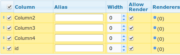
Alias Indicates an alternative name for the column, for display.
Format The data format to use for the column For example, selecting the data format as
0.00will cause all numbers in that column to be displayed with two decimal places.Alignment indicates the text alignment for the column - either left, right or center justified.
Text Overflow determines how to handle text that overflows the width of the table. Either you can set it to
nowrapwhich will allow the text to overflow into the next column, orwrapwhich causes a line break and allows the text to be displayed on multiple lines.Width indicates the width of each column, in pixels. A value of zero causes the width to be automatically determined. Else, the width of the column is set to the user defined value.
Hyperlink Text allows you to hyperlink the column header.
Sortable makes the column sortable. Double click the column header to sort the column in Ascending order. Double click the column header again to sort the column in Descending order.
Allow Render indicates whether the output of the column is to be included when rendering to PDF and HTML. Select this option as desired.
Renderers: The
rendererscolumn allows the contents of the table cell to be displayed or rendered differently depending on the value in the cell.An expression is selected to test the value. If the expression is true, the cell can be changed by one or more of the following ways.
- Background colour
- Foreground colour
- Add an icon
This allows you to mark a cell or a row of cells with unusually high values, for instance.
One or more tests can be added per column. The first test that evaluates to true is the one that is used to render the cell.
(From Ambience 3.6)Expressions: You can now add custom Javascript code to transform your data as you wish, for display.
In the Javascript code, a single substitution - #{value} is required. This represents the cell value that is used as input to the expression.
For example, the following Javascript code in a Date column will transform the date into an age.
function getAge(dateStr) {
    var split = dateStr.split("-");
    var dob = new Date(split[0], split[1], split[2]);
    var now = new Date();
    var age = now.getFullYear() - dob.getFullYear();
    var m = now.getMonth() - dob.getMonth();
    if (m < 0 || (m === 0 && now.getDate() < dob.getDate())) {
        age = age - 1;
    }
    var r = age.toString();
    var n = r.split(".");
    return n[0];
}
return getAge(#{value});
The result of this expression will be the age (calculated as the difference between the current date and the date mentioned in the input.)
From Ambience version 3.7 onwards, the TableView cell expression has been extended to allow expressions to be calculated based on values of other columns of the same table row.
If a table has a schema of:
[Fruit100.Company, Fruit100.WeightKG, Fruit100.Unit Cost,
Fruit100.Quantity, Fruit100.Id, Fruit100.Date]
To access the value of a column, you wrap the column with #. For example:
#{Fruit100.Company}
Here is an example expression:
function test(company) {
if (company === "C") {
if (#{Fruit100.WeightKG}

<= 1.2)
{ return "C Weight <= 1.2"; }

else
{ return "C Weight 1.2"; }

}else
{ return company; }

}
return test(#
{value}

);
Filter: See the section called “Filter”