
Charts are visually appealing and make it easy for users to see comparisons, patterns, and trends in data. For instance, rather than having to analyze several columns of data reports, you can see at a glance whether sales are falling or rising over quarterly periods, or how the actual sales compared to the projected sales. Elixir Report Designer provides support for charts through the Chart element.
Note
- Colour tab for customizing the pattern of the chart is available in Pie, Bar, Area, Column, Line, Polar Waterfall, XY, Bubble and Heat Map charts.
- The label for Area, Bar, Column, Line and XY charts can be configured to rotate through the wizard tab where plot background is configured. The degree of rotation and direction can be configured in the same page.
-
Interval range can be drawn on Area, Bar, Column and Line Chart. This can be
done in the Chart Wizard, in the page where the
Key,Values, etc are selected. -
Position of values in Chart element can be customized according to preference.
However, this is only applicable to Area, Bar, Column, Line and XY Chart (except
Heat Map). The font, color and format of the values can all be customized as
well. The prerequisite is to check
Valuein theColumntab. - Area, Bar, Column, Line, XY and Composite Charts can be Domain Gridlines and/or Range Gridlines enabled. Domain Gridlines are lines extended from the points on the X axis. Range Gridlines are lines extended from each respective values on the Y axis.
Select and place a Chart element in the report layout. The Wizard appears as shown in Figure 4.17, “Chart Wizard”. Select the DataSource from the combo box. Alternatively, by clicking the Add button on the right of the combo box select the DataSource from the Configure DataSource Wizard.

OverAll: On selecting this option, the whole set of records are taken into consideration irrespective of the grouping.
OverGroup: If this option is selected then the plotting is done based on the grouping of data is considered.
OverCurrentRecord: If this option is selected for the chart in the Group header, then the first record of the group is considered. If this option is selected for the section footer, then the last record of the data source is considered as the current record or if this option is selected for the section header then the first record of the data source is considered.
Enter the Display Name if required.
Click on the Next button to navigate to the next screen.
The chart types are listed in the left panel of the wizard. On selecting a particular chart category the various sub types are listed on the right panel. You can select the desired chart type from the different options listed. The different types of chart are listed below:

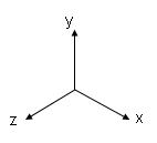
A 3D chart displays data using three axes, X, Y and Z. The orientation of these axes follows the right-hand rule: make a fist with your right hand, and extend your thumb to point to the right. Extend your index finger so it points upwards, making a 90 degree angle with the thumb. Finally, extend your middle finger so it is at 90 degrees to both your thumb and index finger. You now have the directions of the X (thumb), Y (index finger) and Z (middle finger) axes. These are shown in Figure 4.18, “XYZ Axes”.
Five kinds of 3D charts are supported, Area, Column, Line, Scatter and Surface. In each case, the X axis may reference any kind of field, such as strings, numbers etc. The Y axes can only hold numeric values, so the wizard will only let you select from the numeric fields of your datasource. The Z axis can reference any kind of field, but discrete values, i.e. strings make most sense. The Z axis can't key the values effectively over a continuous range, such as a floating point number.
The chart preview tab on the Chart Wizard allows you to preview what your chart will look like. In addition, for 3D charts, you can also adjust the camera angle here, to look at the chart from a different orientation. To do this, press and hold the mouse button and drag slowly up and down and left and right. You will see the chart repainted as you drag the camera around.
Note
3D Surface chart shows values in a range. 3D Scatter chart displays values in a collection of points, as shown in Figure 4.19, “3D Scatter Chart”. These charts are also available in Dashboard Designer.

An area chart displays series as a set of points connected by a line, with an area filled in below the line. By displaying the sum of plotted values, an area chart also shows the relationship of parts as a whole. Area charts are typically used to compare values over time.
The Area Stacked charts shows related data groups one above another. The Stacked Area charts are used when you want to compare the sum of multiple sets. The Area Stacked Percentage chart shows each data set as the percentage of the sum of all sets.

A bar chart displays series as set of horizontal bars that are grouped by category. The categories are arranged horizontally and the values vertically . Bar charts are used to compare value over categories and are ideal for showing the variations in the value of an item over time, or for showing the values of several items at a single point in time.
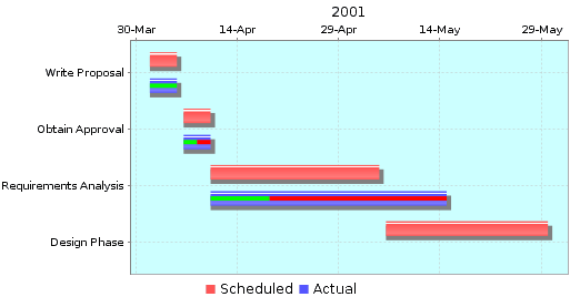
The Bar chart types include Bar, Bar 3D, Cylinder, Bar Stacked Chart, Bar Stacked Percentage and Gantt Chart. For example, the 3D Bars are used to display data in 3D format which is convenient for visually comparing the Bars. This is used for making comparisons between groups of data particularly when you want to compare one period of time to another (You can use Bar graph to compare sales per quarter). The Gantt Charts are used to display how much percent of the tasks has been completed during the Start and End dates, which helps you monitor the progress of a schedule project at a glimpse. Figure 4.20, “Gantt Chart” displays a common example of Gantt Chart, which uses Percent on the Actual values to show the current progress:
Sub-category is supported for both Bar and Column charts. Figure 4.21, “Bar Chart without Sub-Category” and Figure 4.22, “Bar Chart with Sub-Category” explains for themselves.


Line chart are used to display the trends in data at equal interval. Values are represent by the height of the point along the Y-axis and categories are displayed along the X-axis.
This category also includes Line with Shape Chart and Wind Chart which have similar properties as the Line Chart.

The Column charts are similar to Bar charts but instead of horizontal bars the data is displayed as vertical bars.

Pie chart represents single data set as percentages of the whole. The individual slices represent the category. The size of the slice is determined by the value. These charts are useful for showing percentages. Using the Pie Chart you can display only one set of values for a certain category but if you want to represent multiple values for a certain category the multiple pie charts are used.
This category also includes Ring charts, which have the same properties as a Pie, but have a hole in the middle and do not allow slices to be exploded. Multi-ring charts are also available.
Note
Labels can be added to Pie Chart element. This suggests that the Pie Chart can show the respective field names and values. {0} will display the field name, {1} will display the value and {2} will display the percentage of each slice.
The Meter chart is used for representing the values in the form of a Meter. Using the meter chart we can show the Overall, Normal, Critical and Warning ranges. Additionally, the Meter chart includes a thermometer type. It is useful for creating charts for management purposes.

Polar charts are used to graph according to angles or other criteria particularly suited to a circular format. Polar charts are required in case of financial analysis. Additionally, there is also a WindRose type. These charts can be used to graph repeating data sets that flow into each other. For example you can graph temperatures hour by hour for several consecutive days, representing each day in a different color or pattern.

As the name implies, a Stock chart is most often used to illustrate the fluctuation of stock prices. However, this chart may also be used for scientific data. For example, you could use a Stock chart to indicate the fluctuation of daily or annual temperatures.
Candlestick graphs are used when you want to show the stock prices with open, high, low and close values and want to emphasize whether the prices are up or down each day. It can also be used when a similar chart with these four values is to be created. A High Low Chart must have data sets for high and low values. These charts can also be used to show high and low values similar to Candlestick charts.

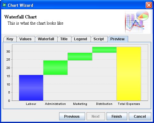
Waterfall charts are a special type of Floating Column Charts. A typical waterfall chart shows how an initial value is increased and decreased by a series of intermediate values, leading to a final value.
Waterfall charts have very specific data requirements. Here is a sample datasource we will use for illustration:
Product     Stage           Value
----------------------------------
Product 1   Labour          15.76
Product 1   Administration   8.66
Product 1   Marketing        4.71
Product 1   Distribution     3.51
Product 1   Total Expense   32.64
----------------------------------
Every Waterfall datasource requires three fields to be specified, one Key and two Values. The Key in this case is Product. The first value should be the field that describes the composition of the bars, in this case Stage. The second value should be the field that holds the numeric data. In this case Value. If you create a dataset with more or less than two values, it won't render correctly. The output produced for the sample dataset given above is shown in Figure 4.23, “Sample Waterfall Chart”.

XY charts are used to graph paired data. This type of chart either shows the relationship among numeric values in several data series or plots two groups of number as one series of xy coordinates. It shows uneven intervals 3/4 or clusters 3/4 of data and is commonly used for scientific data. When you arrange your data, place x values in one row or column, and then enter corresponding y values in the adjacent rows or columns.
The XY Scattered chart consists of plotted points "scattered" around an X-Y grid. The pattern may reveal a relationship between the two variables measured by the X and Y axes. This is more or less similar to the Line chart but in this chart type the key and value data should be numeric unlike Line charts. XY Scattered charts are used to view actual measurements or observations on a grid, possibly revealing patterns and trends in those data.
The XY Line chart consists of points connected with lines around an X-Y grid. The XY Line with Shape chart consists of emphasized plotted points connected with lines. The XY Curve Line chart is similar to XY Line chart; the only difference is that in this type "curved" lines are used to connected the points.
Bubble Chart and Heat Map Chart are in this category as well.
The Area, Bar, Line, XY, Column and Line charts are more or less similar because we can select a single field for the Key but multiple fields as values.
After choosing the chart type and clicking the Next button the screen allows chart-specific properties to be entered. Many of the tabs on these screens are similar. The common tabs seen in all the chart wizards are described below:
Key: The key provides Labels for the Chart elements. For instance in the column chart the key is plotted along x-axis one for each set of columns. In the wizard tab Key can be specified by selecting the corresponding Field Type from the combo box. The Field type can either be a data field or Script.
Values: When a chart is created, you should add at least one value series to the chart. Values determine the size of the chart element for each Key. For example, values determine the height of a column in a column chart and the size of a slice in a pie chart. If you define a single value series, then a single chart element is displayed for each Key. For example, a simple column chart with one value series displays a single column for each Key. If you define multiple values, the chart will display a chart element for each value series.
Pie charts can only support a single set of values whereas many other chart types support multiple values. The GUI of the value tab window is specific to the chart types and will be explained in the example for the corresponding chart types.
Title: The chart title can be specified by selecting a Field type from the combo box. The possible field types are Field, Operation, Script and Literal. Usually the title will be a literal text string, like "Sample Elixir Chart", but you can also use data from your datasource to define the title. The position of the Title can be selected from the combo box. By clicking the Colour or Font button the presentation of the title can be controlled.
Legend: The legend displays the label for each data series in the chart. It is used to identify each data series used in your chart by using the colour, symbol or pattern. If there are multiple data values Report will identify each data series by using a different colour or pattern. The Legend title can be of any field type selected from the combo box. The available field types are Field, Operation, Script and Literal. Just like the title, the position, font and colour of the legend title can be controlled.
Script: JavaScript code can be used
to manipulate the Chart element. Elixir charts are built on
JFreeChart and the JFreeChart
instance is accessible as this from the JavaScript to
allow further customization. For example, to put a background image on
a chart you can use:
url = new java.net.URL("file:/C:/Photos/Sample-01.jpg");
im = Packages.javax.imageio.ImageIO.read(url);
plot.backgroundImage = im;
Elixir provides a helper class to allow easy changing of the default chart colours. Here's an example:
importClass(
	Packages.com.elixirtech.chart2.ui.CustomDrawingSupplier);

paints = ["Pink","Green","Orange","Blue"];

cds = new CustomDrawingSupplier();
cds.setPaintNames(paints);
plot.drawingSupplier = cds;
Preview: This displays a chart sample of how it will look like when it is rendered but it is just an indicator as it is displayed at design time it will not have any idea of the runtime data grouping and sorting. Preview is very useful for testing scripts.
Previewing of Chart element on the workspace can be disabled by
unchecking the checkbox in the Properties panel, as
shown in Figure 4.24, “Properties Panel”. With the
Preview function enabled, any changes made including the
size, colour and position invokes a re-render of preview. Thus, increasing
the chances of performance issues.

When the Preview function is disabled, the Chart element on the workspace will show that previewing of the Chart is disabled, like in Figure 4.25, “Chart Preview Disabled”.

The steps followed for creating Area, Bar, Column, Line, Waterfall and XY Charts are similar except for that in Column Charts, it consists of Column tab and in Area Charts there is an Area tab but the properties in these tabs are all the same. The steps for creating a Column Chart is given below. In this example you can see the difference between the Column Chart by selecting OverAll, OverGroup, etc.
Here's how to add a Column Chart based on the Company sales for four consecutive years.
Add a Blank report with ChartData.ds as the default data source which points to the Fruit.csv file.
Invoke the Section Wizard on Section 1 and sort based on CompanyName in Ascending order and group on Each Value. Make sure the group header is enabled.
Select the Layout tab and place the Chart element in the Section header. In the Wizard that appears select Default from the DataSource combo box. Select the Over All option and click on the Next button.
In this screen select the Column category and Column as the chart type. Click on the Next button.
In the Key tab select Company from the fields listed in the table.
In the Values tab click the Add button to add a value. Select Operation from the Field type combo box and Sum from the Operation combo box. Select 2000 from the list of fields and click on the Ok button. Follow the same procedure and add the 1999, 1998 and 1997 fields.
Select the column tab and enter "Years" as the label for X Axis and "Sales(Company)" as the label for Y axis. button.
Select the Title tab. By default Literal is the field type. Enter Company Sales(Over All) in the text field and select North as the position. Select Legend tab and enter the legend title as Company and select South from the position combo box.
After entering all the values the preview should appear as shown in Figure 4.26, “Column Chart”. Click on the Finish button to embed the chart in the report.
Next, expand the group header so that it is large enough to accommodate a chart. Copy the Chart element from the Section Header and paste it into the Group Header. You can use the popup menu for copying and pasting, or the accelerator keys Control-C and Control-V. In order to paste into the group header using the keyboard, you must select group header first. The currently selected header shows a highlighted ruler down the left hand side.
Now edit the Chart element in the Group Header so that it is Over Group instead of Over All. You can also change the chart title to "Company Sales (Over Group)" so that the charts can be distinguished.
Now click the Render button and render as Glint. You will see that the Chart element in the Section header displays the Over All sum(sales) of the companies for the respective years. The Chart element placed in the Group header will display the Over group sum(sales) of each company.

In the Column tab an Invert Data check box is available. There are three data items per point in a chart: Key, Value and Amount. So when you turn on the Invert Data check box the Value and Key are switched over. The first data item controls the Overall grouping, including legend and allocation of colours. The second data item controls the clustering of values along X-axis (Column Chart). The third data items gives you the height of the bar. So, by inverting the data we get the preview as shown in Figure 4.27, “Inverted Data Column Chart”.

If in the above example Key(CompanyName), Value(Year) and Amount(Sales) are the data items. When the invert data check box is selected the Company Name and Year data items are switched but the Sales remains unchanged. The X-Axis title and Legend title have been modified in this example to reflect the inversion of data.
There are a number of additional chart properties that can be controlled from the wizard. These concern the rendering of values on the columns (or other chart types) and are described below:
Position: This attribute controls the position of the plot value label of each data item on the chart. The various options that are available are Center, Inside 1 to 12, Outside 1 to 12, etc. They are similar to the position of the hands in the clock. If for instance you are plotting negative values then Outside6 would be the position for the negative column.
Anchor: This is the enumeration of position which a plot value label can take. That is once you know the point location of the value you need to map to a point on text. If for instance in case of column you may want positive column values to have their center baseline at the point, but for positive bar values, you may want left half-ascent. The available values are baseline, half ascent,etc.
Pivot: This attribute specifies the point of rotation about which the plot value label has to be rotated. The available values are Baseline left, Half Ascent, etc. If you want to rotate a label you have to select a pivot value about which it has to be rotated and specify the angle of rotation.
Angle: The angle in degrees by which the Plot label value should be rotated (about the pivot point).
In order to create a dual axis chart like the one shown in Figure 4.28, “Dual Axis Chart”, you need to be able to control each side of the chart independently. To make this easy, you can create two independent chart plots and then merge them into one chart.
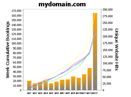
We will call the first chart, that will show the final result the Master. The other chart, which will be merged in to the Master we will call the Subchart. The two charts to be merged are shown in Figure 4.29, “Dual Axis Chart Design”.

You will notice that one has the Y axis on the left and the other on the right. To put a Y axis on the right you need to add this script:
importClass(Packages.org.jfree.chart.axis.AxisLocation);
plot.setRangeAxisLocation(AxisLocation.TOP_OR_RIGHT);
In the designer you will see separate charts, so you can configure them independently. In the rendered output you will only see one combined chart.
- Create the two charts and ensure the Subchart Name is set ("Subchart" is used here).
- In the Properties panel, set the Subchart visibility to false.
- Go to the Shapes tab, right click on Master and select Wizard to access the Chart Wizard dialog box.
- Click Next until you reach the Line Chart section. Go to the Script tab.
- Key in the following code, modifying it based on your design:
importClass(Packages.com.elixirtech.report2.logical.renderer.\
  ChartRenderer);

if (cxt!=null) // real rendering
{
  var subChart = cxt.getRawElementByName("Subchart");
  var subPlot = ChartRenderer.buildChart(cxt,subChart).plot;
  var axis = subPlot.getRangeAxis();
  axis.setAutoRange(false);
  plot.setRangeAxis(1,axis);
  plot.setDataset(1,subPlot.getDataset());
  plot.setRenderer(1,subPlot.getRenderer());
  plot.mapDatasetToRangeAxis(1,1);
}
(the text here is wrapped at the \ character on the first line - remove this and concatenate the first two lines together).
Note
When you have finished designing your two charts, you can put the Subchart anywhere you want - even on top of, or behind the Master as it won't appear in the output. This way it doesn't occupy space you need for other report components