
Form
The Form tab consists of two panels. The left panel displays the hierarchy, the items and their properties of the form. The right panel displays the form, allowing to to visualise the form as you design it.
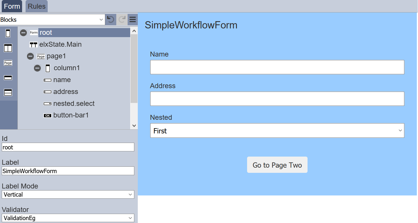
The left panel displays the available actions for the selected item in the form. It has three parts; the top row, form structure in the middle and item properties at the bottom.
Top Row
The top row consists of a selection for the type of items to be added into the form and some icons.

| Item | Description |
|---|---|
| Types of Options | List the available types of options for the form. Available options: - Actions - Blocks - Inputs - Others |
| Undo | Undo the last action on the form. |
| Redo | Redo the last action on the form. |
| More Actions | List of other actions for the form. |
The icons will grey out if there is no action to perform (e.g., no action to redo).
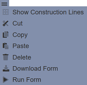
More Actions
The list of more actions are listed in the table below.
| Item | Description |
|---|---|
| Show/Hide Construction Line | Toggle to show or hide the construction lines in the form area to better see the alignment of the items. |
| Cut | Cuts the selected item and adds onto clipboard. Not available for root. |
| Copy | Copies the selected item and adds onto clipboard. Not available for root. |
| Paste | Pastes the item from the clipboard onto the form. |
| Delete | Deletes the selected item from the form. Not available for root. |
| Download Form | Downloads the form. |
| Run Form | Runs the form in another tab. |
Note that if the item in the form does not allow certain actions, those icons will not be available. For example, the root cannot be deleted, so the “Cut” and “Delete” icons will not appear.
You can toggle between showing or hiding the construction lines in the form by clicking on the “Show/Hide Construction Line” icon.
The “Run Form” icon allows you to test the form. To do so, select the “Run Form” and a “Run Form” dialog box will appear.
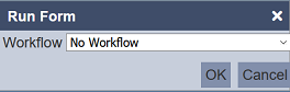
Select the appropriate option and click on the “OK” button to run the form. The form will appear in another tab.
Form Structure
The form structure allows you to design the structure of the form, as well as add pages, inputs fields, actions, etc. onto the form.
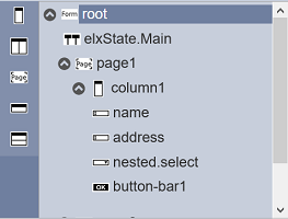
Every form begins with a root, which other items can be added onto it.
The list of available items vary according to the “Types of Options” selected in the top row’s drop-down list. By default, “Blocks” is selected.
The table below list of available actions for the “Types of Options”.
| Item | Description |
|---|---|
| Actions | List the available action items for the form, such as Button Bar. |
| Blocks | List the block items that can be added onto the form, such as columns, rows, etc. |
| Inputs | List of input items that can be added onto the form, such as checkbox, radio button, etc. |
| Others | List of miscellaneous items that can be added onto the form, such as workflow state, HTML, etc. |
To add an item onto the form, first select the “Type of Options” in the top row. The available items will be displayed in the Form Structure section. Simply drag and drop the desired item onto the desired higher level.
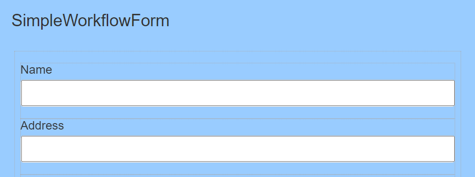
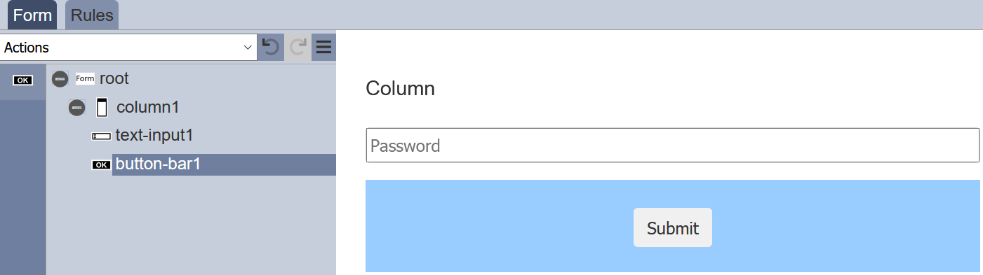
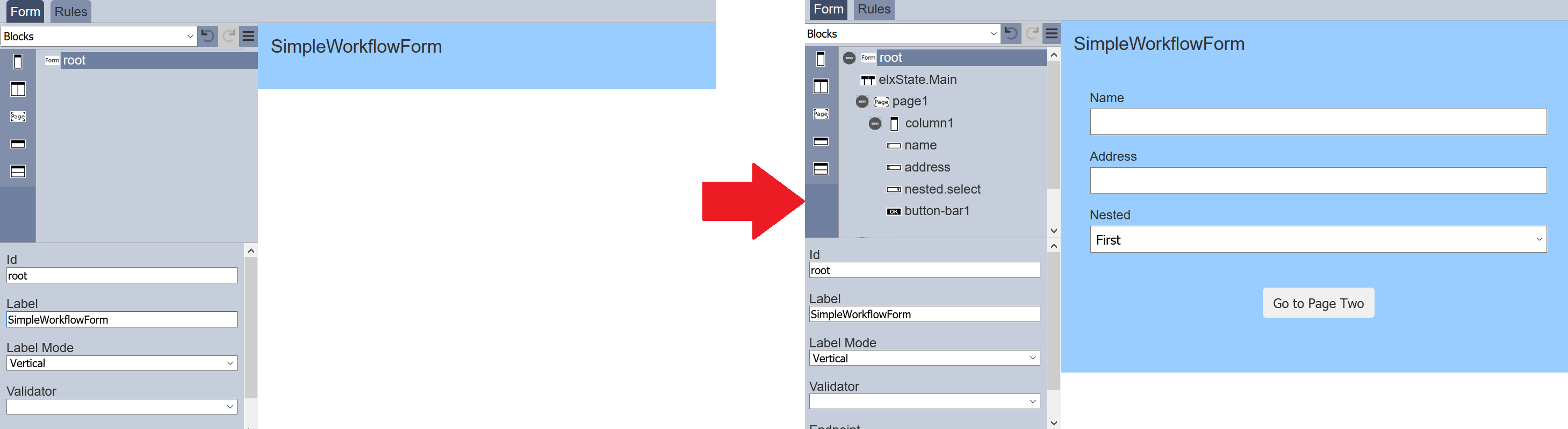
In the simple example below, a new form is created, which includes a input text field and a submit button. First, under the “Blocks” option, select “Column” and drag it to the “root”. Next, under the “Inputs” option, select “Text Input” and drag it to the column. Lastly, add a “Button Bar” under the “Actions” option to the column.
To add a page to the form, select “Blocks” from top row and select the “Page” icon on the left panel in the “Form Structure” section. Drag and drop the “Page” onto “root”. The new page will be added at the bottom of the “root” by default, if there are any items added onto the form prior adding the page. You can relocate the new page by drag and drop it to a new location in the form structure.
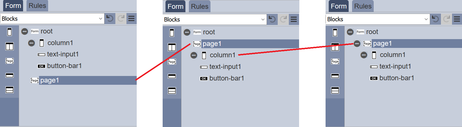
Note that the default name (or Id) of items added onto “root” will always start with the number “1”. For example, when the first text input is added, the default name will be “text-input1”, the next text input will have the default name of “text-input2” and so on. Unless the first such item is renamed (i.e., first text input name is renamed to “TextBox”), then the second text input item will be named “text-input1” instead. This numbering method applies to all items on the form.
Item Properties
The Item Properties at the bottom of the left panel displays the properties of the selected item.
It allows you to label, define and/or validate the selected item. Currently there are four types of options that are selectable from the top row:
- Actions
- Blocks
- Inputs
- Others
Each type may have one or more items. Depends on the selected item, the properties will vary. You can also define and validate the root.
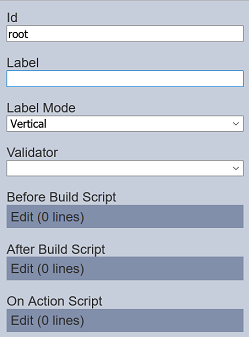
Root
Every form has a root, this is by default. The root presents the blank form itself until items are added onto it.
You can define and validate the form using its properties.
| Item | Description | Default |
|---|---|---|
| Id | Name of the root that will be displayed in the form structure. | “root” |
| Label | Name of the form that will be displayed. | None |
| Label Mode | Defines the orientation of the form. Available options: - Vertical - Horizontal - None |
“Vertical” |
| Validator | Defines the ETL chainset to be used to validate the form. | None |
| Before Build Script | The script to be executed before any changes are applied to the current form. | Empty script dialog box |
| After Build Script | The script to be executed after every change is made to the current form. | Empty script dialog box |
| On Action Script | The script to be called when a button is pressed. | Empty script dialog box |
Refer to Examples on how to create a form that uses script.
Blocks
Blocks include items such as column(s), page and row(s). This block items works as a placeholder for the input or action items to be placed.
To add a block item, simply drag and drop under the desired level. The block item will not show up in the form itself but creates a canvas for adding input items and/or action items. Hence, a block item need to be added before any input or action item can be displayed in the form. The properties for each block item varies.
| Item | Description |
|---|---|
| Column | allows you to add a single column onto the form, as well as defining its width. |
| Columns | Creates a placeholder that allows multiple single columns to be added onto the form. |
| Page | Allows you to create multiple-paged form. |
| Row | Allows you to add input or action items in a single row. |
| Rows | Allows you to add input or action items in multiple rows row. |
Refer to Blocks for more details on the items and their properties.
Actions
Currently there is only one item, which is the Button Bar. To display an action item in the form, a block item need to be added onto the form before the action item can be added.
| Item | Description |
|---|---|
| Button Bar | Allows you to add button bar onto the form. |
| Render DocX | Allows you to add a button bar onto the form to a render DocX report. |
| Render RML | Allows you to add a button bar onto the form to a render RML report. |
Refer to Actions for more details on the items and their properties.
Inputs
Inputs includes input field items such as single line text input, multiple line text area, radio button, checkbox, drop down selection, dataset select, etc. To display an action item in the form, a block need to be added onto the form before the input item can be added.
To add an input item onto the form, simply drag and drop to the desired location in the form structure. To edit the properties, simply select the desired item and the properties of the desired item wil lbe displayed at the lower panel.
| Item | Description |
|---|---|
| Checkbox | Allows you to add checkbox options onto the form. |
| Dataset Checkbox | Allows you to add dataset selection options as checkboxes onto the form. |
| Dataset Select | Allows you to add dataset selection options onto the form. |
| Radio Button | Allows you to add radio button options onto the form. |
| Multiple Selection | Allows you to place a drop-down selection onto the form. |
| Text Area | Allows you to place a multiple-lined (from 2 to 50) text box onto the form. |
| Text Input | Allows you to place a single-lined input onto the form in several formats. |
Refer to Inputs for more details on the items and their properties.
Others
This group consists of items such as HTML, vertical space, workflow, etc.
| Item | Description |
|---|---|
| Form Launcher | Allows you to launch another form from the current form. |
| HTML | Allows you to add a HTML onto the form. It can be text, web page, logo, etc. |
| Hidden | Allows you to store information in the form which is not visible to the user. |
| History | Allows you to include history information (such as user, timestamp and results) in the form. |
| IFrame | Allows you to embed another HTML document into the form. |
| Vertical Space | Allows you to add white space in the form, creating space between items. |
| Workflow | Allows you to add an existing workflow onto the form (will not appear in the form). |
Refer to Others for more details on the items and their properties.
Validation
Validation can be performed before a form is submitted to the workflow.
It is performed by ETL steps, in particular those in the Validation category which produce a “validationIssues” array as a result.
The “root” of the form will define the ETL chainset to be used to validate the form. The “Page” input item can then define the ETL chain to validate the input values entered within the page.