
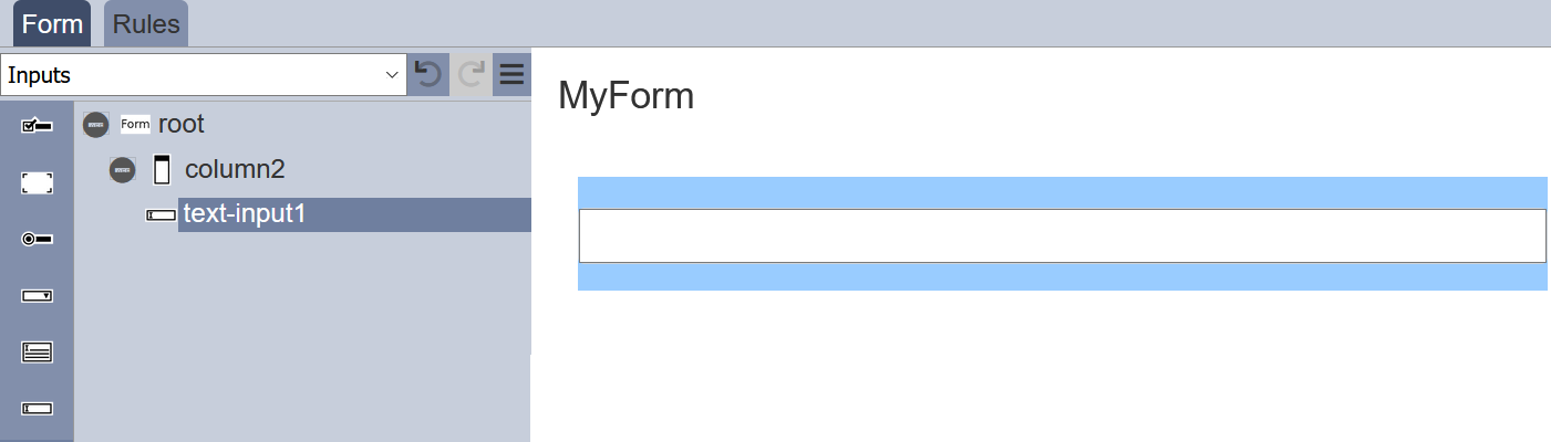
Inputs
Inputs includes input field items such as single line text input, multiple line text area, radio button, checkbox, drop-down selection, dataset selection, etc. To display an action item in the form, a block need to be added onto the form before the input item can be added.
To add an input item onto the form, simply drag and drop to the desired location in the form structure. To edit the properties, simply select the desired item and the properties of the desired item wil lbe displayed at the lower panel.
Checkbox
This item allows you to add checkbox options onto the form.

It has the following properties.
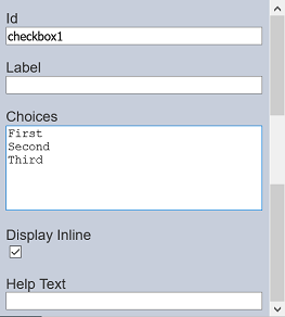
| Item | Description | Default |
|---|---|---|
| Id | Name of the item that will be displayed in the form structure. | “checkboxX” |
| Label | Name of the item that will be displayed in the form. | None |
| Choices | Defines the checkbox choices on the form. | “First”, “Second”, “Third” |
| Display Inline | If selected, displays the checkboxes in a row. If unselected, displays the checkboxes in several rows. | Selected |
| Help Text | Text that will be displayed below the input. | None |
The checkbox options can be edited using the “Choices” field, with one option in a row.
Dataset Checkbox
This item allows you to add dataset selection options in the form of checkbox onto the form. Multiple select is permitted.
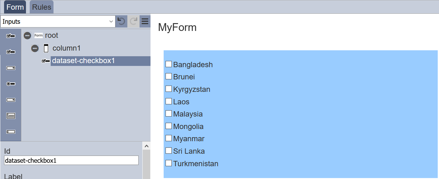
It has the following properties.
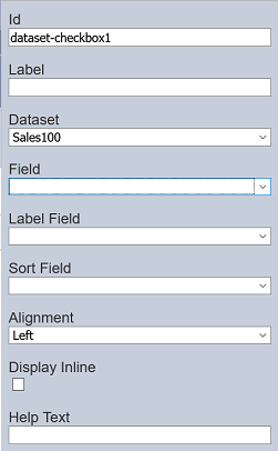
| Item | Description | Default |
|---|---|---|
| Id | Name of the item that will be displayed in the form structure. | “dataset_selectX” |
| Label | Name of the item that will be displayed in the form. | None |
| Dataset | Selects the dataset to be used. | None |
| Field | Selects the field from the selected dataset to be used. | None |
| Label Field | Selects the field whose values are to be displayed. | None |
| Sort Field | Selects the sorting field. | None |
| Alignment | Alignment of the checkboxes in the form. Available options: - Left - Centre - Right |
Left |
| Display Inline | If selected, displays the checkboxes in a row. If unselected, displays the checkboxes in several rows. | Selected |
| Help Text | Text that will be displayed below the input. | None |
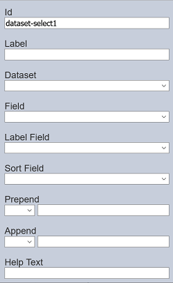
Dataset Select
This item allows you to add dataset selection options in the form of drop-down list onto the form.
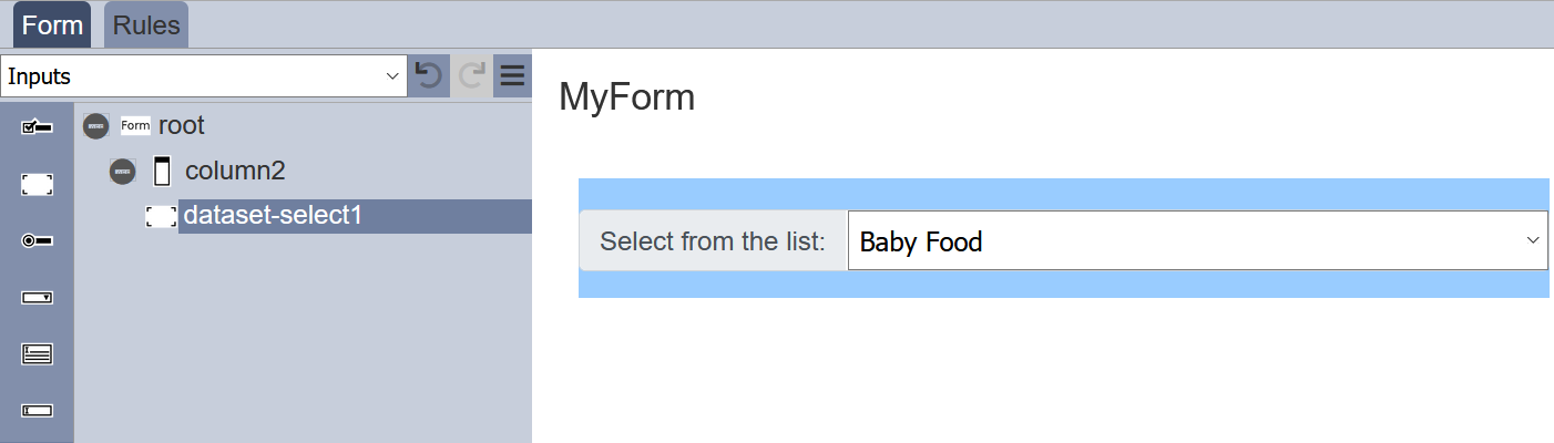
It has the following properties.
| Item | Description | Default |
|---|---|---|
| Id | Name of the item that will be displayed in the form structure. | “dataset_selectX” |
| Label | Name of the item that will be displayed in the form. | None |
| Dataset | Selects the dataset to be used. | None |
| Field | Selects the field from the selected dataset to be used. | None |
| Label Field | Selects the field whose values are to be displayed. | None |
| Sort Field | Selects the sorting field. | None |
| Prepend | Select either to display text, image or none before the choices. | None |
| Append | Select either to display text, image or none after the choices. | None |
| Help Text | Text that will be displayed below the input. | None |
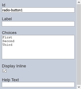
Radio Button
This item allows you to add radio button options onto the form.
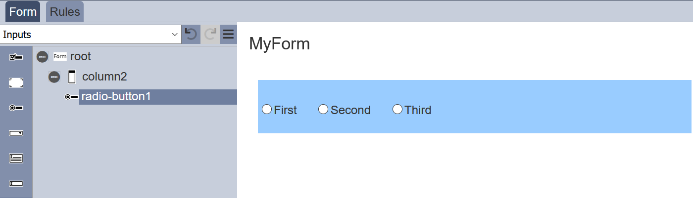
It has the following properties.
| Item | Description | Default |
|---|---|---|
| Id | Name of the item that will be displayed in the form structure. | “radio-buttonX” |
| Label | Name of the item that will be displayed in the form. | None |
| Choices | Defines the radio button choices on the form. | “First”, “Second”, “Third” |
| Display Inline | If selected, displays the checkboxes in a row. If unselected, displays the checkboxes in several rows. | Selected |
| Help Text | Text that will be displayed below the input. | None |
The radio button options can be edited using the “Choices” field, with one option in a row.
Multiple Selection
This item allows you to place a drop-down selection onto the form.
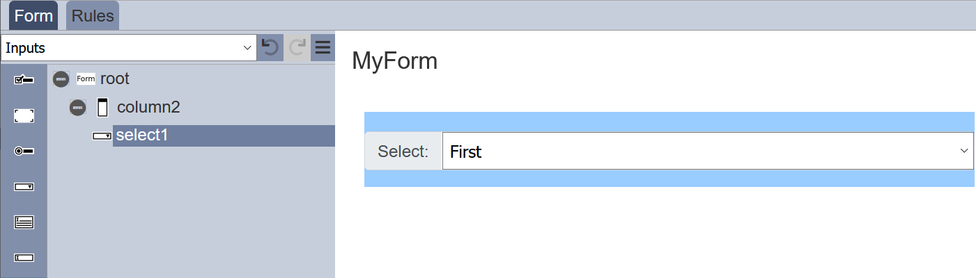
It has the following properties.
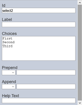
| Item | Description | Default |
|---|---|---|
| Id | Name of the item that will be displayed in the form structure. | “selectX” |
| Label | Name of the item that will be displayed in the form. | None |
| Choices | Defines the drop-down choices on the form. | “First”, “Second”, “Third” |
| Prepend | Select either to display text, image or none before the choices. | None |
| Append | Select either to display text, image or none after the choices. | None |
| Help Text | Text that will be displayed below the input. | None |
The selection options can be edited using the “Choices” field, with one option in a row.
Text Area
This item allows you to place a multiple-lined text box onto the form.

It has the following properties.
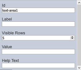
| Item | Description | Default |
|---|---|---|
| Id | Name of the item that will be displayed in the form structure. | “selectX” |
| Label | Name of the item that will be displayed in the form. | None |
| Visible Rows | Number of rows (between 2 to 50) on the form. | “5” |
| Value | Defines the default value. | None |
| Help Text | Text that will be displayed below the text area. | None |
The number of lines to be displayed on the form via “Visible Rows” field can be from 2 to 50, default is 5 lines.
Text Input
This item allows you to place a single-lined input onto the form. The type of input comes in several form as defined in the “Input Type” field.
It has the following properties.
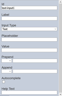
| Item | Description | Default |
|---|---|---|
| Id | Name of the item that will be displayed in the form structure. | “selectX” |
| Label | Name of the item that will be displayed in the form. | None |
| Input Type | Selects the type of input. Available option: - Text - Password - Number - File |
“Text” |
| Placeholder | Suggestion text for the text input. E.g.: Enter your password |
None |
| Value | Defines the default value. | None |
| Prepend | Select either to display text, image or none before the input. | None |
| Append | Select either to display text, image or none after the input. | None |
| Autocomplete | If selected, allows autocomplete. | Not selected |
| Help Text | Text that will be displayed below the text area. | None |