
Visualisation Designer
The Visualisation Designer page allows you to create and edit the metadata of the visualisation. You need to have the following privileges:
mod-viz-interactivemod-viz-interactive-edit
The Visualisation Designer page consists of two pages:
- Design page - Select and create visualisation
- View page - Displays the final view
Design Page
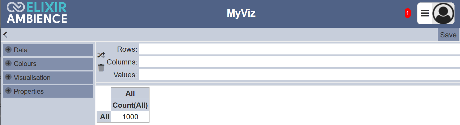
The Design page is displayed by default. It is divided into four portions:
- Top row - Consists of the “Close” icon and “Save” button
- Left panel - Displays data, colour palette, visualisation and properties
- Top right panel - Displays selected data
- Lower right panel - Displays visualisation
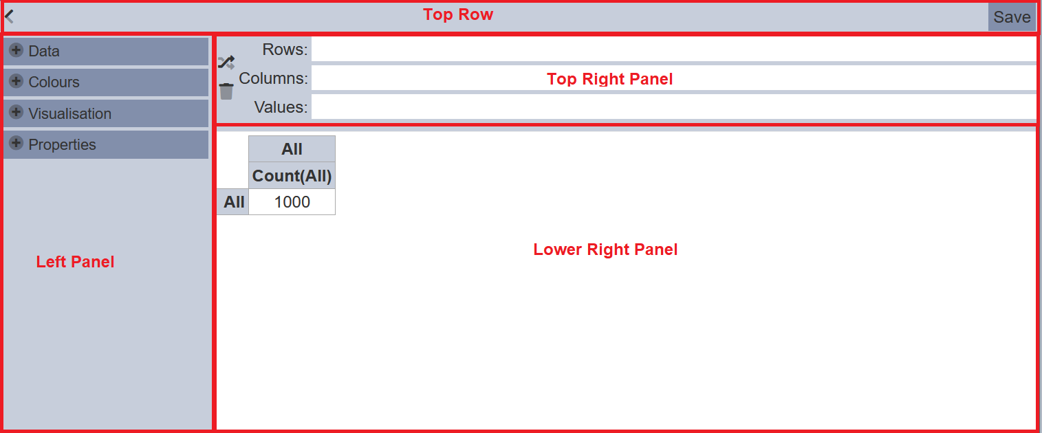
Top Row
The top row consists on the < “Close” icon and the “Save” button.
The “Close” icon allows you to close the Design page and goes to the View page. The “Save” button saves the changes made to the visualisation.
Left Panel
The left panel consists of 4 sections:
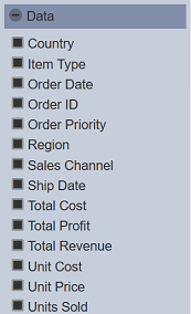
- Data - Lists the fields of the dataset and the values of the fields
- Colours - List of colour palettes
- Visualisation - List of views, charts and tables
- Properties - List of parameters, depends on the visualisation selection
Top Right Panel
This panel allows you to set the fields for the view and it consists of 3 fields:
- Rows - Defines the XAxis of the view
- Columns - Defines the YAxis of the view
- Values - Defines the field as the value in the cell
To add data into the fields, click on the “+” icon on the “Data” section in the left panel. The list of fields of the dataset are displayed.
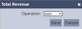
Drag and drop the data to the desired fields (“Rows”, “Columns” and “Values”). If a data is dragged and dropped into the “Values” field, depending on the data type, by default the “sum” operation is selected. You can change the operation by clicking on the  “Change Operation” icon on the right of the field. A dialog box will appear. In the dialog box, select the desired operation from the drop-down list. Click on the “Save” button to save the change.
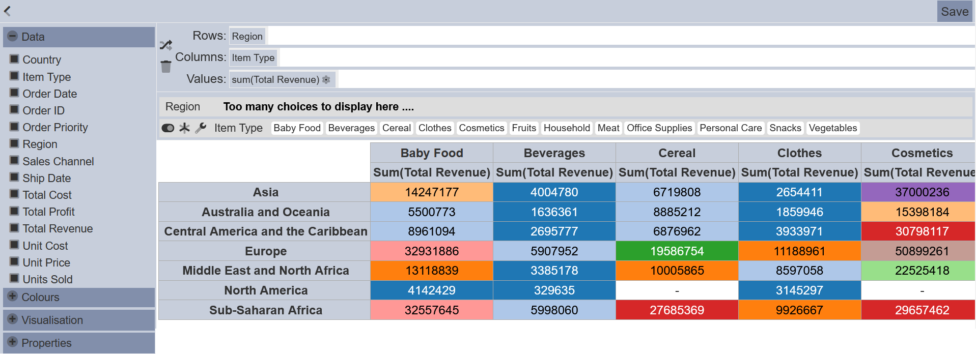
Once “Rows”, “Columns” and “Values” fields are populated, the visualisation will appear in the lower right panel. By default pivot table is selected.
You can add more data into the 3 fields by drag and drop. You can also swap the data around. The last data in the “Rows” and “Columns” fields will be the axis.
Lower Right Panel
The lower right panel displays the view of the visualisation and the values of the data that were selected in the “Rows” and “Columns” fields.
Example
Below is an example of creating a visualisation in the Visualisation Designer.
Add Data
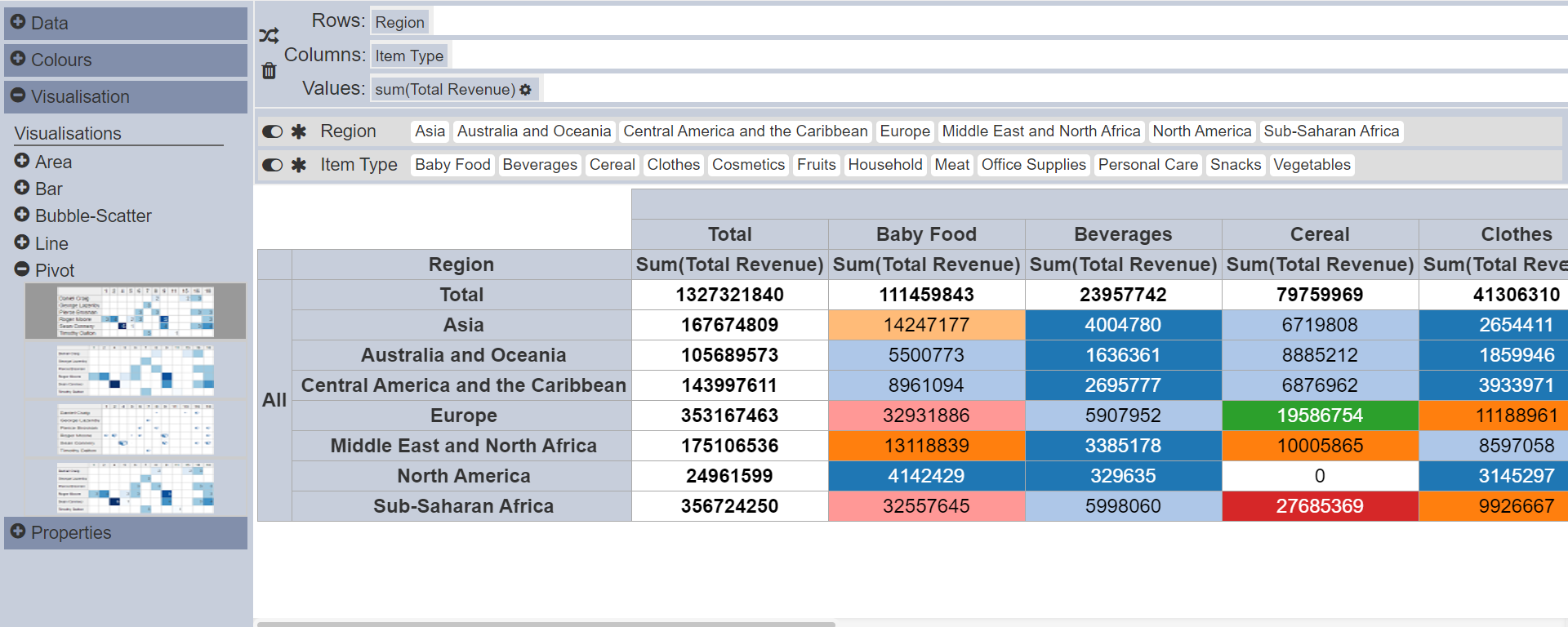
Click on the “+” icon of ’Data“ in the left panel. The list of fields of the dataset is displayed. Drag and drop the desired data into their respective fields (”Rows“, ”Columns“ and ”Values“) in the top right panel. Once data is dropped into the ”Rows“ or ”Columns“ field, a row is added at the top of the lower right panel. In this example, 2 rows are added for ”Region“ and ”Item Type".
By default, “sum” operation is used in the “Values” field. You can change the operation by clicking on the “Change Operation” icon. A dialog box will appear. In the dialog box, select the desired operation from the drop-down list.
You can swap the data in the “Rows” and “Columns” fields by clicking on the  “Switch Rows and Columns” icon. To delete the data in the field, drag and drop the data towards the
  “Drag Here To Delete” icon.
Click on the “-” icon to collapse “Data”. Click on the “Save” button at the upper right corner of the page to save your changes.
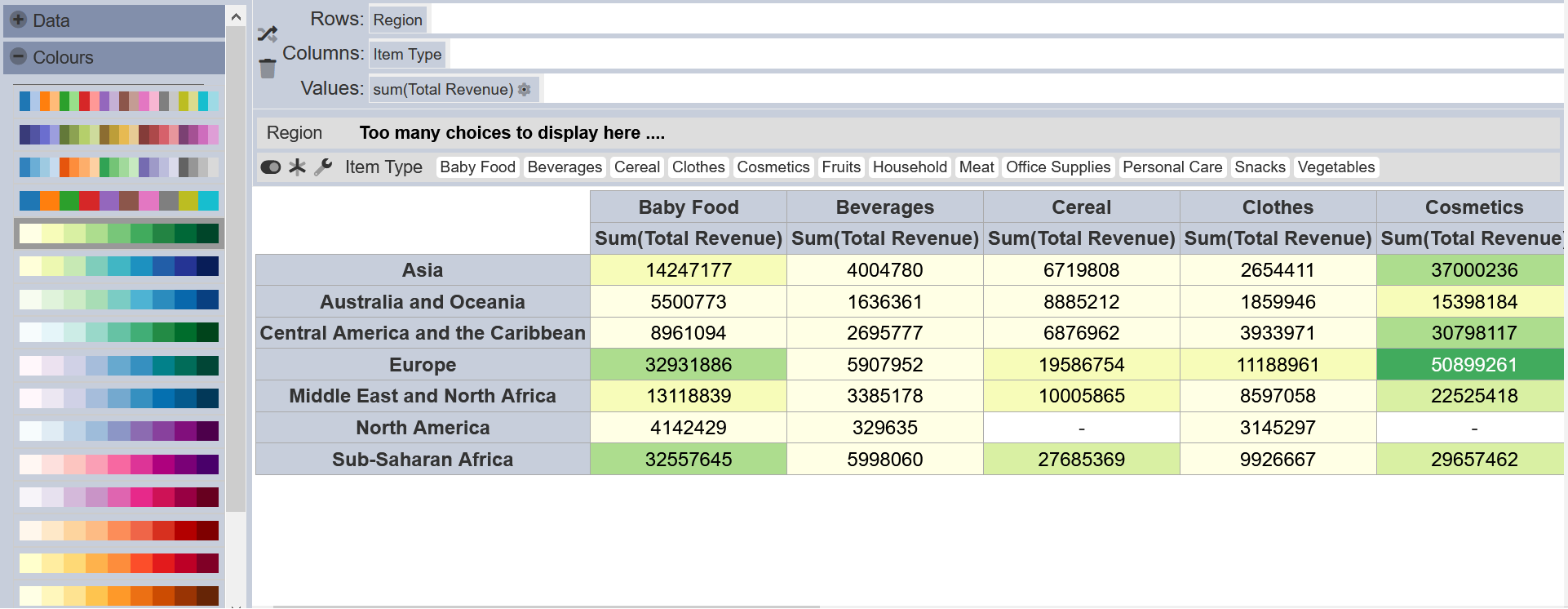
Select Colour
Click on the “+” icon next to “Colours” in the left panel and a list of available colour palette will appear. By default the first colour palette is selected. Select the desired colour palette and click on the “-” icon to collapse “Colours”. Click on the “Save” button at the upper right corner of the page to save the changes.
Visualisation
Click on the “+” icon next to “Visualisation” in the left panel and a list of visualisations will appear.
There are several types of visualisations in the list. For each type of visualisation, there are several variations. By default, the first type of pivot table is selected.
To select other visualisation, click on the “+” icon next to the desired visualisation, for example, the first variation in “Bar”. The view in the lower right panel will change according to your selection. The colours in the bar chart corresponds to the colours in “Region”.
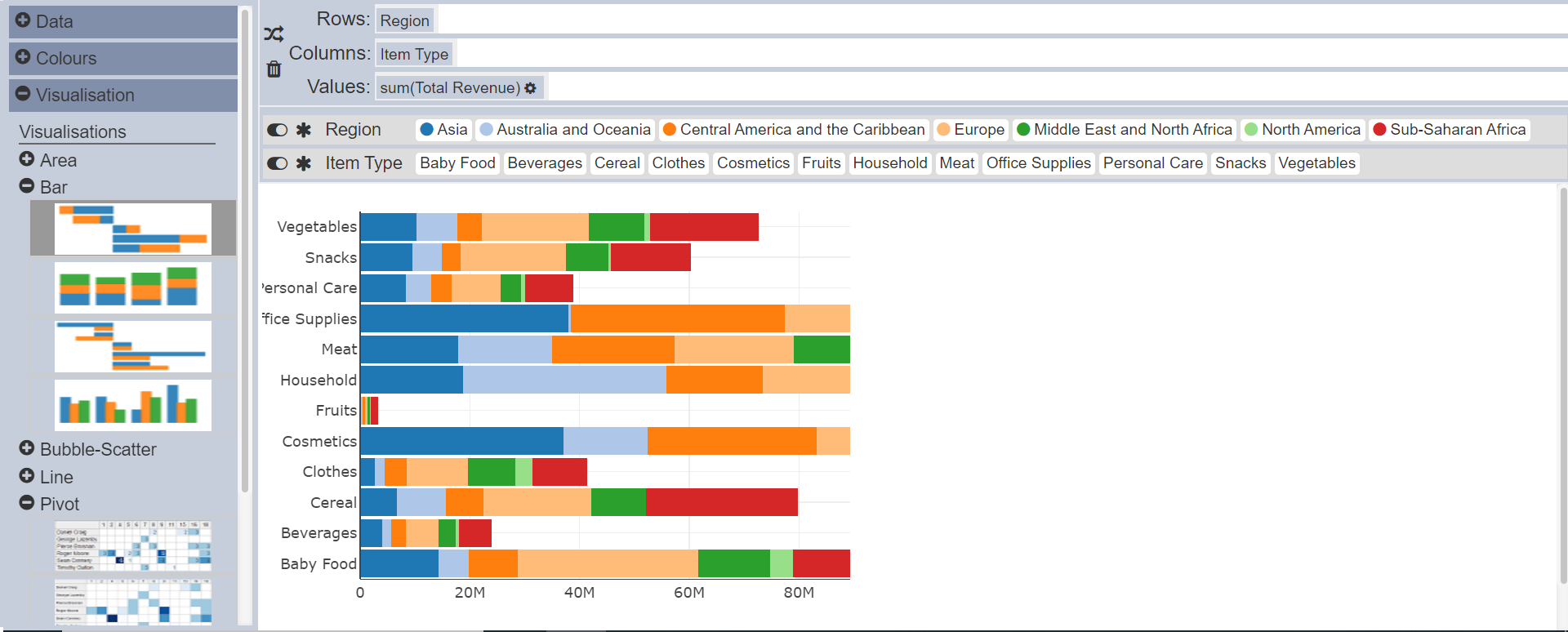
You can click on the “-” icons to collapse the visualisations. Click on the “Save” button at the upper right corner of the page to save the changes.
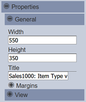
Properties
The “Properties” in the left panel allows you to set the general parameters and settings of the selected view. The properties in this section will vary according to the selected view in the “Visualisation” section. Generally, there are 2 portions: “General” and “View”. Click on the “+” icon next to desired portion to expand and display the properties. Click on the “-” icon to collapse the properties.
| Field | Description | Mandatory | Input Type | Constraints | Default Value |
|---|---|---|---|---|---|
| General | |||||
| Width | Defines the width of the view. | Y | Text field | Any integer greater than 0 | 500 |
| Height | Defines the height of the view. | Y | Text field | Any integer greater than 0 | 400 |
| Title | Defines the title of the view. | N | Text field | Any text | Empty string |
| Margins | Allows adjusting margins and padding between charts and grid. | N | Vary | Default settings | |
| View | |||||
| Various settings | These settings vary according to the selected view in Visualisation. | N | Vary | Default settings | |
| XAxis, YAxis | Controls the axis’ title, visibility, formatting, show grid or line. | N | Vary | Default settings |
After setting the properties, click on the “Save” button at the upper right corner of the page to save the settings. This generally sets up the visualisation.
Add More Data
You can add more data into the “Rows”, “Columns” and “Values” fields. Simply drag and drop the desired data into the textbox next to the field.
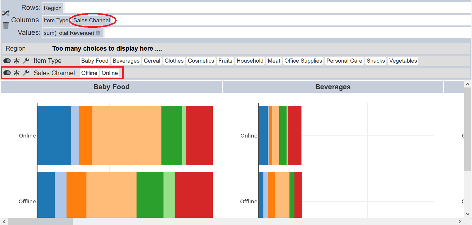
In the example above, “Sales Channel” is dropped into the “Columns” field and an extra row is added in the lower right panel. The view(s) in the lower right panel will change accordingly. In this case, several bar charts are created.
The last data in the “Columns” field will be the YAxis. If this is not desired, simply drag and drop “Item Type” in front of “Sales Channel” to swap the data.
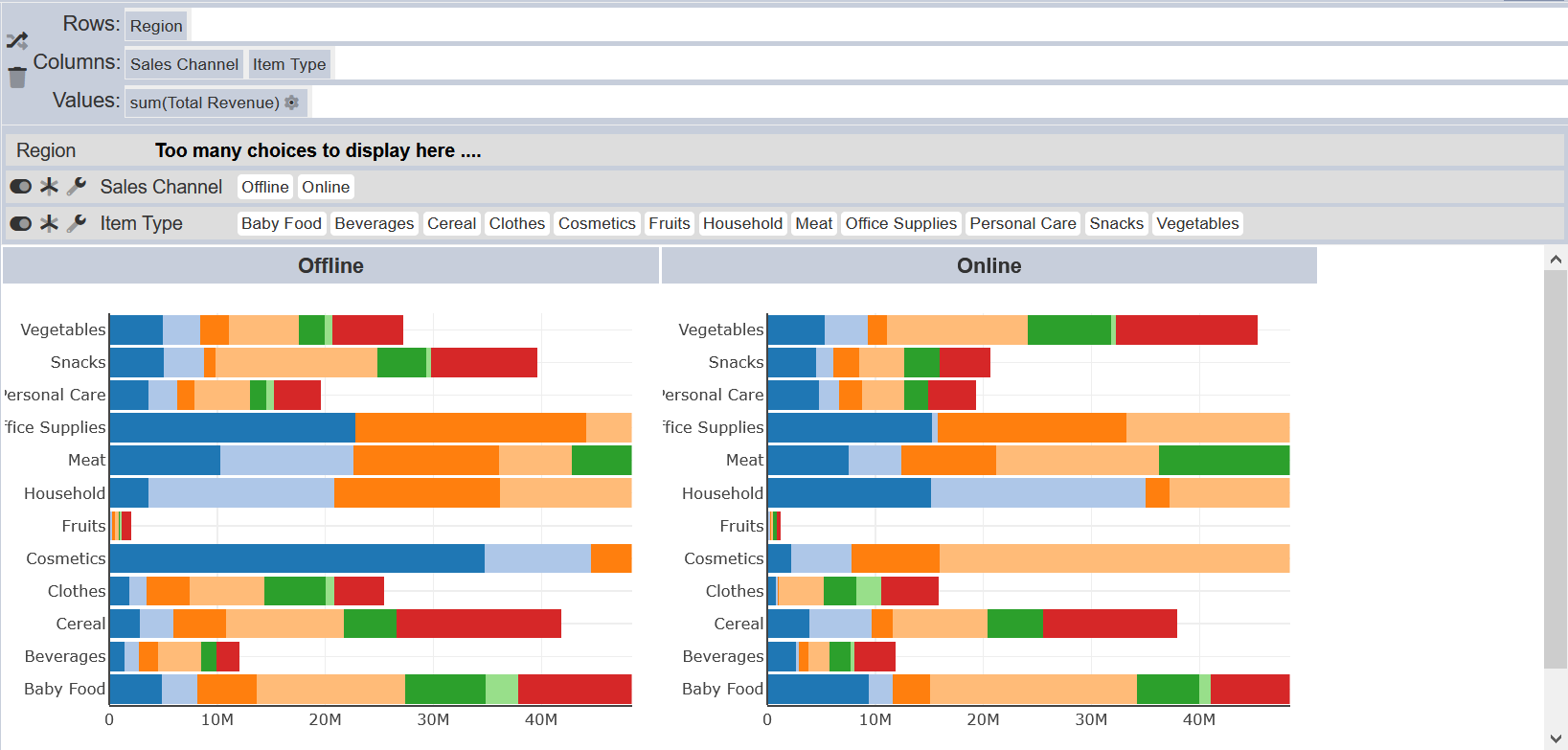
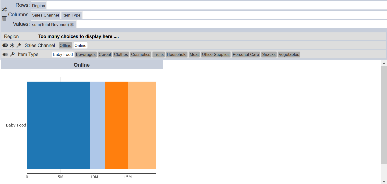
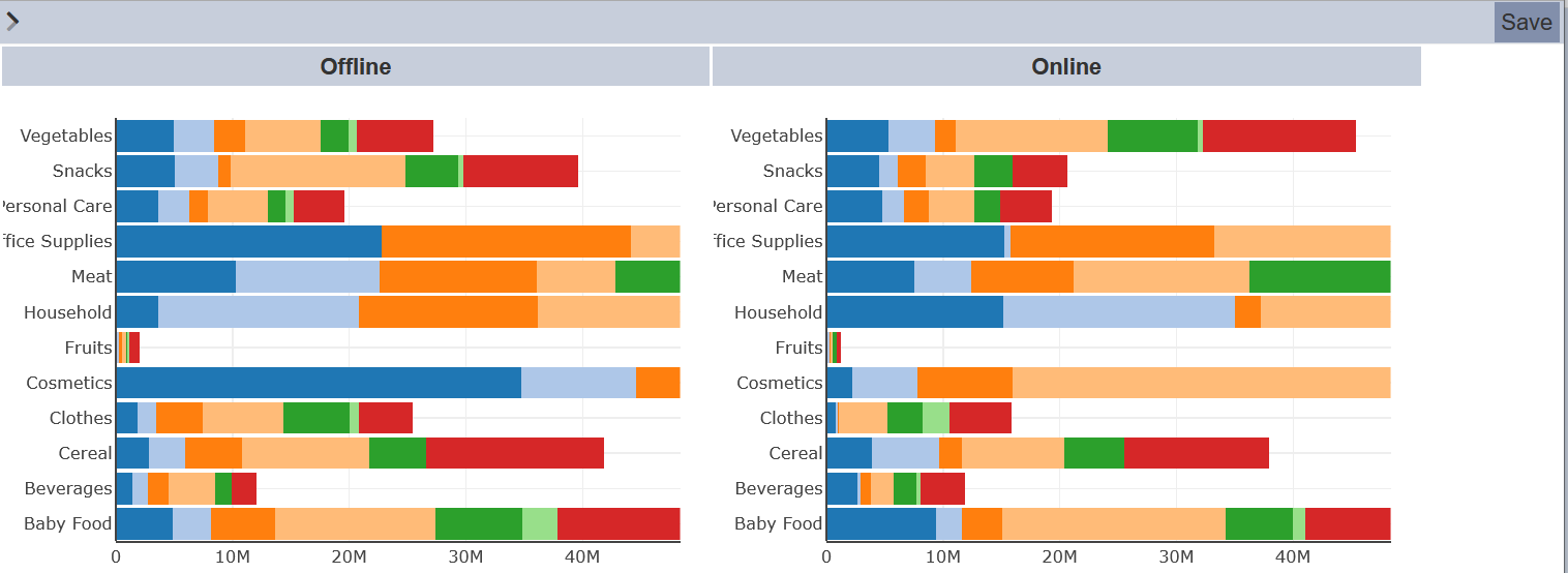
Select Data
By default all values of the data in the “Rows” and “Columns” are selected and displayed. You can unselect a value by clicking on the value itself. In the example, “Offline” is unselected in the “Sales Channel” row. The “Offline” value is grayed out and the view shows “Online” bar chart only.
If several values have been unselected, to re-select the values, either click in the values one by one or click on the  “Select All” icon to select all values. The
  “Multiple Select” icon allows you to switch from multiple select to single select. In multiple select mode, you can select more than one value, while in single select mode, you can select only one value at a time. Do note that in single select mode, the icon will not be available and the first value in the data is selected.
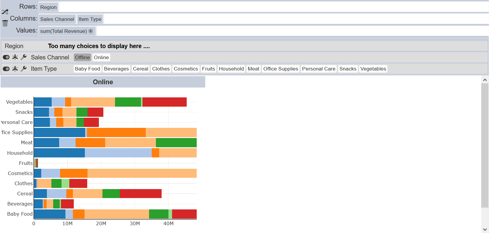
In the example, multiple select mode is switched off for “Item Type”. The view displays the value “Baby Food” (by default) for “Online”.
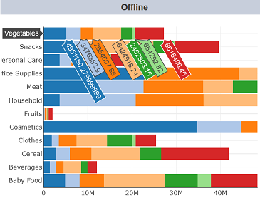
You can sort the the data by clicking on the  “Settings” icon. A dialog box with the field name will appear.
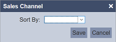
Select the desired field from the drop-down list and click on the “OK” button to save the change.
Filter Data
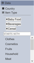
You can filter the values in the data using the “Data” section in the left panel. To do so, click on the icon next to the data you wish to filter. A list of values for the data along with a search textbox will be displayed. Click on the values to select, the view will change according to your selection.
In this example, “Baby Food”, “Beverages” and “Cereal” are selected and the view changes according to your selection. You can search for the values by using the textbox. To remove the selected value, click on the “X” icon next to the value. To close the filter, unselect the checkbox next to the data and the view will display all the values.
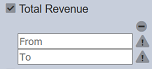
If the data to be filtered is numeric, you will need to key in a range of values in the textboxes. The view in the lower right panel will change accordingly. To reset the range, click on the “-” icon above the textbox. Unselect the checkbox of the data to close the filter.
Using Sync Column
Below is an example of using the “Sync Column” property in the “View” properties when using the “Parallel Coordinates” option in the “Visualisation” section. When the “Sync Column” is not used, the columns “Unit Cost” and “Unit Price” both show different Y-axis in terms of their values.
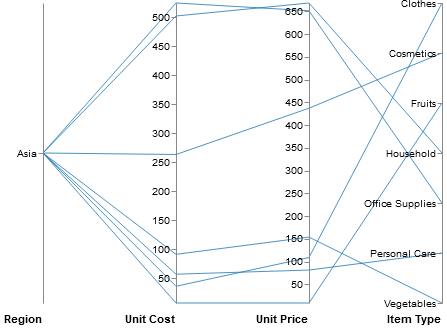
This make it harder to read. You can synchronise both columns using the “Sync Column” sub-properties. In the drop-down list, select the desired column to sync. In this case, it will be “Unit Cost”. To add another column, click on the “+” icon below. Select another field “Unit Price”. Now the columns are sync-ed, both columns have the value “650” as their maximum value in the Y-axis. It make it easier to read and compare.
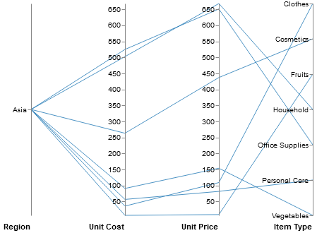
Do note that this property applies only to “Parallel Coordinates” visualisation only.
View Page
The View page displays the final visualisation that will be seen when used in the dashboards.
To go to the View page, click on the “<” icon at the upper left corner of the Design page.
Hover over the view and the details will be displayed.
To go back to the Design page, click on the “>” icon at the upper left corner of the page.