
Colours
Introduction
The Colours page allows you to define the colours you wish to use in your interface elements and provide a name for them. The Colours page can be selected via the left panel.
The colours defined here can be accessed using the Lookup Colour ETL step under the Ambience category.
Add
By default no colour is defined. To add a colour, click on the “Add” button at the upper right corner of the page.
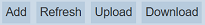
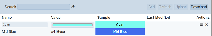
A new row will appear at the top with two editable fields.
| Field | Description | Input Type | Default Value |
|---|---|---|---|
| Name | Unique name of the colour. | Textbox | None |
| Value | Hex value of the colour. | Colour picker | None |
| Sample | When the colour is selected in the Value field, the selected colour along with the “Name” will appear in this field. This field is not editable. |
Textbox | Blank |
Key in an unique name for the colour in the “Name” field. In the “Value” field, select the desired colour by clicking onto the textbox to display the colour picker.
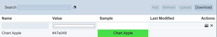
The colour picker varies based on the browser. In Firefox, the RGB colour scheme is used and the values “255 255 255” which represents white is selected. To select another colour, click on the colour palette or simply key in the RGB values in the three textboxes. There are other colour schemes available, such as HSL and Hex. To select other colour scheme, click on the RGB text at the bottom to toggle between them.
Once the colour is selected, click on the  “Save” icon under the “Actions” column to save the colour. To abort, click on the “X” icon.
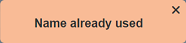
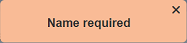
If the name provided in the “Name” field already exists or no name is provided, the appropriate error message will appear.
Once saved successfully, the hex code of the colour will be displayed in the “Value” column and the actual colour will be displayed in the “Sample” column along with the name provided in the “Name” field. Note that the Sample label uses an appropriate colour for best contrast. In the example at the top, the label for the Red colour is shown in white, rather than black. Ambience will use the same contrast colour for foreground information where needed.
By default the list of colours are sorted in ascending order using the “Name” field. You can sort the list in descending order by clicking on the column title. The “Value” and “Sample” columns can be sorted as well by clicking on their respective column title.
Delete
To delete a colour, click on the  “Delete” icon under the “Actions” column of the corresponding colour.

A notification will appear.
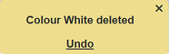
There is an “Undo” button to undo the deletion. Upon clicking on the “Undo” button, the deleted colour is restored and is added back to the list of colours. Do note that the notification will disappear after some time.
Edit
To edit a colour, click on the  “Edit” icon under the “Actions” column corresponding to the desired colour.
The colour will become editable.
Edit as desired and click on the icon under the “Actions” column to save the changes. To abort the change, click on the “X” icon.
Upload
To upload a colour palette, click on the “Upload” button at the upper right corner of the page.
The “Upload Colour Palette” dialog box will appear.
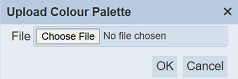
Click on the “Choose File” button in the dialog box and browse to the location of the JSON file to be uploaded. Click on the “OK” button to upload the file. To abort, click on the “Cancel” button.
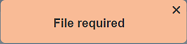
If no file is selected, an error message will appear.
The colours in the uploaded file will overwrite the existing colours with the same name.
Download
You can download the list of colours by clicking on the “Download” button at the upper right corner of the page.
The downloaded file will have the filename ColourPalette.json.
Refresh
After performing actions on the browser, the list is reloaded to display the list of colours. The manual “Refresh” button is available and is particularly useful if there are others making changes on the same page.
The “Refresh” button is found on the upper right corner of the page. Clicking on it reloads the list of colours.
Search
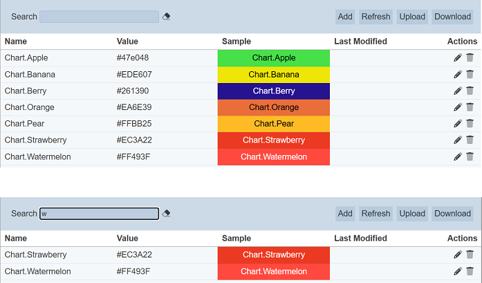
There is a cross-field search function for the list of colours. It is located at the upper left corner of the page.

This provides an easy way to search through the list of colours. It is case-insensitive and displays colours that have the entered search value in any of the values of the fields below:
- Name
- Value
Usage
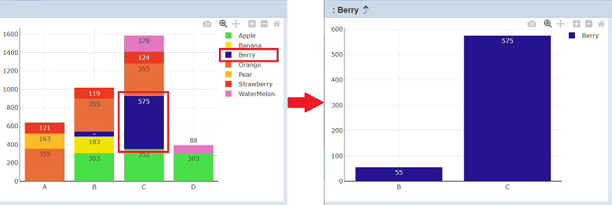
Dashboard charts use default colours and will assign colour based on first-come-first-serve basis. For example, if the first default colour is blue, then the first item in the list will be blue. If the second default colour is orange, the second item will use that colour, etc. If filtering is used, the colour of the item will change. This may cause confusion.
In the example below, the third item is given the colour green. When filtering is used, the colour of the third item will change from green to blue, since it is the first item in the list.
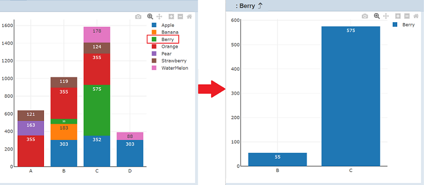
By using the colours in the Colours page, the colour of these items can remain the same in the chart, even when filtering is applied on the chart.
In the Colours page, create colours with names in the format: Chart.<value>.
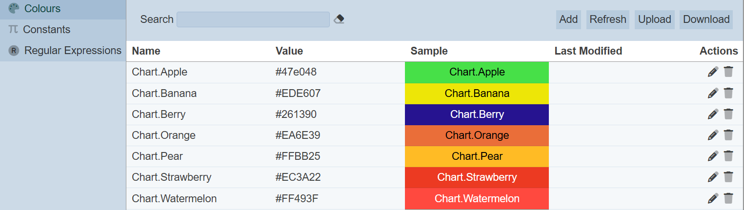
Refresh the chart to see the effect of the colours.
The colours in the Colours page give each item an unique colour, which will follow the item after filtering is applied.
If you wish to fix the colour of one item in the chart instead of all items. Simply create just one colour with the ID of the item in its name. The chart will replace the default colour with the colour defined in the Colours page.