This chapter describes adding a variety of charts to your report. Charts enhance the visual appeal of the reports and help the user discern the information easily. Each type of chart contains its own set of properties. Follow the instructions to get started with chart designing.

This section lists the properties that are common to all the chart types.
Data:
Key: Describes the fields used to group the data. Click the Choose Column icon (
 ).
The
).
The Column Chooserwindow opens. Make your selection as required.Value: The values to be plotted on the chart. Click the Choose Column icon (
).
The Column Chooserwindow opens. Make your selection as required.After adding a column, you have the option to edit it by clicking the Edit Column icon (
 ). Available operations include Average,
Count, Count Distinct, Min, Max, Standard Deviation, Sum, and Variance.
). Available operations include Average,
Count, Count Distinct, Min, Max, Standard Deviation, Sum, and Variance.Sort: Sorts the data before plotting. Available sorting options include Key Ascending, Key Descending, Value Ascending, Value Descending, and None.
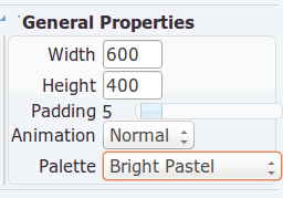
General Properties:
Width: Width of the chart in pixels.
Height: Height of the chart in pixels.
Padding: Padding properties insert some separation between the item and the surrounding graphics. They can be used to tweak the charts to prevent certain items overlapping.
Palette: Denotes the colour shades for the chart.
Background: Lets you choose how to fill the background - either solid or gradient. Select the desired background colours from a wide range of colour options. You can also customize the border, by specifying border width, radius and colour.
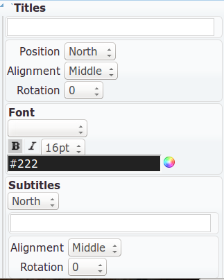
Titles: Set the formats for titles and subtitles, including position, alignment, rotation, font and colour.
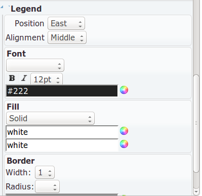
Legend: Set the legend style, including position, alignment, font, colour, and fill pattern.
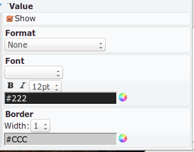
Value: Allows you to customize the display of values. Available options include whether to show or hide the Value, position, padding, font, colour, and border properties.