
Inputs
Inputs includes input field components such as single line text input, multiple line text area, radio button, checkbox, drop-down selection, dataset selection, etc. To display an action component in the form, a block need to be added onto the form before the input component can be added.
To add an input component onto the form, simply drag and drop to the desired location in the form structure. To edit the properties, simply select the desired component and the properties of the desired component wil lbe displayed at the lower panel.
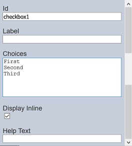
Checkbox
The Checkbox component allows you to add checkbox options onto the form.

It has the following properties.
| Field | Description | Default |
|---|---|---|
| Id | Name of the component that will be displayed in the form structure. | “checkboxX” |
| Label | Name of the component that will be displayed in the form. | None |
| Choices | Defines the checkbox choices on the form. | “First”, “Second”, “Third” |
| Display Inline | If selected, displays the checkboxes in a row. If unselected, displays the checkboxes in several rows. | Selected |
| Help Text | Text that will be displayed below the input. | None |
The checkbox options can be edited using the “Choices” field, with one option in a row.
Dataset Checkbox
The Dataset Checkbox component allows you to add dataset selection options in the form of checkbox onto the form. Multiple select is permitted.
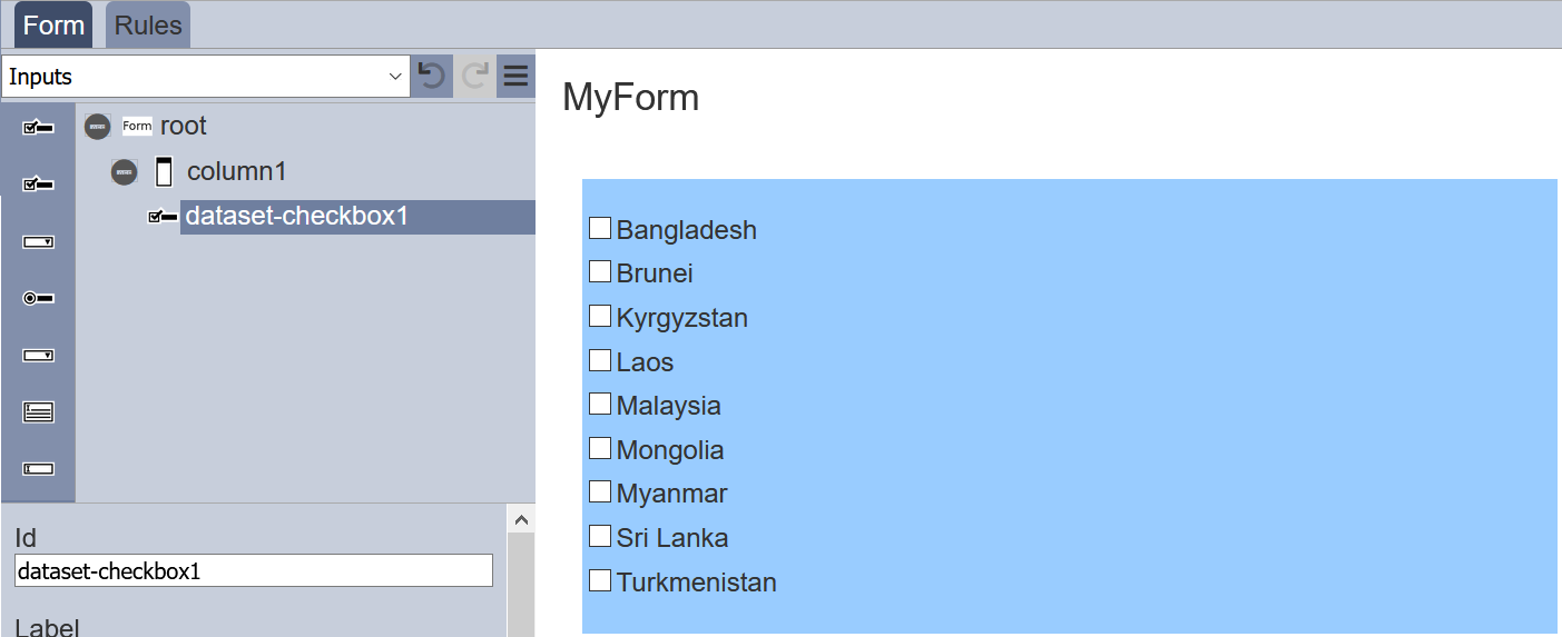
It has the following properties.
| Field | Description | Default |
|---|---|---|
| Id | Name of the component that will be displayed in the form structure. | “dataset_selectX” |
| Label | Name of the component that will be displayed in the form. | None |
| Dataset | Selects the dataset to be used. | None |
| Field | Selects the field from the selected dataset to be used. | None |
| Label Field | Selects the field whose values are to be displayed. | None |
| Sort Field | Selects the sorting field. | None |
| Alignment | Alignment of the checkboxes in the form. Available options: - Left - Centre - Right |
Left |
| Display Inline | If selected, displays the checkboxes in a row. If unselected, displays the checkboxes in several rows. | Selected |
| Help Text | Text that will be displayed below the input. | None |
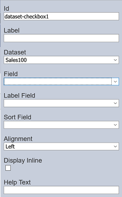
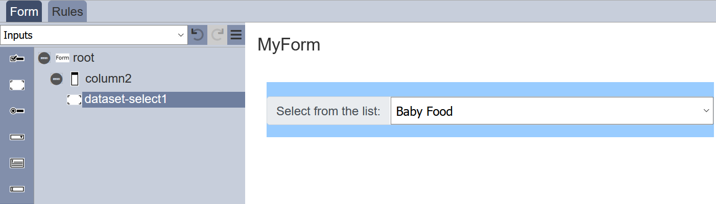
Dataset Select
The Dataset Select component allows you to add dataset selection options in the form of drop-down list onto the form.
It has the following properties.
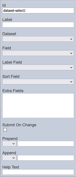
| Field | Description | Default |
|---|---|---|
| Id | Name of the component that will be displayed in the form structure. | “dataset_selectX” |
| Label | Name of the component that will be displayed in the form. | None |
| Dataset | Selects the dataset to be used. | None |
| Field | Selects the field from the selected dataset to be used. | None |
| Label Field | Selects the field whose values are to be displayed. | None |
| Sort Field | Selects the sorting field. | None |
| Extra Fields | Lists the extra fields to be used by other component (such as Derived Text). | None |
| Submit On Change | If selected, when a choice is made, the form is auto submitted. | Not selected |
| Prepend | Select either to display text, image or none before the choices. | None |
| Append | Select either to display text, image or none after the choices. | None |
| Help Text | Text that will be displayed below the input. | None |
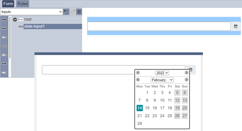
Date Input
The Date Input component allows you to add a date selection option in the form of drop-down list onto the form.
It has the following properties.
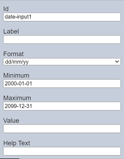
| Field | Description | Default |
|---|---|---|
| Id | Name of the component that will be displayed in the form structure. | “date-inputX” |
| Label | Name of the component that will be displayed in the form. | None |
| Dataset | Selects the dataset to be used. | None |
| Format | Selects the format of the date. Available options: - “yy/mm/dd” - “dd/mm/yy” - “mm/dd/yy” |
“dd/mm/yy” |
| Minimum | Sets the lower date range for selection in the date picker. | “2000-01-01” |
| Maximum | Sets the upper date range for selection in the date picker. | “2099-12-31” |
| Value | Defines the initial value. If left empty, today’s date is used. |
None |
| Help Text | Text that will be displayed below the input. | None |
The “Value” field defines the initial date value. If it is left empty, today’s date is used. While the “Minimum” and “Maximum” fields set the lower and upper date ranges for selection in the date picker. If these values are not defined or the syntax is wrong, the default values will be used.
All these values can either be absolute dates or as relative offsets. The allowed offsets are:
[+/-][0-9]+[dmy]
You can define the field as a relative value, e.g., +5d, -23y or +3m, etc. If today’s date is 2022-01-01, +5d will constitute 2022-01-06.
Form Select
The Form Select component allows you to link one form onto another form.
It has the following properties.
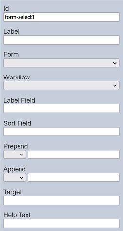
| Field | Description | Default |
|---|---|---|
| Id | Name of the component that will be displayed in the form structure. | “form-selectX” |
| Label | Name of the component that will be displayed in the form. | None |
| Form | Selects the form from the drop-down list. | Blank |
| Workflow | If selected, displays the checkboxes in a row. If unselected, displays the checkboxes in several rows. | Selected |
| Label Field | Selects the field whose values are to be displayed. | None |
| Sort Field | Selects the sorting field. | None |
| Prepend | Select either to display text, image or none before the choices. | None |
| Append | Select either to display text, image or none after the choices. | None |
| Help Text | Text that will be displayed below the input. | None |
Refer to Examples for a simple example on how to use Form Select component.
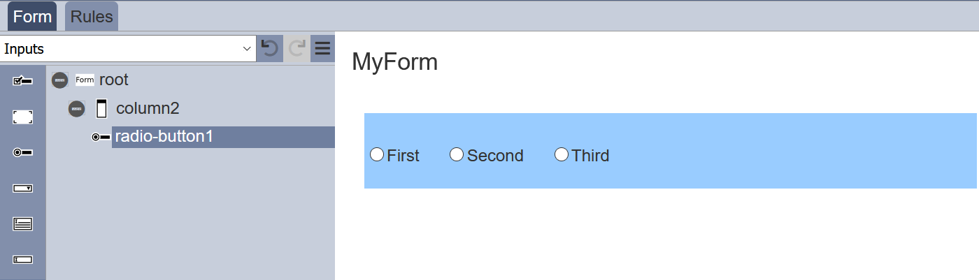
Radio Button
The Radio Button component allows you to add radio button options onto the form.
It has the following properties.
| Field | Description | Default |
|---|---|---|
| Id | Name of the component that will be displayed in the form structure. | “radio-buttonX” |
| Label | Name of the component that will be displayed in the form. | None |
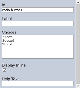
| Choices | Defines the radio button choices on the form. | “First”, “Second”, “Third” |
| Display Inline | If selected, displays the checkboxes in a row. If unselected, displays the checkboxes in several rows. | Selected |
| Help Text | Text that will be displayed below the input. | None |
The radio button options can be edited using the “Choices” field, with one option in a row.
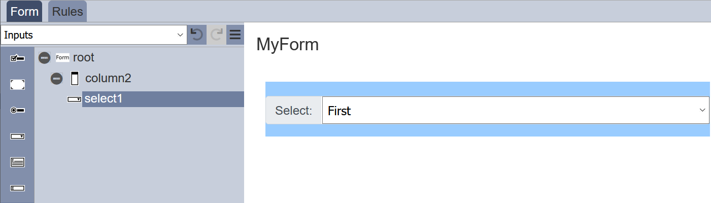
Multiple Selection
The Multiple Selection component allows you to place a drop-down selection onto the form.
It has the following properties.
| Field | Description | Default |
|---|---|---|
| Id | Name of the component that will be displayed in the form structure. | “selectX” |
| Label | Name of the component that will be displayed in the form. | None |
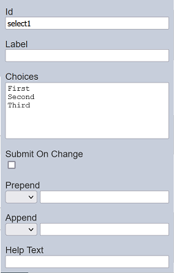
| Choices | Defines the drop-down choices on the form. | “First”, “Second”, “Third” |
| Submit On Change | If selected, when a choice is made, the form is auto submitted. | Not selected |
| Prepend | Select either to display text, image or none before the choices. | None |
| Append | Select either to display text, image or none after the choices. | None |
| Help Text | Text that will be displayed below the input. | None |
The selection options can be edited using the “Choices” field, with one option in a row.
Dynamic Select
The choices for the Multiple Selection component can be edited using the “Choices” field in its properties. This make the choices static, which means it cannot be changed unless the “Choices” field is edited.
You can make the choices dynamic without having to edit the “Choices” field in the form.
Below is a simple example of using ETL chainset and workflow to create dynamic choices.
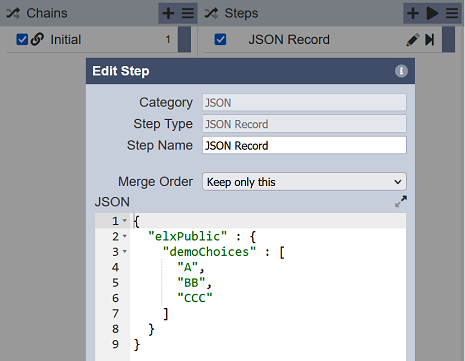
First, create an ETL chainset using the ETL module. Add a “JSON Record” ETL step that initialises the elxPublic with the choices for the form.
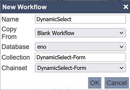
Second, create a workflow using the Workflows module with the settings are per screenshot.
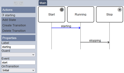
In the workflow, select “starting” transition. Set the “OnTransition” field to “Initial” in the “Properties” panel.
Third, create a simple form with a Multiple Selection component with no choices defined. You can also add a HTML component to view the choices. Set up the two components are per the screenshot below.
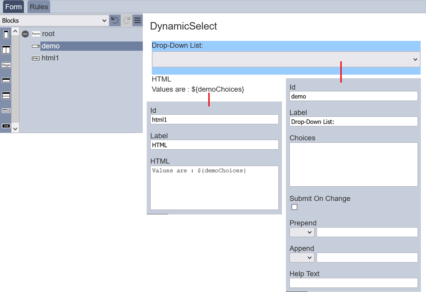
When the “Choices” field in the Multiple Selection component is not defined (i.e., left blank), it will look for choices in the elxPublic by taking the “Id” field (“demo”) and + “Choices”. In other words, it will look for “demoChoices”.
Lastly, test the form by clicking on the “More Actions” icon at the top row and select the “Run Form” option. In the “Run Form” dialog box, select the workflow created earlier, in this case “DynamicSelect-Form”.
The form is generated in another tab.
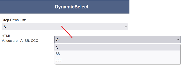
You can click on the “Drop-Down List” to select the choices listed in the ETL. The HTML view component also displays the values of the Multiple Selection component.
With this dynamic select, you have different set of choices for the same form instead of creating different forms for different situations.
Do note that this dynamic select method also works with the Checkbox component.
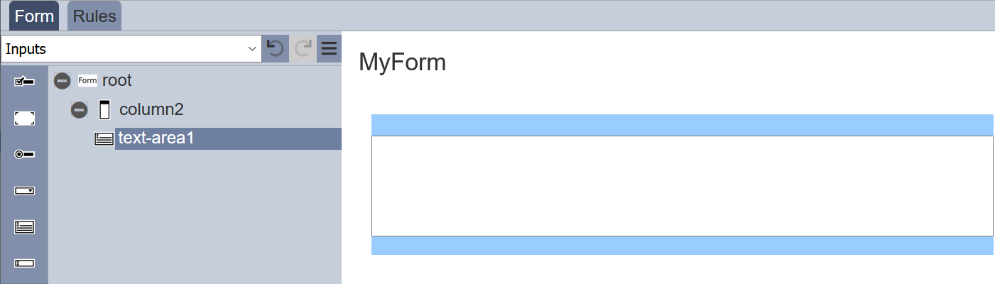
Text Area
The Text Area component allows you to place a multiple-lined text box onto the form.
It has the following properties.
| Field | Description | Default |
|---|---|---|
| Id | Name of the component that will be displayed in the form structure. | “selectX” |
| Label | Name of the component that will be displayed in the form. | None |
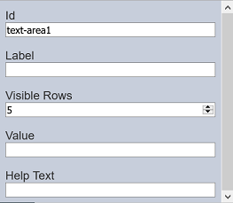
| Visible Rows | Number of rows (between 2 to 50) on the form. | “5” |
| Value | Defines the default value. | None |
| Help Text | Text that will be displayed below the text area. | None |
The number of lines to be displayed on the form via “Visible Rows” field can be from 2 to 50, default is 5 lines.
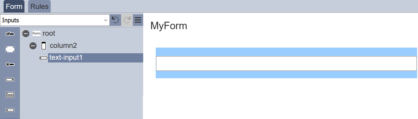
Text Input
The Text Input component allows you to place a single-lined input onto the form. The type of input comes in several form as defined in the “Input Type” field.
It has the following properties.
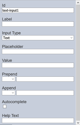
| Field | Description | Default |
|---|---|---|
| Id | Name of the component that will be displayed in the form structure. | “selectX” |
| Label | Name of the component that will be displayed in the form. | None |
| Input Type | Selects the type of input. Available option: - Text - Password - Number - File |
“Text” |
| Placeholder | Suggestion text for the text input. E.g.: Enter your password |
None |
| Value | Defines the default value. | None |
| Prepend | Select either to display text, image or none before the input. | None |
| Append | Select either to display text, image or none after the input. | None |
| Autocomplete | If selected, allows autocomplete. | Not selected |
| Help Text | Text that will be displayed below the text area. | None |
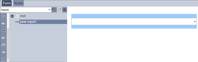
Year Input
The Year Input component allows you to select a value from a range of years from the drop-down list.
It has the following properties.
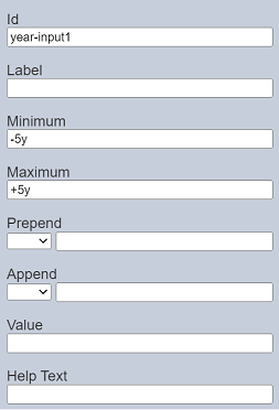
| Field | Description | Default |
|---|---|---|
| Id | Name of the component that will be displayed in the form structure. | “year-inputX” |
| Label | Name of the component that will be displayed in the form. | None |
| Minimum | Sets the lower range in the year selection based on current year. | “-5y” |
| Maximum | Sets the upper range in the year selection based on current year. | “+5y” |
| Prepend | Select either to display text, image or none before the input. | None |
| Append | Select either to display text, image or none after the input. | None |
| Value | Defines the initial year value. If undefined, blank is displayed. |
Blank |
| Help Text | Text that will be displayed below the input. | None |
The “Minimum” and “Maximum” fields defines the lower and upper range for the year selection based on the current year. The default values are -5y and +5y respectively. If this year is 2022, the year range for selection will be from 2017 to 2027.