
Checkbox Filter
Description
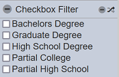
This filter control is commonly used to filter datasets based on a specific field identified in the “Filter” property. This is a single-field filter and allows multiple options to be selected when used on the Viewer. A checkbox corresponds to each option. This is suitable for string-type fields (field identified for “Filter”) with not so many options that also require multiple values to be selected at a time.
Viewer Usage
To select an option, simply select the checkboxes corresponding the value. Multiple options can be selected.
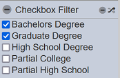
There are shortcut buttons that provide convenience in controlling the selected values.

Clicking on the  “Deselect All” icon deselects all the options.
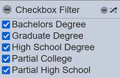
Clicking on the  “Invert Selection” icon inverts the selected options. This means that all options that are selected become deselected. Likewise, all options that are deselected become selected.
Specific Properties
Below are the fields that are specific to this control:
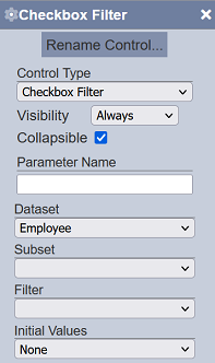
| Field | Description | Mandatory | Input Type | Constraints | Default Value |
|---|---|---|---|---|---|
| Initial Values | Determines the initial set or selected values upon loading in the Dashboard Viewer. | Y | Select | One value can be selected. Available options are: - None (all options are deselected) - First (only the first displayed option is selected) - Last (only the last displayed option is selected) - All (all of the options are selected) - Values (all comma-separated values entered in the field that appears below this property; spaces are allowed before and after the comma) 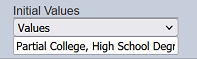 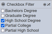 |
“None” |