
Actions
Actions include components such as the Button Bar, Render DocX and Render RML. To display an action component in the form, a block component need to be added onto the form before the action component can be added.
Button Bar
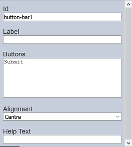
The Button Bar component allows you to add one or more buttons onto the form and determine the text on the buttons as well. It has the following properties.
| Field | Description | Default |
|---|---|---|
| Id | Name of the component that will be displayed in the form structure. | “button-barX” |
| Label | Name of the component that will be displayed in the form. | None |
| Buttons | Defines the button(s) on the form. | “Submit” |
| Alignment | Alignment of the button(s) in the form. Available options: - Left - Centre - Right |
“Centre” |
| Help Text | Text that will be displayed below the button(s). | None |
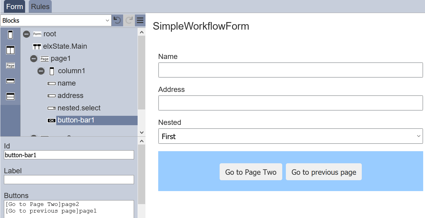
For “Buttons” field, the syntax is [label]event. If no label is specified, the event name is shown instead.
You can add more than one button. For example, if you need to add two buttons, simply key in the following in the “Buttons” field.
  [Go to Page 2]page2
  [Go to previous page]page1
The two buttons will appear in the form.
Render DocX / RML
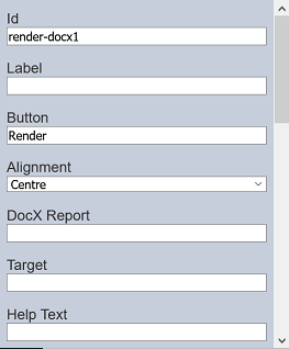
The Render DocX and Render RML components allows you to add a button onto the form that allows you to generate a DocX or RML report respectively. It has the following properties.
| Field | Description | Default |
|---|---|---|
| Id | Name of the component that will be displayed in the form structure. | “render-docxX” |
| Label | Name of the component that will be displayed in the form. | None |
| Buttons | Defines the button(s) on the form. | “Render” |
| Alignment | Alignment of the button(s) in the form. Available options: - Left - Centre - Right |
“Centre” |
| DocX Report | Path of the file for the report to be generated. | None |
| Target | Location of the report generated. | None |
| Help Text | The text that will be displayed below the button(s). | None |
The properties for Render RML are similar to Render DocX, except for the Id field where the default value is render-rmlX and there is a RML Report field instead of the DocX Report field.