
Functional Properties (N-Z)
These properties are related to the actual features of the view.
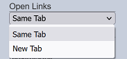
Open Links
This property allows you to whether to open the link in the field (with hyperlink set) either in the same tab (navigate away from dashboard) or a new tab.
| Field | Description | Input Type | Constraints | Default Value | Dependency |
|---|---|---|---|---|---|
| Open Links | Selects a field to respond to the search. | Select | One value can be selected from the drop-down list. | Not selected | “Show Search” must be enabled. |
There are two options, “Same Tab” and “New Tab”. By default “Same Tab” is selected. If the “Hyperlink” field in the “Columns” property is defined, the link will open in the same tab (by default) or a new tab if “New Tab” is selected.
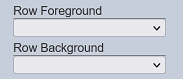
Row Background / Foreground
The “Row Background” and “Row Foreground” allows you to define the background and foreground colour of the rows for a specific field type through aggregation pipeline respectively.
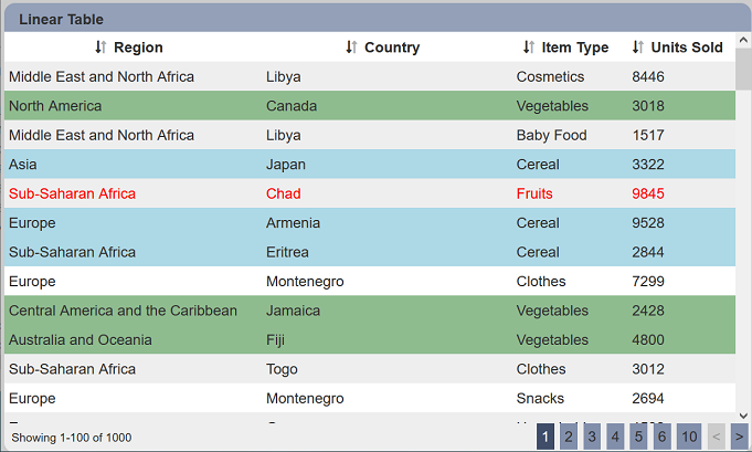
In the example below, three items under the “Item Type” column are highlighted. The item “Fruits” foreground (text) is red. Item “Vegetables” background is green and item “Cereal” background is blue.
To do so, first set the colours of the selected items using aggregation pipeline. In the Datasets module page, select the desired dataset and click on the  icon under the “Actions” column. In the “Edit” Panel, select the “Aggregation Pipeline” tab.
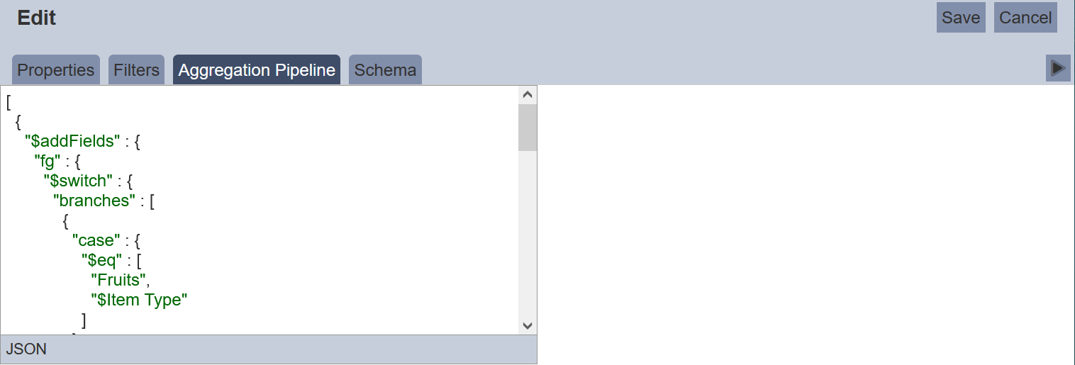
Key in the below code.
{
  "$addFields" : {
    "fg" : {
      "$switch" : {
        "branches" : [
          {
            "case" : {
              "$eq" : [ "Fruits", "$Item Type" ]
            },
            "then" : "red"
          }
        ],
        "default" : ""
      }
    },
    "bg" : {
      "$switch" : {
        "branches" : [
          {
            "case" : {
              "$eq" : [ "Vegetables", "$Item Type" ]
            },
            "then" : "darkseagreen"
          },
          {
            "case" : {
              "$eq" : [ "Cereal", "$Item Type" ]
            },
            "then" : "lightblue"
          }
        ],
        "default" : ""
      }
    }
  }
}
Select the “Schema” tab and click on the “Infer Schema” icon on the right of the tab.
Next, in the linear table properties, select “fg” and “bg” for “Row Foreground” and “Row Background” properties.
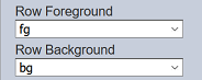
Click on the “Save” button to save the changes. The linear table now shows green background for “Vegetables”, blue background for “Cereal” and red foreground (text) for “Fruits”.
Do note that it is advisable not to show all data in the linear table when using aggregation pipeline for the foreground and background properties, as the new “fg” and “bg” fields will also be displayed.
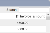
Search Field
This field works together with the “Show Search” field to defines the field that is allows to be searched in the search function.
| Field | Description | Input Type | Constraints | Default Value | Dependency |
|---|---|---|---|---|---|
| Search Field | Selects a field to respond to the search. | Select | One value can be selected from the drop-down list. | Not selected | “Show Search” must be enabled. |
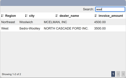
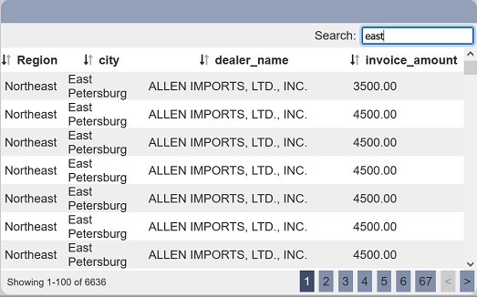
When a field is selected, only the selected field responds to the search. If none is selected, all fields can be searched.
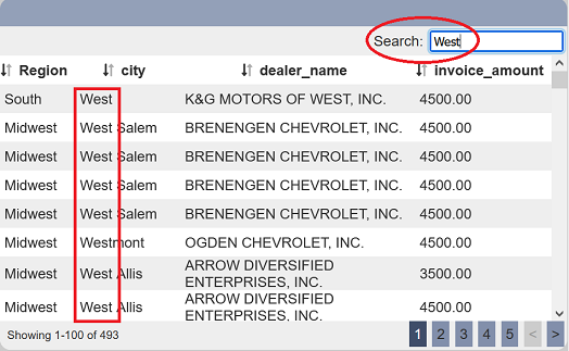
In the example below, city is selected in “Search Field”. When West is used to search, only records that contains West in the “city” column are displayed.
Search Ignore Case
This field works together with the “Show Search” field to allow a search that is case insensitive.
The “Show Search” field adds a search function onto the table and is case sensitive. To allow for search that is case insensitive, enable this field.
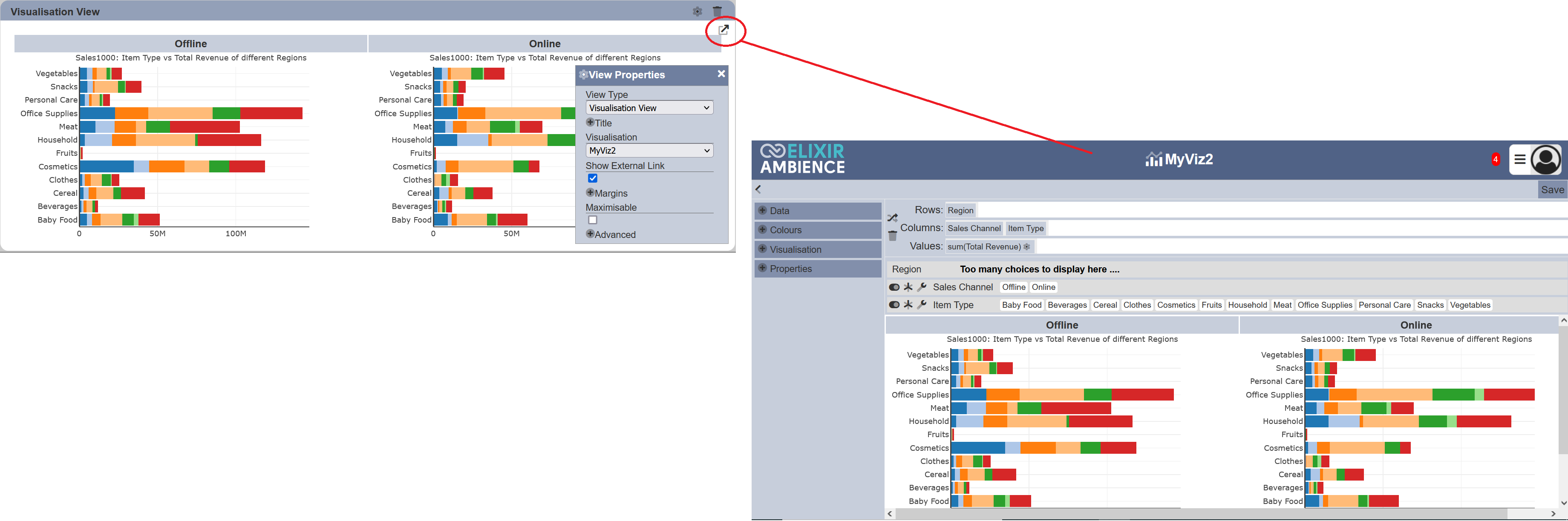
Show External Link
This property when selected displays an external link icon at the upper right corner of the view.
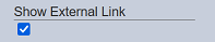
By default this property is selected. Clicking on the icon allows you to open the visualisation or GIS explorer.
Show Search
This adds a search function in the view.
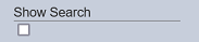
If enabled, a search function at the upper right of the view.
It can be used to search records that contains the expression and its case sensitive.
You can enable the “Search Ignore Case” field to allow the search to be case insensitive. You can also define which column is allowed to be searched by using the “Search Field” field.
Select Column
This field works together with the “Select to Control” field to define the field in the dataset to provide selection control from one view to another. The “Select to Control” field defines the filter control, while the “Select Column” field defines the field for the control in the linear table.
| Field | Input Type | Constraints | Default Value | Dependency |
|---|---|---|---|---|
| Select Column | Select | Selects the desired column to be displayed. | None | Select to Control field need to be set |
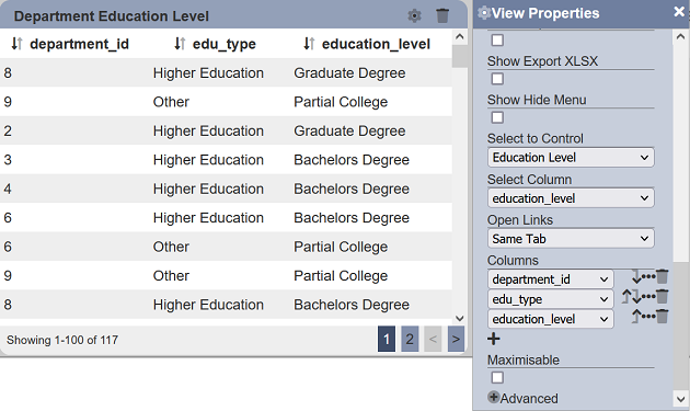
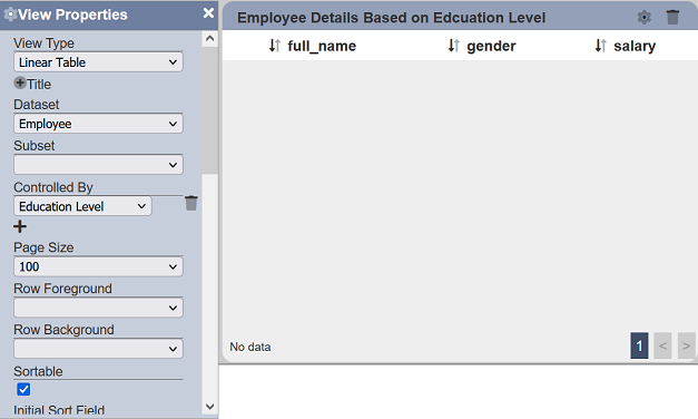
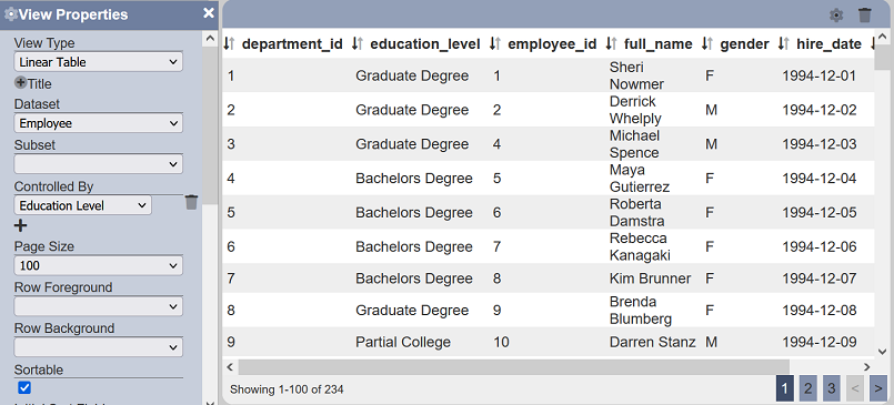
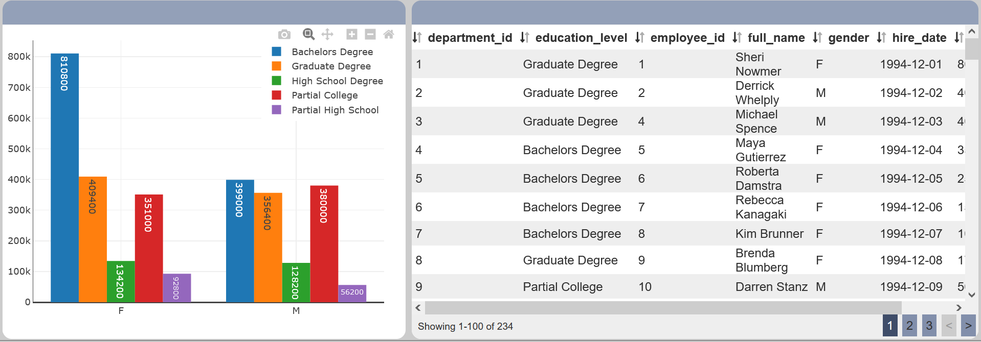
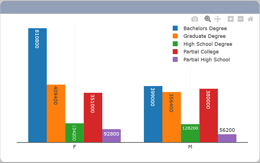
In the example below, a linear table lists the education level of employees in several departments. Another linear table is used to show the details of the personnel along with their education level. A select filter named “Education Level” is used to control the list of details of personnel in the second table through the first linear table.
In the first linear table, set the “Select to Control” field to the “Education Level” select filter and “Select Column” field to the desired field. In this case, education_level field is selected. Save the changes.
In the second linear table, set the “Controlled By” field to the same Select Filter. Save the changes.
You will notice that the second linear table is now empty, as the value “None” us selected in “Default Select” field of the Select Filter. Click on any row in the first linear table and the second linear table will be populated with the details of the employee with that education level.
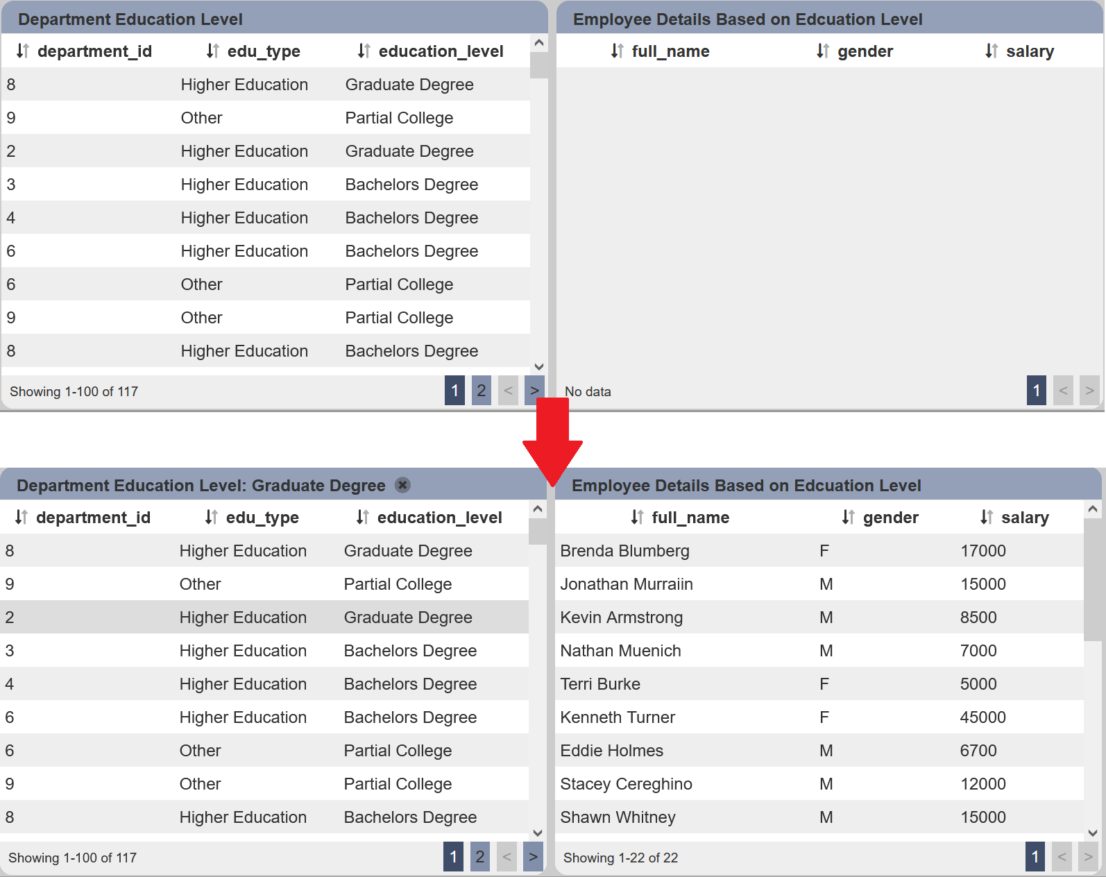
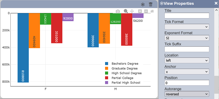
In this example, the third row in the first linear table is clicked, the second linear table then displays the details of employees with Graduate Degree.
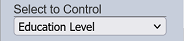
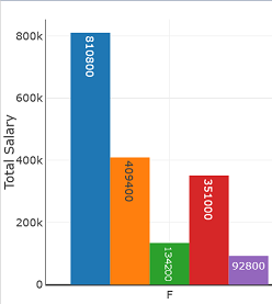
Select to Control
This property allows the view to manipulate the selected value of a select filter control. This is typically used to add an interaction on the dashboard. A chart type of view is usually used with this property to enable selecting a data group/trace (field used in the legend displayed) on it to change the value of a select filter control, which subsequently filters the data on the views that are linked to the control.
| Field | Input Type | Constraints | Default Value | Dependency |
|---|---|---|---|---|
| Select to Control | Select | One value can be selected. Names of all “Select Filter” controls are available options. |
None | None |
To set up this type of interaction, know what data and field should be used. A minimum of three dashboard components are required to complete this:
- view (View 1) that controls the select filter control
- select filter control (Filter 1)
- view (View 2) that is linked to the select filter control
The datasets used in each of these do not have to be the same but they would have to have the same field name, at the very least. If datasets used for each are different, the list of distinct values for the said field should ideally be the same.
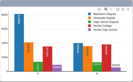
In this example, the field selected to be used is “education_level”. To simplify the example, all three components would use the same dataset, the “Employee” dataset.
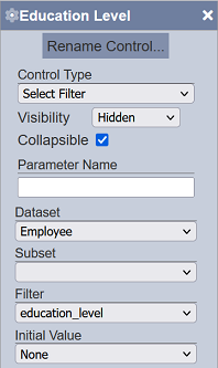
Start by setting a select filter control first. Refer to the guide here for adding a select filter control. Setting the control’s visibility to “Hidden” makes the interaction appear more seamless on the Viewer.
On View 1, set it to a view type that has this property. For this example, a bar chart is used.
Set the bar chart’s properties and ensure the data grouping is using the identified field, “education_level”.
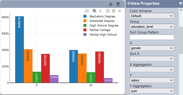
Set the “Select to Control” property to the name given to Filter 1.
On View 2, select any view to be linked to Filter 1. For this example, a linear table would be used for simplification. Set the “Dataset” property and add Filter 1 to the “Controlled By” property.
Save the changes to exit the Designer and to view it on the Viewer.
Click on a data group/trace in View 1. View 2 subsequently re-renders the data to display only the records that are under the same data group (“education_level”).
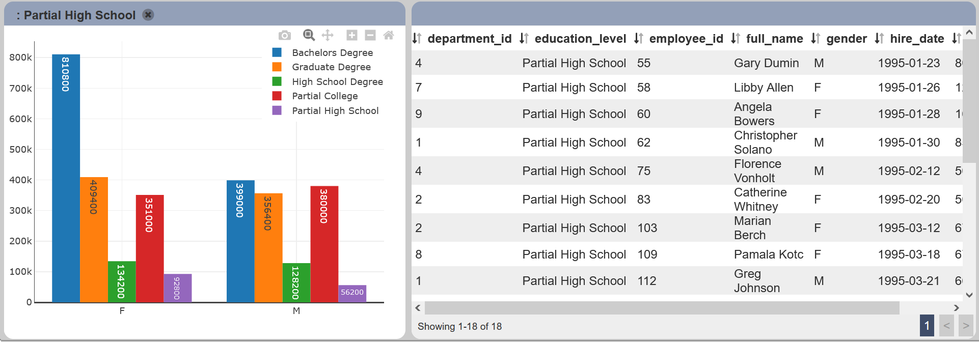
In the example, the “Partial High School” data trace is selected on View 1. To reset the views, click on the  “Reset” icon in View 1.
Note that the this property takes precedence over the “Drill” property if both are enabled. This effectively means that the “Drill” property won’t be enabled if “Select to Control” is set.
Show Export CSV / XLSX
These fields if selected display the export CSV and XLSX icons respectively on the top left of the view.
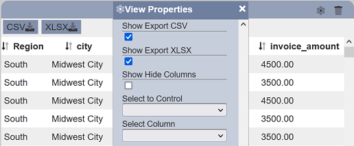
Click on the export CSV or export XLSX icon allows you to export the view in the selected format.
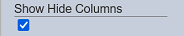
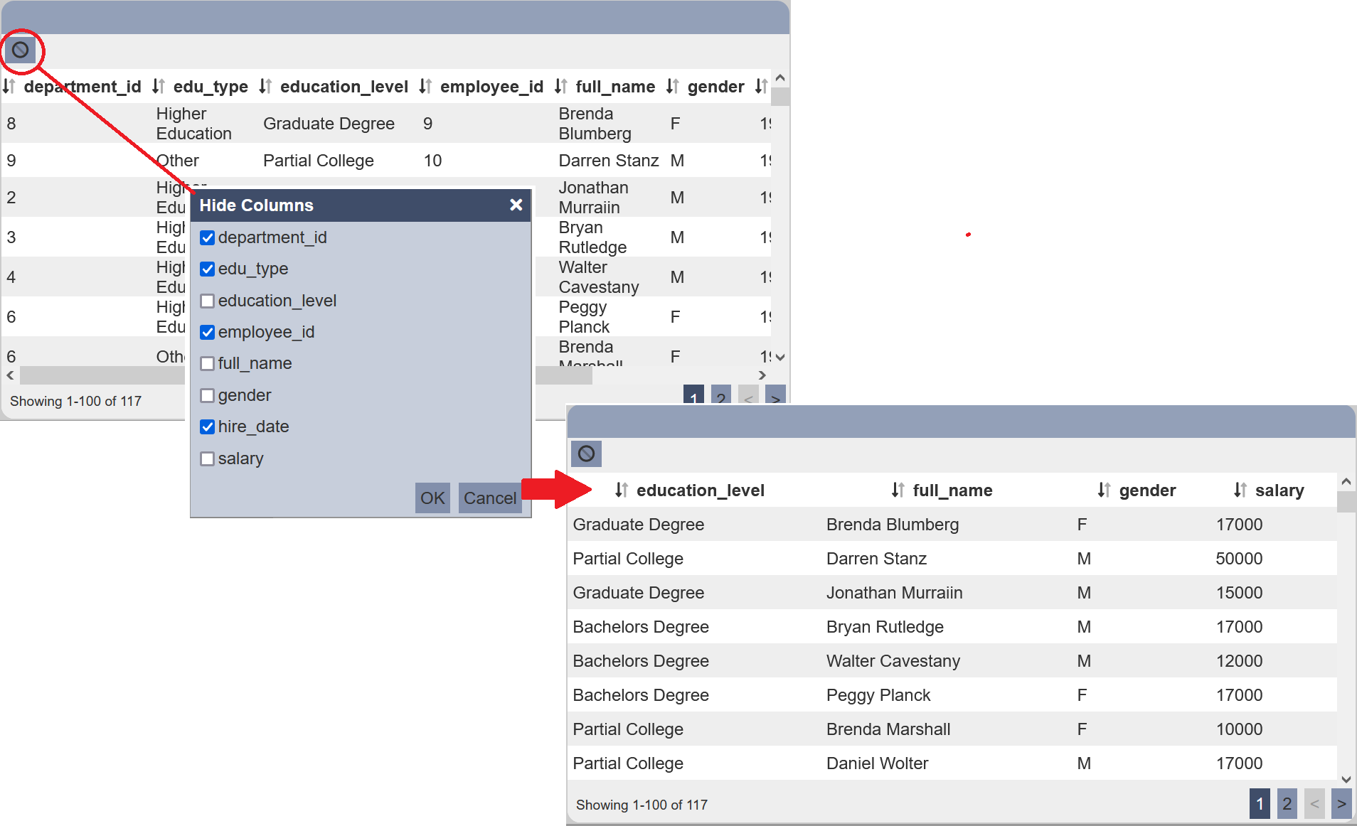
Show Hide Columns
This field is only available in Linear Tables. This sets allows you to show/hide columns in the linear table.
It is useful when there are too many columns to be displayed and not all columns are essential. Using this field, you can display the most essential columns by default and allow users to show/hide columns they wanted to view or do not wish to view.
| Field | Input Type | Constraints | Default Value | Dependency |
|---|---|---|---|---|
| Show Hide Columns | Checkbox | If selected, displays the Hide Columns icon on the top left of the view. | Not selected | None |
When the “Show Hide Columns” is selected, the  “Hide Columns” icon will appear at the upper left corner of the view.
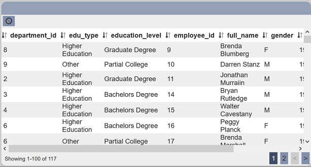
Click on the icon will display the “Hide Columns” dialog box.
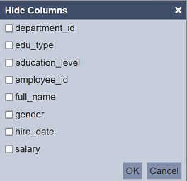
The dialog box will display all fields in the dataset. By default, all fields not selected (i.e. all are displayed). Select the fields that you wish to hide and click on the “OK” button to save the change.
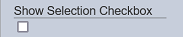
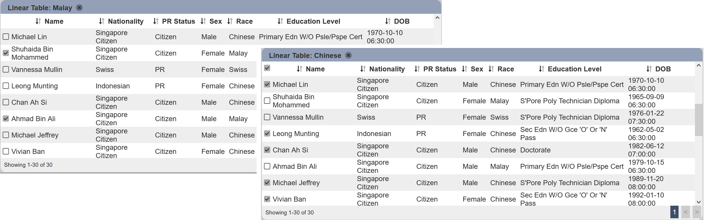
Show Selection Checkbox
This field is dependent on the “Select to Control” and “Select Column” fields. Both fields must be selected in order for this field to work.
With all three fields combined, checkboxes are displayed on the left of the linear table for each record. Select any checkbox will select the records according to the field in the “Select Column”.
| Field | Input Type | Constraints | Default Value | Dependency |
|---|---|---|---|---|
| Show Selection Checkbox | Checkbox | If selected, displays checkboxes in the left of the table. Select any checkbox selects all records for the value in the field in “Select Column”. |
Not selected | Select Column and "Select must to be selected. |
For example, the “Select to Control” selects Nationality Select Filter and “Select Column” selects Race. With “Show Selection Checkbox” selected, the checkboxes will appear at the left of the linear table. Click on the row with the value Malay under the “Race” column, all records with the value Malay under the “Race” column will be selected. To select all records with the value Chinese under the “Race” column, click on the any row with the value Chinese.
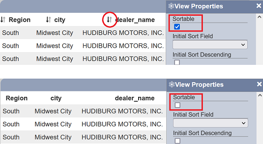
Sortable
This field when enabled will display sort icons next to the columns in the linear table, allowing them to be sortable. It is enabled by default.
Sort Group Pattern
This sets the field to be used to sort the “Group” field. It is most useful to have a 1:1 correspondence between the “Group” and “Sort Group Pattern” values to ensure proper sorting of the values. If this property is not available, the “Group” field value will be used for sorting.
| Field | Input Type | Constraints | Default Value | Dependency |
|---|---|---|---|---|
| Sort Group Pattern | Textbox | Name of field to be used for sorting. | None | Group must first be set |
This is useful if the “Group” values have corresponding indices or codes that must be used for ordering.
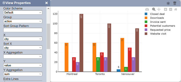
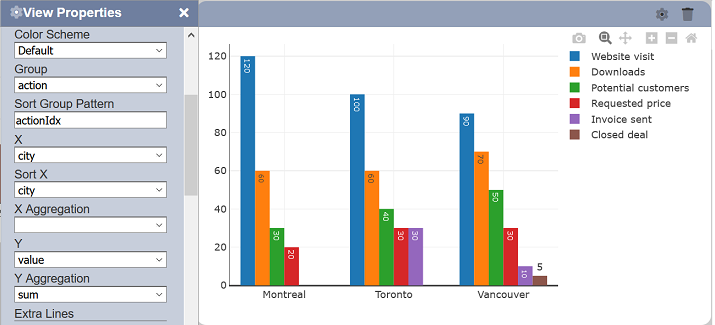
To support drill down, a string with the format prefix:suffix can be used.
For example, set the Pattern to :Idx and actionIdx will be used because the “Group” field is action. That way, if you drill down to XXX, then the system will expect a sorting field called XXXIdx, so sorting can be supported while drilling down.
You can supply both a prefix and suffix. For example, if there is a hidden field _actionABC (starting with an underscore), by keying in _:ABC, you will find the _actionABC column. Note that this field is not shown as an available field anywhere, thus it allows adding of sort columns without the user being confused by them.
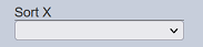
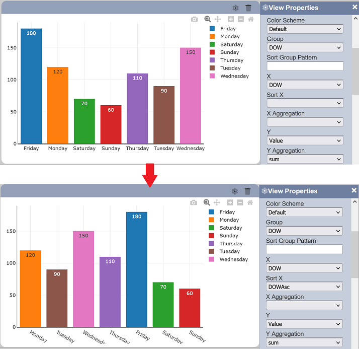
Sort X
This sets the field to be used to sort the X axis values. It is most useful to have a 1:1 correspondence between the “X” and “Sort X” values to ensure proper sorting of the X values.
| Field | Input Type | Constraints | Default Value | Dependency |
|---|---|---|---|---|
| X | Select | One value can be selected. All fields of the selected dataset/subset are available. |
None | Dataset/subset must first be set |
This is useful if the X axis values have corresponding indices or codes that must be used for ordering. Another usage would be for displaying dates in different formats but must still be sorted chronologically.
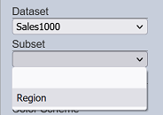
Subset
This property links the view to a subset of the selected dataset. The options are dependent on the selected “Dataset”. Once selected, the data returned by the subset, not the dataset, would be displayed on the rendered view. Similarly, other property options that are dependent on the selected dataset/subset’s fields are updated to reflect those of the selected subset.
| Field | Input Type | Constraints | Default Value | Dependency |
|---|---|---|---|---|
| Subset | Select | One value can be selected. All enabled subsets of the selected dataset are available options. |
None | Its available options depend on the selected “Dataset” value |
Text Format
This property sets the format of the displayed data point values. For the effect of this property to be visible, the “Text Position” must be set to any option that makes the labels visible.
Note that the text format is for formatting date and numeric data types.
Text Position
This property sets where the value labels of each data point should be displayed on specific views.
| Field | Input Type | Constraints | Default Value | Dependency |
|---|---|---|---|---|
| Text Position | Select | One value can be selected. Available options are dependent on the chart type. |
Depends on view type | None |
Views types that have two-dimensional data point representations would have the following options:
- inside - the values are displayed inside the shapes
- outside - the values are displayed outside the shapes
- auto - the values are displayed either inside or outside the shapes depending on the spacing available and the view type
- none - the values are not displayed at all
View types that have one-dimensional data point representations would have all horizontal and vertical position combinations available.
Vertical:
- top
- middle
- bottom
Horizontal:
- left
- center
- right
Value
This sets the field to be used as the main data point.
Its exact representation depends on the type of view. For instance, in a pie chart, it is used to determine the size of each portion based on the selected “Aggregation”. In a heat map, it is used to determine the value to be set for each cell on each X and Y coordinate combination. In a box plot, it is used to determine the field to be used to display the five-number summary of a data group.
| Field | Input Type | Constraints | Default Value | Dependency |
|---|---|---|---|---|
| Value | Select | One value can be selected. All fields of the selected dataset/subset are available. |
None | Dataset/subset must first be set |
X
This sets the field to be used as the X axis. Similar to other data-based properties, any record that does not contain the said field gets excluded from rendering.
| Field | Input Type | Constraints | Default Value | Dependency |
|---|---|---|---|---|
| X | Select | One value can be selected. All fields of the selected dataset/subset are available. |
None | Dataset/subset must first be set |
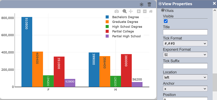
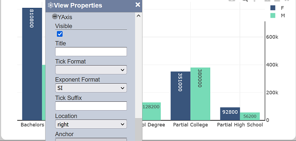
XAxis and YAxis
Each group of properties allows setting various display-related aspects of the X and Y axes, respectively. This includes formatting, sorting, titles, labels, positioning, axis display, etc.
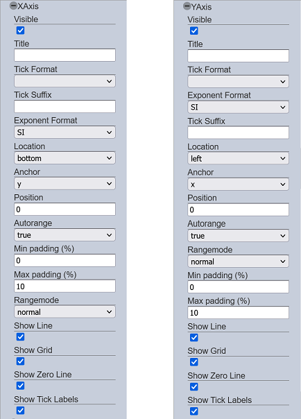
The X and Y axes property groups have the same set, with some varying choices for some properties, such as “Anchor” and “Location”. For simplicity, the properties in this group would be demonstrated for the Y axis.
Visible
This property allows toggling between displaying and hiding its corresponding associated axis. If selected, which is the default set value, the associated axis is displayed entirely.
If deselected, the associated axis is hidden entirely, including the grid lines, title, labels, etc.
Note that the rest of the X and Y axis properties below would only be visible if this property is enabled.
Title
This property allows adding a title to the associated axis.
| Field | Mandatory | Input Type | Constraints | Default Value | Dependency |
|---|---|---|---|---|---|
| Title | N | Text field | Any text | Empty string | None |
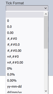
Tick Format
This property allows setting the format of the labels on the associated axis. These formats are available for numeric and date values.
| Field | Input Type | Constraints | Default Value | Dependency |
|---|---|---|---|---|
| Tick Format | Select | One value can be selected. | None | None |
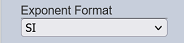
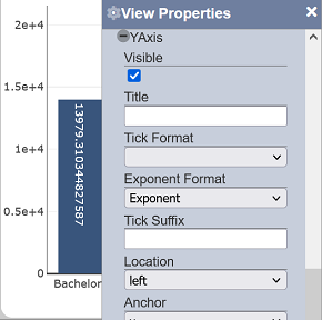
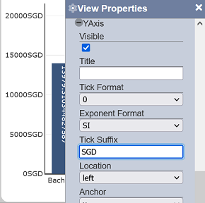
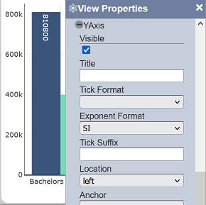
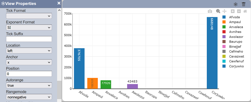
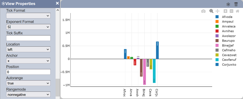
Exponent Format
This property allows setting the exponent format of the labels on the associated axis. This affects only numeric values.
| Field | Input Type | Constraints | Default Value | Dependency |
|---|---|---|---|---|
| Exponent Format | Select | One value can be selected. Available options are: - Exponent - SI - B |
“SI” | None |
Tick Suffix
This property allows adding a static text as a suffix to the labels on the associated axis.
| Field | Input Type | Constraints | Default Value | Dependency |
|---|---|---|---|---|
| Tick Suffix | Text field | Any text | Empty string | None |
Location
This property determines where the associated axis labels and line should be displayed.
| Field | Input Type | Constraints | Default Value | Dependency |
|---|---|---|---|---|
| Location | Select | One value can be selected. For the X axis, “left” and “right” are available options, while “bottom” and “top” are available for the Y axis. |
“left” for X axis. “bottom” for Y axis. |
None |
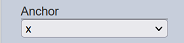
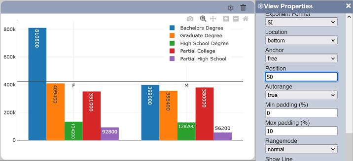
Anchor
This property allows you to determine the location of the axis line.
| Field | Input Type | Constraints | Default Value | Dependency |
|---|---|---|---|---|
| Anchor | Select | One value can be selected. For the X axis, “y” and “free” are available options. For the Y axis, “x” and “free” are available options. |
“y” for X axis. “x” for Y axis. |
Position(%) |
If “x” or “y” is selected in the “Anchor” field, the axis line will be fixed to the “0” value of the XAxis or YAxis respectively. If “free” is selected in the “Anchor” field, the location of the axis line will depends on the value selected in the “Position (%)” field.
Position (%)
This property determines the location of the axis line in the chart or view (in terms of percentage) and it is only effective if “Anchor” field selects the value “free”.
| Field | Input Type | Constraints | Default Value | Dependency |
|---|---|---|---|---|
| Position (%) | Numeric | One value can be selected. Values from 0 to 100. |
0 | Anchor |
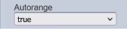
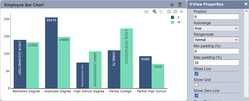
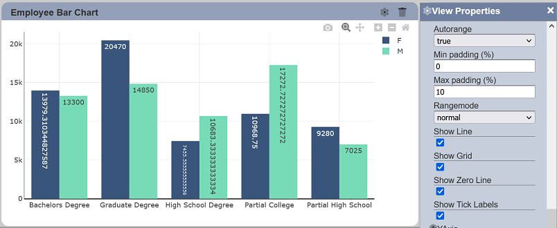
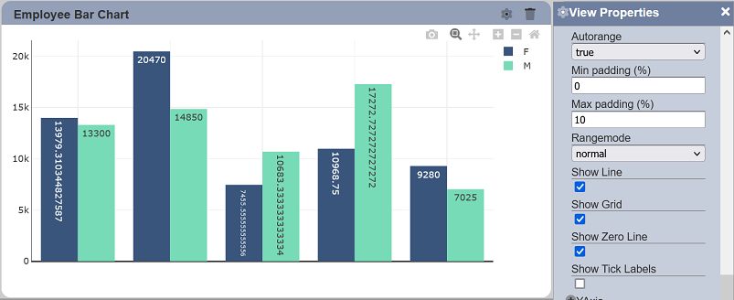
Autorange
This property determines how the associated axis range would be displayed by default.
| Field | Input Type | Constraints | Default Value | Dependency |
|---|---|---|---|---|
| Autorange | Select | One value can be selected. Available values are: - true Sets default axis range to include both floor and ceiling values on display; sorting is done in ascending order (left to right for X axis; bottom to top for Y axis). - false Sets the default displayed axis range to a fixed range - reversed Sets default axis range to include both floor and ceiling range values on display (similar to “true”; sorting is done in descending order (right to left for X axis; top to bottom for Y axis). |
“true” | None |
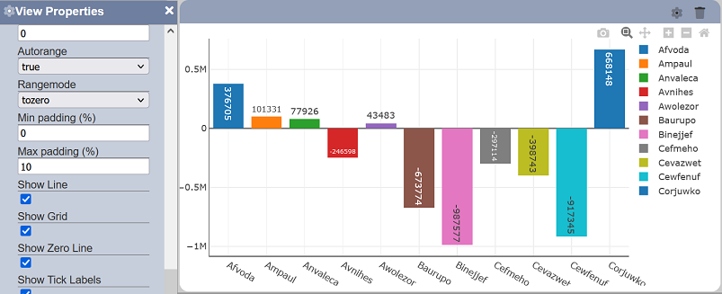
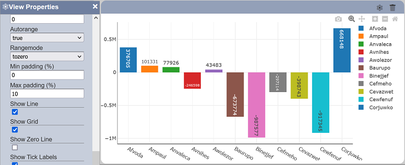
Range Mode
This property sets the default displayed starting point of the associated axis.
| Field | Input Type | Constraints | Default Value | Dependency |
|---|---|---|---|---|
| Range Mode | Select | One value can be selected. Available values are: - normal - tozero - nonnegative |
normal | None |
By default, “normal” is selected, which sets default display from starting range to floor value. Below are the available options:
- normal - sets default displayed starting range to floor value (may not start from zero)
- tozero - sets default displayed starting range to zero
- nonnegative - sets default displayed starting range to zero (negative values will not be displayed by default)
Note that negative values can still be viewed on the rendered view by zooming out.
Show Line
This property allows toggling between displaying and hiding the axis line on the associated axis. This property is enabled by default.
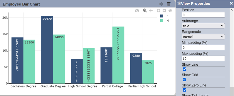
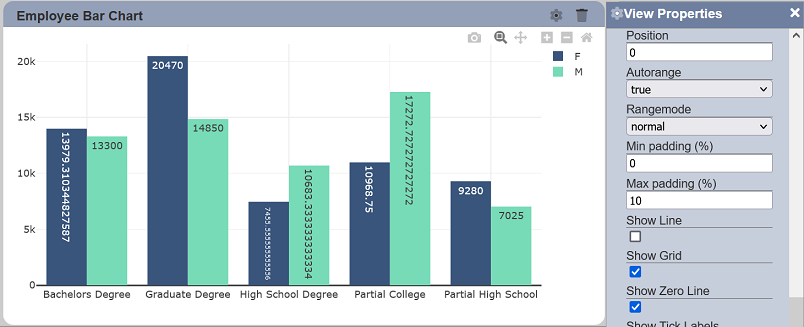
Show Grid
This property allows toggling between displaying and hiding the grid lines on the associated axis. This property is enabled by default.
Show Zero Line
This property allows toggling between displaying and hiding the zero line on the associated axis. This property is enabled by default.
Show Tick Labels
This property allows toggling between displaying and hiding the labels on the associated axis. This property is enabled by default.
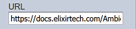
URL
This property allows you to define the URL of the embedded document you wish to display in the IFrame view.
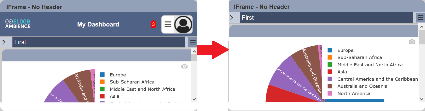
You can customise the HTML document to remove the header that you do not want to display in the IFrame, or to display a particular page in the URL as the inital page in the IFrame.
Remove Header
When a URL is used, the entire page of the URL is displayed. Depending on the HTML document, you may not want to display the header of the HTML document in the IFrame view, as the size of the IFrame view is small. To remove the header of the URL in the IFrame, simply add ?header=false at the end of the URL.
Set Initial Page
By default, the first page of the URL is displayed in the IFrame view. You can set to display other pages of the URL as the initial page by adding ?initialPAge=<NameOfPage> at the end of the URL.
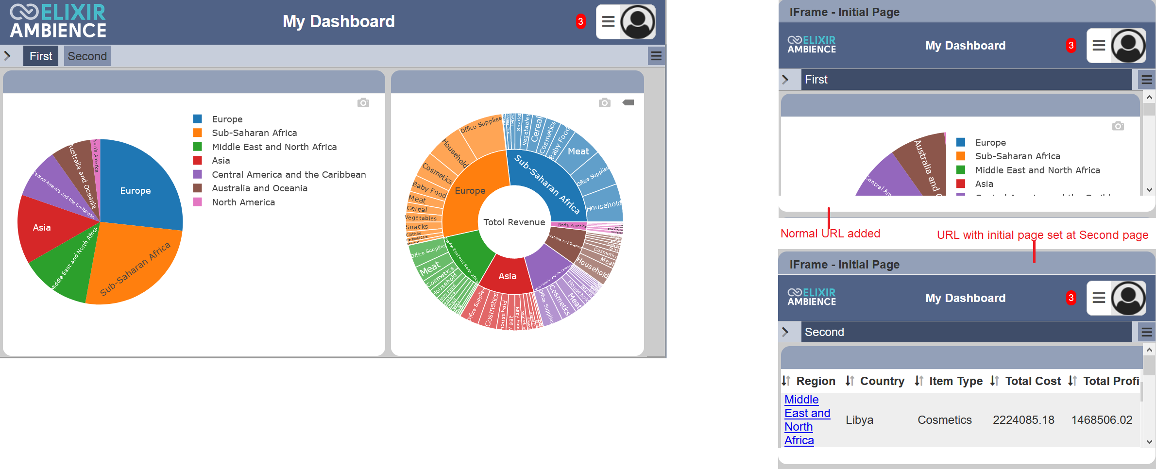
In the example above, the IFrame view is used to display the two pages in “My Dashboard”. The “First” page (default) is displayed in the IFrame view by default when the URL of “My Dashboard” is used. To display the “Second” page as the initial page when the IFrame view is dispalyed, ?initalPage=Secomd is added the the end of the URL.
Note that any spaces in the name will be encoded as %20. Within your URL string, you should replace the special characters (including space, ampersand, etc.) yourself.
X Aggregation
This determines the operation to be applied on the values of the field identified in “X”. This works in conjunction with the “X” property and is dependent on the option selected for it.
| Field | Input Type | Constraints | Default Value | Dependency |
|---|---|---|---|---|
| X Aggregation | Select | One value can be selected. Available options depend on the data type of the selected “X” field. |
None | “X” property must be set |
If not set, each distinct X value is displayed on the X axis. Not setting this is more useful for categorical values on the X axis, like the normal use case for bar charts.
For numeric values on the X axis, like how bubble and scatter charts are typically used, setting this property is more useful.
If the X field data type is numeric, the following options are additionally available:
- sum (sum of all values in a specific data group)
- average (simple average applied to all values in a specific data group)
If the X field data type is non-numeric, only “count” is additionally available.
Y
This sets the field to be used as the Y axis. Similar to other data-based properties, any record that does not contain the said field gets excluded from rendering.
| Field | Input Type | Constraints | Default Value | Dependency |
|---|---|---|---|---|
| Y | Select | One value can be selected. All fields of the selected dataset/subset are available. |
None | Dataset/subset must first be set |
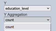
Y Aggregation
This determines the operation to be applied on the values of the field identified in “Y”. This works in conjunction with the “Y” property and is dependent on the option selected for it.
| Field | Input Type | Constraints | Default Value | Dependency |
|---|---|---|---|---|
| Y Aggregation | Select | One value can be selected. Available options depend on the data type of the selected “Y” field. |
“count” | “Y” property must first be set |
This property, where applicable, is usually required to be set to render the view. Usually numeric types are used for the Y axis.
If the Y field data type is numeric, the following options are additionally available:
- sum (sum of all values in a specific data group)
- average (simple average applied to all values in a specific data group)
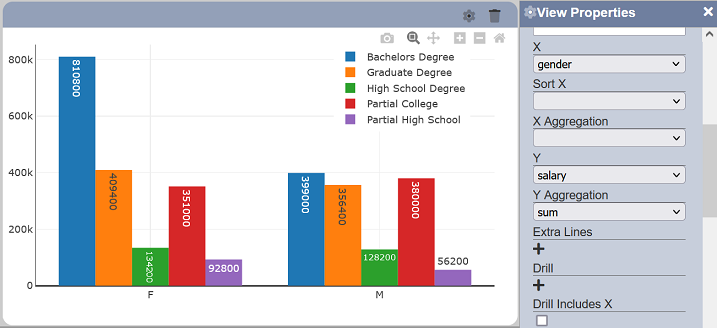
If the Y field data type is non-numeric, only “count” is additionally available. This counts the total number of records for the data group.
In some views, such as the scatter chart, selecting no value for this property is available to plot each data point on the view. It may affect loading times though, especially if there are numerous data points.