
Tooltip
The Tooltip filter control allows you to add a tooltip to a specific type of pins with a pre-defined text.

Visual Usage
Depends on the setting, the tooltip will appear when hovering over the pin.
Control Properties
Below are the fields for this filter control:
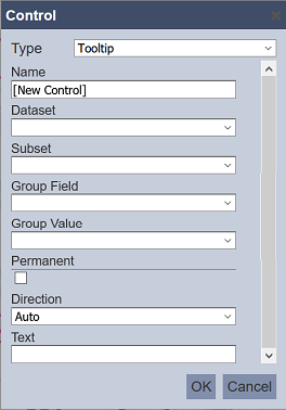
| Field | Description | Mandatory | Input Type | Constraints | Default Value |
|---|---|---|---|---|---|
| Type | Selects the type of filter control. | Y | Drop-down list | Select from drop-down list | “Pin Filter” |
| Name | Unique name of the filter control. | Y | Text field | Any text | “[New Control]” |
| Collapsible | Indicates if the control, if displayed on view mode, can be collapsed and expanded. This also acts as the “switch” to enable or disable the control. If collapsed, the control is disabled. If expanded, the control is applied. Selected options are retained when collapsing and expanding controls. |
Y | Checkbox | Enable or disable | Enabled |
| Visibility | Indicates if the control would be displayed on the explorer. Available options: - Always (always displays the control on the explorer, regardless of usage) - When Used (only displays the control on a page if at least one explorer on the same page is linked to it) - Hidden (won’t be displayed regardless of usage) |
Y | Drop-down list | Select from drop-down list | “When Used” |
| Dataset | Dataset to be used in the filter. | Y | Drop-down list | Select from drop-down list | None |
| Subset | Subset of the dataset selected. | Y | Drop-down list | Select from drop-down list The dataset must be selected first. |
None |
| Group Field | Field of the selected dataset to be filtered. | Y | Drop-down list | Select from drop-down list | None |
| Group Value | Value of the field selected in Group Field. | Y | Drop-down list | Select from drop-down list | None |
| Permanent | If selected, tooltip is always displayed on the pin. If not selected, tooltip will only appear when pin is not hovered over. |
Y | Checkbox | Enable or disable | Disabled |
| Direction | Defines the direction of the tooltip. Available options: - Auto - Right - Left - Top - Bottom - Center |
Y | Drop-down list | Select from drop-down list | “Auto” |
| Text | Defines the text to appear in the tooltip. | Y | Text field | Any text | None |