
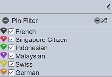
Pin Filter
The Pin filter control works just like the Checkbox filter control. The Pin filter control allows you to filter the Pin Icon filter controls that were being set up.
Do note that the Pin Icon filter controls have to be set up prior setting up this filter control, or else there will not be any options to select.
Viewer Usage
To select an option, simply select the checkboxes corresponding the value. Multiple options can be selected.
There are shortcut buttons that provide convenience in controlling the selected values.
Clicking on the “Deselect All” button deselects all the options.
Clicking on the “Invert Selection” button inverts the selected options. This means that all options that are selected become deselected. Likewise, all options that are deselected become selected.
Control Properties
Below are the fields for this filter control:
| Field | Description | Mandatory | Input Type | Constraints | Default Value |
|---|---|---|---|---|---|
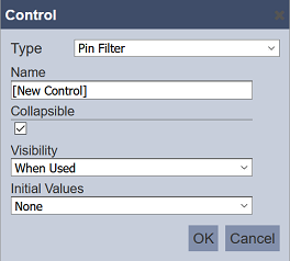
| Type | Selects the type of filter control. | Y | Drop-down list | Select from drop-down list | “Pin Filter” |
| Name | Unique name of the filter control. | Y | Text field | Any text | “[New Control]” |
| Collapsible | Indicates if the control, if displayed on view mode, can be collapsed and expanded. This also acts as the “switch” to enable or disable the control. If collapsed, the control is disabled. If expanded, the control is applied. Selected options are retained when collapsing and expanding controls. |
Y | Checkbox | Enable or disable | Enabled |
| Visibility | Indicates if the control would be displayed on the explorer. Available options: - Always (always displays the control on the explorer, regardless of usage) - When Used (only displays the control on a page if at least one explorer on the same page is linked to it) - Hidden (won’t be displayed regardless of usage) |
Y | Drop-down list | Select from drop-down list | “When Used” |
| Initial Values | Determines the initial set or selected values upon loading in the explorer. Available options are: - None - First - Last - All - Values |
Y | Drop-down list | Select from drop-down list | “None” |
The table below list all the available options for “Initial Values” field:
| Option | Description |
|---|---|
| None | All options are deselected. |
| First | Only the first displayed option is selected. |
| Last | Only the last displayed option is selected. |
| All | All of the options are selected. |
| Values | All comma-separated values entered in the field that appears below this property. Spaces are allowed before and after the comma. |