
Components And Component Editor
The Components panel and Components Editor panel together allows user to add or edit components for an item
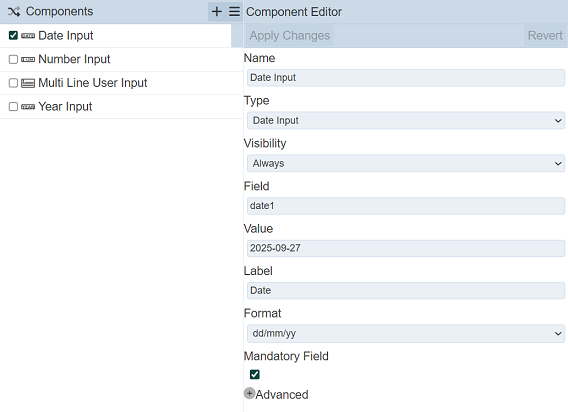
Components Panel
The Components panel contains of a top row and a lower panel that lists the components for the item.
The top row consists of several icons and the title of the panel.

| Icon | Description |
|---|---|
Invert Checkboxes  |
This icon when clicked reverse the selection of the components in the list. |
Add  |
Allows user to add a new component. |
More Actions  |
This icon when clicked, displays a list of available actions. If no component is selected, this icon will not appear. 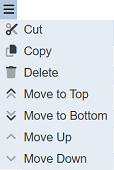 |
The “Undo” and “Redo” buttons in the top row of the Checklist Sections panel can be used to undo or redo actions done in the Components panel.
Component Editor
The Component Editor displays the meta data of the selected component in the Component panel.
The fields for the component are the same as those in the Wizard except for the additional “Visibility” field. This field allows user to hide or show the component.
| Option | Description |
|---|---|
| Always | When selected, the component will be displayed in the checklist at all times. |
| Can Submit | When selected, this component |
| Can Not Submit | When selected, |
| Submitted | When selected, this component will be displayed when submitted. |
| Not Submitted | When selected, this component will be displayed when not submitted. |
Add
A component can be added into the item either using the “+” icon.
Using Add Icon
To add a new component, click on the “+” icon in the top row. A “Add Component” dialog box will appear.
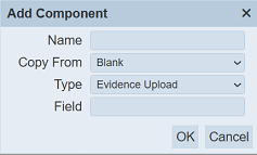
| Field | Description | Mandatory | Input Type | Constraints | Default Value |
|---|---|---|---|---|---|
| Name | Name assigned to the component. | Y | Text field | Any text. The value must not exist in the list of page names. The value is case-sensitive. |
Empty string |
| Copy From | Indicates what template the component would be based on. Selecting “Blank Page” results in using a blank canvass as a starting point while selecting an existing component would result in having the selected component as the starting template. |
Y | Drop-down list | One value can be selected. Options are: - “Blank Page” - Names of all components in the current item |
“Blank” |
| Type | Selects the type of component. | Y | Select | One value can be selected. Options are: <br.- Evidence Upload - button - Checkbox - Date Input - Number Input - Text - Multi-Select - Radio Button - Select - Multiple Line User Input - Single Line User Input - Year Input |
“Evidence Upload” |
| Field | Defines the field to hold data from this component. | Y | Text field | Any text. The value must not exist in the list of field names. The value is case-sensitive. |
Empty string |
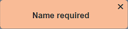
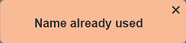
In the “Name” field, enter an unique name for the new component. If this field is left empty or the name already exist, the relevant error message will appear when attempt to sve the section.
In the “Copy From” field, select either “Blank” or any other existing components from the drop-down list.
Select the desired component type from the drop-down list in the “Type” field.
Provide an unique field name for the component in the “Field” field.
Click on the “OK” button to create the new component. Too abort, click on the “Cancel” button.
Edit
To edit a component, select the checkbox next to the desired component. The meta data of the component will appear in the Component Editor.
Edit desired in the Component Editor. Clik on the “Apply Changes” button to save the change or click on the “Revert” button to revert back to previous settings.
Delete
To delete a component, select the checkbox next to the desired component, click on the icon and select the “Delete” option. The selected component will be deleted from the Components panel.
Copy
To copy a component, select the checkbox next to the desired component, click on the icon and select the “Copy” option. The selected component will be added to clipboard.
Paste/Paste Before Selection
To paste a component, a component must be copied prior.
Click on the icon and select the “Paste” or “Paste Before Selection” option. The first option paste the copied component at the end of the list.
The second option pastes the copied component before the selected component in the panel, if there are more than two components in the panel. If there is only one component in the panel, the “Paste Before Selection” option will not appear.
Cut
To cut a component, select the checkbox next to the desired component, click on the icon and select the “Cut” option. This will remove the component from the list and add to clipboard.
User can use the “Paste” or “Paste Before Selection” to add the component that was cut.
Move To Top / Move To Bottom
These functions allows user to relocate one or multiple components either to the top or bottom of the list.
To do so, select the desired component or components, click on the icon and select the “Move To Top” to move the components(s) to the top of the list. To move to the bottom of the list, select the “Move To Bottom” option.
Move Up / Move Down
These function allows user to move a selected component up or down one level.
To do so, select the desired component, click on the icon and select the “Move Up” to move the component up one level in the list. To move the component down one level of the list, select the “Move Down” option.