Checklist Section Wizard
The Checklist Section Wizard allows user to setup the checklist section with ease. There are three different levels; namely the Basic, Intermediate and Advanced.
Basic
The Basic tab allows user to setup the type, style and label of the checklist item.
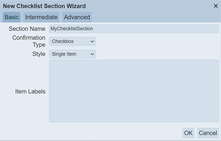
It has the following fields:
| Field | Description | Mandatory | Input Type | Constraints | Default Value |
|---|---|---|---|---|---|
| Section Name | Unique name assigned to the checklist iem. | Y | Text field | Any text (case-sensitive) | “MyChecklistSection” |
| Confirmation Type | Selects the type of selection. | Y | Select | One value can be selected. Options are: - Checkbox - Radio Button |
“Checkbox” |
| Style | Selects either single or multi select style. | Y | Select | One value can be selected. Options are: - Single Item - Multi Item |
“Single Item” |
| Item Labels | Defines the label or purpose (sentence) for the section. | N | Text field | Any text (case-sensitive) | Empty string |
Intermediate
The Intermediate tab allows user to setup common components for an item to be added to the checklist. More than one component can be selected.
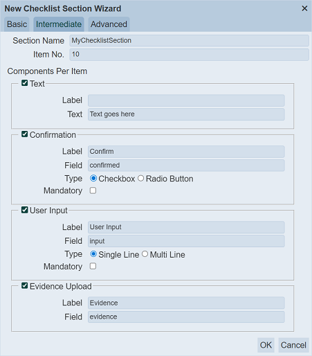
It has the following fields:
| Field | Description | Mandatory | Input Type | Constraints | Default Value |
|---|---|---|---|---|---|
| Section Name | Unique name assigned to the checklist iem. | Y | Text field | Any text (case-sensitive) | “MyChecklistSection” |
| Item No. | Defines the number of the components to add. | Y | Text field | Numeric | “10” |
| Components Per Item | |||||
| Text | If selected, places a text component in the item. | N | Checkbox | ||
| Label | Defines the label for the component. | N | Text field | Any text (case-sensitive) | Empty string |
| Text | Defines the text to be displayed for the component. | N | Text field | Any text (case-sensitive) | “Text goes here” |
| Confirmation | If selected, places a confirmation component in the item. | N | Checkbox | ||
| Label | Defines the label for the component. | N | Text field | Any text (case-sensitive) | “Confirm” |
| Text | Defines the text to be displayed for the component. | N | Text field | Any text (case-sensitive) | “confirmed” |
| Type | Selects either type of confirmation. | Y | Checkbox | One value can be selected. Options are: - Checkbox - Radio Button |
“Checkbox” |
| Mandatory | If selected, this component is made mandatory. | N | Checkbox | Not selected | |
| User Input | If selected, places a user input component in the item. | N | Checkbox | ||
| Label | Defines the label for the component. | N | Text field | Any text (case-sensitive) | USer Input“ | | Text | Defines the text to be displayed for the component. |N| Text field | Any text (case-sensitive) | ”Input“ | | Type | Selects either type of input. |Y| Checkbox | One value can be selected. Options are: - Single Line - Multi Line | ”Single Line“ | | Mandatory | If selected, this component is made mandatory. |N| Checkbox | | Not selected | | Evidence Upload | If selected, places a evidence upload component in the item. |N| Checkbox | | | | Label | Defines the label for the component. |N| Text field | Any text (case-sensitive) | ”Evidence“ | | Text | Defines the text to be displayed for the component. |N| Text field | Any text (case-sensitive) | ”evidence" |
Advanced
The Advanced tab allows user to setup any components for an item to be added to the checklist. More than one component can be selected.
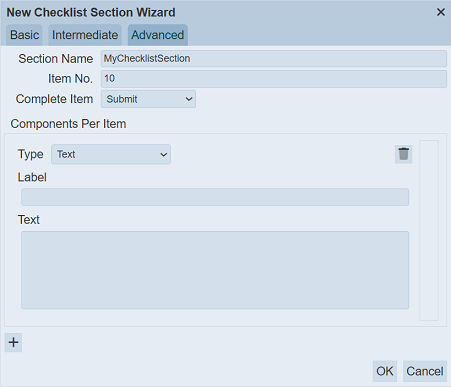
It has the following fields:
| Field | Description | Mandatory | Input Type | Constraints | Default Value |
|---|---|---|---|---|---|
| Section Name | Unique name assigned to the checklist iem. | Y | Text field | Any text (case-sensitive) | “MyChecklistSection” |
| Item No. | Defines the number of the components to add. | Y | Text field | Numeric | “10” |
| Complete Item | Selects the option to complete an item. | Y | Select | One value can be selected. Depending on the sections in the checklist, the list of options vary. | “None” |
| Components Per Item | |||||
| Type | Selects the type of component to be added in the item. | Y | Select | One value can be selected. Options are: - Evidence Upload - Button - Checkbox - Date Input - Number Input - Text - Multi Select - Radio Button - Select - Multi Line User Input - Single Line User Input - Year Input |
“Text” |
| Fields | The fields that appear after the “Type” field vary according to the type of component selected. | Y | Vary | Vary | Vary |
| “+” | Click on the “+” icon to add another item. | N | Icon | -- | -- |
Evidence Upload
The Evidence Upload component allows user to upload one or more items to the checklist.
It has the following fields:
| Field | Description | Mandatory | Input Type | Constraints | Default Value |
|---|---|---|---|---|---|
| Type | Selects “Evidence Upload” component to be added in the item. | Y | Select | “Evidence Upload” component selected | “Evidence Upload” |
| Field | Name of field that appear in the checklist designer page. | Y | Text field | Any text (case-sensitive) | Empty string |
| Label | Name that will appear in the checklist. | Y | Text field | Any text (case-sensitive) | Empty string |
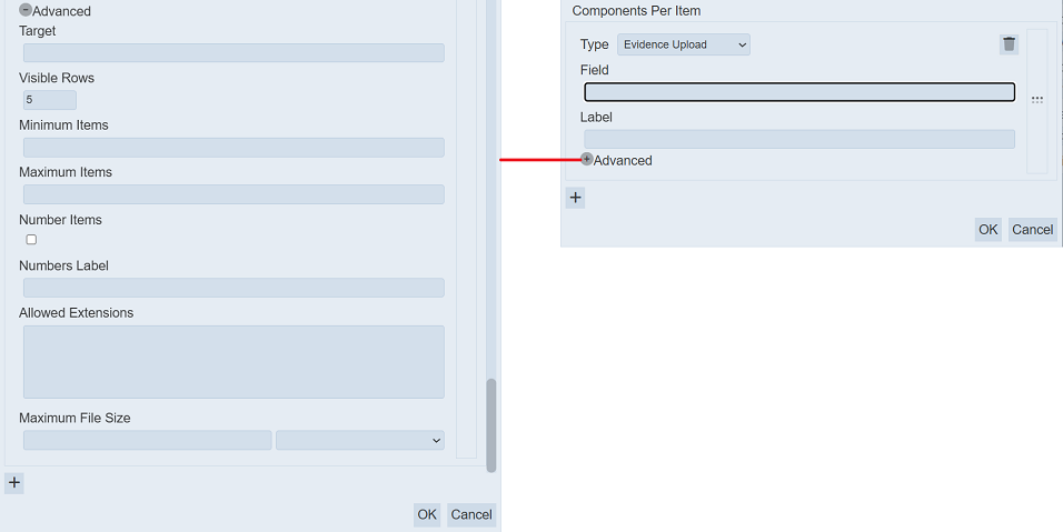
| Advanced | |||||
| Target | Location where the uploaded item will be saved. | Y | Text field | Any text (sensitive) | Empty string |
| Visible Rows | Number of rows for the component. | Y | Text field | Numeric. Minimum value is “2”. | “5” |
| Minimum Items | Minimum number of items that can be uploaded. | N | Text field | Numeric. | Blank |
| Maximum Items | Maximum number of items that can be uploaded. | N | Text field | Numeric. | Blank |
| Number Items | If selected, displays the number of the item uploaded. | N | Checkbox | -- | Not selected |
| Numbers Label | Name that will appear for the “Number Items” field if it is selected. | N | Text field | Any text (sensitive) | Empty string |
| Allowed Extensions | Lists the filename extension of the item that can be uploaded. | N | Text field | Any text (sensitive). More than one extension can be defined, each extension separated with a comma. | Empty string |
| Maximum File Size | Maximum file size of the items to be uploaded and its unit. | N | Text field Select |
Numeric One value can be selected. |
Empty string Not selected |
Button
The Button component allows user to add a button in the checklist.
It has the following fields:
| Field | Description | Mandatory | Input Type | Constraints | Default Value |
|---|---|---|---|---|---|
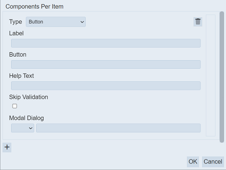
| Type | Selects “Button” component to be added in the item. | Y | Select | “Button” component selected | “Evidence Upload” |
| Label | Name that will appear in the checklist. | N | Text field | Any text (case-sensitive) | Empty string |
| Button | Name of button that will appear in the checklist. | N | Text field | Any text (case-sensitive) | Empty string |
| Help Text | Text that will appear below the component to aid user. | N | Text field | Any text (case-sensitive) | Empty string |
| Skip Validation | If selected, skips any validation. | N | Checkbox | -- | Not selected |
| Modal Dialog | Defines the nodal dialog box. Two fields are required: - Drop-down list - Textbox |
N | - Drop-down list - Text field |
- Select one option. - Any text (case-sensitive) |
- Not selected - Empty string |
Checkbox
The Checkbox component allows user to add checkboxes in the checklist.
It has the following fields:
| Field | Description | Mandatory | Input Type | Constraints | Default Value |
|---|---|---|---|---|---|
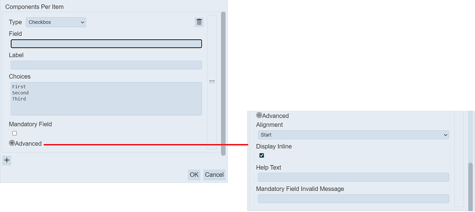
| Type | Selects “Checkbox” component to be added in the item. | Y | Select | “Checkbox” component selected | “Evidence Upload” |
| Field | Name of field that appear in the checklist designer page. | Y | Text field | Any text (case-sensitive) | Empty string |
| Label | Name that will appear in the checklist. | N | Text field | Any text (case-sensitive) | Empty string |
| Choices | Defines the names of the checkboxes that will appear in the checklist. Each value is separated with a comma. |
Y | Text field | Any text (case-sensitive) | “First” “Second” “Third” |
| Mandatory Field | If selected, one of the checkbox options must be selected in the checklist, making it a mandatory choice. | N | Checkbox | -- | Not selected |
| Advanced | |||||
| Alignment | Defines how the checkboxes are aligned in the checklist. | Y | Select | One value can be selected. Options are: - Start - Centre - End |
“Start” |
| Display Inline | If selected, displays the checkboxes in a row, else checkboxes are displayed in a column. | N | Checkbox | -- | Not selected |
| Help Text | Text that will appear below the component to aid user. | N | Text field | Any text (case-sensitive) | Empty string |
| Mandatory Field Invalid Message | Defines the message that will be displayed if no checkbox is selected and the “Mandatory” field is selected. | N | Text field | “Mandatory” field must be selected to display the message | Empty string |
Date Input
The Date Input component allows user to input date in the checklist.
It has the following fields:
| Field | Description | Mandatory | Input Type | Constraints | Default Value |
|---|---|---|---|---|---|
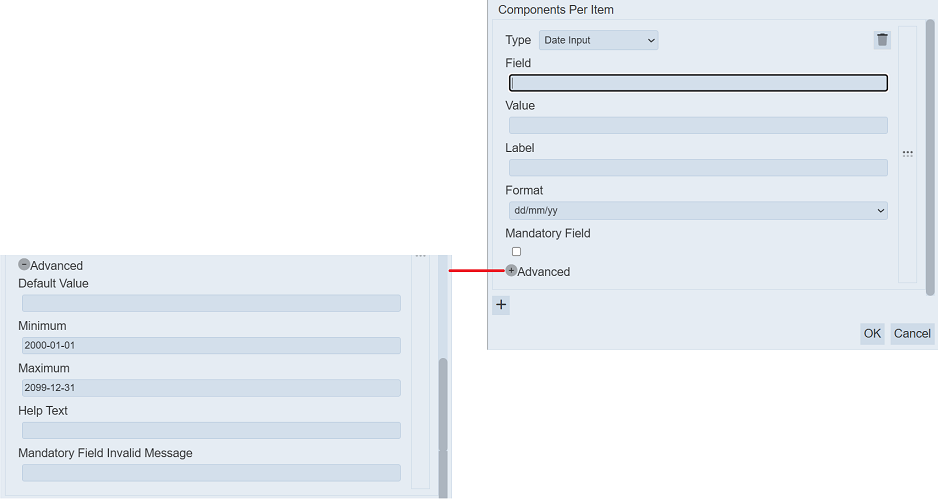
| Type | Selects “Date Input” component to be added in the item. | Y | Select | “Date Input” component selected | “Evidence Upload” |
| Field | Name of field that appear in the checklist designer page. | Y | Text field | Any text (case-sensitive) | Empty string |
| Value | The value that will appear in the checklist. | N | Text field | Any text (case-sensitive) | Empty string |
| Label | Name that will appear in the checklist. | N | Text field | Any text (case-sensitive) | Empty string |
| Format | Defines the format of the date that will appear in the checklist. | Y | Select | One value can be selected. - yy-mm-dd - dd/mm/yy - mm/dd/yy |
“dd/mm/yy” |
| Mandatory Field | If selected, a date must be entered in the checklist. | N | Checkbox | -- | Not selected |
| Advanced | |||||
| Alignment | Defines how the date is aligned in the checklist. | Y | Select | One value can be selected. Options are: - Start - Centre - End |
“Start” |
| Display Inline | If selected, displays the checkboxes in a row, else date is displayed in a column. | N | Checkbox | -- | Selected |
| Help Text | Text that will appear below the component to aid user. | N | Text field | Any text (case-sensitive) | Empty string |
| Mandatory Field Invalid Message | Defines the message that will be displayed if no date is entered and the “Mandatory” field is selected. | N | Text field | “Mandatory” field must be selected to display the message | Empty string |
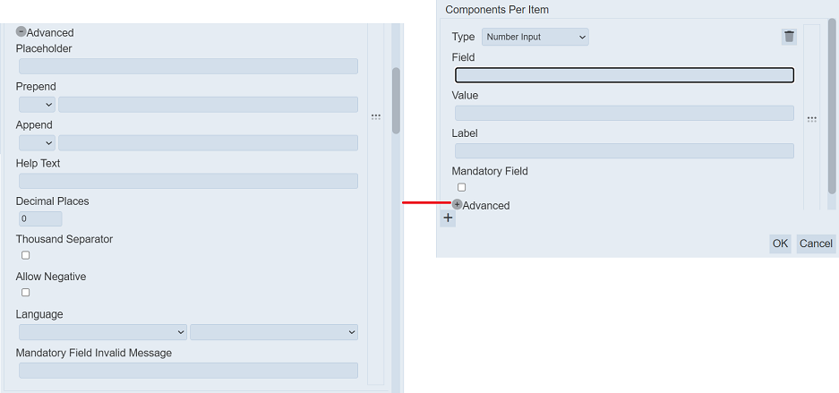
Number Input
The Number Input component allows user to input a numeric value in the checklist.
It has the following fields:
| Field | Description | Mandatory | Input Type | Constraints | Default Value |
|---|---|---|---|---|---|
| Type | Selects “Date Input” component to be added in the item. | Y | Select | “Date Input” component selected | “Evidence Upload” |
| Field | Name of field that appear in the checklist designer page. | Y | Text field | Any text (case-sensitive) | Empty string |
| Value | The default value that will appear in the checklist. | N | Text field | Any text (case-sensitive) | Empty string |
| Label | Name that will appear in the checklist. | N | Text field | Any text (case-sensitive) | Empty string |
| Format | Defines the format of the number that will appear in the checklist. | Y | Select | One value can be selected. - yy-mm-dd - dd/mm/yy - mm/dd/yy |
“dd/mm/yy” |
| Mandatory Field | If selected, a number must be entered in the checklist. | N | Checkbox | -- | Not selected |
| Advanced | |||||
| Placeholder | Defines the text (non-editable) that will appear in the “Value” field. | N | Text field | Any text (case-sensitive) The value defined in the “Value” field will take precedent over the value defined here. |
Empty string |
| Prepend | Defines the text or icon that will appear before the numeric value. | N | Text field and/or icon | Any text (case-sensitive) | Not selected |
| Append | Defines the text or icon that will appear after the numeric value. | N | Text field and/or icon | Any text (case-sensitive) | Not selected |
| Help Text | Text that will appear below the component to aid user. | N | Text field | Any text (case-sensitive) | Empty string |
| Decimal Places | Defines the number of decimal places allowed for the value. | Y | Text field | Numeric value from 0 to 20 | “0” |
| Thousand Separator | If selected, a comma will appear at the thousandth place. | N | Checkbox | -- | Not selected |
| Allow Negative | If selected, any negative value entered will trigger an error message. | N | Checkbox | -- | Not selected |
| Language | Defines the language used and its sub-type. | N | Select | One value can be selected in each drop-down list. If no language is selected, English is used by default. | Not selected |
| Mandatory Field Invalid Message | Defines the message that will be displayed if no value is entered and the “Mandatory” field is selected. | N | Text field | “Mandatory” field must be selected to display the message | Empty string |
Text
The Text component allows user to input text in the checklist.
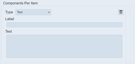
It has the following fields:
| Field | Description | Mandatory | Input Type | Constraints | Default Value |
|---|---|---|---|---|---|
| Type | Selects “Text” component to be added in the item. | Y | Select | “Text” component selected | “Evidence Upload” |
| Label | Name that will appear in the checklist. | N | Text field | Any text (case-sensitive) | Empty string |
| Text | Defines the default text that will appear in the checklist. | N | Text field | Any text (case-sensitive) | Empty string |
Multi-Select
The Multi-Select component allows user to place a scroll list that enable more than one options to be selected in the checklist.
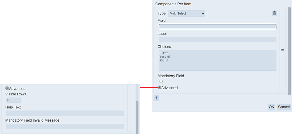
It has the following fields:
| Field | Description | Mandatory | Input Type | Constraints | Default Value |
|---|---|---|---|---|---|
| Type | Selects “Multi-Select” component to be added in the item. | Y | Select | “Multi-sSelect” component selected | “Evidence Upload” |
| Label | Name that will appear in the checklist. | N | Text field | Any text (case-sensitive) | Empty string |
| Choices | Defines the list of options that will appear in the checklist. | N | Text field | Each option is separated with a “CR” | “First” “Second” “Third” |
| Mandatory Field | If selected, at least one option must be selected in the checklist. | N | Checkbox | -- | Not selected |
| Advanced | |||||
| Visible Rows | Number of visible rows in the component. | Y | Select | Values from 2 to 50 | “5” |
| Help Text | Text that will appear below the component to aid user. | N | Text field | Any text (case-sensitive) | Empty string |
| Mandatory Field Invalid Message | Defines the message that will be displayed if no value is selected and the “Mandatory” field is selected. | N | Text field | “Mandatory” field must be selected to display the message | Empty string |
Below is an example of the Multi-Select component with seven options for select.
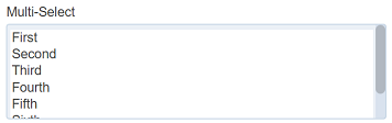
To select more than one option in the checklist, click on the “CTRL” key and select the desired options.
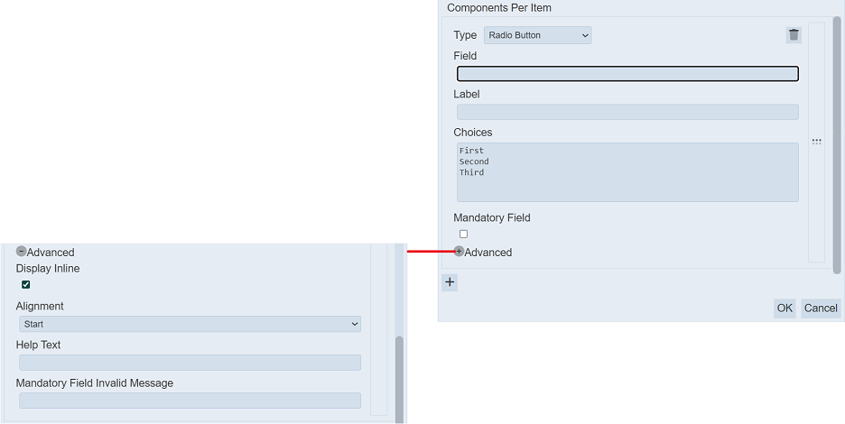
Radio Button
The Radio Button component allows user to radio buttons in the checklist.
It has the following fields:
| Field | Description | Mandatory | Input Type | Constraints | Default Value |
|---|---|---|---|---|---|
| Type | Selects “Radio Button” component to be added in the item. | Y | Select | “Radio Button” component selected | “Evidence Upload” |
| Label | Name that will appear in the checklist. | N | Text field | Any text (case-sensitive) | Empty string |
| Choices | Defines the list of radio buttons that will appear in the checklist. | N | Text field | Each option is separated with a “CR” | “First” “Second” “Third” |
| Mandatory Field | If selected, a radio button must be selected in the multi-select in the checklist. | N | Checkbox | -- | Not selected |
| Advanced | |||||
| Alignment | Defines how the radio buttons are aligned in the checklist. | Y | Select | One value can be selected. | “Start” |
| Display Inline | If selected, displays the radio buttons in a row, else radio buttons are displayed in a column. | N | Checkbox | -- | Selected |
| Help Text | Text that will appear below the component to aid user. | N | Text field | Any text (case-sensitive) | Empty string |
| Mandatory Field Invalid Message | Defines the message that will be displayed if no option is selected and the “Mandatory” field is selected. | N | Text field | “Mandatory” field must be selected to display the message | Empty string |
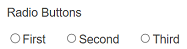
Below is an example of three radio buttons displayed inline in the cehcklist.
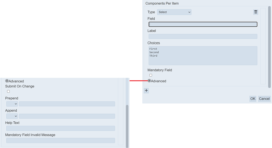
Select
The Select component allows user to place a drop-down list for selection in the checklist.
It has the following fields:
| Field | Description | Mandatory | Input Type | Constraints | Default Value |
|---|---|---|---|---|---|
| Type | Selects “Select” component to be added in the item. | Y | Select | “sSelect” component selected | “Evidence Upload” |
| Label | Name that will appear in the checklist. | N | Text field | Any text (case-sensitive) | Empty string |
| Choices | Defines the list of options that will appear in the checklist. | N | Text field | Each option is separated with a “CR” | “First” “Second” “Third” |
| Mandatory Field | If selected, an option must be selected in the checklist. | N | Checkbox | -- | Not selected |
| Advanced | |||||
| Submit On Change | If selected, any change in the option select will be submitted immediately. | Y | Checkbox | -- | Not selected |
| Prepend | Defines the text or icon that will appear before the list. | N | Text field and/or icon | Any text (case-sensitive) | Not selected |
| Append | Defines the text or icon that will appear after the list. | N | Text field and/or icon | Any text (case-sensitive) | Not selected |
| Help Text | Text that will appear below the component to aid user. | N | Text field | Any text (case-sensitive) | Empty string |
| Mandatory Field Invalid Message | Defines the message that will be displayed if no option is selected and the “Mandatory” field is selected. | N | Text field | “Mandatory” field must be selected to display the message | Empty string |
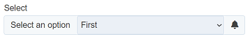
Below is an example of the Select component with three options for select with a prepend and an append.
Multi Line User Input
The Multi Line User Input component allows user to place a multi-line textbox in the checklist.
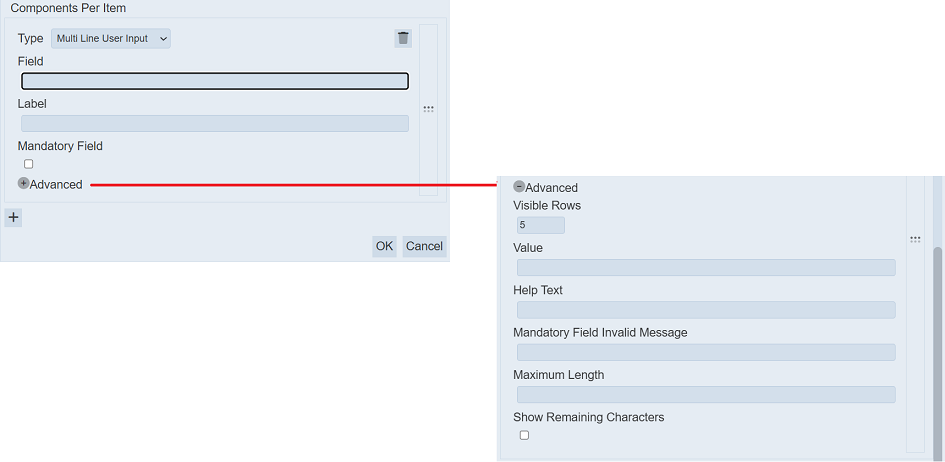
It has the following fields:
| Field | Description | Mandatory | Input Type | Constraints | Default Value |
|---|---|---|---|---|---|
| Type | Selects “Multi Line User Input” component to be added in the item. | Y | Select | “Multi Line User Input” component selected | “Evidence Upload” |
| Field | Name of field that appear in the checklist designer page. | Y | Text field | Any text (case-sensitive) | Empty string |
| Label | Name that will appear in the checklist. | N | Text field | Any text (case-sensitive) | Empty string |
| Mandatory Field | If selected, text must be entered in the component. | N | Checkbox | -- | Not selected |
| Advanced | |||||
| Visible Rows | Number of visible rows in the component. | Y | Select | Values from 2 to 50 | “5” |
| Value | Default text that will appear in the checklist. | N | Text field | Any text (case-sensitive) | Empty string |
| Help Text | Text that will appear below the component to aid user. | N | Text field | Any text (case-sensitive) | Empty string |
| Mandatory Field Invalid Message | Defines the message that will be displayed if no option is selected and the “Mandatory” field is selected. | N | Text field | “Mandatory” field must be selected to display the message | Empty string |
| Maximum Length | Maximum number of character allowed. | N | Text field | Numeric | Empty string |
| Show Remaining Characters | If selected, displays the number of character remaining. | N | Checkbox | -- | Not selected |
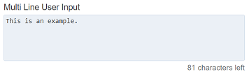
In the example below, the Multi Line User Input component with predefined text and remaining character displayed below it.
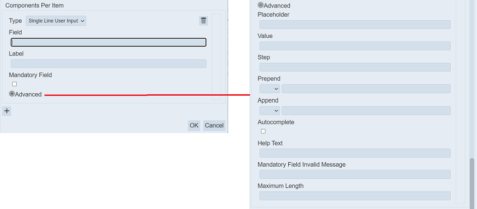
Single Line User Input
The Single Line User Input component allows user to place a one-line textbox in the checklist.
It has the following fields:
| Field | Description | Mandatory | Input Type | Constraints | Default Value |
|---|---|---|---|---|---|
| Type | Selects “Single Line User Input” component to be added in the item. | Y | Select | “Single Line User Input” component selected | “Evidence Upload” |
| Field | Name of field that appear in the checklist designer page. | Y | Text field | Any text (case-sensitive) | Empty string |
| Label | Name that will appear in the checklist. | N | Text field | Any text (case-sensitive) | Empty string |
| Mandatory Field | If selected, text must be entered in the component. | N | Checkbox | -- | Not selected |
| Advanced | |||||
| Placeholder | Number of visible rows in the component. | Y | Select | Values from 2 to 50 | “5” |
| Value | Default text that will appear in the component. | N | Text field | Any text (case-sensitive) | Empty string |
| Step | Defines the step value for input type such as date, tome and number. | N | Text field | Any text (case-sensitive) | Empty string |
| Prepend | Defines the text or icon that will appear before the list. | N | Text field and/or icon | Any text (case-sensitive) | Not selected |
| Append | Defines the text or icon that will appear after the list. | N | Text field and/or icon | Any text (case-sensitive) | Not selected |
| Help Text | Text that will appear below the component to aid user. | N | Text field | Any text (case-sensitive) | Empty string |
| Mandatory Field Invalid Message | Defines the message that will be displayed if no option is selected and the “Mandatory” field is selected. | N | Text field | “Mandatory” field must be selected to display the message | Empty string |
| Maximum Length | Maximum number of character allowed. | N | Text field | Numeric | Empty string |
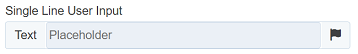
In the example below, the Single Line User Input component with a placeholder in the background, predefined text.
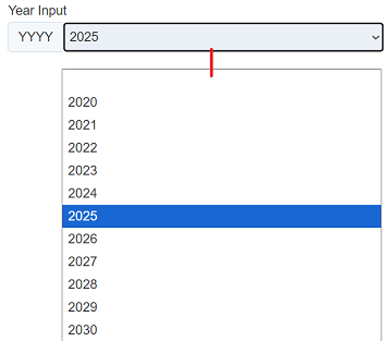
Year Input
The Year Input component allows user to place year drop-down selection in the checklist.
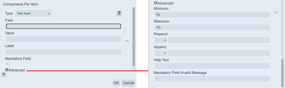
It has the following fields:
| Field | Description | Mandatory | Input Type | Constraints | Default Value |
|---|---|---|---|---|---|
| Type | Selects “Year Input” component to be added in the item. | Y | Select | “Year Input” component selected | “Evidence Upload” |
| Field | Name of field that appear in the checklist designer page. | Y | Text field | Any text (case-sensitive) | Empty string |
| Value | Default value that will appear in the component. | N | Text field | Any text (case-sensitive) | Empty string |
| Label | Name that will appear in the checklist. | N | Text field | Any text (case-sensitive) | Empty string |
| Mandatory Field | If selected, text must be entered in the component. | N | Checkbox | -- | Not selected |
| Advanced | |||||
| Minimum | Number of year from current year. | Y | Text field | -- | “-5y” |
| Maximum | Number of year after current year. | Y | Text field | -- | “+5y” |
| Prepend | Defines the text or icon that will appear before the list. | N | Text field and/or icon | Any text (case-sensitive) | Not selected |
| Append | Defines the text or icon that will appear after the list. | N | Text field and/or icon | Any text (case-sensitive) | Not selected |
| Help Text | Text that will appear below the component to aid user. | N | Text field | Any text (case-sensitive) | Empty string |
| Mandatory Field Invalid Message | Defines the message that will be displayed if no option is selected and the “Mandatory” field is selected. | N | Text field | “Mandatory” field must be selected to display the message | Empty string |
Below is an example of the Year Input with a +/-5-year range with the current year as default.