
Multiple Axes or Combination Charts
The  Multiple Axes or Combination Charts element is an advanced version of the Chart element. It allows multiple charts to be displayed in a single chart. This element creates a combination chart or chart with multiple axes. Area, column and line charts can be combined.
Add
To add such a chart in the report, select the “Multiple Axes or Combination Charts” button and click on the location where you wish to place the chart. A “Composite Chart Wizard” will appear.
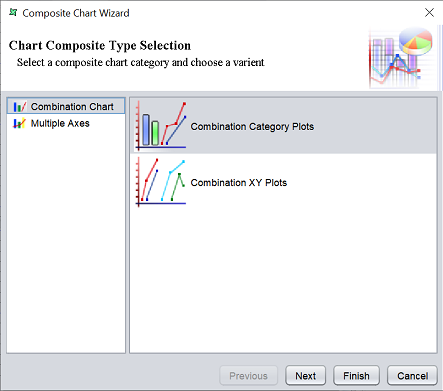
There are two types of composite charts and their options:
| Field | Description |
|---|---|
| Combination Chart | Selects the combination of difference charts. Available options: - Combination Category Plots - Allows the display of of two or more Area, Column and Line Charts together side by side - Combination XY Plots - Allows the combination of multiple XY plots |
| Multiple Axes | Selects the display of two or more Area, Column and Line Charts together by overlapping each other while sharing either X- or Y-axis. When one axis is shared, the other axis will have additional axis depending on the number of charts in the Composite Chart. When the X-axis is shared, the location will be either right or left. If the Y-axis is shared, the location will be either top or bottom. Available options: - Category Plot with Multiple Axes - XY Plot with Multiple Axis - |
Select the desired composite chart type and option. Click on the “Next” button to continue.
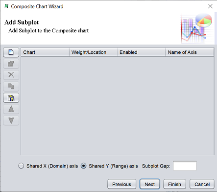
The next page allows you to add a subplot to the composite chart. The creation of each subplot is similar to the process o creating a convention Chart element. The only difference is that the process is more simplified with fewer chart types.
Click on the “Add” button on the left. A “Chart Wizard” will appear.
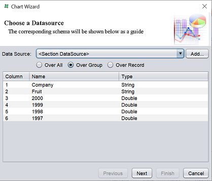
Select the desired datasource from the “Data Soruce” field and the range of records from three radio buttons below. The table below is not selectable. Click on the “Next” button to continue.
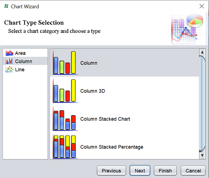
Select the type of chart and click on the “Next” button.
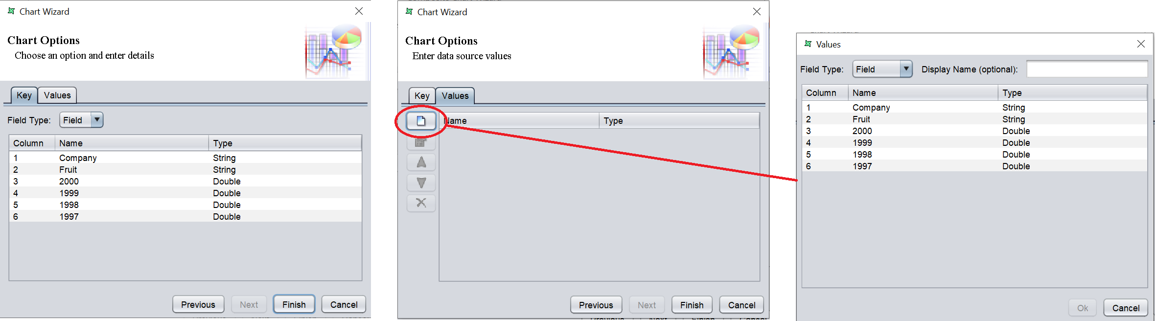
The “Key” tab allows you to define the key for the chart, which defines the X-axis. The “Values” tab allows you to define the values to be used in the chart, which defines the Y-axis.
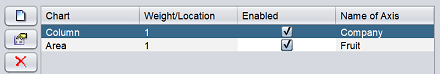
Select as desired and click on the “Finish” button to add the subplot. Once the subplot is added, it will appear in the table. One subplot creates one chart. To create two charts, add another subplot.
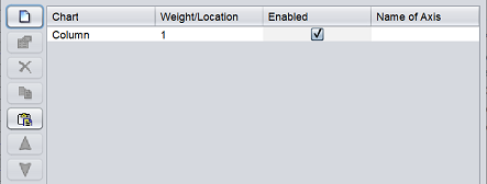
Since this is a multichart, it may be advisable to provide a name for the X-axis. To do so, click on the textbox under the “Name of Axis” column. Key in the desired name.
Select either to share the X or Y axis by selecting appropriate radio button. Click on the “Next” button to continue.
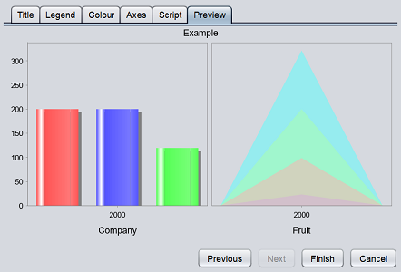
The last page allows you to select the title for the chart.
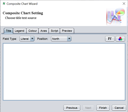
Key in the appropriate title in the textbox and setup the title as required in the other tabs. You can preview the composite chart in the “Preview” tab before clicking on the “Finish” button.
Edit
To edit the multichart in the report template, double-click on the MultiChart element. The “Composite Chart Wizard” will appear, which is identical to the wizard when adding a MultiChart element. Except that first page (which allows you to choose the composite type) is disabled.