
Report Wizard
The Report Designer assist you to create a report template for generate reports using the datasource in the repository via a ReportWizard. The ReportWizard provides a guide for the user to create a RML report template.
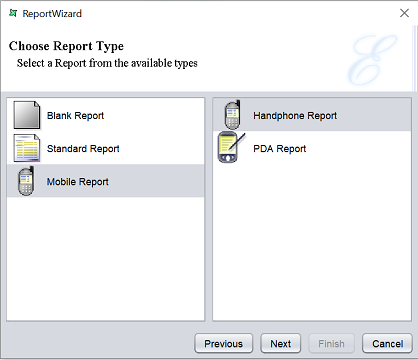
There are three types of report that can be created from the ReportWizard:
- Blank Report
- Standard Report
- Mobile Report
The following sections describes the common pages for the ReportWizard and the pages for the different types of report.
Common Pages
The first two pages in the ReportWizard are common to all types of report.
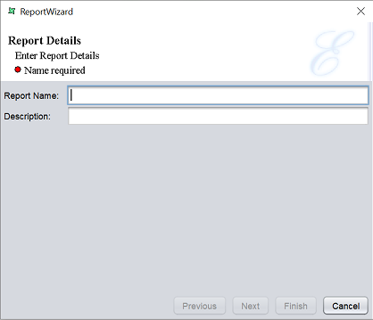
The first page requires the user to enter the name and a brief description of the report.
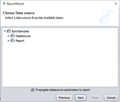
The second page of the wizard requires the user to select a datasource for the report.
The third page requires the user to select the type of report and its options.
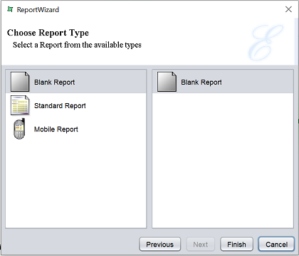
There are three types of report:
- Blank Report
- Standard Report
- Mobile Report
Blank Report
If the “Blank Report” type is selected, there is only one option.
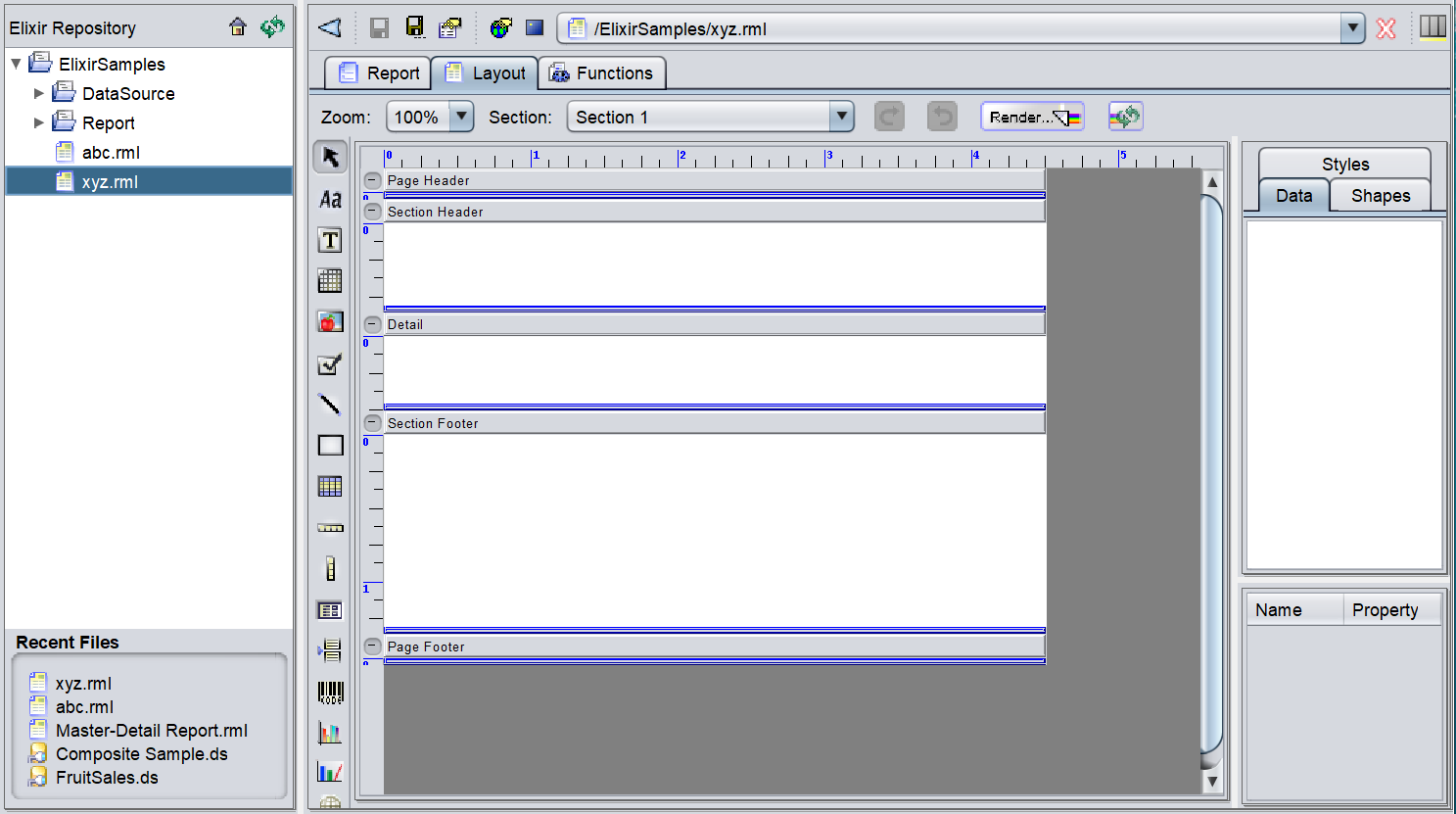
Click on the “Finish” button to complete the creation of the new report template.
The blank report is opened on the workspace after creation.
Standard Report
The Standard Report has three options:
- Tabular Report
- Columnar Report
- Mailing Labels
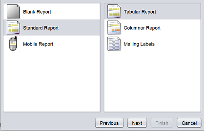
Each option creates a different type of report format. By default, “Tabular Report” is selected. Select either one option and click on the “Next” button to continue.
Tabular/Columnar Report
A tabular report is a basic report that displays the columns and values according to the order that it is created. A columnar report is similar to a tabular report, except that it allows elements to be grouped.
To create a tabular/columnar report, select “Tabular Report” option (default) or “Columnar Report)” repsectively and click on the “Next” button to continue. In the next page, all the available fields in the datasource will appear in the Datasource panel on the left.
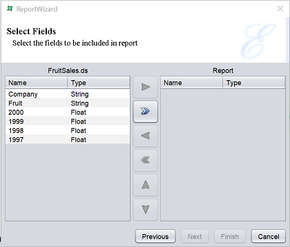
In this example, it is labelled as FruitSales.ds. The Report panel on the right is empty by default. This panel should includes all the fields required for the report. In the middle are action icons. These icons allows you to move the fields to and fro from the left panel to the right panel. By default, only the  “Move All” icon is enabled.
| Action | Description |
|---|---|
 Move Right Move Right |
Moves the selected field from the datasource panel to the report panel. |
| Move All |
Moves all fields from the datasource panel to the report panel. |
 Move Left Move Left |
Moves the selected field from the report panel to the datasource panel. |
 Move All Move All |
Moves all fields from the report panel to the datasource panel. |
 Move Up Move Up |
Moves the selected field from the report panel up from its current position. |
 Move Down Move Down |
Moves the selected field from the report panel down from its current position. |
If all fields are to be used for the report, click on the icon to include all the fields. Or you can select each individual field one by one by selecting the field and click on the icon.
The selected fields will appear on the “Report” panel. The order of the fields can be changed by selecting the desired field and click on the or icon to move its position up or down. You can also remove a field by selecting it and click on the icon.
Tabular Report
After all has been set up, click on the “Finish” button to complete the report template creation. Or click on the “Previous” button to go back to the previous pages.
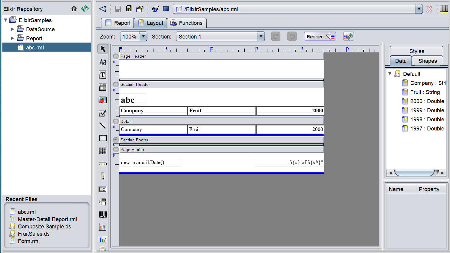
Upon creating the report template, the a new RML report will be added into the repository in the location specified earlier and opened in the workspace.
Columnar Report
After all the desired columns are added and ordered, click on the “Next” button to continue.
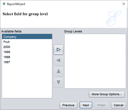
This page allows you to set the group levels.
To select a field for grouping, select the desired field from the “Available fields” panel and click on the “Move Right” button to move it to the “Group Levels” panel. More than one field can be added. You can re-arrange the order of the fields by clicking on the “Move Up” or “Move Down” button. To remove a field from the “Group Levels” panel, select the desired field and click on the “Move Left” button to move it back to the “Available fields” panel.
You can further define the grouping by clicking on the “More Group Options…” button below the “Group Levels” panel. A “Grouping and Sorting Properties Level” dialog box will appear.
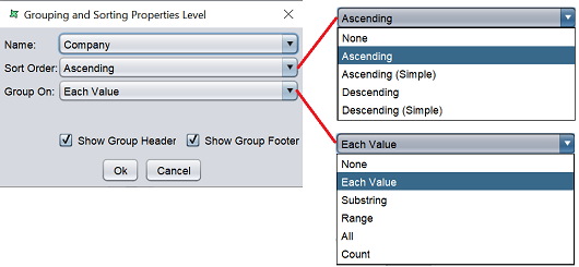
Select the desired field to group or sort in the “Name” field and select the desired sort order and grouping method from the drop-down list in the “Sort Order” and “Group On” fields. By default the “Show Group Header” and “Show Group Footer” fields are selected to display the header and footer of the group in the report respectively.
Click on the “Next” button once all the settings are completed.
The next page allows you to define how the fields (except fields selected for grouping) are to be sorted.
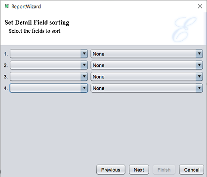
Select the field from the first drop-down list, then select the desired sorting method from the drop-down list next to it. By default, “None” is selected. Setup the fields as desired and click on the “Next” button to continue. Do note that this setup is optional. If you do not wish to sort the fields, simply click on the “Next” button.
In this page, you can setup the layout and the orientation of the columnar report.
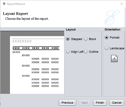
The left panel displays a sample of the layout that is currently selected. You can select the different layout options and the left panel will show you how the report will look like.
| Options | Description |
|---|---|
| Layout | |
| Stepped | This layout is the default. In this layout, grouped fields are arranged in indented steps and the rest of the fields are arranged in a sequence. 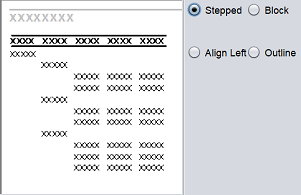 |
| Block | This layout displays data that has been grouped or sorted in vertical columns. 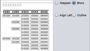 |
| Align Left | This layout displays all data being aligned to the left of the table. Grouped columns are displayed one below the other and sorted columns are arranged vertically as in a table. 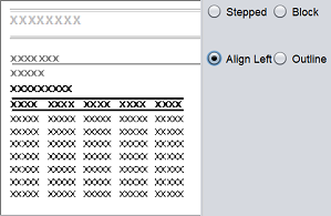 |
| Outline | This layout is similar to stepped report except that there is outlining and highlighting of group sections. 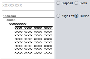 |
| Orientation | |
| Portrait | Displays the report in the vertical layout .  |
| Landscape | Displays the report in a horizontal layout.  |
Select the desired options and click on the “Finish” button to complete the columnar report.
Upon creating the report template, the a new RML report will be added into the repository in the location specified earlier and opened in the workspace.
Mailing Report
This report allows you to create a report in the form of mailing labels.
To create a mailing label report, select “Mailing Labels” option and click on the “Next” button to continue. In the next page, all the available fields in the datasource will appear in the Datasource panel on the left.
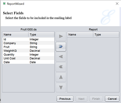
In this example, it is labelled as Fruit1000.ds. The Report panel on the right is empty by default. This panel should includes all the fields required for the report. In the middle are action icons. These icons allows you to move the fields to and fro from the left panel to the right panel. By default, only the “Move All” icon is enabled.
| Action | Description |
|---|---|
| Move Right |
Moves the selected field from the datasource panel to the report panel. |
| Move All |
Moves all fields from the datasource panel to the report panel. |
| Move Left |
Moves the selected field from the report panel to the datasource panel. |
| Move All |
Moves all fields from the report panel to the datasource panel. |
| Move Up |
Moves the selected field from the report panel up from its current position. |
| Move Down |
Moves the selected field from the report panel down from its current position. |
If all fields are to be used for the report, click on the icon to include all the fields. Or you can select each individual field one by one by selecting the field and click on the icon.
The selected fields will appear on the “Report” panel. The order of the fields can be changed by selecting the desired field and click on the or icon to move its position up or down. You can also remove a field by selecting it and click on the icon.
After all has been set up, click on the “Next” button to continue. Or click on the “Previous” button to go back to the previous pages.
In the next page, you can setup the type of label and its layout setting.
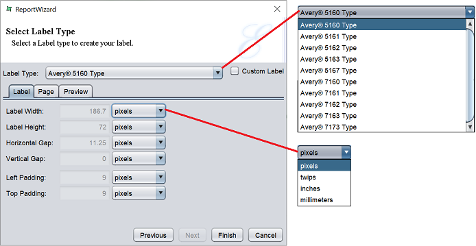
Select the desired type from the drop-down list in the “Label Type” field. By default, “Avery 5161 Type” is selected.
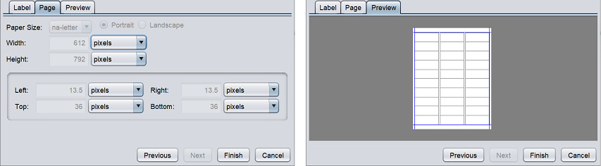
The three tabs below the “Label Type” field shows the default label settings, page settings and the preview of the selected label type. The “Label” tab displays the dimensions of the label. You can choose to view dimension in different units using the drop-down list. The “Page” tab displays the page layout dimensions and the margins. You can view the mailing label layout in the “Preview” tab. Do note that all settings are not editable.
If none of the label type is desired, you can select the “Custom Label” field.
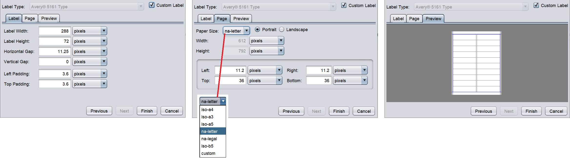
Once “Custom Label” is selected, the settings in the “Label” ad “Page” tabs will be editable. You can define the size, gap and padding of the label in the “Label” tab. The page size, orientation and margin of the page can be defined in the “Page” tab. After all settings are defined, you can view the layout of the mailing label in the “Preview” tab.
Lastly, click on the “Finish” button to complete the report. Or click on the “Previous” button to go back to the previous pages.
Upon creating the report template, the a new RML report will be added into the repository in the location specified earlier and opened in the workspace.
Mobile Report
The Mobile Report has two options:
- Handphone Report
- PDA Report
Each option creates a different type of report format. By default, “Handphone Report” is selected. Select either one option and click on the “Next” button to continue.
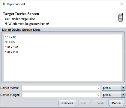
Handphone/PDA Report
This report allows you to create a report that targets the screen size the handphones and PDAs.
When the “Handphone Report” option is selected, the next page allows you to select the screen size for handphones.
When the “PDA Report” option is selected, the next page allows you to select the screen size for PDAs.
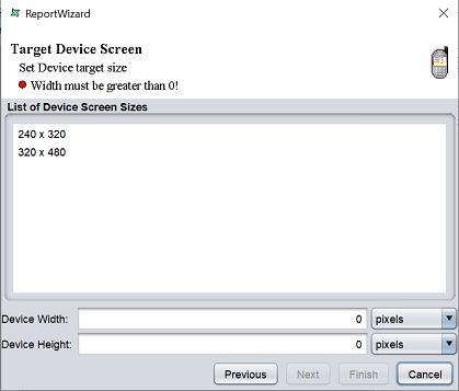
By default, none is selected. Select the desired screen size from the “List of Device Screen Sizes” field and the device width and height will be displayed in the “Device Width” and “Device Height” fields below. The width and height can be edited. By default, the width and height are shown in pixels. You can choose a different unit by selecting the desired unit from the drop-down list.
Click on the “Next” button to continue.
The next few pages in the wizard are similar to that of the “Columnar Report”. See Tabluar/Coulmnar Report.