
Others
Others include components such as button, HTML template, image, text, etc.
To add a Others component, simply drag and drop under the desired level. The Others component will be displayed in the template/page itself along with their default settings. The properties for each others component varies.
In the sections below, the Template Designer is used as example, all values of “Id” field has the prefix tm-.
Button
A Button component allows you to add a button to navigate to CMS page or external link.
It has the following properties.
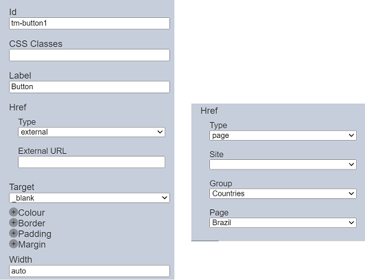
| Field | Description | Default |
|---|---|---|
| Id | Name of the Button that will be displayed in the tree structure. | “tm-buttonX” |
| Label | Name of the Button to be displayed in the template/page. | “Button” |
| CSS Classes | Defines the CSS classes. | None |
| Href | ||
| Type | Selects the type of reference, either external URL or another page in CMS. Depending on the selection, the fields below may vary. |
“external” |
| External URL | Defines the URL of external link. | Blank |
| Site | Selects the site of the page from the drop-down list. | Not selected |
| Group | Selects the group of the page from the drop-down list. The list will depends on the site selected. |
First item in the list |
| Page | Selects the page from the drop-down list. The list will depends on the group selected. |
First item in the list |
| Target | Selects how the selected referenced page/URL is to be displayed. Available option: - “_blank” - display the page/URL in a new tab - “_self” - display the page/URL in the same tab |
“_blank” |
| Width | Width of the button. By default the entire width of the device is used. |
“auto” |
| Common properties | Common properties. - Colour - Border - Padding - Margin See Common Properties for more details. |
Vary |
HTML Template
The HTML Template allows you to add a HTML text, either using HTML editor or derive from a dataset.
It has the following properties.
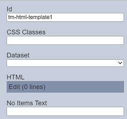
| Field | Description | Default |
|---|---|---|
| Id | Name of the HTML Template that will be displayed in the tree structure. | “tm-html-templateX” |
| CSS Classes | Defines the CSS classes. | None |
| Dataset | Selects the dataset to derive the HTML text from the drop-down list. | Not selected |
| HTML | Defines the HTML code that displays the desired text. | HTML editor |
| No Items Text | Defines the error messae to display when no item is found if dataset is selected. | Blank |
When neither the “Dataset” and “HTML” are defined, the default text that will appear in the template will be No HTML Template found.
If the “HTML” field is defined (using the HTML editor), the template/page will display the text defined in the HTML editor. If a dataset is selected in the “Dataset” field and the item cannot be found, the default error message No Items Available will be displayed. This text can be changed using the “No Items Text” field.
Hyperlink
Allows you to add a hyperlink to navigate to CMS site page or external link. It works like the Button component.
It has the following properties.
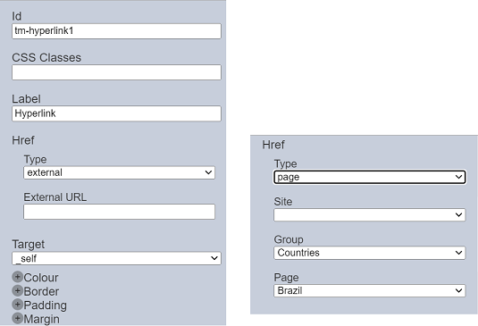
| Field | Description | Default |
|---|---|---|
| Id | Name of the Hyperlink that will be displayed in the tree structure. | “tm-hyperlinkX” |
| CSS Classes | Defines the CSS classes. | None |
| Label | Name of the Hyperlink to be displayed in the template/page. | “Hyperlink” |
| Href | ||
| Type | Selects the type of reference, either external URL or another page in CMS. Depending on the selection, the fields below may vary. |
“external” |
| External URL | Defines the URL of external link. | Blank |
| Site | Selects the site of the page from the drop-down list. | Not selected |
| Group | Selects the group of the page from the drop-down list. The list will depends on the site selected. |
First item in the list |
| Page | Selects the page from the drop-down list. The list will depends on the group selected. |
First item in the list |
| Target | Selects how the selected referenced page/URL is to be displayed. Available option: - “_blank” - display the page/URL in a new tab - “_self” - display the page/URL in the same tab |
“_blank” |
| Width | Width of the button. By default the entire width of the device is used. |
“auto” |
| Common properties | Common properties. - Colour - Border - Padding - Margin See Common Properties for more details. |
Vary |
IFrame
The IFrame component allows you to embed another HTML document into the template/page.
It has the following properties.
| Field | Description | Default |
|---|---|---|
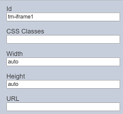
| Id | Name of the IFrame that will be displayed in the tree structure. | “tm-iframeX” |
| CSS Classes | Defines the CSS classes. | None |
| Width | Width of the IFrame in the template/page. By default the entire width of the device is used. |
“auto” |
| Height | Height of the IFrame in the template/page. By default the entire height of the device is used. |
“auto” |
| URL | Link to the embed document. | Blank |
Image
The Image component allows you to add a placeholder to load an image.
It has the following properties.
| Field | Description | Default |
|---|---|---|
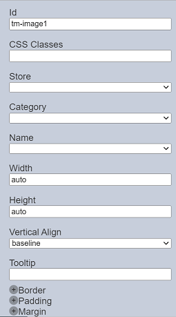
| Id | Name of the Image that will be displayed in the tree structure. | “tm-imageX” |
| CSS Classes | Defines the CSS classes. | None |
| Store | Selects which binary store to select the image from the drop-down list. | None |
| Category | Selects which category to select the image from the drop-down list. | None |
| Name | Select the image to be displayed from the drop-down list. | None |
| Width | Width of the image in the template/page. By default the entire width of the device is used. |
“auto” |
| Height | Height of the image in the template/page. By default the entire height of the device is used. |
“auto” |
| Vertical Align | Vertical alignment of the text. Available options: - baseline - center - flex-start - flex-end - stretch |
“baseline” |
| Tooltip | Defines the text to display when hover over the image. | None |
| Common properties | Common properties. - Border - Padding - Margin See Common Properties for more details. |
Vary |
New Line
The New Line component allows you to a new line.
It has the following properties.
| Field | Description | Default |
|---|---|---|
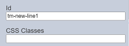
| Id | Name of the New Line that will be displayed in the tree structure. | “tm-new-lineX” |
| CSS Classes | Defines the CSS classes. | None |
Text
The Text component allows you to add text content.
It has the following properties.
| Field | Description | Default |
|---|---|---|
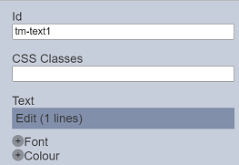
| Id | Name of the Text that will be displayed in the tree structure. | “tm-textX” |
| CSS Classes | Defines the CSS classes. | None |
| Text | Defines the text to be displayed using the text editor. | Blank |
| Common properties | Common properties. - Font - Colour See Common Properties for more details. |
Vary |
Text Image
The Text Image component allows you to add an image and text component allowing different ways to layout the text and image together
It has the following properties.
| Field | Description | Default |
|---|---|---|
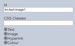
| Id | Name of the Text Image that will be displayed in the tree structure. | “tm-text-imageX” |
| CSS Classes | Defines the CSS classes. | None |
| Text | Defines the text to be displayed, along with its style and alignment. Click on the “+” icon to see more properties. See Text component properties for more details. |
Various settings |
| Image | Defines the image to be displayed, along with its size and alignment. Click on the “+” icon to see more properties. See Image component properties for more details. |
Various settings |
| Hyperlink | ||
| Type | Selects the type of reference, either external URL or another page in CMS. Depending on the selection, the fields below may vary. |
“external” |
| External URL | Defines the URL of external link. | Blank |
| Target | Selects how the selected referenced page/URL is to be displayed. Available option: - “_blank” - display the page/URL in a new tab - “_self” - display the page/URL in the same tab |
“_blank” |
| Common properties | Common properties. - Colour See Common Properties for more details. |
Vary |