
Common Properties
Each component has their own unique properties as well as common properties.
This section details the common properties used by the Blocks, Menu and Others components. These properties are by default are hidden or collapsed, showing only the title of the properties. To access the properties, click on the “+” icon on the left of the property to expand them.
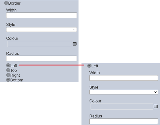
Border
The “Border” properties allow you to set the borders of the template/page.
It has the following properties.
| Field | Description | Default |
|---|---|---|
| Width | Width of the border. | None |
| Style | Selects the style of the border. Available options: - blank - none - solid - hidden - dotted - dashed - double |
None |
| Colour | Selects the colour of the boarder via the colour picker. | “transparent” |
| Radius | Defines the radius of the corners of the border. | None |
| Left | Defines the left side of the border with the same “Width”, “Style” “Colour” and “Radius” properties. If undefined, the values defined above will be used. |
None |
| Top | Defines the top side of the border with the same properties as “Left”. If undefined, the values defined above will be used. |
None |
| Right | Defines the right side of the border with the same properties as “Left”. If undefined, the values defined above will be used. |
None |
| Bottom | Defines the bottom side of the border with the same properties as “Left”. If undefined, the values defined above will be used. |
None |
The values of the first four properties acts as the overall values if the last four properties are undefined. In the example below, the first four properties are set as:
- “Width” = 2rem
- “Style” = “solid”
- “Colour” = “black”
- “Radius” = “2rem”
The “Left” property has the values of “1rem”, “dashed”, “blue” and “1rem” for the four fields. The “Right” property has the values of “3rem”, “double”, “red” and “3rem” for the four fields. The “Top” and “Bottom” properties are undefined.
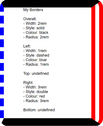
Since “Top” and “Bottom” are undefined, the values of the first four properties are used. While the “Left” and “Right” are defined with their own values, their own values are used.
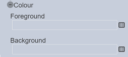
Colour
The “Colour” properties allow you to set the colour of the component. It has the following properties.
| Field | Description | Default |
|---|---|---|
| Foreground | Selects the foreground colour from the colour picker. | “transparent” |
| Background | Selects the background colour from the colour picker. | “transparent” |
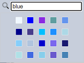
To access the colour picker, click on the “Colour Picker” icon or click on the colour itself. The “Colour Picker” will appear.
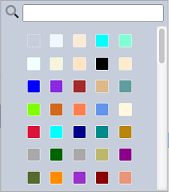
Select the desired colour from the colour palette. To aid the search of colour, key in the name of the colour in the search function at the top to display the list of colours belonging to that name. For example, you wish to search for all the colours belonging to the blue colour group. Key in “blue” in the search function. The list of colours belonging to the blue colour group will appear.
CSS
The “CSS” property allows you to add and define a CSS resource for the template.
To add a CSS resource, click on the “+” icon after expanding the “CSS” property.
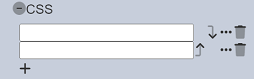
A new CSS will be added. Click on the  “Properties” icon on the right. The “CSS Resource Chooser” dialog box will appear.
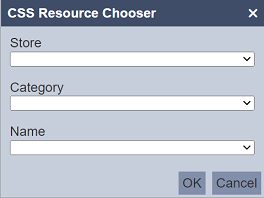
Select the desired values for the “Store”, “Category” and “Name” fields. Click on the “OK” button to save the CSS resource. The new CSS resource will be added. More than one CSS resource can be added. To add another CSS resource, simply click in the “+” icon below the newly added CSS resource.
To edit the CSS resource, click on the icon on the right of the desired CSS resource. Edit the fields as desired in the “CSS Resource Chooser” dialog box.
To remove a CSS resource, click on the  icon on the right of the desired CSS resource.
By default the CSS resources are arranged in the order they are added. You can re-arrange them by clicking on the  “Move Up” or
  “Move Down” icons.
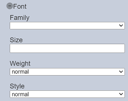
Font
The “Font” properties allow you to set the font type, size, etc. of the text in the component.
It has the following properties.
| Field | Description | Default |
|---|---|---|
| Family | Defines the font type from the drop-down list. If none is selected, “Arial” font is used. |
None |
| Size | Defines the font size. If none is selected, size “16” is used. |
None |
| Weight | Defines the font weight. Available options: - bold - normal |
“normal” |
| Style | Defines the font style. Available options: - italic - normal |
“normal” |
Do note that “Weight” and “Style” properties do not apply to the root component.
JS
The “JS” property allows you to add and define a Java Script resource for the template.
To add a JS resource, click on the “+” icon after expanding the “JS” property.
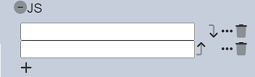
A new JS will be added. Click on the “Properties” icon on the right. The “JS Resource Chooser” dialog box will appear.
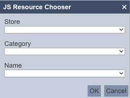
Select the desired values for the “Store”, “Category” and “Name” fields. Click on the “OK” button to save the JS resource. The new JS resource will be added More than one JS resource can be added. To add another JS resource, simply click in the “+” icon below the newly added JS resource.
To edit the JS resource, click on the icon on the right of the desired JS resource. Edit the fields as desired in the “JS Resource Chooser” dialog box.
To remove a JS resource, click on the icon on the right of the desired JS resource.
By default the JS resources are arranged in the order they are added. You can re-arrange them by clicking on the “Move Up” or “Move Down” icons.
Margin
The “Margin” properties allow you to define space around the borders of the component.
It has the following properties.
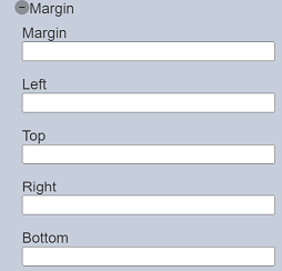
| Field | Description | Default |
|---|---|---|
| Margin | Defines the overall space around the borders of the component. | none |
| Left | Defines the space from the left of the border. | none |
| Top | Defines the space from the top of the border. | none |
| Right | Defines the space from the right of the border. | none |
| Bottom | Defines the space from the botton of the border. | none |
If the “Left”, “Top”, “Right” and “Bottom” properties are not defined, the value of “Margin” property will be used.
Padding
The “Padding” properties allow you to define space around the content of the component.
It has the following properties.
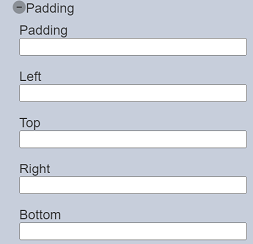
| Field | Description | Default |
|---|---|---|
| Padding | Defines the overall space around the content of the component. | none |
| Left | Defines the space from the left of the content. | none |
| Top | Defines the space from the top of the content. | none |
| Right | Defines the space from the right of the content. | none |
| Bottom | Defines the space from the botton of the content. | none |
If the “Left”, “Top”, “Right” and “Bottom” properties are not defined, the value of “Padding” property will be used.