
Blocks
Blocks include components such as column, row, tab bar, tab panel, etc. These components work as placeholders for the other components to be placed.
To add a block component, simply drag and drop under the desired level. The block component will not show up in the template/page itself but creates a canvas for adding other components. The properties for each block component varies.
In the sections below, the Template Designer is used as example, all values of “Id” field has the prefix tm-.
Anbience Header
An Ambience Header component allows you to add an Ambience Header in the template or page. Do note that only one header is allowed to be added into the template or page.
It has the following properties.
| Field | Description | Default |
|---|---|---|
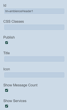
| Id | Name of the Ambience Header that will be displayed in the tree structure. | “tm-ambienceHeaderX” |
| Title | Name that will be displayed on the Ambience Header. | None |
| Icon | Icon that will be displayed on the Ambience Header. | None |
| Show Message Count | If selected, shows the number of message count. | Selected |
| Show Services | If selected, shows the “Services” icon. | Selected |
| Common properties | Common properties. - CSS Classes - Publish See Common Properties for more details. |
Vary |
Below is an example of an Ambience Header component with title, message count and services icon.

Column
A Column component acts as a placeholder that allows you to add other components in a vertical layout in the template/page.
It has the following properties.
| Field | Description | Default |
|---|---|---|
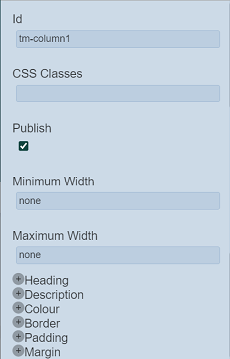
| Id | Name of the Column that will be displayed in the tree structure. | “tm-columnX” |
| Minimum Width | Minimum width of the column. | “none” |
| Maximum Width | Maximum width of the column. If not defined, the width of the device is used. |
“none” |
| Heading | Defines the name of the column, font and alignment with three sub-fields. - Text (via text editor) - Font (see Common Properties) - Text Align (select from drop-down list, default value “left”) - Image (see Others->Image) |
Vary |
| Description | Defines the description of the column, font and alignment with three sub-fields. - Text (via text editor) - Font (see Common Properties) - Text Align (select from drop-down list, default value “left”) |
Vary |
| Common properties | Common properties. - CSS Classes - Publish - Colour - Border - Padding - Margin See Common Properties for more details. |
Vary |
HSpacer
The HSpacer component adds horizontal space in the template/page. It is particularly useful when you need to separate different groups of information in the template/page.
It has the following properties.
| Field | Description | Default |
|---|---|---|
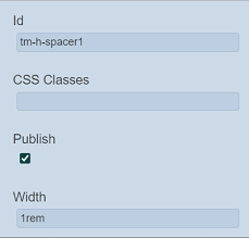
| Id | Name of the HSpacer that will be displayed in the tree structure. | “tm-h-spacerX” |
| Width | Width of the space to be created. | “1rem” |
| Common properties | Common properties. - CSS Classes - Publish See Common Properties for more details. |
Vary |
Row
The Row component acts as a placeholder that allows you to add components in a horizontal layout.
It has the following properties.
| Field | Description | Default |
|---|---|---|
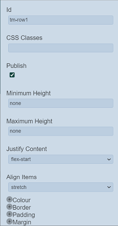
| Id | Name of the Row that will be displayed in the tree structure. | “tm-rowX” |
| Minimum Height | Minimum height of the row. | “none” |
| Maximum Height | Maximum height of the row. If not defined, the height of the device is used. |
“none” |
| Justify Content | Defines how the content is justified. Available options: - center - end - flex-start - flex-end - left - right - start |
“flex-start” |
| Align Items | Defines how the content is aligned. Available options: - baseline - center - flex-start - flex-end - stretch |
“stretch” |
| Common Properties | Common properties. - CSS Classes - Publish - Colour - Border - Padding - Margin See Common Properties for more details. |
Vary |
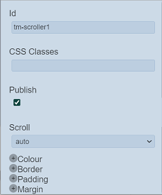
Scroller
The Scroller components allows you to add a scrolling bar.
It has the following properties.
| Field | Description | Default |
|---|---|---|
| Id | Name of the Scroller that will be displayed in the tree structure. | “tm-scrollerX” |
| Scroll | Defines whether the scroller is in auto or scroll mode. | “auto” |
| Common Properties | Common properties. - CSS Classes - Publish - Colour - Border - Padding - Margin See Common Properties for more details. |
Vary |
Tab Bar
The Tab Bar component along with the Tab Panels, allows you to create template/page with multiple tabs. It puts a placeholder in the template/page to display the names of the Tab Panel components that were added into the template/page under it.
It has the following properties.
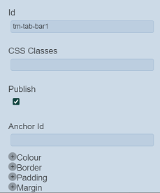
| Field | Description | Default |
|---|---|---|
| Id | Name of the Tab Bar that will be displayed in the tree structure. | “tm-tab-barX” |
| Anchor Id | When defined, the anchor Id will appear in the URL. This Id should be unique and small. |
Blank |
| Common Properties | Common properties. - CSS Classes - Publish - Colour - Border - Padding - Margin See Common Properties for more details. |
Vary |
If no Tab Panel components are added onto the template/page under the Tab Bar component, the Tab Bar component will not be visible in the template/page. Once Tab Panel components are added under the Tab Bar component, the labels of the Tab Panel components will appear in the Tab Bar component.
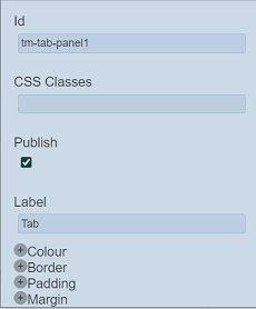
Tab Panel
The Tab Panel component along with the Tab Bar component, allows you to create template/page with multiple tabs. The Tab Panel components are to be added under the Tab Bar component.
It has the following properties.
| Field | Description | Default |
|---|---|---|
| Id | Name of the Tab Panel that will be displayed in the tree structure. | “tm-tab-panelX” |
| Label | Name of the Tab Panel that will be displayed in the template/page. | “Tab” |
| Common Properties | Common properties. - CSS Classes - Publish - Colour - Border - Padding - Margin See Common Properties for more details. |
Vary |
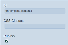
Template Content
The template Content component acts as a placeholder for users to fill in the required content when creating pages with this template.
It has the following properties.
| Field | Description | Default |
|---|---|---|
| Id | Name of the Template Content that will be displayed in the tree structure. | “tm-template-contentX” |
| Common Properties | Common properties. - CSS Classes - Publish See Common Properties for more details. |
Vary |
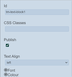
Text Block
The Text Block component acts as a placeholder to add text related components.
It has the following properties.
| Field | Description | Default |
|---|---|---|
| Id | Name of the Text Block that will be displayed in the tree structure. | “tm-text-blockX” |
| Text Align | Alignment of the text in the template/page. Available options: - left - right - center - justify |
“left” |
| Common Properties | Common properties. - CSS Classes - Publish - Font - Colour See Common Properties for more details. |
Vary |
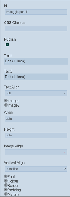
Toggle Panel
The Toggle Panel component acts as a placeholder to add components that are shown or hidden (such as “Show More” component). The header allows an image and label to set depending on the shown or hidden state.
It has the following properties.
| Field | Description | Default |
|---|---|---|
| Id | Name of the Toggle Panel that will be displayed in the tree structure. | “tm-toggle-panelX” |
| Text1 | The text to be shown when selected. | “Show More” in text editor |
| Text2 | The text to be shown when selected. | “Show Less” in text editor |
| Text Align | Alignment of the text in the template/page. Available options: - left - right - center - justify |
“left” |
| Image1 / 2 | ||
| Tooltip | Message to be display when hover over the image. | Blank |
| Store | Selects which binary store to select the image from the drop-down list. | None |
| Category | Selects which category to select the image from the drop-down list. | None |
| Name | Select the image to be displayed from the drop-down list. | None |
| Width | Width of the image. | “auto” |
| Height | Height of the image. | “auto” |
| Image Align | Alignment of the images. Available options: - left - right |
“left” |
| Vertical Align | Vertical alignment of the text. Available options: - baseline - center - flex-start - flex-end - stretch |
“baseline” |
| Common Properties | Common properties. - CSS Classes - Publish - Font - Colour - Border - Padding - Margin See Common Properties for more details. |
Vary |
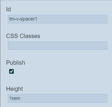
Vertical Spacer
The VSpacer component adds vertical space in the template/page. It is particularly useful when you need to separate different groups of information in the template/page.
It has the following properties.
| Field | Description | Default |
|---|---|---|
| Id | Name of the VSpacer that will be displayed in the tree structure. | “tm-v-spacerX” |
| Height | Height of the component. | “1rem” |
| Common Properties | Common properties. - CSS Classes - Publish See Common Properties for more details. |
Vary |