
Designers
There are two designers in the CMS module; the Page Designer and the Template Designer. The Template Designer allows you to design a template for the web pages. These templates then can be used to create web pages with the same outlook. The Page Designer allows you to design a web page, with or without a template.
Both designer is quite similar. The main difference is that the Template Designer allows you to add CSS and Java Script (JS) to the root component and has a Template Content component.
The Designer consists of two panels. The left panel displays the hierarchy, the components and their properties. The right panel displays the template/page, allowing you to visualise the template/page as you design it.
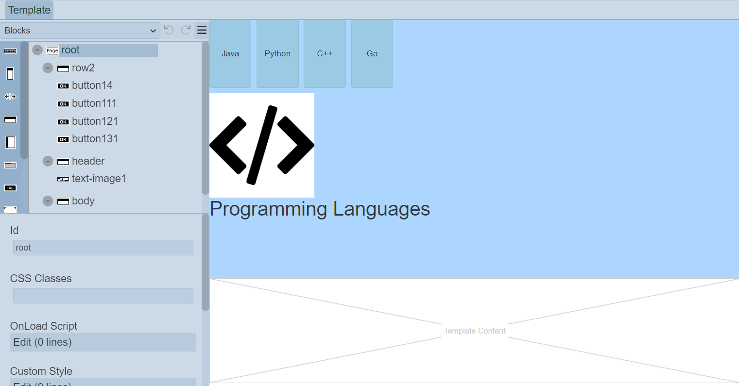
The left panel displays the available actions for the selected component in the template/page. It has three parts; the top row, tree structure in the middle and component properties at the bottom.
Top Row
The top row consists of a selection for the type of components to be added into the template/page and some icons.
| Item | Description |
|---|---|
| Types of Options | List the available types of options for the template/page. Available options: - Blocks - Menu - Others |
| Undo | Undo the last action on the template/page. |
| Redo | Redo the last action on the template/page. |
| More Actions | List of other actions for the template/page. |
The icons will grey out if there is no action to perform (e.g., no action to redo).
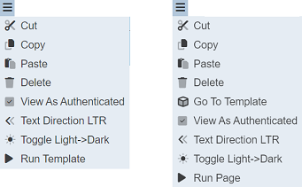
More Actions
The list of more actions for template/page (respectively) are listed in the table below.
| Item | Description |
|---|---|
| Cut | Removes the component on the template/page and add onto clipboard. Not available for root. |
| Copy | Copies the component onto the clipboard. Not available for root. |
| Paste | Pastes the component from the clipboard onto the template/page. |
| Delete | Deletes the component from the template/page. Not available for root. |
| Go To Template | Launches the Template Designer. For Page Designer only. |
| View As Authenticated | TBD. |
| Toggle Light->Dark | Toggles between light and dark theme. Default is light theme. |
| Run Template | Runs the template in another tab. For Template Designer only. |
| Run Page | Runs the page in another tab. For Page Designer only. |
Note that if the component in the template/page does not allow certain actions, those icons will not be available. For example, the root cannot be deleted, so the “Cut” and “Delete” icons will not appear.
The “Toggle light->Dark” icon in the Template Designer allows you to toggle between light and dark theme. By default light theme is used.
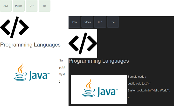
The “Run Template” icon in the Template Designer allows you to test the template. To do so, select the “Run Template” and the template will be displayed in another tab. The same goes for the “Run Page” icon in the Page Designer.
Tree Structure
The template/page structure allows you to design the structure of the template/page, as well as add images, drop-down menu, buttons, etc. onto the template/page.
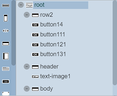
Every template/page begins with a root, which other components can be added onto it.
The list of available components vary according to the “Types of Options” selected in the top row’s drop-down list. By default, “Blocks” is selected.
The table below list of available actions for the “Types of Options”.
| Item | Description |
|---|---|
| Blocks | List the block components that can be added onto the template/page, such as column, row, etc. |
| Menu | List of menu components that can be added onto the template/page, such as drop-down menu, button menu, etc. |
| Others | List of other components that can be added onto the template/page, such as button, HTML, etc. |
Component Properties
The Component Properties at the bottom of the left panel displays the properties of the selected component.
It allows you to label and define the selected component. Currently there are three types of options that are selectable from the top row:
- Blocks
- Menu
- Others
Each type may have one or more components. Depends on the selected component, the properties will vary. You can also define the properties of the root.
Component Id
Each component has an “Id” field in its properties. This “Id” field allows you to identify and differentiate the component in the tree structure.
The “Id” field of these properties for template is indicated with a prefix tm- as compared to those for page. For example, in the Template Designer, the value for the “Id” field is tm-columnX where X is the number which increments by 1 when another such component is added onto the template. In the Page Designer, the value for the “Id” field is columnX where X also increments by 1 when the same component is added onto the page.
Root
Every template/page has a root, this is by default. The root presents the blank template/page itself until components are added onto it.
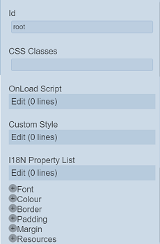
You can define the root using its properties. The properties for root is different for template and page. Below are the screenshots for template and page respectively.
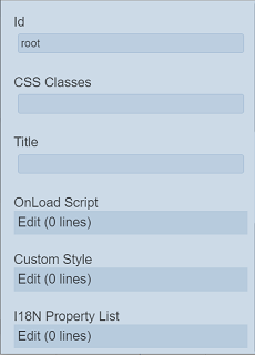
| Field | Description | Default |
|---|---|---|
| Id | Name of the root that will be displayed in the tree structure. | “root” |
| CSS Classes | Defines the CSS class to be used. | Empty |
| Title | Name that will be displayed on the windows tab when the page is ran. If not defined, the name of page is used. For page only. |
Empty |
| On Load Script | Defines the script to run when loading template/page. | None |
| Custom Style | Customise the style of the template/page. | None |
| I18N Property List | Defines the I18N property list for the template/page. | None |
| Common properties | Some common properties such as CSS Classes, Font, Colour, Border, etc. See Common Properties for more details. |
Vary |
Blocks
Blocks include components such as column, row, tab bar, tab panel, etc. This block components works as a placeholder for other components to be placed.
To add a block component, simply drag and drop under the desired level. The block component will not show up in the template/page itself but creates a canvas for adding other components. Hence, a block component need to be added before any other component can be displayed in the template/page. The properties for each block component varies.
| Component | Description |
|---|---|
| Ambience Header | Allows you to an Ambience Header. |
| Column | Allows you to add components in a vertical layout. |
| HSpacer | Allows you to add horizontal space. |
| Row | Allows you to add components in a horizontal layout. |
| Scoller | Creates a scolling bar. |
| Tab Bar | Allows you to create pages with multiple tabs along with Tab Panel. |
| Tab Panel | Allows you to create pages with multiple tabs along with Tab Bar. |
| Template Content | Creates a placeholder for the pages that uses this template to fill in its contents. |
| Text Block | Creates a placeholder to add text related components. |
| Toggle Panel | Creates a placeholder to add components that are shown or hidden. |
| VSpacer | Allows you to add vertical space. |
Refer to Blocks for more details on the components and their properties.
Menu
Menu option consists of several components, such as button menu.
| Component | Description |
|---|---|
| Button Menu | Creates a placeholder to add buttons onto the template/page. |
| Dropdown Menu | Creates a placeholder to add buttons onto it as options. |
| Responsive Button Menu | Creates a placeholder to add buttons onto the template/page. |
| StepImage Menu | Create a placeholder to add Step Image Menu Panel components. Each menu component is n image and/or text with an optional line drawn between them. |
| StepImage Menu Panel | Creates a placeholder that allows you to add components. |
Refer to Menu for more details on the components and their properties.
Others
This group consists of components such as button, HTML template, IFrame, etc.
| Component | Description |
|---|---|
| Ambience Banner | Allows you to add a banner. |
| Button | Allows you to add a button to navigate to CMS page or external link. |
| HTML Template | Allows you to add a HTML template. |
| Hyperlink | Allows you to add a hyperlink to navigate to CMS site page or external link. |
| IFrame | Allows you to embed another HTML document. |
| Image | Allows you to add a placeholder to load an image. |
| New Line | Allows you to an HTML new line. |
| Text | Allows you to add text content. |
| Text Image | Allows you to add an image and text component allowing different ways to layout the text and image together. |
| Toggle Light-Dark | Allows you to add a button to toggle between dark and light theme. |
Refer to Others for more details on the components and their properties.