
Menu
Menu include components such as Button Menu, Step Image Menu, etc. These components work as placeholders for the other components to be placed.
To add a menu component, simply drag and drop under the desired level. The menu component will not show up in the template/page itself but creates a canvas for adding other components. The properties for each menu component varies.
In the sections below, the Template Designer is used as example, all values of “Id” field has the prefix tm-.
Button Menu
A Button Menu component acts as a placeholder that allows you to add other components in the template/page.
It has the following properties.
| Field | Description | Default |
|---|---|---|
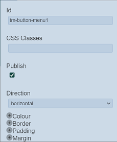
| Id | Name of the Button Menu that will be displayed in the tree structure. | “tm-button-menuX” |
| Direction | Direction of the menu. Available options: - horizontal - vertical |
“horizontal” |
| Common properties | Common properties. - CSS Classes - Publish - Colour - Border - Padding - Margin See Common Properties for more details. |
Vary |
Drop Down Menu
A Drop Down Menu component acts as a placeholder to add buttons onto it as options.
It has the following properties.
| Field | Description | Default |
|---|---|---|
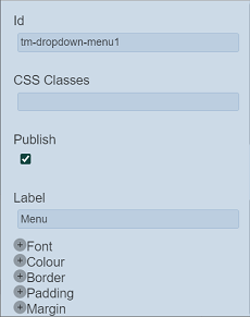
| Id | Name of the Drop Down Menu that will be displayed in the tree structure. | “tm-dropdowm-menuX” |
| Label | Name of the menu to be displayed in the template/page. | “Menu” |
| Common properties | Common properties. - CSS Classes - Publish - Font - Colour - Border - Padding - Margin See Common Properties for more details. |
Vary |
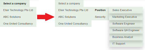
Below is an example of cascaded drop-down menu.
Responsive Button Menu
The Responsive Button Menu component acts as a placeholder to add buttons onto it as options.
It has the following properties.
| Field | Description | Default |
|---|---|---|
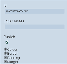
| Id | Name of the Responsive Button Menu that will be displayed in the tree structure. | “tm-rbutton-menuX” |
| Common properties | Common properties. - CSS Classes - Publish - Colour - Border - Padding - Margin See Common Properties for more details. |
Vary |
This menu allows you to add one or more buttons. When the browser is in the maximised, the buttons will be displayed in sequence.

When the screen of the browser is reduced, the  icon will appear instead of the buttons added. To view the buttons, click on the icon.

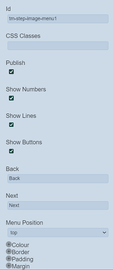
Step Image Menu
A Step Image Menu acts as a placeholder to add Step Image Menu Panel components. Each menu component is an image and/or text with an optional line drawn between them.
It has the following properties.
| Field | Description | Default |
|---|---|---|
| Id | Name of the Step Image Menu Panel that will be displayed in the tree structure. | “tm-step-image-menu-panelX” |
| Show Numbers | If selected, display the numbers between the step image menu panels added onto it. | Selected |
| Show Lines | If selected, display the lines between the step image menu panels added onto it. | Selected |
| Show Buttons | If selected, displays two buttons in the menu. | Selected |
| Back | Text to be shown in the first button. | “Back” |
| Next | Text to be shown in the second button. | “Next” |
| Menu Position | Defines the location of the buttons. Available options: - bottom - top |
“top” |
| Common properties | Common properties. - CSS Classes - Publish - Colour - Border - Padding - Margin See Common Properties for more details. |
Vary |
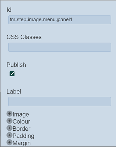
Step Image Menu Panel
A Step Image Menu Panel acts as a placeholder that allows you to add components.
It has the following properties.
| Field | Description | Default |
|---|---|---|
| Id | Name of the Step Image Menu Panel that will be displayed in the tree structure. | “tm-step-image-menu-panelX” |
| Label | Name of the panel to be displayed in the template/page. | Blank |
| Common properties | Common properties. - CSS Classes - Publish - Image - Colour - Border - Padding - Margin See Common Properties for more details. |
Vary |