
Actions
Actions include components such as the Button Bar, Render DocX and Render RML. To display an action component in the form, a block component need to be added onto the form before the action component can be added.
Button
The Button component allows you to add a button onto the form. It has the following properties.
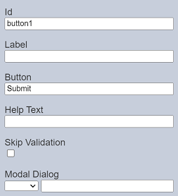
| Field | Description | Default |
|---|---|---|
| Id | Name of the component that will be displayed in the form structure. | “buttonX” |
| Label | Name of the component that will be displayed in the form. | None |
| Buttons | Defines the text on the button on the form. | “Submit” |
| Help Text | Text that will be displayed below the button(s). | None |
| Skip Validation | If selected, skips validation of the component. This is useful for buttons such as “Cancel” or “Go Back”, which does not require validation. |
Not selected |
| Modal Dialog | Selects the desired Modal Dialog component from the drop-down list. | None |
Button Bar
The Button Bar component allows you to add one or more buttons onto the form and determine the text on the buttons as well. It has the following properties.
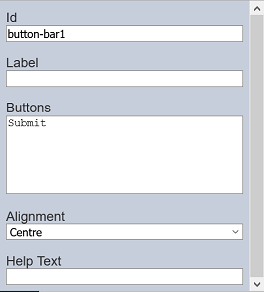
| Field | Description | Default |
|---|---|---|
| Id | Name of the component that will be displayed in the form structure. | “button-barX” |
| Label | Name of the component that will be displayed in the form. | None |
| Buttons | Defines the button(s) on the form. | “Submit” |
| Alignment | Alignment of the button(s) in the form. Available options: - Left - Centre - Right |
“Centre” |
| Help Text | Text that will be displayed below the button(s). | None |
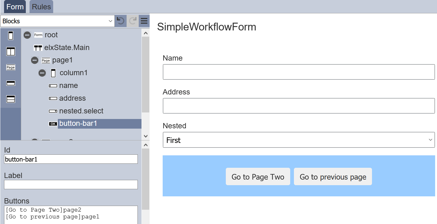
Button Label
For “Buttons” field, the syntax is [label]event. If no label is specified, the event name is shown instead.
You can add more than one button. For example, if you need to add two buttons, simply key in the following in the “Buttons” field.
  [Go to Page 2]page2
  [Go to previous page]page1
The two buttons will appear in the form.
Button Colour
By default the button has a grey background and black text. You can change the colour of the background and text using the ambience-form.css in the Theme module.
In the Theme module, theambience-form.css file classes as shown below can be used to alter the colour or components.
.btn.primary {
  background-color: #90b2d6;
}

.btn.secondary {
  background-color: #bbc7a4;
}

.btn.negative {
  color: 3ed474a;
  border-color: #ed474a;
  background-color: white;
}

.btn:not(:disabled):not(.disabled):hover {
  cursor:pointer;
  background-color: rgb(130,143,171);
  color: white;
}
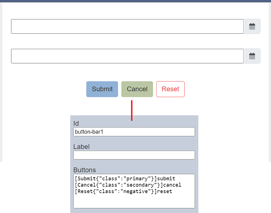
In the Forms module, create a form with three buttons, naming them as follows:
[Submit{"class":"primary"}]sumbit
[Cancel{"class":"secondary"}]cancel
[Reset{"class":"negative"}]reset
The background colour of the buttons will change from light grey to blue and green respectively, as defined in the CSS file.
Alternatively, you can change the colour code in the ambience-form.css to the desired colour. Or you can add another code to change the colour of the button when hovering over it.
.btn.negative:not(:disabled):not(.disabled):hover {
  border-color: red;
}
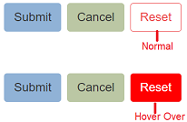
It can be any class, not only for .btn.negative.
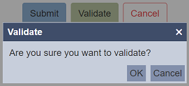
Validate
You can make use of the “After Build Script” to add a prompt dialog to confirm the action of the button.
In this example, in the “After Build Script” field of the “root” component, enter the following script:
$("#button-bar1-validate").attr("data-confirm-prompt","Are you sure you want to validate?");
Note that because it is scriptable, it is dynamic and more powerful than a property. For example, you might add the attribute only if another field is modified, if there was no change, there is nothing to confirm.
Any button which has a data-confirm-prompt defined will show that message and only send the event upon choosing the “OK” button in the dialog box.
The title of the prompt follows the text in the button.
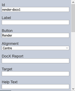
Render DocX / RML
The Render DocX and Render RML components allows you to add a button onto the form that allows you to generate a DocX or RML report respectively. It has the following properties.
| Field | Description | Default |
|---|---|---|
| Id | Name of the component that will be displayed in the form structure. | “render-docxX” |
| Label | Name of the component that will be displayed in the form. | None |
| Buttons | Defines the button(s) on the form. | “Render” |
| Alignment | Alignment of the button(s) in the form. Available options: - Left - Centre - Right |
“Centre” |
| DocX Report | Path of the file for the report to be generated. | None |
| Target | Location of the report generated. | None |
| Help Text | The text that will be displayed below the button(s). | None |
The properties for Render RML are similar to Render DocX, except for the Id field where the default value is render-rmlX and there is a RML Report field instead of the DocX Report field.