
Others
This group consists of components such as Form Launcher, HTML, Hidden, History, IFrame, Vertical Space, Workflow, etc.
Attachments
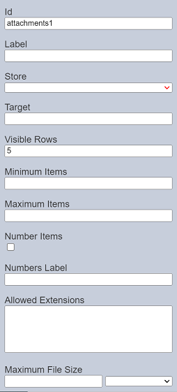
The Attachments component allows you to attach files onto the form. It has the following properties.
| Field | Description | Default |
|---|---|---|
| Id | Name of the component that will be displayed in the form structure. | “attachmentX” |
| Label | Name of the component that will be displayed in the form. | None |
| Store | Location where the attached file is stored. | None |
| Target | Path of the file content to appear in. | None |
| Visible Rows | Number of rows in the form. | “5” |
| Minimum Items | Defines the minimum number of items to attach. | None |
| Maximum Items | Defines the maximum number of items to attach. | None |
| Number Items | If selected, displays the number of items attached in the form. | Not selected |
| Number Label | Defines the label for the number items. | None |
| Allowed Extensions | Defines the extensions allowed to be attached. Each separated by a row. It is case insensitive. |
None |
| Maximum File Size | Defines the maximum file size of the items to be attached. | None |
To test the form, click on the “More Actions” icon at the top row and select the “Run Form” option. In the “Run Form” dialog box, select a workflow from the drop-down list. Do note that currently the Attachment component needs to run with a workflow to work.
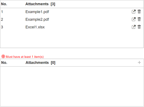
The form will appear in another tab. The Attachment component has the following settings in its properties:
- Minimum one attachment
- Maximum three attachments
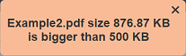
- Maximum file size of 500KB
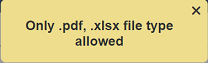
- Allows only PDF and xlsx files
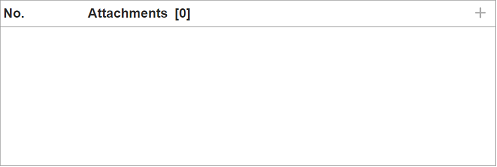
To attach a file, click on the “+” icon at the right of the Attachment component. The “Add Attachment” dialog box will appear. If the form is ran without a workflow, the “+” icon will not appear in the form.
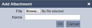
Browse to the location of the file to be attached. The name of the selected file is used by default in the “Name” field. Change the name if it is not desired. Click on the “OK” button to attach the file.
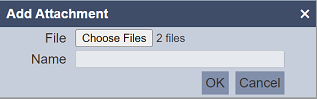
You can choose multiple files to attach. In this case, the “Name” field will be disabled.
There are several types of file extensions that are not allowed to be uploaded. The default configuration is:
ambience.form.attachments.disallowed-extensions = [".exe", ".bat", ".cmd", ".js", ".dll", ".so"]
All comparisons are case-insensitive.
If the file extension matches one of those listed above, an error message will appear.
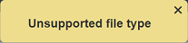
The “Allowed Extensions” property limits the type of extension allowed. If the attached file does not match the list in the property, an error message will also appear.
The “Maximum File Size” is set in the properties, an error message will appear if the file size is exceeded.
Once uploaded, the name of the attached file appears in the Attachment component along with the  “Open Attachment” icon and
  “Delete Attachment” icon on the right. You can add more files by clicking on the “+” again.
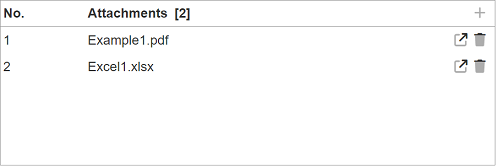
If the “Minimum Items” property is set, error message will appear if no attachment is attached and the “Submit” button is clicked. When the number of attachments matches the value set in the “Maximum Items” property, the “+” icon will disappear.
To open the attached file, click on the icon and the content of the file will be displayed according to the value in the “Target” field in the component properties.
To delete the attached file, click on the icon and a dialog box with warning messages will appear.
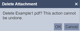
To confirm deletion, click on the “OK” button. Click on the “Cancel” button to abort.
Derived Text
The Derived Text component provides a text area that allows you to display the desired text based on the selection of another component, such as the Dataset Select component.
It has the following properties:
| Field | Description | Default |
|---|---|---|
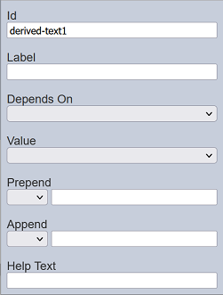
| Id | Name of the component that will be displayed in the form structure. | “derived-textX” |
| Label | Name of the component that will be displayed in the form. | None |
| Depends On | Selects the dataset that the Value field will use. | None |
| Value | Selects the field that the text will be derived from. | None |
| Prepend | Select either to display text, image or none before the choices. | None |
| Append | Select either to display text, image or none after the choices. | None |
| Help Text | Text that will be displayed below the input. | None |
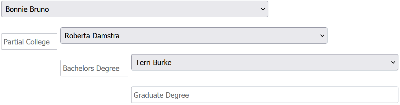
This component is particularly useful when some text (such as an explanation, caution, or any information) needs to be displayed along with a selection.
For example, a form uses the Dataset component to allow users to select personnel from a list based on their names. But it can only the names are displayed in the drop-dowm list, no other information is provided. It may be useful to provide more information for the users, such as education level and gender of the personnel selected. This can be done by adding two Derived Text components into the form, one to display the education level, another to display the gender.
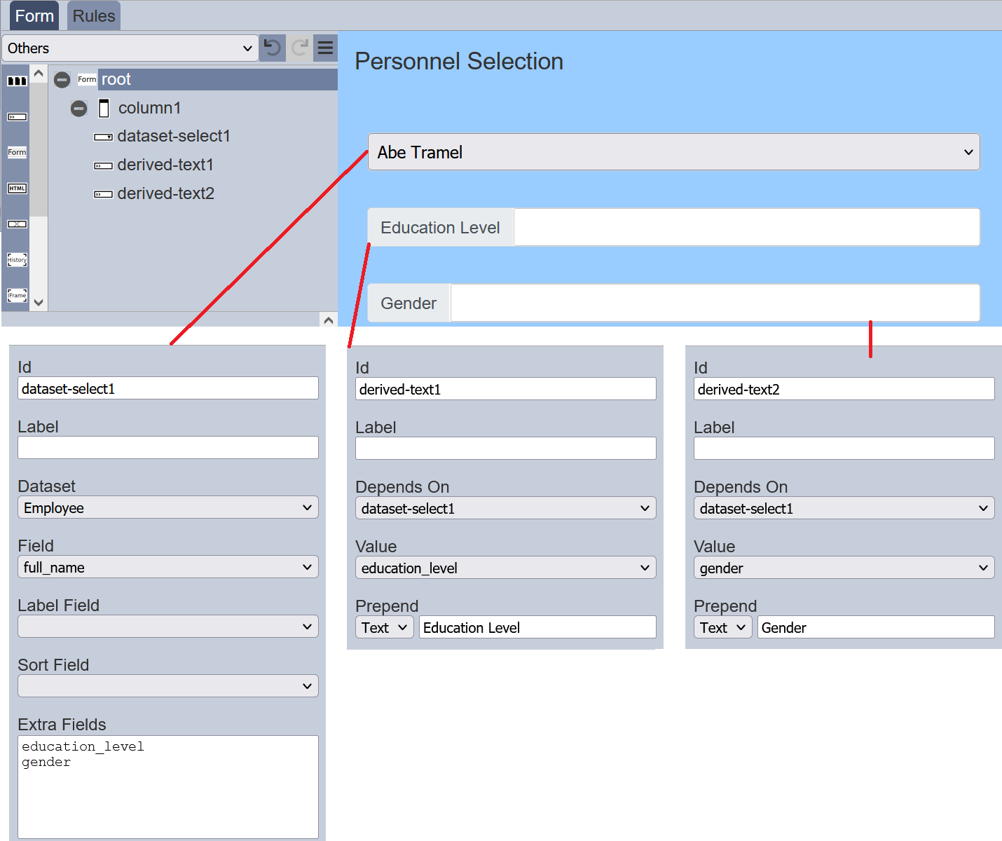
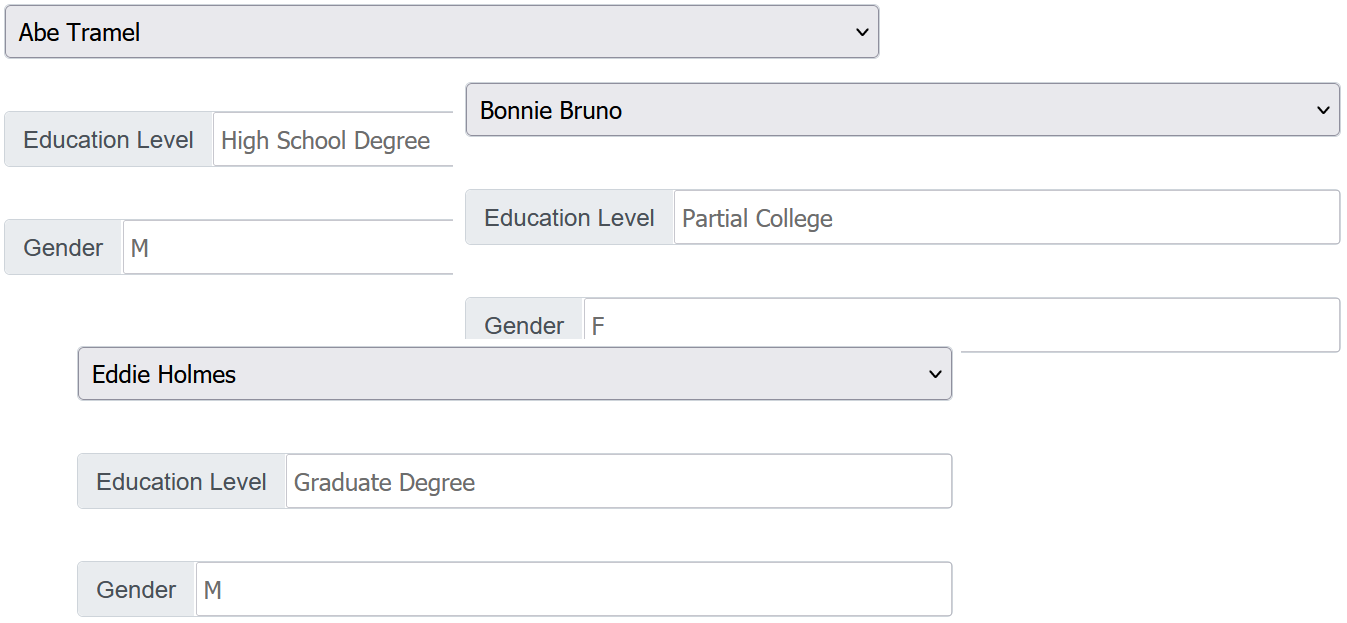
Once the form is launched, when the user selects any personnel, the education level and gender will be displayed.
Instead of placing text in the “Prepend” and “Append” fields, icons can be used as well. In the “Prepend” or “Append” field, select the option “Icon” and a empty icon will appear next to the textbox in the property. Click on the icon and the Icon Picker will appear.
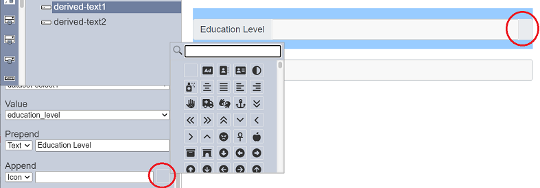
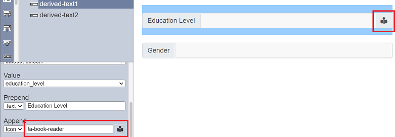
Select the desired icon. The selected icon will appear in the form. In the property, the name of the icon will appear in the textbox and the empty icon will be replaced by the selected icon.
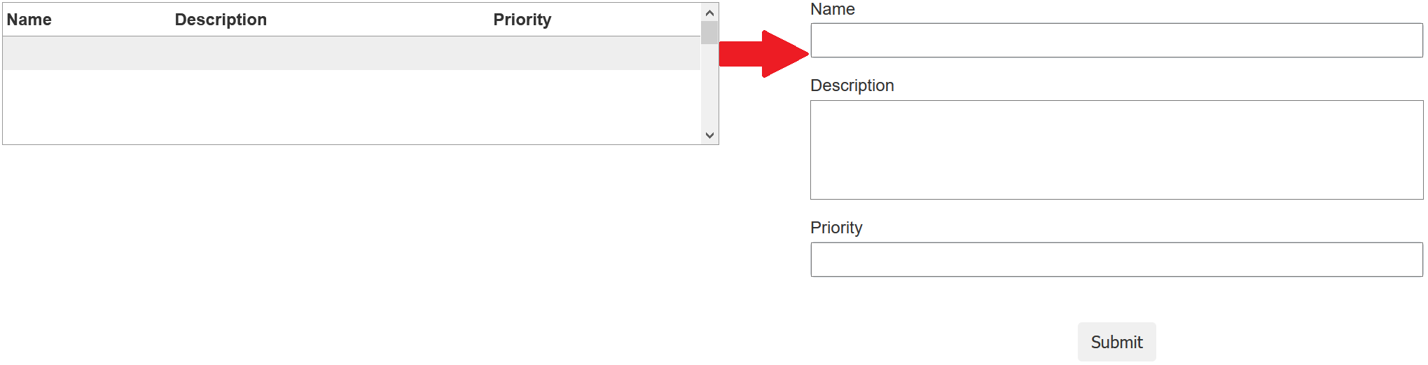
Form Launcher
The Form Launcher component allows you to launch another form from the current form by clicking on the rows on the current form.
It has the following properties.
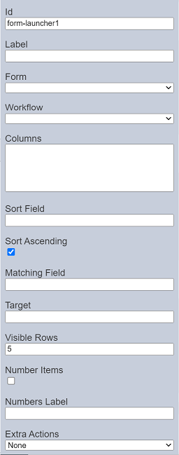
| Field | Description | Default |
|---|---|---|
| Id | Name of the component that will be displayed in the form structure. | “form-launcherX” |
| Label | Name of the component that will be displayed in the form. | None |
| Form | Selects a form from the Forms page through a drop-down list. | None |
| Workflow | Selects a workflow from the Workflows page through a drop-down list. | None |
| Columns | The columns to be displayed in the form. | None |
| Sort Field | The field from elxPublic to sort the records. | None |
| Sort Ascending | If selected, sort the field in ascending order. | Selected |
| Matching Field | The field to filter the records listed. | None |
| Target | The path which the form content to appear in. | None |
| Visible Rows | Number of rows in the form. | “5” |
| Number Items | If selected, displays the numbering of the items in the component. | Not selected |
| Numbers Label | Defines the title of the numbering if “Number Items” is selected.. | None |
| Extra Actions | Selects the action to be added onto the component, including its icon and confirmation prompt (if applicalbe). | “None” |
Refer to Examples for a simple example on how to create a form with form launcher.
HTML
The HTML component allows you to add a HTML onto the form. It can be text, web page, logo, etc. It has the following properties.
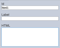
| Field | Description | Default |
|---|---|---|
| Id | Name of the component that will be displayed in the form structure. | “htmlX” |
| Label | Name of the component that will be displayed in the form. | None |
| HTML | HTML code to be entered. | None |
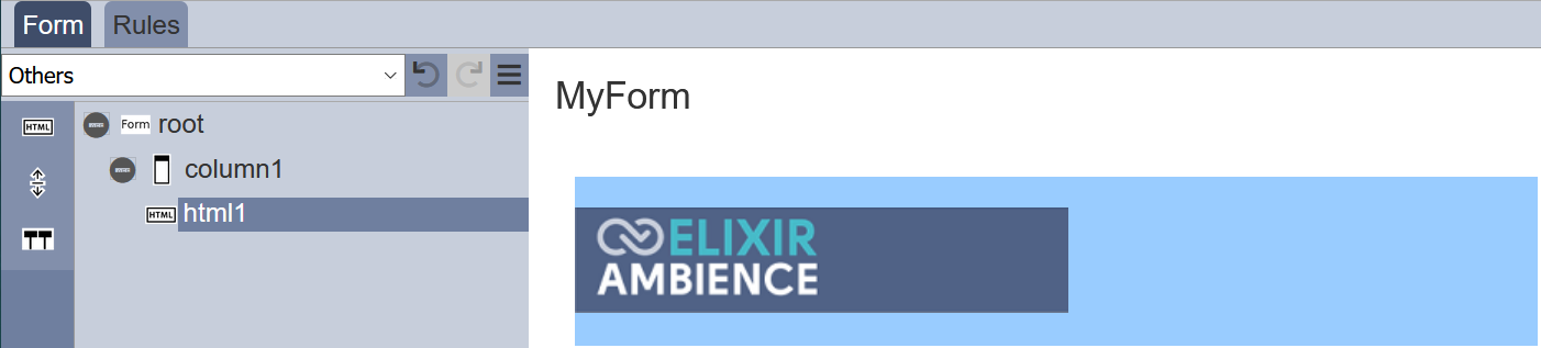
In the below example, a logo is to be added onto the form. To do so, enter the HTML code <img src="logo.png"> in the “HTML” field.
Hidden
The Hidden component allows you to store information in the form which is not visible to the user or use this . You can use this component for version control of the form, for example. a value of “1” means version 1 of the form and a value of “2” means version 2 of the form, etc. These values allow the designer to know which version of the form the user is using.
It has the following properties.
| Field | Description | Default |
|---|---|---|
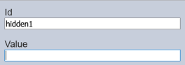
| Id | Name of the component that will be displayed in the form structure. | “hiddenX” |
| Value | Information to be stored. | None |
History
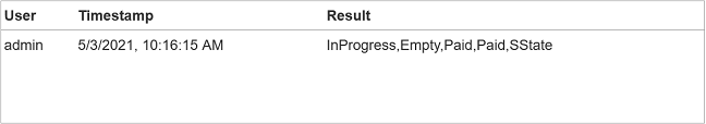
The History component allows you to include history information (such as user, timestamp and result) in the form.
It has the following properties.
| Field | Description | Default |
|---|---|---|
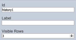
| Id | Name of the component that will be displayed in the form structure. | “historyX” |
| Label | Name of the component that will be displayed in the form. | None |
| Visible Rows | Number of rows to be displayed. | “5” |
IFrame
The IFrame component allows you to embed another HTML document into the form. It has the following properties.
| Field | Description | Default |
|---|---|---|
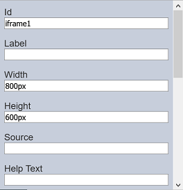
| Id | Name of the component that will be displayed in the form structure. | “iframeX” |
| Label | Name of the component that will be displayed in the form. | None |
| Width | Width of the IFrame. | “800px” |
| Height | Height of the IFrame. | “600px” |
| Source | Path of the HTML. | None |
| Help Text | Text that will be displayed below the IFrame. | None |
The IFrame component is the same as the IFrame view in Dashboards. See IFrame view for more details on how to customise the HTML path.
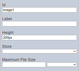
Image
The Image component allows you to add a placeholder to load an image into the form with a workflow. It has the following properties.
| Field | Description | Default |
|---|---|---|
| Id | Name of the component that will be displayed in the form structure. | “imageX” |
| Label | Name of the component that will be displayed in the form. | None |
| Height | Height of the image placeholder. | “200px” |
| Store | Location where the image file is stored. | “default” |
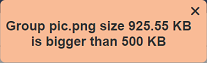
| Maximum File Size | Defines the maximum size of image. | None |
To test the form, click on the “More Actions” icon at the top row and select “Run Form”. In the “Run Form” dialog box, select the desired workflow. The form with the Image component will appear with a “…” icon at the far right.
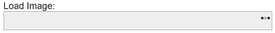
Click on the “…” icon to display the “Set Image” dialog box.
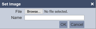
In the dialog box, browse to the location of the image file. The “Name” field takes the filename by default, change if the name is not desired. Click on the “OK” button to load the image or click the “Cancel” button to abort the action.
If the “Maximum File Size” property is set and the image file exceeds the file size, an error message will appear.
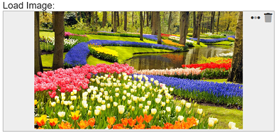
Upon successful uploading, the image will appear in the form.
You can reselect the image by clicking on the “…” icon.
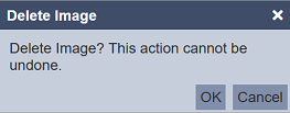
To remove the image, click on the “Delete” icon. The “Delete Image” dialog box will appear with a warning message. To confirm, click on the “OK” button. Click on the “Cancel” button to abort.
Do note that the Image component works only when run with a workflow. If no workflow is selected in “Run Form” dialog box, the Image component will appear in the form without the “…” icon to load an image.
Vertical Space
The Vertical Space component allows you to add white space in the form, creating space between components.
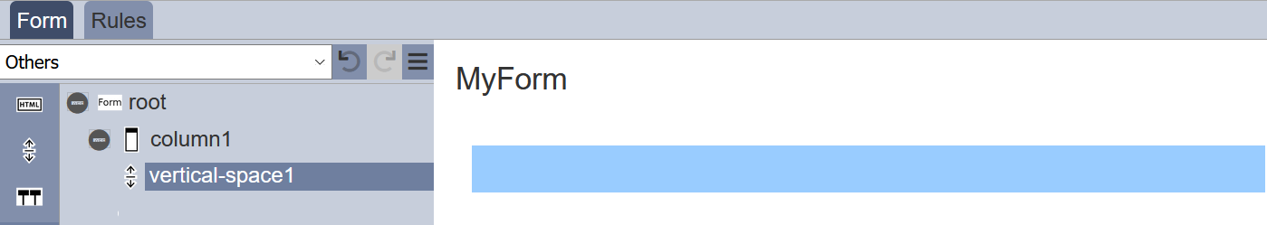
It has the following properties.
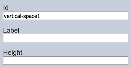
| Field | Description | Default |
|---|---|---|
| Id | Name of the component that will be displayed in the form structure. | “htmlX” |
| Label | Name of the component that will be displayed in the form. | None |
| Height | Height of the vertical space. | None |
Workflow State
The Workflow State component allows you to add an existing workflow onto the form. The workflow will not appear in the form, but act as an interface to the workflow. It has the following properties.
| Field | Description | Default |
|---|---|---|
| Id | Name of the state of the workflow that will be used with the form. | “elxState.X” |
Ensure the Workflow and the form has the same name and X is the name of the state in the workflow.