
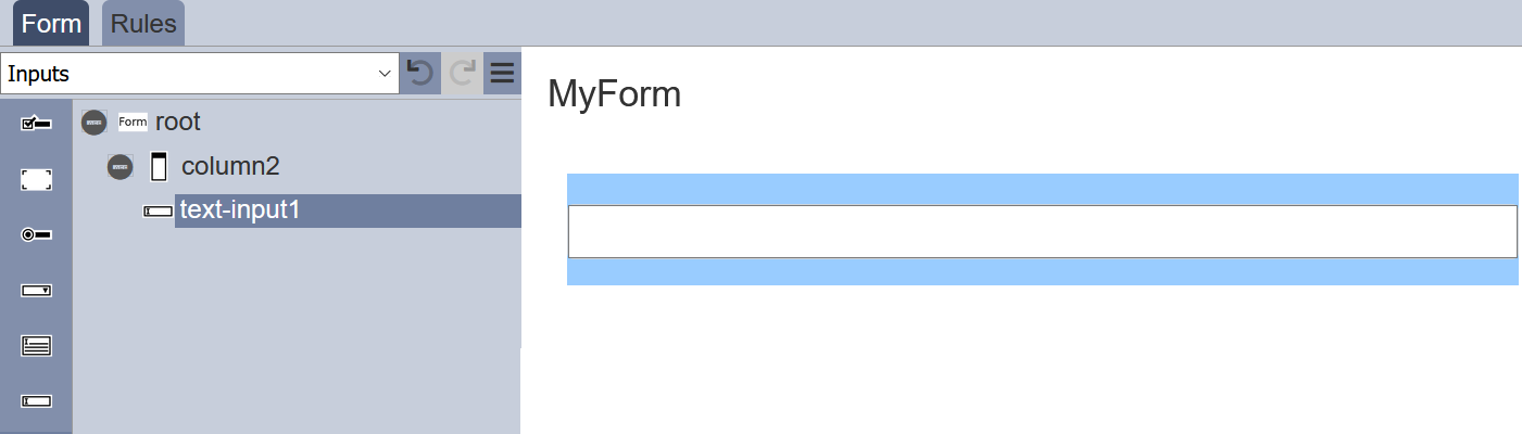
Inputs
Inputs includes input field components such as single line text input, multiple line text area, radio button, checkbox, drop-down selection, dataset selection, etc. To display an action component in the form, a block need to be added onto the form before the input component can be added.
To add an input component onto the form, simply drag and drop to the desired location in the form structure. To edit the properties, simply select the desired component and the properties of the desired component wil lbe displayed at the lower panel.
Checkbox
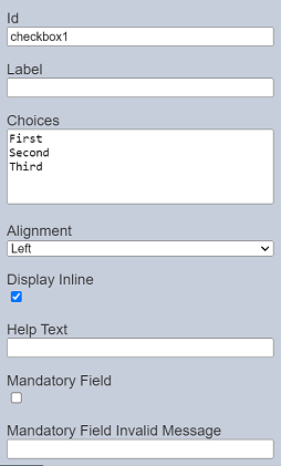
The Checkbox component allows you to add checkbox options onto the form.

It has the following properties.
| Field | Description | Default |
|---|---|---|
| Id | Name of the component that will be displayed in the form structure. | “checkboxX” |
| Label | Name of the component that will be displayed in the form. | None |
| Choices | Defines the checkbox choices on the form. | “First”, “Second”, “Third” |
| Display Inline | If selected, displays the checkboxes in a row. If unselected, displays the checkboxes in several rows. | Selected |
| Help Text | Text that will be displayed below the input. | None |
| Mandatory Field | If selected, a checkbox is to be selected or an error message will appear. The error message to be displayed is defined in the “Mandatory Field Error Message” field. |
Not selected |
| Mandatory Field Invalid Message | Defines the error message to be displayed if no checkbox is selected and when the “Mandatory Field” field is selected. | None |
The checkbox options can be edited using the “Choices” field, with one option in a row.
If the “Mandatory Field” is selected, the following will occur:
- A red asterisk will appear to indicate that this field is mandatory.
- If no value is selected for this field, the error message defined in the “Mandatory Field Invalid Message” will appear.
Dataset Checkbox
The Dataset Checkbox component allows you to add dataset selection options in the form of checkbox onto the form. Multiple select is permitted.
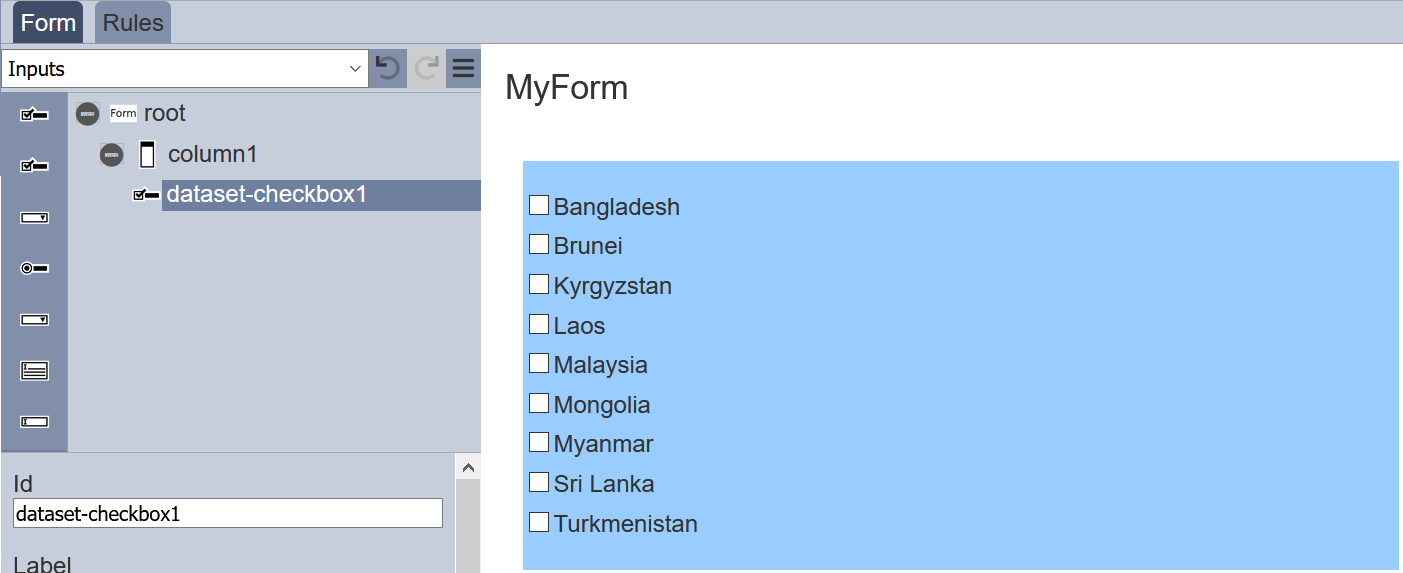
It has the following properties.
| Field | Description | Default |
|---|---|---|
| Id | Name of the component that will be displayed in the form structure. | “dataset-checkboxX” |
| Label | Name of the component that will be displayed in the form. | None |
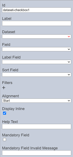
| Dataset | Selects the dataset to be used. | None |
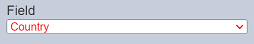
| Field | Selects the field from the selected dataset to be used. | None |
| Label Field | Selects the field whose values are to be displayed. | None |
| Sort Field | Selects the sorting field. | None |
| Filter | Adds criteria filters to a field of the selected dataset. | None |
| Alignment | Alignment of the checkboxes in the form. Available options: - Left - Centre - Right |
Left |
| Display Inline | If selected, displays the checkboxes in a row. If unselected, displays the checkboxes in several rows. | Selected |
| Help Text | Text that will be displayed below the input. | None |
| Mandatory Field | If selected, a checkbox is to be selected or an error message will appear. The error message to be displayed is defined in the “Mandatory Field Error Message” field. |
Not selected |
| Mandatory Field Invalid Message | Defines the error message to be displayed if no checkbox is selected and when the “Mandatory Field” field is selected. | None |
See Filter for more details on how to add criteria filter.
If the “Mandatory Field” is selected, the following will occur:
- A red asterisk will appear to indicate that this field is mandatory.
- If no value is selected for this field, the error message defined in the “Mandatory Field Invalid Message” will appear.
Do note that if the selected option in the field appears in red, it indicates that the selection has become invalid.
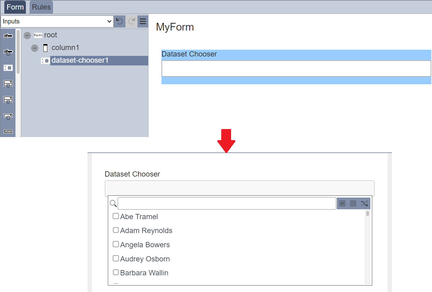
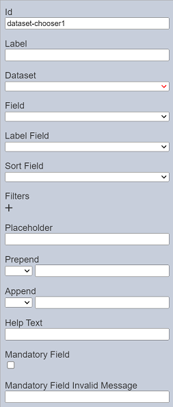
Dataset Chooser
The Dataset Chooser component allows you to add the values of a dataset field as selectable options in the form of checkboxes onto the form. One or more options can be selected by selecting the checkboxes. A search function is available to allow users to conduct a search on the options. There are options to select all, select none and invert selection by clicking on their respective icons next to the search function.
It has the following properties.
| Field | Description | Default |
|---|---|---|
| Id | Name of the component that will be displayed in the form structure. | “dataset-chooserX” |
| Label | Name of the component that will be displayed in the form. | None |
| Dataset | Selects the dataset to be used. | None |
| Field | Selects the field from the selected dataset to be used. | None |
| Label Field | Selects the field whose values are to be displayed. | None |
| Sort Field | Selects the sorting field. | None |
| Filter | Adds criteria filters to a field of the selected dataset. | None |
| Placeholder | Suggestion text for the text input. E.g.: Enter your password |
None |
| Prepend | Select either to display text, image or none before the choice. | None |
| Append | Select either to display text, image or none after the choice. | None |
| Help Text | Text that will be displayed below the input. | None |
| Mandatory Field | If selected, at least one option is to be selected or an error message will appear. The error message to be displayed is defined in the “Mandatory Field Error Message” field. |
Not selected |
| Mandatory Field Invalid Message | Defines the error message to be displayed if no option is selected and when the “Mandatory Field” field is selected. | None |
Do note that if the selected option in the field appears in red, it indicates that the selection has become invalid.
If the “Mandatory Field” is selected, the following will occur:
- A red asterisk will appear to indicate that this field is mandatory.
- If no value is selected for this field, the error message defined in the “Mandatory Field Invalid Message” will appear.
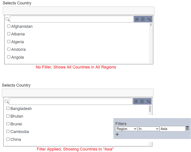
Filter
When a dataset and the desired field is selected, all the values in the field will appear as options. It may not be desired to show all options in the form. Therefore, a criteria filter can be added to filter out the options that should be shown in the form.
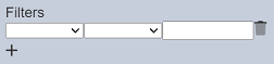
To add a criteria filter, click on the “+” icon beneath the “Filter” field. A new line will appear.
There are three components to form a criteria filter; namely the dataset field, operator and expression/value. The dataset field selects the field to filter. The expression defines the value to filter. The operator selects how the filter behaves along with the selected field and expression. When no dataset field and/or expression is defined, all options will be displayed when the form is run. When only the operator is selected and the dataset field and expresion is not defined, no options will be displayed.
To add a filter, select the desired field to filter in the first drop-down list. Selects the desired operator from the second drop-down list. In the textbox, enter the expression/value to filter the selected field. To cliear or delete a filter, click on the  icon. Too add more filters, click on the “+” icon.
When the form is run, the filter will be applied.
The expression can be substituted with the following expression:
${username}${userid}${email}${roles}${privileges}
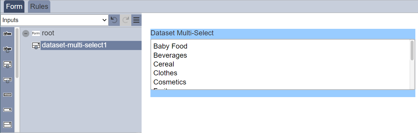
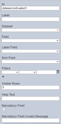
Dataset Multi-select
The Dataset Multi-select component allows you to add multiple dataset selection options in the form of drop-down list onto the form.
It has the following properties.
| Field | Description | Default |
|---|---|---|
| Id | Name of the component that will be displayed in the form structure. | “dataset-multi-sselectX” |
| Label | Name of the component that will be displayed in the form. | None |
| Dataset | Selects the dataset to be used. | None |
| Field | Selects the field from the selected dataset to be used. | None |
| Label Field | Selects the field whose values are to be displayed. | None |
| Sort Field | Selects the sorting field. | None |
| Filter | Adds criteria filters to a field of the selected dataset. | None |
| Visible Rows | Defines how many rows are visible in the selection box. Minimum value is “2” and maximum value is “50”. |
“5” |
| Help Text | Text that will be displayed below the input. | None |
| Mandatory Field | If selected, at least one option is to be selected or an error message will appear. The error message to be displayed is defined in the “Mandatory Field Error Message” field. |
Not selected |
| Mandatory Field Invalid Message | Defines the error message to be displayed if no option is selected and when the “Mandatory Field” field is selected. | None |
See Filter for more details on how to add criteria filter.
To select multiple options, click the “ctrl” key while selecting the options. Or click the “shift” key and select the options.
Do note that if the selected option in the field appears in red, it indicates that the selection has become invalid.
If the “Mandatory Field” is selected, the following will occur:
- A red asterisk will appear to indicate that this field is mandatory.
- If no value is selected for this field, the error message defined in the “Mandatory Field Invalid Message” will appear.
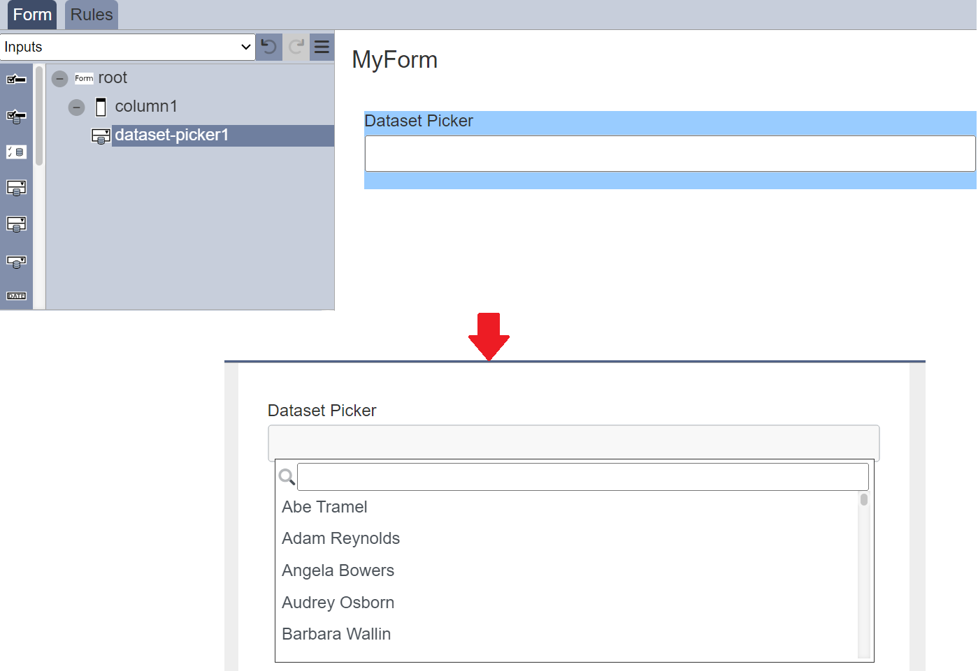
Dataset Picker
The Dataset Picker component allows you to add the values of a dataset field as selectable options in the form of drop-down list onto the form. A search function is available to allow users to conduct a search on the options.
It has the following properties.

| Field | Description | Default |
|---|---|---|
| Id | Name of the component that will be displayed in the form structure. | “dataset-pickerX” |
| Label | Name of the component that will be displayed in the form. | None |
| Dataset | Selects the dataset to be used. | None |
| Field | Selects the field from the selected dataset to be used. | None |
| Label Field | Selects the field whose values are to be displayed. | None |
| Sort Field | Selects the sorting field. | None |
| Filter | Adds criteria filters to a field of the selected dataset. | None |
| Placeholder | Suggestion text for the text input. E.g.: Enter your password |
None |
| Prepend | Select either to display text, image or none before the choice. | None |
| Append | Select either to display text, image or none after the choice. | None |
| Help Text | Text that will be displayed below the input. | None |
| Mandatory Field | If selected, an option is to be selected or an error message will appear. The error message to be displayed is defined in the “Mandatory Field Error Message” field. |
Not selected |
| Mandatory Field Invalid Message | Defines the error message to be displayed if no option is selected and when the “Mandatory Field” field is selected. | None |
See Filter for more details on how to add criteria filter.
Do note that if the selected option in the field appears in red, it indicates that the selection has become invalid.
If the “Mandatory Field” is selected, the following will occur:
- A red asterisk will appear to indicate that this field is mandatory.
- If no value is selected for this field, the error message defined in the “Mandatory Field Invalid Message” will appear.
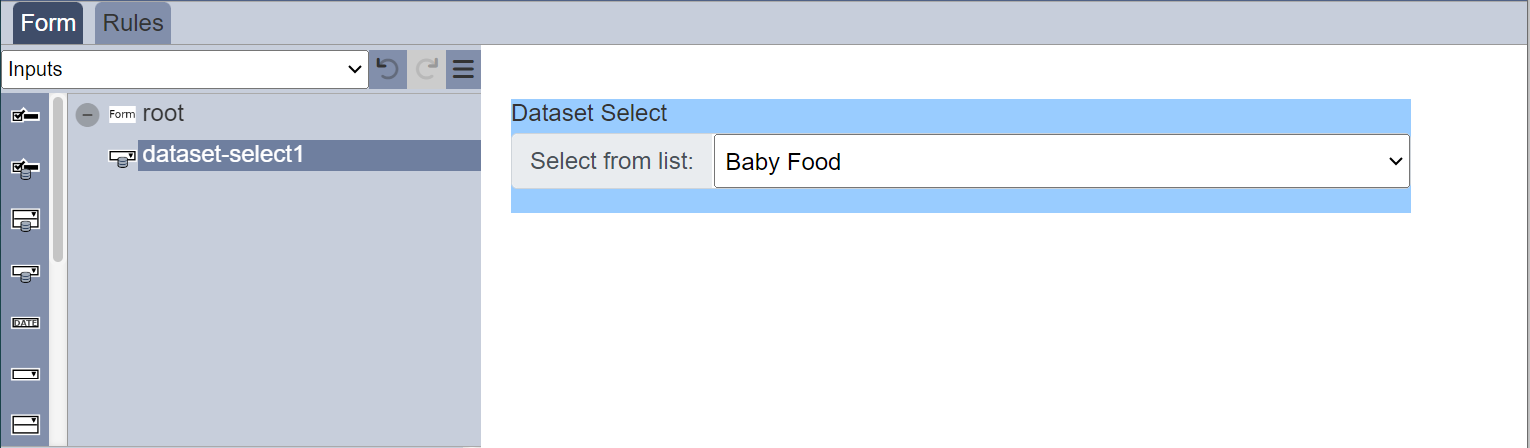
Dataset Select
The Dataset Select component allows you to add dataset selection options in the form of drop-down list onto the form.
It has the following properties.
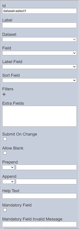
| Field | Description | Default |
|---|---|---|
| Id | Name of the component that will be displayed in the form structure. | “dataset-selectX” |
| Label | Name of the component that will be displayed in the form. | None |
| Dataset | Selects the dataset to be used. | None |
| Field | Selects the field from the selected dataset to be used. | None |
| Label Field | Selects the field whose values are to be displayed. | None |
| Sort Field | Selects the sorting field. | None |
| Filter | Adds criteria filters to a field of the selected dataset. | None |
| Extra Fields | Lists the extra fields to be used by other component (such as Derived Text). | None |
| Submit On Change | If selected, when a choice is made, the form is auto submitted. | Not selected |
| Allow Blank | If selected, allows a blank option in the lst. | Not selected |
| Prepend | Select either to display text, image or none before the choices. | None |
| Append | Select either to display text, image or none after the choices. | None |
| Help Text | Text that will be displayed below the input. | None |
| Mandatory Field | If selected, an option is to be selected or an error message will appear. The error message to be displayed is defined in the “Mandatory Field Error Message” field. |
Not selected |
| Mandatory Field Invalid Message | Defines the error message to be displayed if no option is selected and when the “Mandatory Field” field is selected. | None |
See Filter for more details on how to add criteria filter.
Do note that if the selected option in the field appears in red, it indicates that the selection has become invalid.
If the “Mandatory Field” is selected, the following will occur:
- A red asterisk will appear to indicate that this field is mandatory.
- If no value is selected for this field, the error message defined in the “Mandatory Field Invalid Message” will appear.
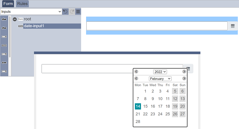
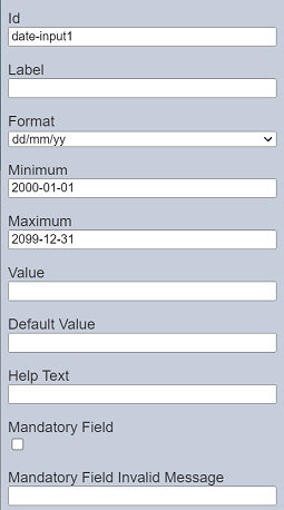
Date Input
The Date Input component allows you to add a date selection option in the form of drop-down list onto the form.
It has the following properties.
| Field | Description | Default |
|---|---|---|
| Id | Name of the component that will be displayed in the form structure. | “date-inputX” |
| Label | Name of the component that will be displayed in the form. | None |
| Dataset | Selects the dataset to be used. | None |
| Format | Selects the format of the date. Available options: - “yy/mm/dd” - “dd/mm/yy” - “mm/dd/yy” |
“dd/mm/yy” |
| Minimum | Sets the lower date range for selection in the date picker. | “2000-01-01” |
| Maximum | Sets the upper date range for selection in the date picker. | “2099-12-31” |
| Value | Defines the initial value. If left empty, today’s date is used. |
None |
| Default Value | Defines the default value when “Value” field is empty. It can either be a fixed date or a relative date. |
None |
| Help Text | Text that will be displayed below the input. | None |
| Mandatory Field | If selected, a date is to be selected or an error message will appear. The error message to be displayed is defined in the “Mandatory Field Error Message” field. |
Not selected |
| Mandatory Field Invalid Message | Defines the error message to be displayed if no date is selected and when the “Mandatory Field” field is selected. | None |
If the “Mandatory Field” is selected, the following will occur:
- A red asterisk will appear to indicate that this field is mandatory.
- If no value is entered or selected for this field, the error message defined in the “Mandatory Field Invalid Message” will appear.
Set Max/Min Dates
The “Value” field defines the initial date value. If it is left empty, today’s date is used. While the “Minimum” and “Maximum” fields set the lower and upper date ranges for selection in the date picker. If these values are not defined or the syntax is wrong, the default values will be used.
All these values can either be absolute dates or as relative offsets. The allowed offsets are:
[+/-][0-9]+[dmy]
You can define the field as a relative value, e.g., +5d, -23y or +3m, etc. If today’s date is 2022-01-01, +5d will constitute 2022-01-06.
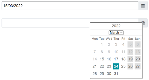
Date Range
You can also set a data range using two data input components.
To do so, add two date input components onto the form. Set the “Minimum” and “Maximum” fields in the date input components as below. Do note the “Id” of the components are changed.
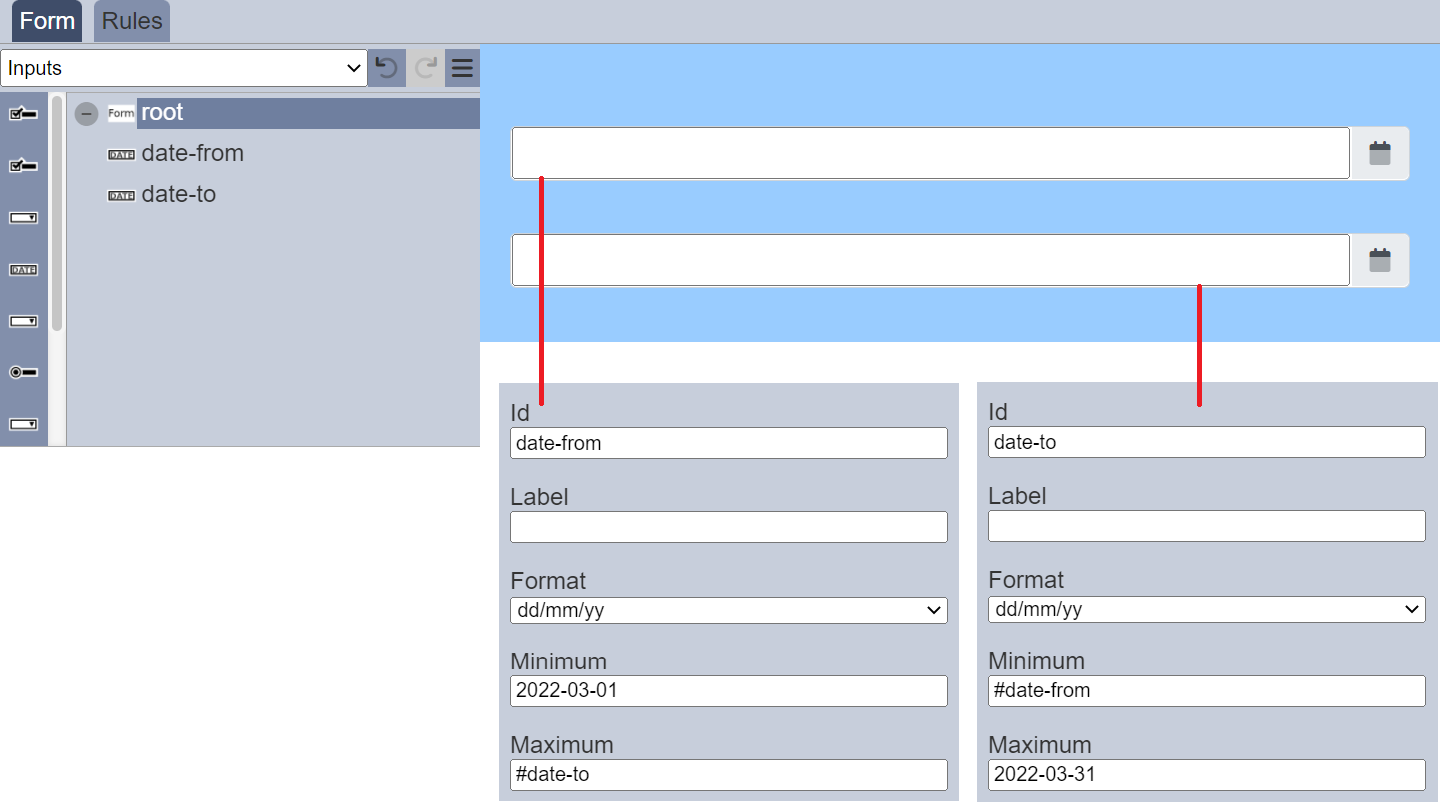
The form will appear as a pair of date pickers which limit the available choices.
Form Select
The Form Select component allows you to link one form onto another form.
It has the following properties.
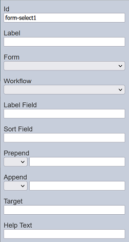
| Field | Description | Default |
|---|---|---|
| Id | Name of the component that will be displayed in the form structure. | “form-selectX” |
| Label | Name of the component that will be displayed in the form. | None |
| Form | Selects the form from the drop-down list. | Blank |
| Workflow | If selected, displays the checkboxes in a row. If unselected, displays the checkboxes in several rows. | Selected |
| Label Field | Selects the field whose values are to be displayed. | None |
| Sort Field | Selects the sorting field. | None |
| Prepend | Select either to display text, image or none before the choices. | None |
| Append | Select either to display text, image or none after the choices. | None |
| Target | Defines where selected form launches from. | None |
| Help Text | Text that will be displayed below the input. | None |
Refer to Examples for a simple example on how to use Form Select component.
Multiple Selection
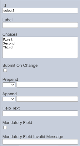
The Multiple Selection component allows you to place a drop-down selection onto the form.
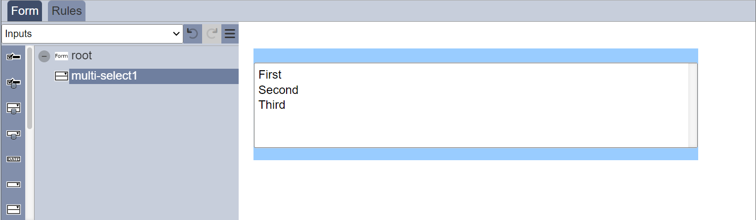
It has the following properties.
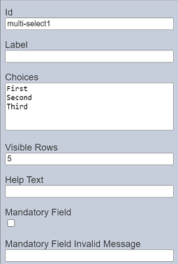
| Field | Description | Default |
|---|---|---|
| Id | Name of the component that will be displayed in the form structure. | “selectX” |
| Label | Name of the component that will be displayed in the form. | None |
| Choices | Defines the drop-down choices on the form. To add a blank option, use “[]” as an option. |
“First”, “Second”, “Third” |
| Submit On Change | If selected, when a choice is made, the form is auto submitted. | Not selected |
| Prepend | Select either to display text, image or none before the choices. | None |
| Append | Select either to display text, image or none after the choices. | None |
| Help Text | Text that will be displayed below the input. | None |
| Mandatory Field | If selected, at least one option is to be selected or an error message will appear. The error message to be displayed is defined in the “Mandatory Field Error Message” field. |
Not selected |
| Mandatory Field Invalid Message | Defines the error message to be displayed if no option is selected and when the “Mandatory Field” field is selected. | None |
The selection options can be edited using the “Choices” field, with one option in a row.
If the “Mandatory Field” is selected, the following will occur:
- A red asterisk will appear to indicate that this field is mandatory.
- If no value is selected for this field, the error message defined in the “Mandatory Field Invalid Message” will appear.
Dynamic Select
The choices for the Multiple Selection component can be edited using the “Choices” field in its properties. This make the choices static, which means it cannot be changed unless the “Choices” field is edited.
You can make the choices dynamic without having to edit the “Choices” field in the form.
Below is a simple example of using ETL chainset and workflow to create dynamic choices.
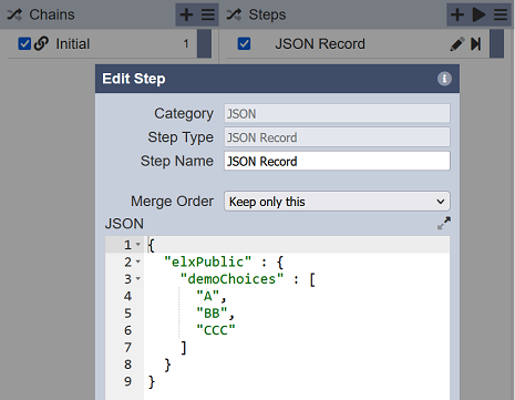
First, create an ETL chainset using the ETL module. Add a “JSON Record” ETL step that initialises the elxPublic with the choices for the form. If a blank option is desired, use [] as an option.
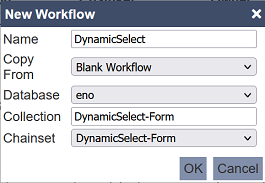
Second, create a workflow using the Workflows module with the settings are per screenshot.
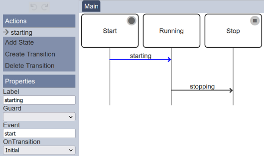
In the workflow, select “starting” transition. Set the “OnTransition” field to “Initial” in the “Properties” panel.
Third, create a simple form with a Multiple Selection component with no choices defined. You can also add a HTML component to view the choices. Set up the two components are per the screenshot below.
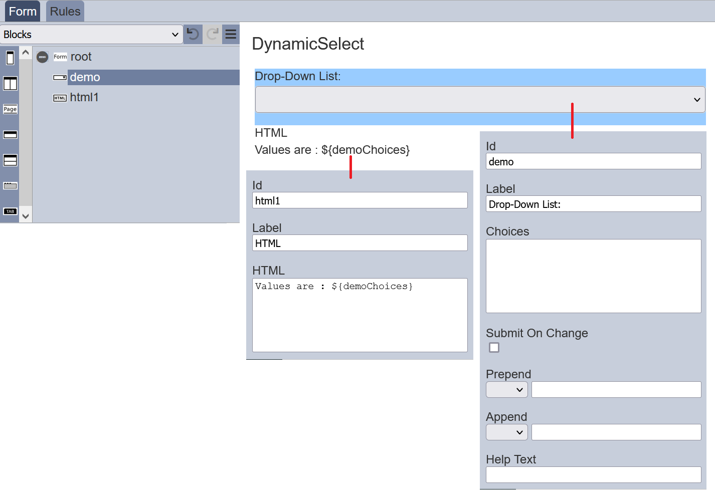
When the “Choices” field in the Multiple Selection component is not defined (i.e., left blank), it will look for choices in the elxPublic by taking the “Id” field (“demo”) and + “Choices”. In other words, it will look for “demoChoices”.
Lastly, test the form by clicking on the “More Actions” icon at the top row and select the “Run Form” option. In the “Run Form” dialog box, select the workflow created earlier, in this case “DynamicSelect-Form”.
The form is generated in another tab.
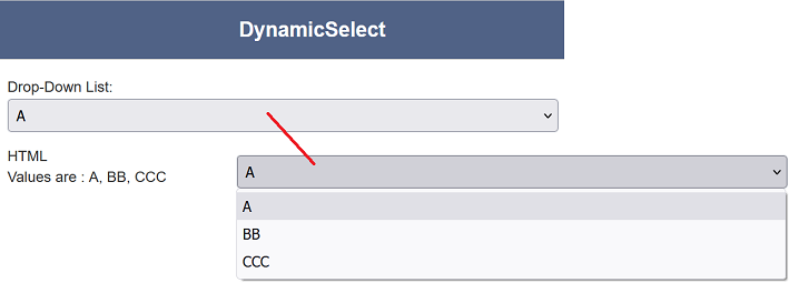
You can click on the “Drop-Down List” to select the choices listed in the ETL. The HTML view component also displays the values of the Multiple Selection component.
With this dynamic select, you have different set of choices for the same form instead of creating different forms for different situations.
Do note that this dynamic select method also works with the Checkbox component.
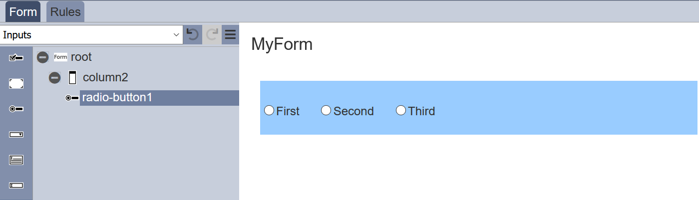
Radio Button
The Radio Button component allows you to add radio button options onto the form.
It has the following properties.
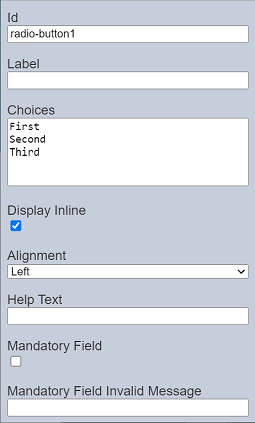
| Field | Description | Default |
|---|---|---|
| Id | Name of the component that will be displayed in the form structure. | “radio-buttonX” |
| Label | Name of the component that will be displayed in the form. | None |
| Choices | Defines the radio button choices on the form. | “First”, “Second”, “Third” |
| Display Inline | If selected, displays the checkboxes in a row. If unselected, displays the checkboxes in several rows. | Selected |
| Help Text | Text that will be displayed below the input. | None |
| Mandatory Field | If selected, an option is to be selected or an error message will appear. The error message to be displayed is defined in the “Mandatory Field Error Message” field. |
Not selected |
| Mandatory Field Invalid Message | Defines the error message to be displayed if no option is selected and when the “Mandatory Field” field is selected. | None |
The radio button options can be edited using the “Choices” field, with one option in a row.
If the “Mandatory Field” is selected, the following will occur:
- A red asterisk will appear to indicate that this field is mandatory.
- If no value is selected for this field, the error message defined in the “Mandatory Field Invalid Message” will appear.
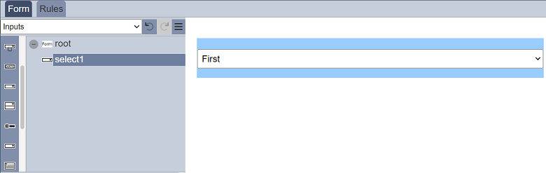
Select
The Select component allows you to place a drop-down selection onto the form.
It has the following properties.
| Field | Description | Default |
|---|---|---|
| Id | Name of the component that will be displayed in the form structure. | “selectX” |
| Label | Name of the component that will be displayed in the form. | None |
| Choices | Defines the drop-down choices on the form. To add a blank option, use “[]” as an option. |
“First”, “Second”, “Third” |
| Submit On Change | If selected, when a choice is made, the form is auto submitted. | Not selected |
| Prepend | Select either to display text, image or none before the choices. | None |
| Append | Select either to display text, image or none after the choices. | None |
| Help Text | Text that will be displayed below the input. | None |
| Mandatory Field | If selected, an option is to be selected or an error message will appear. The error message to be displayed is defined in the “Mandatory Field Error Message” field. |
Not selected |
| Mandatory Field Invalid Message | Defines the error message to be displayed if no option is selected and when the “Mandatory Field” field is selected. | None |
If the “Mandatory Field” is selected, the following will occur:
- A red asterisk will appear to indicate that this field is mandatory.
- If no value is selected for this field, the error message defined in the “Mandatory Field Invalid Message” will appear.
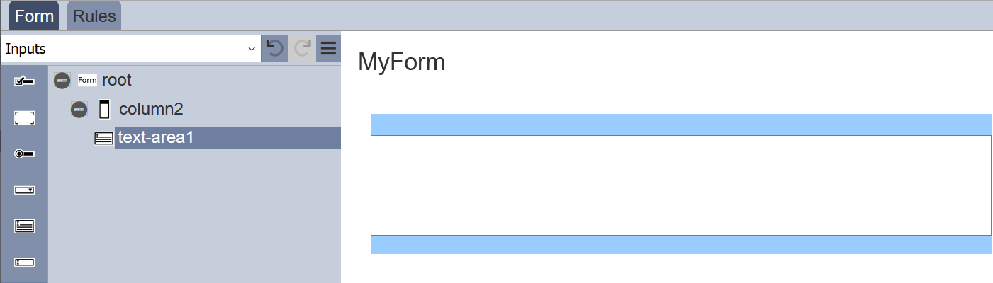
Text Area
The Text Area component allows you to place a multiple-lined text box onto the form.
It has the following properties.
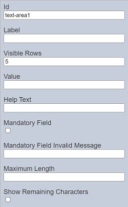
| Field | Description | Default |
|---|---|---|
| Id | Name of the component that will be displayed in the form structure. | “text-areaX” |
| Label | Name of the component that will be displayed in the form. | None |
| Visible Rows | Number of rows (between 2 to 50) on the form. | “5” |
| Value | Defines the default value. | None |
| Help Text | Text that will be displayed below the text area. | None |
| Mandatory Field | If selected, some text are required to be entered or an error message will appear. The error message to be displayed is defined in the “Mandatory Field Error Message” field. |
Not selected |
| Mandatory Field Invalid Message | Defines the error message to be displayed if no text is entered and when the “Mandatory Field” field is selected. | None |
| Maximum Length | Defines the maximum length of the text to be entered. | None |
| Show Remaining Characters | When selected displays the number of characters left that can be entered into the component. | None |
The number of lines to be displayed on the form via “Visible Rows” field can be from 2 to 50, default is 5 lines.
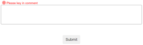
Below is an example of the Text Area component displaying the message defined in the “Mandatory Field Invalid Message” field, when the “Mandatory Field” is selected and no text is entered in the text area.
When the “Show Remaining Characters” field is selected, the defined value in “Maximum Length” is displayed in the lower right corner of the component.
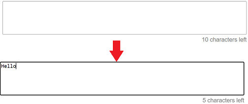
As characters are keyed into the text box, the number of characters is reduced. User will not be able to enter anymore text once the maximum number of characters are entered.
Text Input
The Text Input component allows you to place a single-lined input onto the form. The type of input comes in several form as defined in the “Input Type” field.
It has the following properties.
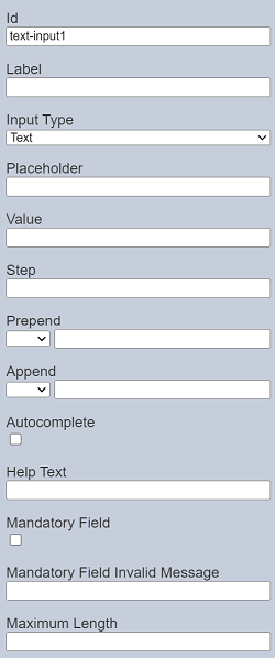
| Field | Description | Default |
|---|---|---|
| Id | Name of the component that will be displayed in the form structure. | “text-inputX” |
| Label | Name of the component that will be displayed in the form. | None |
| Input Type | Selects the type of input. Available option: - Text - Date - Time - Password - Number - File |
“Text” |
| Placeholder | Suggestion text for the text input. E.g.: Enter your password |
None |
| Value | Defines the default value. | None |
| Step | Defines the step value for Input Type such as date, time and number. | None |
| Prepend | Select either to display text, image or none before the input. | None |
| Append | Select either to display text, image or none after the input. | None |
| Autocomplete | If selected, allows autocomplete. | Not selected |
| Help Text | Text that will be displayed below the text area. | None |
| Mandatory Field | If selected, some text are required to be entered or an error message will appear. The error message to be displayed is defined in the “Mandatory Field Error Message” field. |
Not selected |
| Mandatory Field Invalid Message | Defines the error message to be displayed if no text is entered and when the “Mandatory Field” field is selected. | None |
| Maximum Length | Defines the maximum length of the text to be entered. | None |
If the “Mandatory Field” is selected, the following will occur:
- A red asterisk will appear to indicate that this field is mandatory.
- If no value is entered for this field, the error message defined in the “Mandatory Field Invalid Message” will appear.
Prepend/Append
There are three options for the “Prepend” and “Append” property:
- Blank
- Text
- Icon
The “Blank” option is the default option. No text will appear in the Text Input component in the form even when text is entered in the textbox in the property..
If “Text” is selected, key in the desired text in the property textbox. The text will appear in the form.
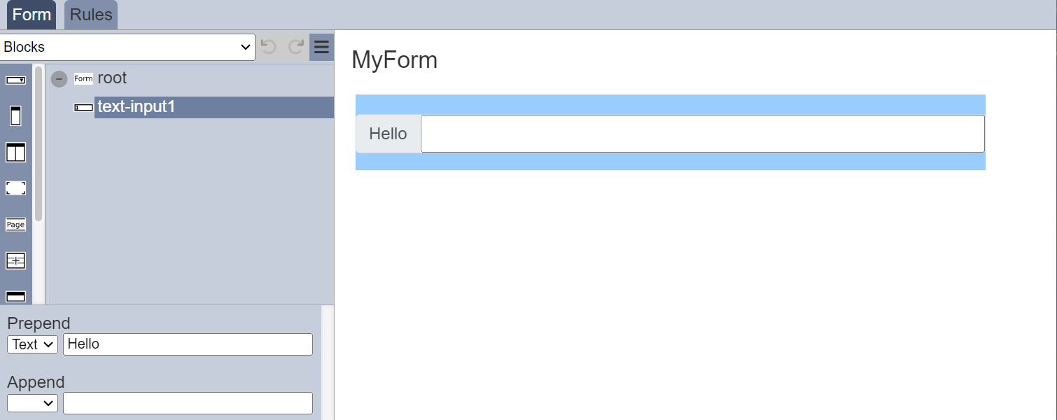
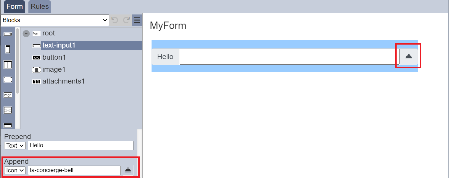
If the “Icon” option is selected, an empty icon will appear next to the textbox in the property. Click on the icon and the Icon Picker will appear.
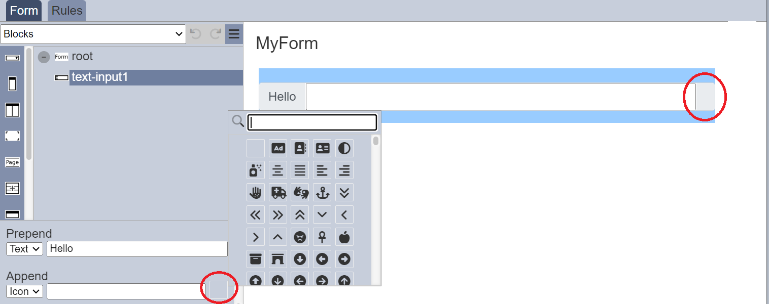
Select the desired icon. The selected icon will appear in the form. In the property, the name of the icon will appear in the textbox and the empty icon will be replaced by the selected icon.
Text Regex Input
The Text Regex Input component allows you to validate a regular expression (regex) input onto the form. Do note that this component only validates the data input onto this component.
It has the following properties.
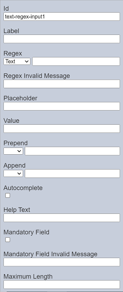
| Field | Description | Default |
|---|---|---|
| Id | Name of the component that will be displayed in the form structure. | “text-regex-inputX” |
| Label | Name of the component that will be displayed in the form. | None |
| Regex | Defines the regular expression. | None |
| Regex Invalid Message | Defines the error message to be displayed when the regular expression entered does not match the defined regex. | None |
| Placeholder | Suggestion text for the text input. E.g.: Enter your password |
None |
| Value | Defines the default value. | None |
| Prepend | Select either to display text, image or none before the input. | None |
| Append | Select either to display text, image or none after the input. | None |
| Autocomplete | If selected, allows autocomplete. | Not selected |
| Help Text | Text that will be displayed below the text area. | None |
| Mandatory Field | If selected, a regex text is to be entered or an error message will appear. The error message to be displayed is defined in the “Mandatory Field Error Message” field. |
Not selected |
| Mandatory Field Invalid Message | Defines the error message to be displayed if no text is entered and when the “Mandatory Field” field is selected. | None |
| Maximum Length | Defines the maximum length of the text to be entered. | None |
If the regex entered does not match the format as defined in the “Regex” field, the error message defined in “Regex Invalid Message” will appear.
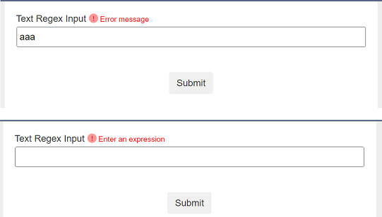
If the “Mandatory Field” is selected, the following will occur:
- A red dot will appear to indicate that this field is mandatory.
- If no regex is entered for this field, the error message defined in the “Mandatory Field Invalid Message” will appear.
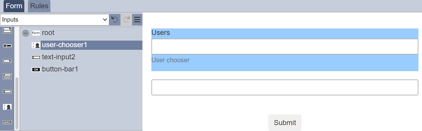
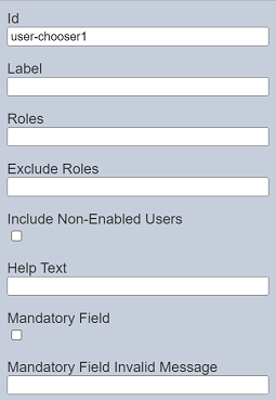
User Chooser
The User Chooser component allows you to select one or more users from a drop-down list based on pre-defined Roles.
It has the following properties.
| Field | Description | Default |
|---|---|---|
| Id | Name of the component that will be displayed in the form structure. | “user-chooserX” |
| Label | Name of the component that will be displayed in the form. | None |
| Roles | The comma-separated list of roles which will decide the users to show. | None |
| Exclude Roles | Defines which role to exclude from the list. | None |
| Include Non-Enabled Users | If selected, list of users will include disabled users. | Not selected |
| Help Text | Text that will be displayed below the component. | None |
| Mandatory Field | If selected, an option is to be selected or an error message will appear. The error message to be displayed is defined in the “Mandatory Field Error Message” field. |
Not selected |
| Mandatory Field Invalid Message | Defines the error message to be displayed if no option is selected and when the “Mandatory Field” field is selected. | None |
The “Roles” field selects the users available for the selected role. For example, if the role Admin consists of two users (namely adminA and adminB), the drop-down list in the form will display these two users.
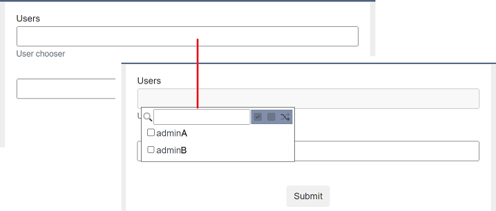
You can choose one or more users from the list by selecting the checkboxes next to the desired users. Each user is separated by a comma.
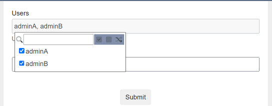
Alternatively, you can use search for the desired user by keying in the keyword in the search function at the top. You can also choose to select all, select none or invert selection by clicking on their respective icons on the right of the search function.
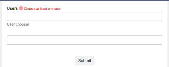
If the “Mandatory Field” is selected, the following will occur:
- A red dot will appear to indicate that this field is mandatory.
- If no option is entered for this field, the error message defined in the “Mandatory Field Invalid Message” will appear.
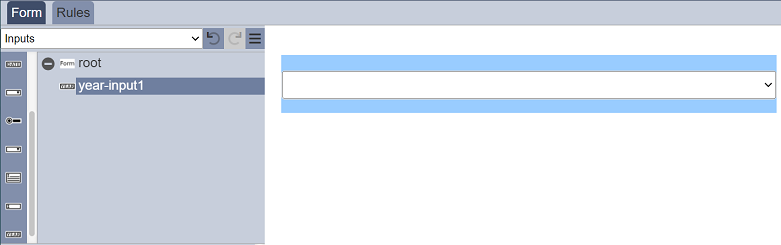
Year Input
The Year Input component allows you to select a value from a range of years from the drop-down list.
It has the following properties.
| Field | Description | Default |
|---|---|---|
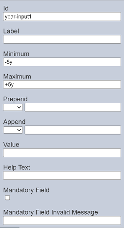
| Id | Name of the component that will be displayed in the form structure. | “year-inputX” |
| Label | Name of the component that will be displayed in the form. | None |
| Minimum | Sets the lower range in the year selection based on current year. | “-5y” |
| Maximum | Sets the upper range in the year selection based on current year. | “+5y” |
| Prepend | Select either to display text, image or none before the input. | None |
| Append | Select either to display text, image or none after the input. | None |
| Value | Defines the initial year value. If undefined, blank is displayed. |
Blank |
| Help Text | Text that will be displayed below the input. | None |
| Mandatory Field | If selected, a value is to be selected or an error message will appear. The error message to be displayed is defined in the “Mandatory Field Error Message” field. |
Not selected |
| Mandatory Field Invalid Message | Defines the error message to be displayed if no value is selected and when the “Mandatory Field” field is selected. | None |
The “Minimum” and “Maximum” fields defines the lower and upper range for the year selection based on the current year. The default values are -5y and +5y respectively. If this year is 2022, the year range for selection will be from 2017 to 2027.
If the “Mandatory Field” is selected, the following will occur:
- A red asterisk will appear to indicate that this field is mandatory.
- If no value is entered or selected for this field, the error message defined in the “Mandatory Field Invalid Message” will appear.