
Blocks
Blocks include components such as column(s), page, row(s), etc. These block components work as placeholders for the input or action components to be placed.
To add a block component, simply drag and drop under the desired level. The block component will not show up in the form itself but creates a canvas for adding input and/or action components. Hence, a block component need to be added before any input or action component can be displayed in the form. The properties for each block component varies.
Cascade Group
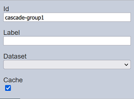
The Cascade Group component allows you to create cascading input selects using the dataset defined. The data for the next input select depends on the selection from the previous input select. There can be any number of such selects.
It has the following properties.
| Field | Description | Default |
|---|---|---|
| Id | Name of the column that will be displayed in the form structure. | “cascade-groupX” |
| Label | Name of the component that will be displayed in the form. | None |
| Dataset | Dataset to be used. | None |
| Cache | If selected, loads the set of data once when the form loads. If unselected, loads the data from the server any time a select is changed. |
Selected |
Example: Using Cascade Group
Below is an example of using Cascade Group component to create a form with cascading input select.
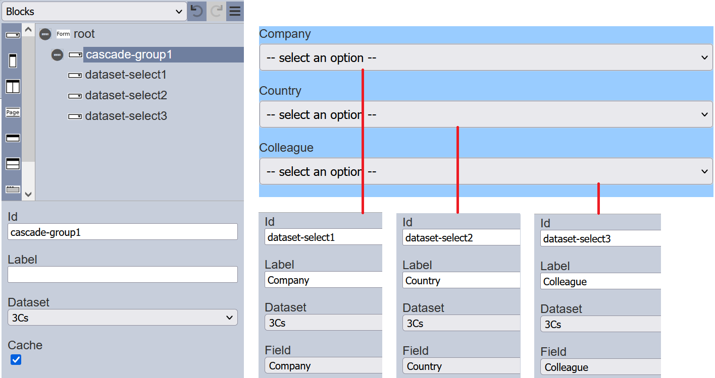
Add a Cascade Group component onto the form. Select the desired dataset to be used in the “Dataset” field. Then add three Data Select components onto the form. Set up the components are per the screenshot below.
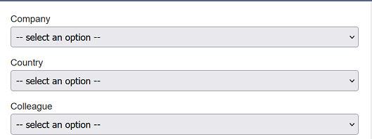
Run the form without any workflow.
Select the any option in the “Company” field. The available options for the selected option will appear in the “Country” field. Depending on the option selected in the “Country” field, the available options for the selection option will appear in the “Colleague” field.
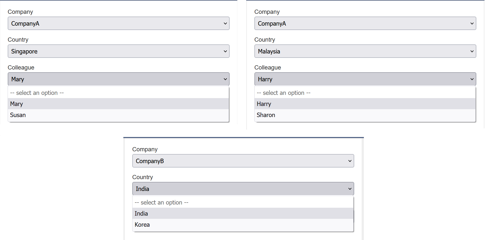
In the example above, different option selected in the “Company” field gives a different set of options in the “Country” field. And the different option selected in the “Country” field will give a different set of options in the “Colleague” field.
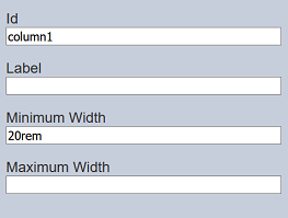
Column
A Column component allows you to add a single column onto the form, as well as defining its width. It has the following properties.
| Field | Description | Default |
|---|---|---|
| Id | Name of the column that will be displayed in the form structure. | “columnX” |
| Label | Name of the column that will be displayed in the form. | None |
| Minimum Width | Minimum width of the column. | 20rem |
| Maximum Width | Maximum width of the column. | If not defined, the width of the device is used. |
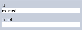
Columns
The Columns component acts as a placeholder that allows multiple single columns to be added onto the form. It is particularly useful when you need to show or hide some inputs based on previous selection using the rules being set up prior.
It has the following properties.
| Field | Description | Default |
|---|---|---|
| Id | Name of the multiple columns that will be displayed in the form structure. | “columnsX” |
| Label | Name of the multiple columns that will be displayed in the form. | None |
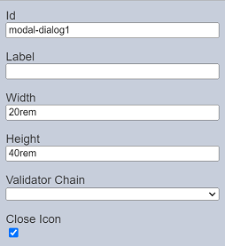
Modal Dialog
The Modal Dialog component allows you to create a modal dialog box. It has the following properties.
| Field | Description | Default |
|---|---|---|
| Id | Name of the dialog box that will be displayed in the form structure. | “modal-dialogX” |
| Label | Name of the dialog box that will be displayed in the form. | None |
| Width | Width of the dialog box. | “20rem” |
| Height | Height of the dialog box. | “40rem” |
| Validator Chain | Selects the ETL chain to validate the form. The “root” need to define the ETL chainset for the form before this field has any option to select. |
None |
| Close Icon | If selected, adds a “X” icon at the upper right corner of the dialog box. | Selected |
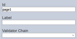
Page
The Page component allows you to create a multiple-paged form. It has the following properties.
| Field | Description | Default |
|---|---|---|
| Id | Name of the page that will be displayed in the form structure. | “pageX” |
| Label | Name of the page that will be displayed in the form. | None |
| Validator Chain | Selects the ETL chain to validate the form. The “root” need to define the ETL chainset for the form before this field has any option to select. |
None |
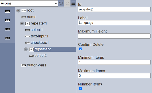
Repeater
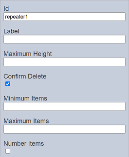
The Repeater component allows you to add a space where other components can be added within it and allow the component itself to be duplicated again. It has the following properties.
| Field | Description | Default |
|---|---|---|
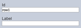
| Id | Name of the page that will be displayed in the form structure. | “repeaterX” |
| Label | Name of the repeater that will be displayed in the form. | None |
| Maximum Height | Height of the component in the form. | None |
| Confirm Delete | If selected, a dialog box will appear to confirm deletion of repeater. | Selected |
| Minimum Items | Defines the minimum number of repeaters. | None |
| Maximum Items | Defines the maximum number of repeaters. | None |
| Number Items | If selected, displays the numeric number of the repeaters. | Not selected |
Example
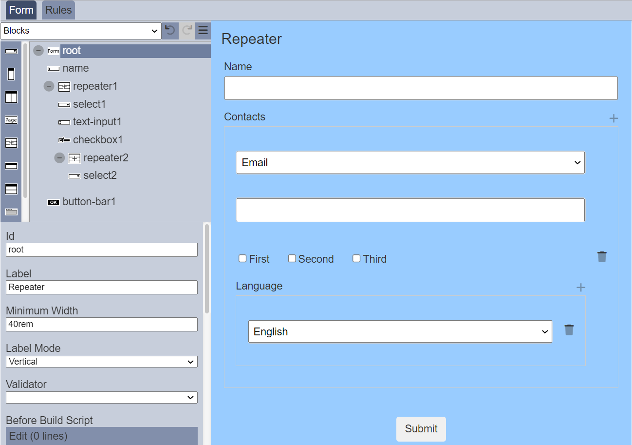
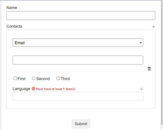
In this example, two Repeater components are used in the form.
When the form is run, by default the repeater is minimised.
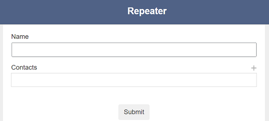
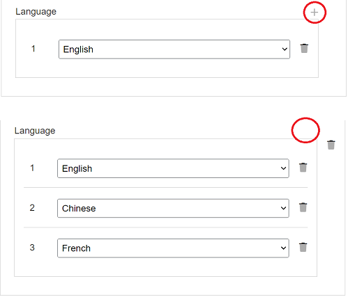
The first Repeater component is the “Contacts” section and the second Repeater component is the “Language” section. To add a contact, click on the “+” icon on the right of the “Contacts” section. The “Contacts” section will expand and display the components within it. To add more contacts, click on the “+” icon and the Repeater component will duplicate itself and display in the form.
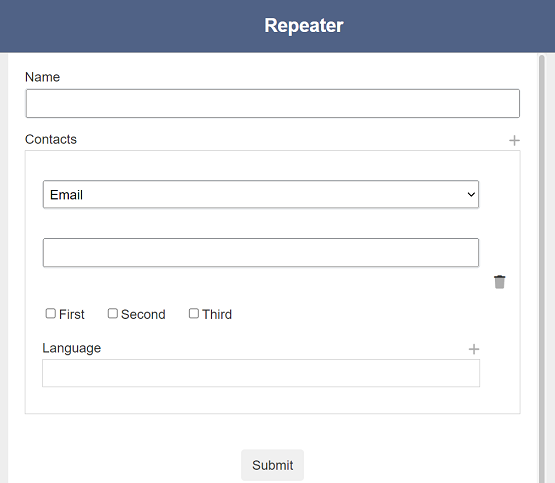
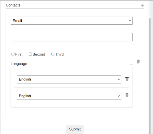
To add a language, click on the “+” icon on the right of the “Language” section.
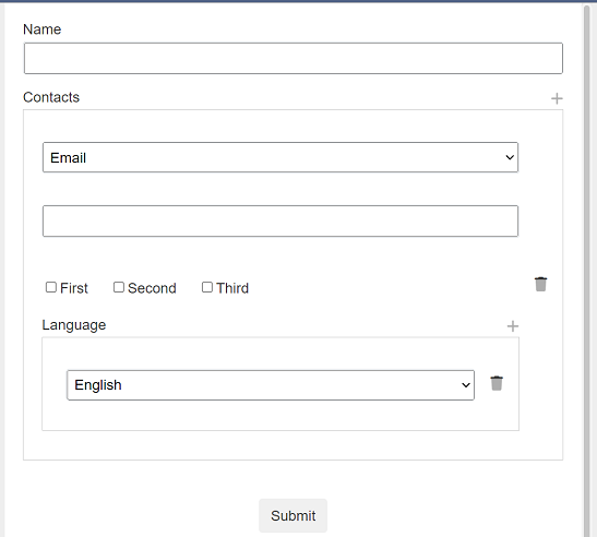
Select the desired language from the drop-down list. To add more languages, click on the “+” icon again.
To remove a language, click on the  “Delete Row” icon next to the language selected. A pop-up dialog box will appear cautioning the action.
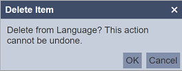
To confirm, click on the “OK” button to delete the language. Click on the “Cancel” button aborts the action.
If the “Minimum Items” and “Maximum Items” properties, error messages will appear when the conditions are not met. In the example below, the second Repeater component has the above two properties set.
Run the form and click on the “+” icon on the right of the “Contacts” section. Without selecting any language, click on the “Submit” button. An error message will appear.
Click on the “+” icon on the right of the “Language” and select the desired language. Once the maximum number of languages are added (in this case its “3”, the “+” icon will disappear.
Row/Rows
The Rows/Rows component allows you to add a row or multiple rows onto the form. A row only allows you to add input or action component in a single row while multiple rows, as the name implies, allows you to add multiple rows of input or action components.
It has the following properties.
| Field | Description | Default |
|---|---|---|
| Id | Name of the row or multiple rows that will be displayed in the form structure. | “rowX” |
| Label | Name of the row or multiple rows that will be displayed in the form. | None |
Tab Bar
The Tab Bar component along with the Tab Panels, allows you to create form with multiple tabs. It puts a placeholder in the form to display the names of the Tab Panel components that were added into the form under it.
It has the following properties.
| Field | Description | Default |
|---|---|---|
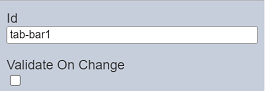
| Id | Name of the Tab Bar that will be displayed in the form structure. | “tab-barX” |
| Validate On Change | IF selected, calls the ETL chainset to validate the inputs in the current tab. | Not selected |
If no Tab Panel components are added onto the form under the Tab Bar component, the Tab Bar component will not be visible in the form. Once Tab Panel components are added under the Tab Bar component, the labels of the Tab Panel components will appear in the Tab Bar component.
Tab Panel
The Tab Panel component along with the Tab Bar component, allows you to create form with multiple tabs. The Tab Panel components are to be added under the Tab Bar component.
It has the following properties.
| Field | Description | Default |
|---|---|---|
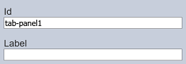
| Id | Name of the Tab Panel that will be displayed in the form structure. | “tab-panelX” |
| Label | Name of the Tab Panel that will be displayed in the form. | None |
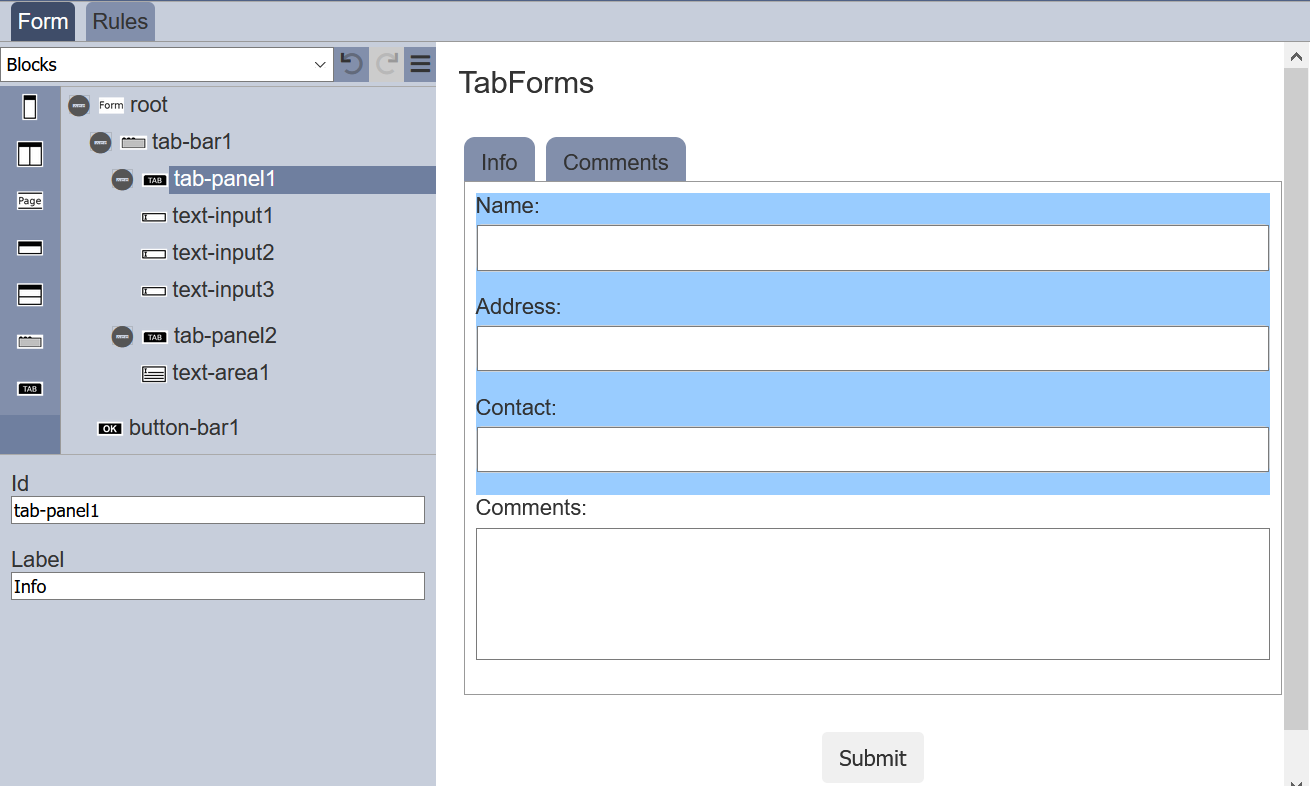
Example 1: Using Tab Bar and Tab Panels
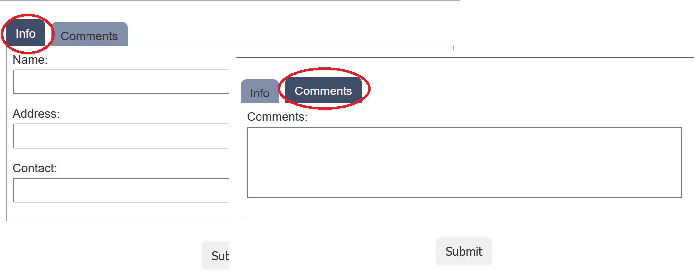
The simple example below creates a form with two tabs.
Create a form with the following components under the root. The Tab Bar component (tab-bar1) is first added to the root, which places a placeholder to display the labels of the subsequent Tab Panel components that are added.
Two Tab Panel components (tab-panel1 and tab-panel2) are added under tab-bar1. Change the value in “Label” fields as “Info” and “Comments” for tab-panel1 and tab-panel2 respectively.
The two labels will appear in the Tab Bar (tab-bar). This will allow you to switch between the two tabs. Add the Input components into the two Tab Panel components and the Action component onto the root. Do note that the Input components will appear in the right panel of the Form Designer according to the sequence they are added into the form structure.
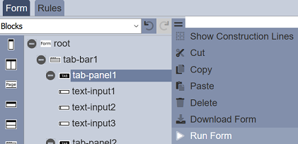
To test the form, click on the  “More Actions” icon at the upper right corner of the Top Row and select “Run Form”.
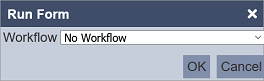
In the “Run Form” dialog box, select the “No Workflow” option (as this is just an example, there are no workflow). Click on the “OK” button to run the form.
In the tab that the form appears, the default tab will be the first tab, in this case, its the “Info” tab. To go to the next tab, click on the tab “Comments” at the top.
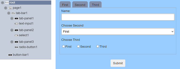
Example 2: Validate Tabs
In this example, a form is created with three tabs and a submit button. Each tab requires the user to enter or select the desired value in the field. If the value entered is not valid, an error message will appear in the form in red.
In the ETL module, create an ETL chainset to validate the input from the fields.
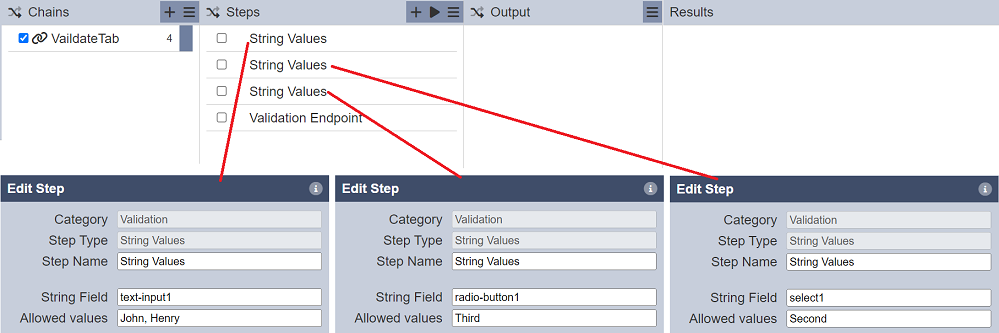
The ETL steps specify the values allowed, any other values will return as an error.
In the “root” of the form, select the ETL created above in the “Validator” field. In the “page1” component, select the ETL chainset in the “Validator Chain” field.
Run the form without workflow.
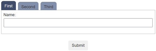
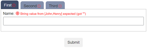
In the “First” tab, do not enter anything into the “Name” field, simply click the “Submit” button. A red exclamation mark will appear in the tab and an error message will appear in red next to the field.
To enhance the error handling, in the “tab-bar1” component, select the field “Validate On Change”.
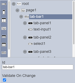
When this field is selected, will calls the validation ETL each time a tab is changed. However, it does not update all the errors, only the ones in the current tab the user is moving away from.
Run the form again and click on the “Second” tab.
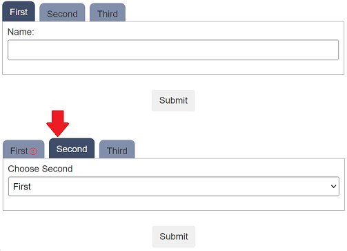
The red exclamation mark appears in the “First” tab. The other two tabs do not show any errors as no values are selected yet.
The “Validate On Change” mechansim only shows validation issues in tabs that you have had a chance to complete. Once you have visited a tab, the errors should remain, in effect clicking away from a tab, in this case, is like a “mini submit” of that tab, so only that tab gets updated.