
Form
The Form tab consists of two panels. The left panel displays the hierarchy, the components and their properties of the form. The right panel displays the form, allowing to to visualise the form as you design it.
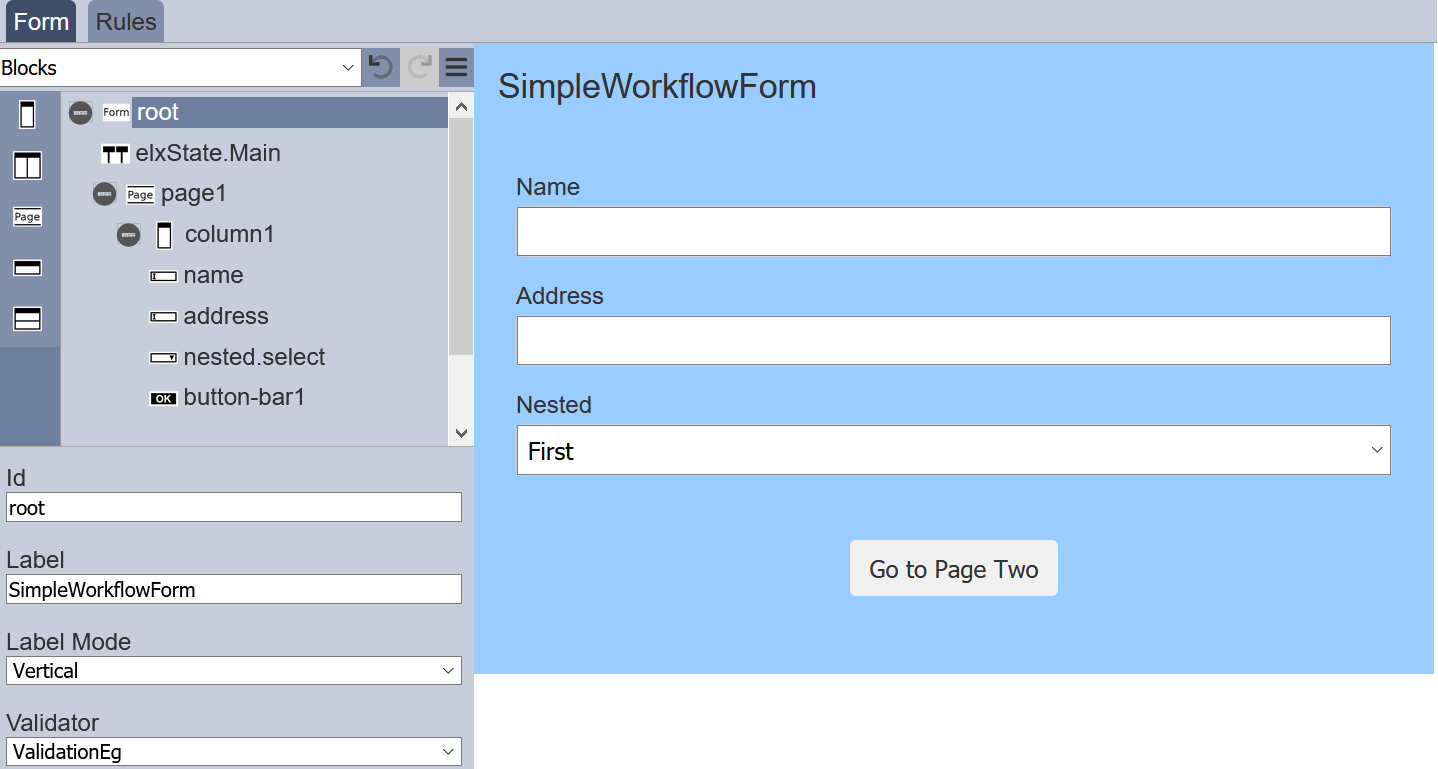
The left panel displays the available actions for the selected component in the form. It has three parts; the top row, form structure in the middle and component properties at the bottom.
Top Row
The top row consists of a selection for the type of components to be added into the form and some icons.

| Item | Description |
|---|---|
| Types of Options | List the available types of options for the form. Available options: - Actions - Blocks - Inputs - Others - Outputs |
| Undo | Undo the last action on the form. |
| Redo | Redo the last action on the form. |
| More Actions | List of other actions for the form. |
The icons will grey out if there is no action to perform (e.g., no action to redo).
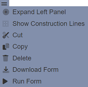
More Actions
The list of more actions are listed in the table below.
| Item | Description |
|---|---|
| Expand/Collapse Left Panel | Toggle to expand or collapse left panel. By default, the left panel is collapsed. |
| Show/Hide Construction Line | Toggle to show or hide the construction lines in the form area to better see the alignment of the components. By default, the construction lines are hidden. |
| Cut | Cuts the selected component and adds onto clipboard. Not available for root. |
| Copy | Copies the selected component and adds onto clipboard. Not available for root. |
| Paste | Pastes the component from the clipboard onto the form. |
| Delete | Deletes the selected component from the form. Not available for root. |
| Download Form | Downloads the form. |
| Run Form | Runs the form in another tab or as per defined in the form. |
Note that if the component in the form does not allow certain actions, those icons will not be available. For example, the root cannot be deleted, so the “Cut” and “Delete” icons will not appear.
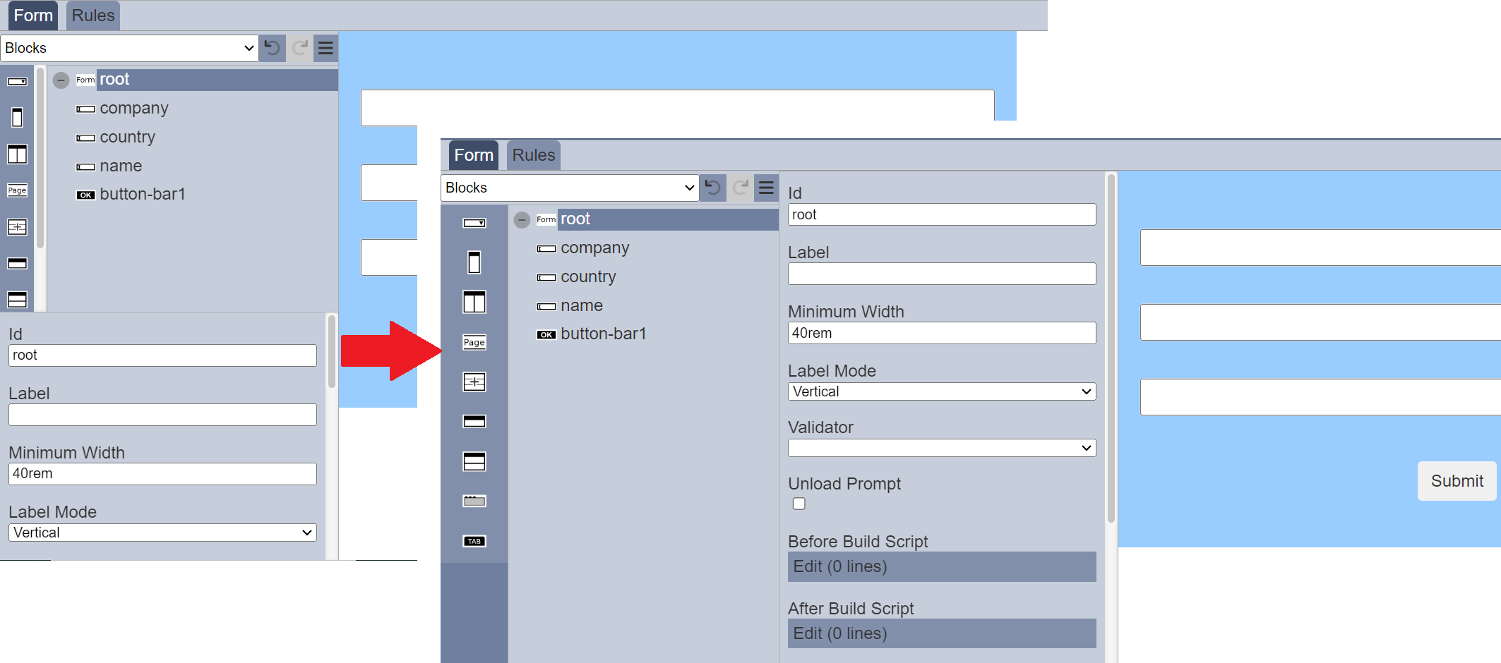
The left panel can be expanded to show component properties more prominently beside the form structure This allows you to view the component properties easily when working on the component.
You can toggle between showing or hiding the construction lines in the form by clicking on the “Show/Hide Construction Line” icon.
The “Run Form” icon allows you to test the form. To do so, select the “Run Form” and a “Run Form” dialog box will appear.
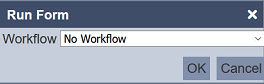
Select the appropriate option and click on the “OK” button to run the form. The form will appear in another tab or as per defined in the form.
Form Structure
The form structure allows you to design the structure of the form, as well as add pages, inputs fields, actions, etc. onto the form.
Every form begins with a root, which other components can be added onto it.
The list of available components vary according to the “Types of Options” selected in the top row’s drop-down list. By default, “Blocks” is selected.
The table below list of available actions for the “Types of Options”.
| Item | Description |
|---|---|
| Actions | List the available action components for the form, such as Button Bar. |
| Blocks | List the block components that can be added onto the form, such as columns, rows, etc. |
| Inputs | List of input components that can be added onto the form, such as checkbox, radio button, etc. |
| Others | List of miscellaneous components that can be added onto the form, such as workflow state, HTML, etc. |
| Outputs | List the available output components for the form, such as Alert. |
To add a component onto the form, first select the “Type of Options” in the top row. The available components will be displayed in the Form Structure section. Simply drag and drop the desired component onto the desired higher level.
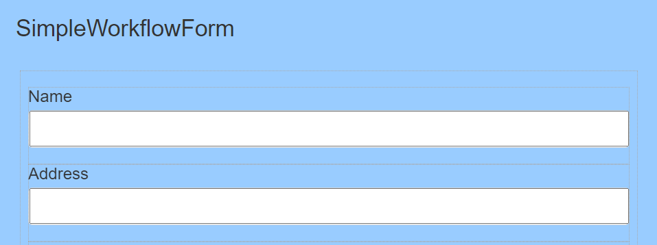
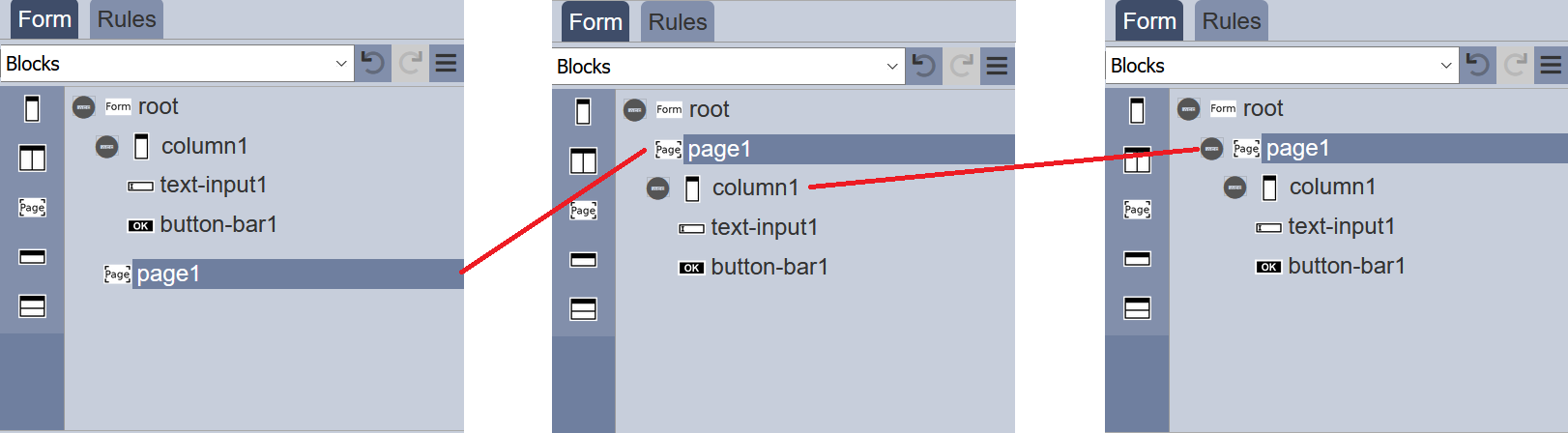
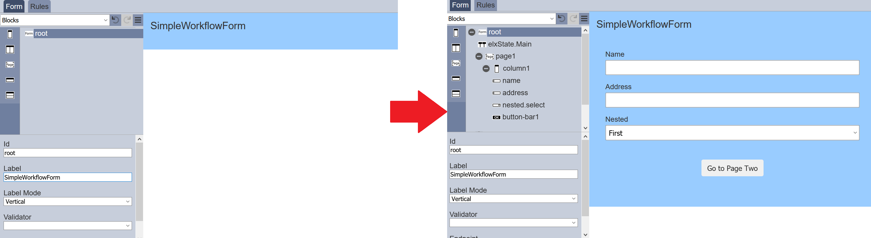
In the simple example below, a new form is created, which includes a input text field and a submit button. First, under the “Blocks” option, select “Column” and drag it to the “root”. Next, under the “Inputs” option, select “Text Input” and drag it to the column. Lastly, add a “Button Bar” under the “Actions” option to the column.
To add a page to the form, select “Blocks” from top row and select the “Page” icon on the left panel in the “Form Structure” section. Drag and drop the “Page” onto “root”. The new page will be added at the bottom of the “root” by default, if there are any components added onto the form prior adding the page. You can relocate the new page by drag and drop it to a new location in the form structure.
Note that the default name (or Id) of components added onto “root” will always start with the number “1”. For example, when the first text input is added, the default name will be “text-input1”, the next text input will have the default name of “text-input2” and so on. Unless the first such component is renamed (i.e., first text input name is renamed to “TextBox”), then the second text input component will be named “text-input1” instead. This numbering method applies to all components on the form.
Multiple Component Actions
You can perform an action on multiple components in the same time by clicking on the Ctrl key and selecting the desired components, either from the form structure or the right panel.
Copy/Cut/Paste/Delete
Actions such as Cut, Copy, Paste and Delete can be used when multiple components are selected.
For example, two Dataset Chooser components and a Button Bar component are added onto the form with their properties are set up properly.
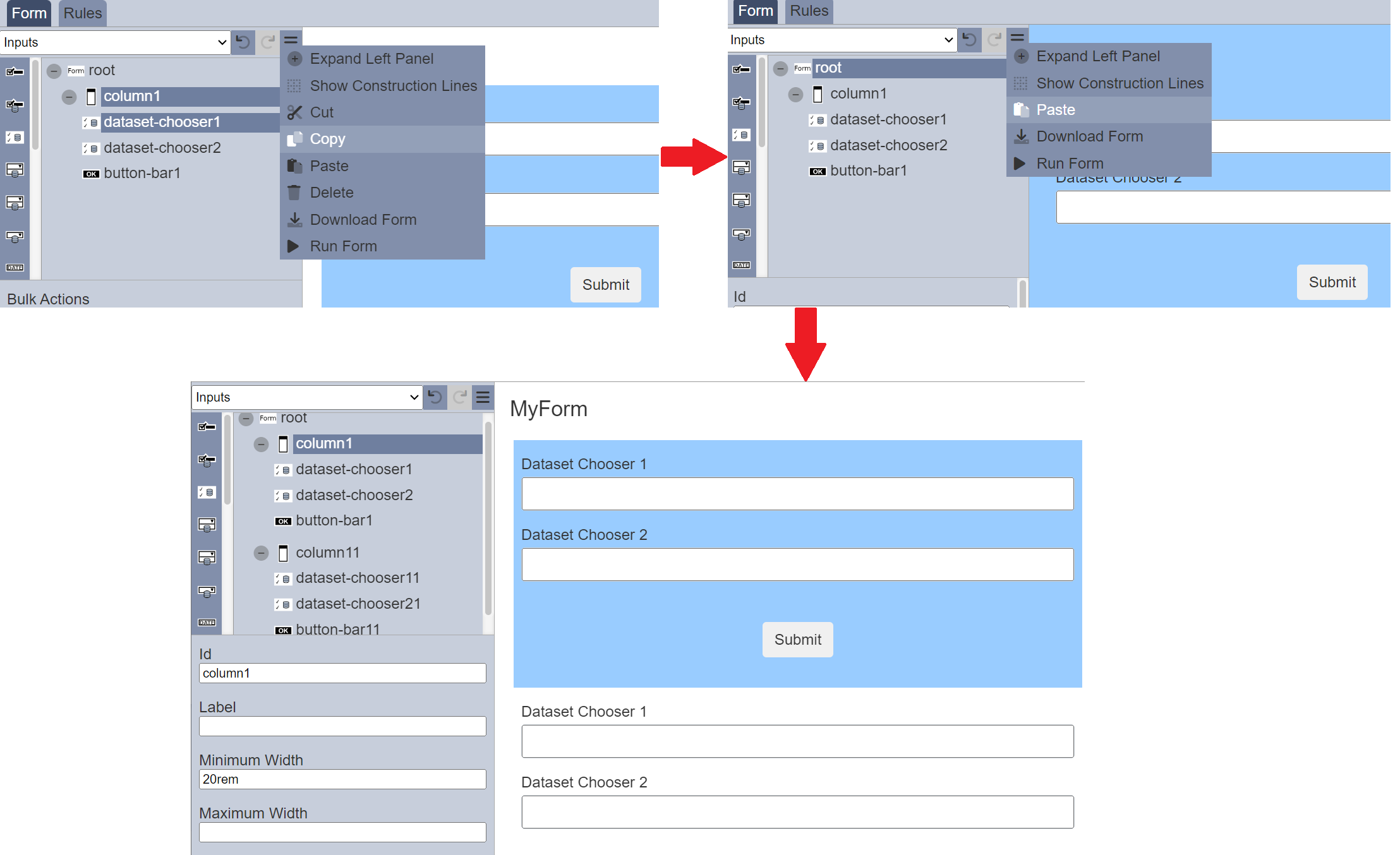
Components Dataset Chooser 1 and Button Bar need to be duplicated in the form. You can click on the Ctrl key and select the Dataset Chooser and Button Bar. Then click on the “More Actions” icon in the Top Row and select the “Copy” option.
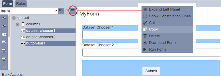
Select the desired location in the form structure to paste the components copied. Click on the “More Actions” icon in the Top Row and select the “Paste” option. The copied components will be added onto the form in the selected location.
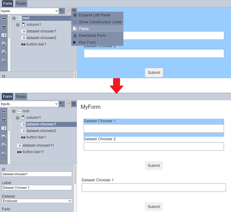
The new component will be labelled with a suffix 1 (e.g., dataset-chooser11) and it will inherits all the properties from the component it copies from.
If the parent component (column1) and the child component (dataset-chooser1) are selected and copied. The Paste action will add all the child components along with the parent component. For example, when copying column1 and dataset-chooser1, and pasted to root. The result will be column11 being pasted under root with all its children.
The Cut and Delete actions behave the same way, all its children will be cut/deleted along with the parent component.
Bulk Actions
When multiple components are selected, the “Bulk Actions” panel will appear below the form structure.
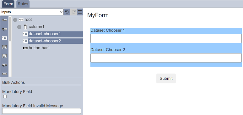
The “Bulk Actions” panel allows you to setup the same properties for the selected components.
The properties in the “Bulk Actions” panel will not affect selected components without Bulk Action Property. Only when all selected components which have the properties shared the same value for that property, then the Bulk Actions properties will show the value. Otherwise, the default value for that property will be shown.
Component Properties
The Component Properties at the bottom of the left panel displays the properties of the selected component.
It can be expanded to be displayed next to the form structure if the “Expand Left Panel” option in the “More Actions” icon is selected.
It allows you to label, define and/or validate the selected component. Currently there are four types of options that are selectable from the top row:
- Actions
- Blocks
- Inputs
- Others
- Outputs
Each type may have one or more components. Depends on the selected component, the properties will vary. You can also define and validate the root.
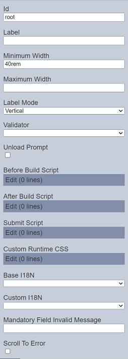
Root
Every form has a root, this is by default. The root presents the blank form itself until components are added onto it.
You can define and validate the form using its properties.
| Field | Description | Default |
|---|---|---|
| Id | Name of the root that will be displayed in the form structure. | “root” |
| Label | Name of the form that will be displayed. | None |
| Minimum Width | Defines the minimum width of the form. | “40rem” |
| Maximum Width | Defines the maximum width of the form. | None |
| Label Mode | Defines the orientation of the form. Available options: - Vertical - Horizontal - None |
“Vertical” |
| Validator | Selects the ETL chainset that validates the form. | None |
| Unload Prompt | If selected, a prompt will appear when changes are made to the runtime form and the user is trying to close the tab or navigate away from the form. 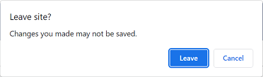 |
Not selected |
| Before Build Script | The script to be executed before any changes are applied to the current form. | Empty script dialog box |
| After Build Script | The script to be executed after every change is made to the current form. | Empty script dialog box |
| Submit Script | The script to be called when a button is pressed. | Empty script dialog box |
| Base I18N | Selects the default I18N. | None |
| Custom I18N | Selects the custom I18N. | None |
| Mandatory Field Invalid Message | Defines the error message to be displayed. | None |
| Scroll To Error | If selected, when there are validation errors during submit, the form will automatically scroll to the first field (from top of form) with error. | Not selected |
Do note that if the selected option in the field appears in red, it indicates that the selection has become invalid.
Refer to Examples on how to create a form that uses script and Internationalisation on how to internationalise a form to different languages.
Actions
Actions option consists of several components, such as button bar. To display an action component in the form, a block component need to be added onto the form before the action component can be added.
| Component | Description |
|---|---|
| Button | Allows you to add a button onto the form. |
| Button Bar | Allows you to add button bar onto the form. |
| Render DocX | Allows you to add a button bar onto the form to a render DocX report. |
| Render RML | Allows you to add a button bar onto the form to a render RML report. |
Refer to Actions for more details on the components and their properties.
Blocks
Blocks include components such as column(s), page, row(s), etc. This block components works as a placeholder for the input or action components to be placed.
To add a block component, simply drag and drop under the desired level. The block component will not show up in the form itself but creates a canvas for adding input components and/or action components. Hence, a block component need to be added before any input or action component can be displayed in the form. The properties for each block component varies.
| Component | Description |
|---|---|
| Cascade Group | Allows you to create cascading pinut selects using the dataset defined. |
| Column | Allows you to add a single column onto the form, as well as defining its width. |
| Columns | Creates a placeholder that allows multiple single columns to be added onto the form. |
| Modal Dialog | Allows you to create modal dialog box. |
| Page | Allows you to create multiple-paged form. |
| Repeater | Allows you to add a space where other components can be added within it and allow the component itself to be duplicated again. |
| Row | Allows you to add input or action components in a single row. |
| Rows | Allows you to add input or action components in multiple rows row. |
| Tab Bar | Allows you to create form with multiple tabs along with Tab Panel. |
| Tab Panel | Allows you to create form with multiple tabs along with Tab Bar. |
Refer to Blocks for more details on the components and their properties.
Inputs
Inputs includes input field components such as single line text input, multiple line text area, radio button, checkbox, drop down selection, dataset select, etc. To display an input field component in the form, a block need to be added onto the form before the input component can be added.
To add an input component onto the form, simply drag and drop to the desired location in the form structure. To edit the properties, simply select the desired component and the properties of the desired component wil lbe displayed at the lower panel.
| Component | Description |
|---|---|
| Checkbox | Allows you to add checkbox options onto the form. |
| Dataset Checkbox | Allows you to add dataset selection options as checkboxes onto the form. |
| Dataset Chooser | Allows you to add dataset field as selectable checkbox options onto the form. |
| Dataset Multi-select | Allows you to add multiple dataset selection options onto the form. |
| Dataset Picker | Allows you to add dataset field as selectable option onto the form. |
| Dataset Select | Allows you to add dataset selection options onto the form. |
| Date Input | Allows you to add a date selection option onto the form. |
| Form Select | Allows you to link one form onto another form. |
| Multi-select | Allows you to place a drop-down selection onto the form. |
| Radio Button | Allows you to add radio button options onto the form. |
| Select | Allows you to place drop-down selection onto the form. |
| Text Area | Allows you to place a multiple-lined (from 2 to 50) text box onto the form. |
| Text Input | Allows you to place a single-lined input onto the form in several formats. |
| Text Regex Input | Allows you to place a single-lined input onto the form in the defined regex format. |
| User Chooser | Allows you to place a single-lined input onto the form that selects one or more users. |
| Year Input | Allows you to add a year selection option onto the form. |
Refer to Inputs for more details on the components and their properties.
Others
This group consists of components such as HTML, vertical space, workflow, etc.
| Component | Description |
|---|---|
| Attachments | Allows you to attach files onto the form. |
| Derived Text | Allows you to place a single-lined input onto the form that displays the desired text based on the selection of another component. |
| Form Launcher | Allows you to launch another form from the current form. |
| HTML | Allows you to add a HTML onto the form. It can be text, web page, logo, etc. |
| Hidden | Allows you to store information in the form which is not visible to the user. |
| History | Allows you to include history information (such as user, timestamp and results) in the form. |
| IFrame | Allows you to embed another HTML document into the form. |
| Image | Allows you to attach an image onto the form. |
| Vertical Space | Allows you to add white space in the form, creating space between components. |
| Workflow State | Allows you to add an existing workflow onto the form (will not appear in the form). |
Refer to Others for more details on the components and their properties.
Outputs
This group consists of component such as Alert.
| Component | Description |
|---|---|
| Alert | Allows you to setup alert message that will appear prior form submission. |
Refer to Outputs for more details on the component and their properties.
Validation
Validation can be performed before a form is submitted to the workflow.
It is performed by ETL steps, in particular those in the Validation category which produce a “validationIssues” array as a result.
The “root” of the form will define the ETL chainset to be used to validate the form. The “Page” input component can then define the ETL chain to validate the input values entered within the page.
For the ETL chainsets to appear in the drop-down list in the “Validator” in the properties of the root, these ETL chainsets must have either:
- The
Validation EndpointETL step - Or imported chainset that has the
Validation EndpointETL step
The Validation Endpoint ETL step is from the Result category and must be part of the chainset. This ETL step serves as a marker step that filters the chains/chainsets to be shown in the other modules for validation.
Alert Mechanism
It may be useful to show information alerts, warnings or error messages prior form submission.
The Form module together with the Workflow module provides a alert mechanism that is invisible on the form itself. Refer to Outputs on how to include this mechanism into the form.