
Report Designer
The Report Designer assist you to create a report template fo generate reports using the datasource in the repository. The report template is store in a file with the extension .rml. It accesses the data source via mapping defined un the report template.
The Report Designer comes in a form of a ReportWizard. The ReportWizard provides a guide for the user to create a RML report template.
Reports
The report designer comes with a broad range of functionality to accommodate literally any layout of reports with a rich set of report elements. Creating complex reports sometimes require strong underlying structure support. The Report Designer comes with a flexible report template structure that supports multiple section, multiple page, and multiple column layout, unlimited number and levels of subreports, cube table for dynamic column, watermark with dynamic content from another report, and scripts for powerful, conditional rendering control.
A report consists of multiple sections, and each section is as a self containing report view with its own sections, page, group header and footers with a detail. Each section has it own page setting.
A section may contain one primary data source with multiples secondary data sources. One can enable or disable the sections and set the order for rendering.
This is done through the Report Tab, Render Sequence.
Types of Report Template
There are two types of report template, namely DocX and RML.
DocX
The DocX file is a template that contains the format and defines which datasource file to use to generate the report. The DocX file cannot be created using the Repertoire Designer. Word from Microsoft Office is required to create the template.
After the DocX file is being created, place the DocX file in the Repository folder so the rendering engine can find it. See DocX for more details on the DocX template and how to render a report using a DocX file.
RML
The RML (Redline Markup Language) file is created using the Repertoire Designer. It contains annotations, markers and other information stored in XML format. The sections below describes the RML template and how a report is rendered using a RML template.
Report Layout
A report contains the following:
- One set of Page Header
- One set of Page Footer
- One set of Section Header
- Multiple groups header and header for grouping of data
- Details
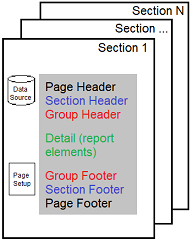
The order rendering of the elements in the report sections is as follows:
Page Header (rendered once at the beginning, repeat on every page)
Section Header (renderd once at the start of section)
  Group Headers 1 (nested)
  ...
  Group Headers N
  Details 1 (containing record in the row belong to the group)
  ...
  Details N
  Group Footers N (nested)
  ...
  Group Footers 1
Section Footer (once at the end of section)
Page Footer (rendered last at end of page, repeated on every page)
These section can be seen in the report template.
Report Wizard
The Report Designer assist you to create a report template for generate reports using the datasource in the repository via a ReportWizard. The ReportWizard provides a guide for the user to create a RML report template.
There are three types of report that can be created from the ReportWizard:
- Blank Report
- Standard Report
- Mobile Report
The Elixir report can output reports in many variety of formats. The output formats can be divided into broadly two categories:
- What you see is what you get (WYSWYG)
- Tabular type
WYSWYG output are report layout at specific point in the page, such as Glint, PDF, HTML with CSS, postscript and RTF.
The Tabular output is in rows nad columns. The elements are aligned in a relative position. These reports may be designed either with a combination of vertical and horizontal box with cells or using table elements.
See Report Wizard for more details.
Report Properties
Once the report has been created in the repository, you can edit the properties in two ways:
- Right-click on the desired RML file and select “Open Properties” from the list of available actions.
- If the RML is opened, select the “Properties” button in the Action Bar.
The “Report Properties” dialog box will appear. The dialog box consists of two pages.
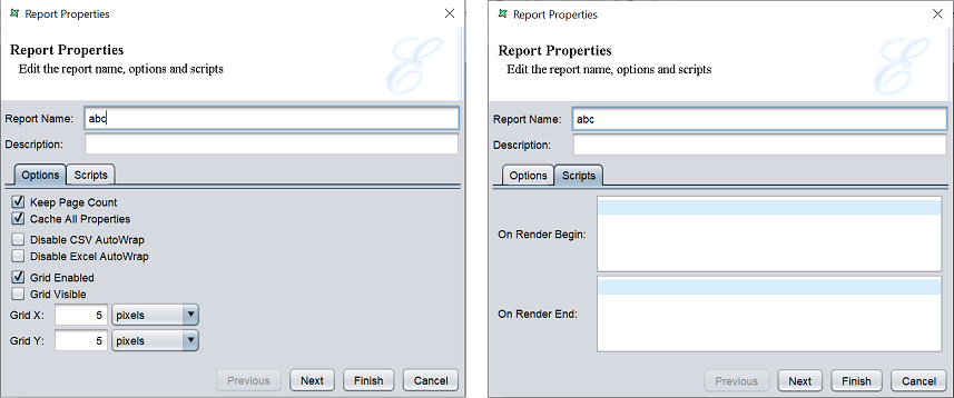
In the first page of the dialog box, you can edit the name and description of the report, as well as the fields in the “Options” and “Scripts” tabs.
| Action | Description |
|---|---|
| Name | Name of the report. |
| Description | Brief description of the report. |
| Options | |
| Keep Page Count | Allows using of Page count substitutions within the report. By default, it is selected. Paging counting is expensive beacuse the whole report needs to be kept in memory until the page count is known. Only then can the first page be output. If the ovverall page count is not required, unselect this field to get much better memory. |
| Cache All Properties | If selected, styles property of report is used, scripted style will not be used. If not selected (default), styles are volatile and renderer need to identify the correct style property. |
| Disable CSV Autowrap | If selected, enables autowrap in CSV datasource. By default, it is not selected. |
| Disable Excel Autowrap | If selected, enables autowrap in Excel datasource. By default, it is not selected. |
| Grid Enabled | . By default, it is selected. |
| Grid Visible | If selected, displays the grid in the report. By default, it is not selected. |
| Grid X | Size of x-axis grid (default value is 5). |
| Grid Y | Size of y-axis grid (default value is 5). |
| Scripts | |
| On Render Begin | Script to run at the start of the report. |
| On Render End | Script to run at the end of the report. |
Edit the fields as desired and click on the “Next” button to go to the second page.
In the second page of the “Report Properties” dialog box, you can edit the security options of the report.
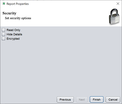
There are three options.
| Type | Description |
|---|---|
| Read Only | When selected and saved, the next time a user opens this report, the user will not be able to edit any details of the report (such as name, description and scripts). |
| Hide Details | When selected and saved, the next time when this report is opened, the user will only be able to see the name and description of the report. |
| Encrypted | This is to be used with either Read Only or Hide Details options or both. Checking the checkbox will prompt the user to enter a password, then re-enter to confirm the password (both password must be the same). After this is done, if another user would like to edit any selections, he will need to enter the password. |
By default, none of the options are selected. Select the options are desired. More than one option can be selected. If “Encrypted” is selected, provide a password in the pop-up dialog box. Click on the “Finish” button to complete the process.
Report Designer Workspace
The Report Designer Workspace consists of three tabs:
- Report
- Layout
- Functions
Report Tab
The Report tab is divided into three parts, the report structure on the left panel, and the “Render Sequence” and “Parameters” panels on the right.
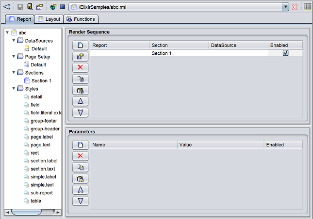
Report Structure
The report structure, consisting of the following displayed in the left panel of the Report tab window: * Datasources * Page setup * Sections * Style sections
The root item of the tree is the report itself.
To access the report properties, double-click on the root item. A “Report Properties” dialog box will appear. See Report Properties for more details.
DataSources
If a datasource is selected for the report, a reference to the datasource is labelled as “Default” in the structure. To view the full path in the repository, double-click on “Default”. The “Configure DataSource” wizard will appear.
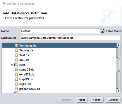
This page allows you to view the full path of the datasource in the repository.
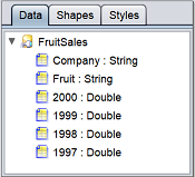
You can change the value “Default” in the “Name” field to your more meaningful name. In the example above, you can change it to “FruitSales”.
The datasource for the report can be changed by selecting another datasource in the lower panel.
The “Table” field is selected by default. When selected, the records are loaded into memory so that they can be sorted and grouped, so the total number of records can be queried. If it is not selected (i.e., in streamed mode), only a single record is loaded into memory at onetime, which greatly improves the memory efficiency, but prevents complex operations that require access to more than one record.
Click on the “Next” button after the desired changes are done or click on the “Finish” button to save the changes and exit the dialog box.
Filter
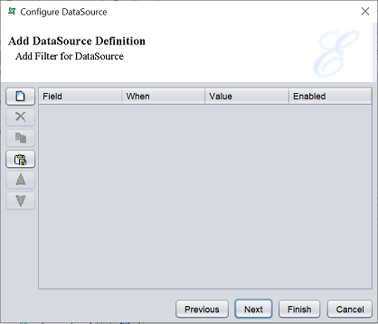
This page allows you to add filter for the datasource.
To add a new filter criteria, click on the “Add” button on the left. A new filter will be added (highlighted in blue). Click on the field below the “Field” column to display the list of available values. Select the desired field from the list. Do the same for the other columns. By default, the “Enabled” field is selected, which enables the filter criteria.
To remove a filter, select the desired filter and click on the “Delete” button.
To copy a filter, select the desired filter and click on the “Copy” button to copy the filter onto clipboard.
To paste a filter from clipboard, click on the “Paste” button.
The order of the filter can be re-arranged. to do so, select the desired filter and click on the “Move Up” and “Move Down” button.
The “Render Sequence” and the “Parameters” panel are present on the right of the Report tab window.
Click on the “Next” button to continue or click on the “Finish” button to save the changes and exit the dialog box.
Parameters
The next page of the dialog box allows you to edit and enable the datasource parameters.
This parameter is usually used in composite datasource for filtering purposes. It helps to create a dynamic parameter that allows users to enter a value during report rendering that filters the datasource using the value entered.
The parameters listed here need to be defined in the datasource prior configuring the datasource in the report template.
If no parameters are defined, an empty table will appear.
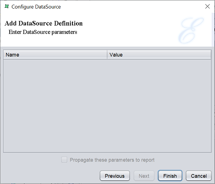
If parameters are defined prior, the table will list the parameters and their values.
In the example below, a simple composite datasource is used and a filter is added in the Filter processor.
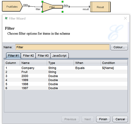
The filter rule added in the Filter processor will allow records that has value equals to ${Name} in the “Company” field. This makes it a dynamic parameter.
In the report template, create a simple report with just the “Company” and “Fruit” fields. When configuring the datasource, you can make use of the parameter created in the datasource. In this page, the parameter will appear in the table.
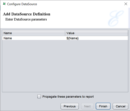
You can edit the name and the value of the parameters defined. To enable the parameters to be propagated to the report, select the checkbox below the table. Click on the “Finish” button to save the changes.
Once the parameters are enabled, if you goes back to the same page in the wizard, the checkbox below the table will be disabled.
The parameters defined will also appear in the “Parameters” panel in the Report tab.
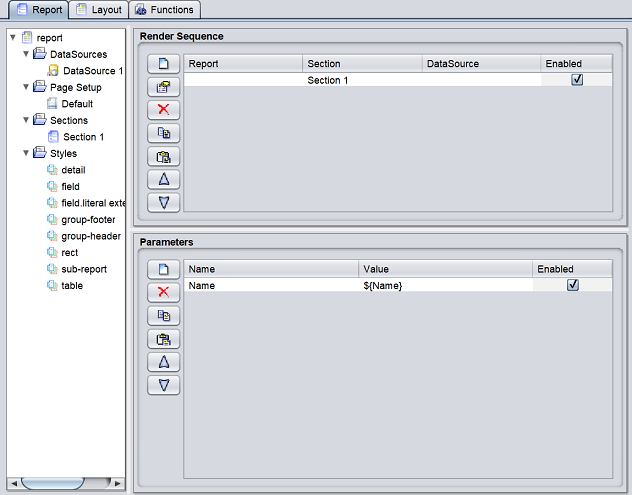
You can disable the parameter by un-select the checkbox under the “Enabled” column in the panel.
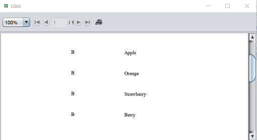
The parameter being propagated to the report allows user to enter a value for the dynamic parameter that filters the datasource according to the value enetered. To see the effect, click on the “Render” button in the Toolbar. Select the desired output format. In this case, select “Glint” and click on the “Next” button. Click on the “Finish” button to generate the report.
The “Dynamic Parameters” dialog box will appear. The “Name” field is the same parameter in the datasource.
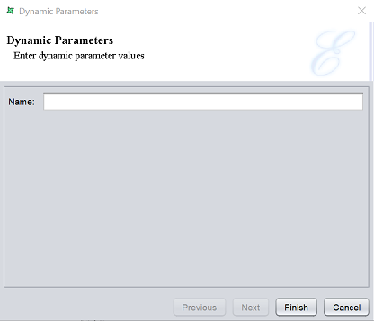
It requires a value for the “Company” field. Enter a value in the textbox. Ensure the value is valid (i.e., the value exist in the records), else an empty report will appear. In this case, the valid values are A, B and C. Enter B and click on the “Finish” button. The Glint output displays the records that has the value B in the “Company” field.
Page Setup
When a Report Template is created, a “Default” Page Setup will be added under the Page Setup section of the tree. Each section of the report can have its own page setup, or several sections can share the same page setup.
To access the Page Setup, double-click on the “Default” Page Setup in the tree. A Page Setup Wizard will appear.
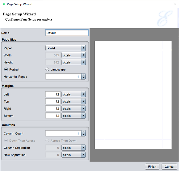
| Type | Description |
|---|---|
| Name | Name of setup. |
| Page Size | |
| Paper | Selects the paper type. |
| Width | Displays the width of the selected paper type. This field is editable only if “custom” is selected in “Paper” field. |
| Height | Displays the height of the selected paper type. This field is editable only if “custom” is selected in “Paper” field. |
| Portrait / Landscape | Selects either portrait or landscape orientation. |
| Horizontal Pages | Defines the number of horizontal pages in a sheet. |
| Margins | |
| Left | Defines the size of left margin. |
| Top | Defines the size of the top margin. |
| Right | Defines the size of right margin. |
| Bottom | Defines the size of the bottom margin. |
| Columns | |
| Column Count | Defines the number of columns in a page. |
| Down Then Across | If selected (default), content flows down one column before proceeding to the next. |
| Across Then Down | If selected, content flows from one column to another before proceeding to the next row. |
| Column Separation | Defines the gap between columns. |
| Row Separation | Defines the gap between rows. |
The default measurement unit is pixel. You can change the unit by selecting the desired one from the drop-down list.
Sections
Each template has at least one section. A new section can be added using the pop-up menu of the Sections mode. The new section will be added to the “Render Sequence” automatically.
To access the Section Wizard, double-click on the desired section in the tree.
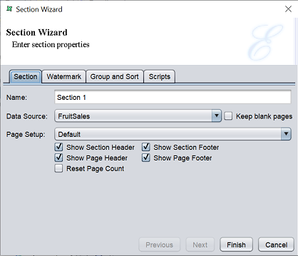
There are four tabs in this wizard:
- Section
- Watermark
- Group and Sort
- Scripts
The Section tab allows you to setup the page, headers and footers for the selected section.
| Type | Description |
|---|---|
| Name | Name of section. |
| DataSource | Selects the datasource from the drop-down list for the section. If none is selected (default), the section will head header and footer but no details. IT is useful for special purpose sections, such as cover pages and watermarks. |
| Keep blank pages | If selected, preserve any blank pages generated in the report. |
| Page Setup | Selects the page setup from the drop-down list. By default, “Default” is selected. |
| Show Section Header | If selected, shows the section header in the report. |
| Show Section Footer | If selected, shows the section footer in the report. |
| Show Page Header | If selected, shows the page header in the report. |
| Show Page Footer | If selected, shows the page footer in the report. |
| Reset Page Count | If selected, the page number will restart at 1 at the start of the section, instead of continue from the previous section (if any). |
The Watermark tab allows you to add a watermark onto the report. It can enhance the appearance of the document by adding a seal or image, or add a text watermark that identifies the report contents as a draft or confidential information.
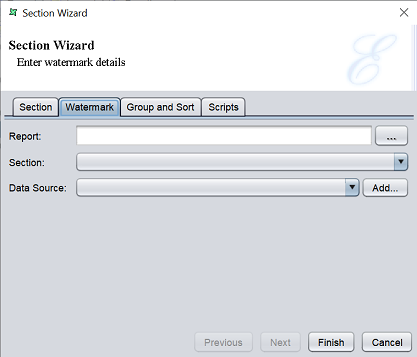
| Type | Description |
|---|---|
| Report | Selects the report as watermark. |
| Section | Selects the section as watermark. |
| Data Source | Selects the watermark datasource. |
| Add | When clicked, displays the repository tree to select a datasource. |
When using a section as a watermark, you need to consider its data requirements. If the section has no datasource (i.e., just an image or literal text), you can leave the datasource blank. If te section has a datasource, then thatsource will be used by default and there is no need to redefine it here. The only time a watermark datasource is if a missing datasource needs to be supplied.
The Group and Sort tab, as the name implies, allows you to group and sort the fields in the datasource.
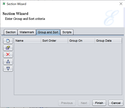
Grouping is done for categorization of data into various logical collections. Sorting is to arrange the data in ascending or descending order.
There are four columns in the page; namely “Name”, “Sort Order”, “Group On” and “Group Data”. On the left are five buttons that allows you to add, edit, move up, move down and remove
Click on the “Add” button to display the “Sort” dialog box.
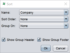
| Type | Description |
|---|---|
| Name | Name of field. By default, the first field in the datasource is selected. |
| Sort Order | Selects the sort order. Available options: - None - Ascending - Ascending (Simple) - Descending - Descending (Simple) |
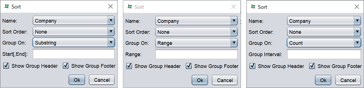
| Group On | Selects the group method. Available options: - None - Each Value - Substring - Range - All - Count |
| Show Group Header | If selected, displays the group header in the report. By default, it is selected. |
| Show Group Footer | If selected, displays the group footer in the report. By default, it is selected. |
Select the field to be sorted in the “Name” field and the sort order from the “Sort Order” field. If the field data need to be grouped, select the grouping method from the “Group On” field. If the value “Substring”, “Range” or “Count” is selected, a text field will appear to allow you to key in its respective group criteria.
The difference between Sort (ascending, descending) and Sort(Simple) are:
- Sort follows a proper dictionary sort algorithm in which spaces are ignored. Sort(Simple) does not follow the proper full sort definition, instead it treats every character as significant.
- Dictionary sort sorts in the order of symbols first followed by alphabets, ignoring any spaces between words. Sort(Simple) is in the order of spaces, symbols and then alphabets.
- Sort(Simple) is especially useful when sorting data that contains any symbols, abbreviation, initials and spaces.
The Scripts tab allows you to include scripts to the section.
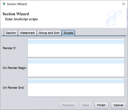
There are three functions, “Render If”, “On Render Begin” and “On Render End”. The JavaScript that are entered in the text boxes for each function are executed when the report section is rendered.
Set the appropriate values for the tabs and click on the “Finish” button. If this is a new section, it will be added under the Sections mode of the report template.
Styles
Every report template have a set of styles. When a new report template is added, the default style settings will be included for the report elements in the Styles node.
To edit the style, double-click on the desired style to display the Style Wizard. To add a new style, right-click on the Style node and select “Add Style” from the list of available actions. The Style Wizard will appear.
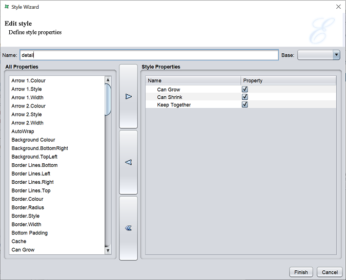
If it is a new style, the default name is “Style 1” and the “Style Properties” panel will be empty. If it is an existing style, the name of the style will appear in the “Name” field.
The “Base” field lists all the current styles in the report. To add a new style based on an existing style, select a style from the “Base” field. The new style will inherit the style properties from the selected base style. This field is optional
Add new properties to the style by selecting the desired property in the “All Properties” panel and click on the “Move Right” button to move the property to the “Style Properties” panel. Or vice versa to remove a property. Some properties moved into the “Style Properties” panel are disabled by default. Enable them by selecting the checkbox in the “Property” column.
Some properties may be need a value or may be hidden (e.g., a sub-property of a parent property). Such properties will have an arrow on the left. Below is an example of such property.
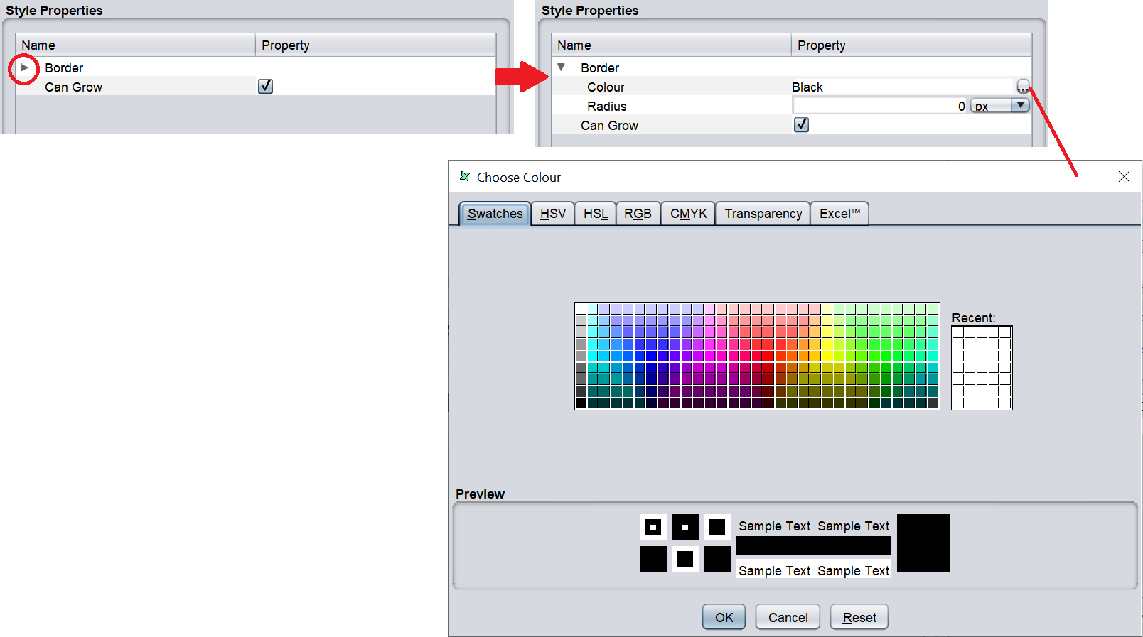
To view the sub-property(s), click on the arrow of the left of the parent property. In this example, its “Border”. The sub-properties “Colour” and “Radius” will appear.
The “Radius” sub-property will need a value to define the radius. Key in the appropriate value in the textbox. For the “Colour” sub-property, the default colour is “Black”. To change the colour, either key in desired colour into the textbox in the “Property” column or click on the icon at the extreme right in the “Property” column to display the colour picker.
After setting up the style, click on the “Finish” button to save the change.
Render Sequence
When a report template is created, a default section is added. Multiple sections can be added into the template at a later stage.
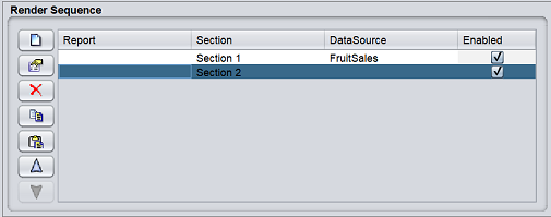
When that happens, the “Section Invocation” table controls the order of section rendering. The initial configuration of the “Section Invocation” table shows the default section is enabled for rendering.
There are action buttons on the left of the panel, namely add, edit, delete, copy, paste, move up and move down, in that order.
If a new section is added to the report template and has to be rendered, click on the “Add” button on the left of the panel. The “Render Sequence” dialog box will appear.
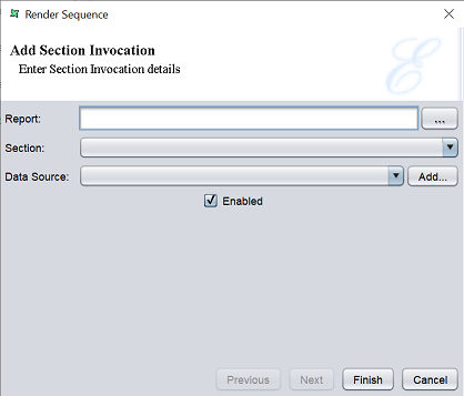
The dialog box can include sections from both the current report template and other reports in the repository. Choose the report (if not the current report) from the “Report” field and then select a section name from the “Section” field. A datasource can be specified and will override any other datasource defined within the section.
This allows the same section to be used repeatedly in the render process, with a different datasource each time.
Click on the “Finish” button to add the new section.
To remove a section, click on the “Delete” button. You can order the sequence of the sections by highlighting the section and click on the “Move Up” or “Move Down” button.
Parameters
The Parameters panel is a table containing “Name”, “Value” and “Enabled” columns.
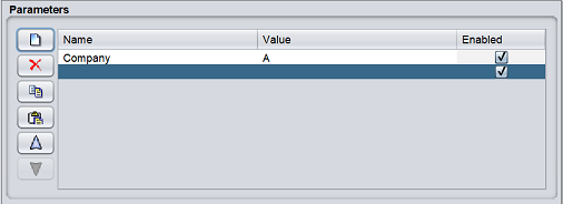
The parameters are used to control the way a report is rendered. The parameters can also be used to control data like selecting a range of employees from a list of employees.
There are action buttons on the left of the panel, namely add, delete, copy, paste, move up and move down, in that order.
To add a parameter, click on the “Add” button. A new row will be added into the table. Click into the field and key in the desired field name and its value. The parameter is enabled by default.
To remove a parameter, select the desired parameter in the table and click on the “Delete” button.
To copy a parameter, select the desired parameter and click on the “Copy” button to copy onto the clipboard. Click on the “Paste” button to paste the item from clipboard into the table.
To arrange the order of the parameters, select the desired parameter and click on the “Move Up” or “Move Down” buttons to re-locate the parameter.
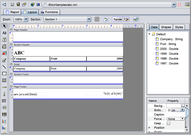
Layout Tab
The Layout tab window can be divided into several parts:
- At the top is a tool bar
- On the left is a column of report elements
- At the centre is the report layout (headers, detail and footers) with markers at the top and on the left
- On the upper right is the tree panel consisting of three tabs (Data, Shapes and Styles)
- On the lower right is the properties panel
Tool Bar
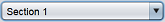
The tool bar is located at the top of the Report tab and it contains the zoom, section, redo, undo, render and repeat render buttons.

| Type | Description |
|---|---|
 Zoom |
Zoom the report in percentage. Available options: - 100 (default) - 200 - 300 - 400 |
 Section |
Selects the desired section of the report from the drop-down list. |
 Redo |
When clicked, repeat the latest action. |
 Undo |
When clicked, reverts the latest action. |
 Render |
Launches the Report Wizard. |
 Repeat Render |
Renders the report bypassing the wizard, using the current output type and parameters. |
Report Elements
The column of Report Elements is on the left of the Report tab. It contains a set of elements that can be used for adding more features and elegance to the reports.

See Report Elements for more details.
Report Layout
The Report Layout is located at the centre of the Report tab.
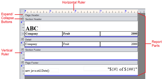
Rulers
The horizontal and vertical rulers are used as a scale for page measurements. By default, the width of all headers and footers in the report layout remains the same. The height of the headers and footers can be changed in the report. The vertical rules are useful to measure and guage the height of the headers, footers and detail sections.
Expand/Collapse
The Expand/Collapse button on the upper left corner of each section allows you to expand or collapse the section. It is useful when to collapse the section when you do not need to work on it, leaving more space for other sections. When the section requires some work, click on the button to expand it again to continue working on it.
Report Parts
The typical layout is shown below. The arrangement of the report parts vary depending on the report type and style selected.
| Parts | Description |
|---|---|
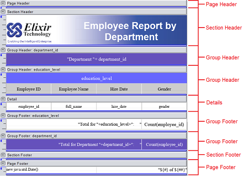
| Page Header | Contains information relevant to the current page and appears at the top of every page. It may contain page number, column heading,s boarder lines or a bitmap. |
| Page Footer | Contains information relevant to the current page and appears at the bottom of every page. It may contain page total or other pertinent text. |
| Section Header | Contains information that will be displayed at the beginning of each section. |
| Section Footer | Contains information that will be displayed at the end of each section. |
| Group Header | Appears at the beginning of a new group of records. May present information about the data group being viewed. |
| Group Footer | Appears at the end of a group of records. May contain totals or other similar information. Group headers and footers can be added by turning on th corresponding options when adding the group column in “Group and Sort” tab of the Section. |
| Detail | Contains the main body of the report’s data. Prints individual records, and repeats until all records have been printed. The Details section can be expanded to place multiple fields above or below each other. |
| Field Label | Specify the fields displayed in the report. By default, the field name from the original datasource is used as the field labels in the report. These field labels can be edited. |
| Field | Item of data from the datasource specified in the report. |
Tree Panel
The tree panel consists of three tabs, namely the Data, Shapes and Styles.
Data Tab
The Data tab contains the tree view representation of the datasource that this report uses.
A new datasource can be added under this tab by drag-and-drop the datasource from the repository. The “Configure DataSource” wizard will appear to define the datasource as desired.
The datasource fields can be directly selected from the tab and placed inside the report layout.
You can right-click on the datasource to display a list of available actions.
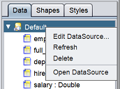
| Action | Description |
|---|---|
| Edit Datasource | Displays the Configure DataSource wizard. |
| Refresh | Refreshes the dataSource. It is useful to refresh when changes to the datasource structure. |
| Delete | Deletes the selected dataSource. |
| Open DataSource | Opens the datasource in the workspace. |
Shapes
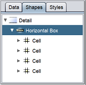
The Shape tab contains the tree view representation of the report parts and the type and names of the fields placed in the layout headers, footers, etc.
Style
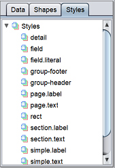
The Style tab contains the tree view representation of the styles of the report parts, fonts, fields placed in the group header, group footer and section label, etc. Styles can be added to adjust the report outlook and alignment, etc.
Properties
The Properties table contains the Name and Property columns.
The property name and its corresponding values are listed in the table. When a part of the report or the field placed in the layout is selected, the corresponding properties are listed in the table.
Functions Tab
The Functions tab window contains several tabs:
- Script Summary
- Function Definitions
- On Layout
- On Reader Begin
- On Reader End
- Render If
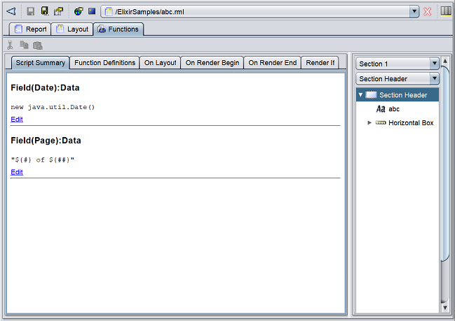
These tabs list all functions that are added into the report. See JavaScript section for more information.