
Chart
The  Chart element allows you to add a chart onto the report.
A chart is a graphical representation for data visualisation. It can represent tabular numeric data, functions or some kinds of quality structure and provides different information.
Add Chart
To add a chart onto the report, select the “Chart” button and click onto the location in the report where the chart is to be placed. A “Chart Wizard” will appear.
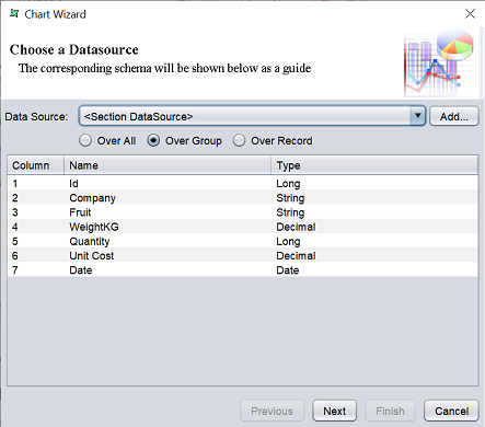
In this page, select the datasource for the chart either by selecting one from the drop-down list or click on the “Add” button to select a datasource from the repository. Select one of the three options:
- Over All - Whole set of records are taken ito consideration irrespective of the grouping
- Over Group - Plotting is done based on the grouping of data is considered
- Over Record
- If this option is selected for the chart in the group header, the first record of the group is considered
- If this option is selected for the chart in the group footer, the last record of the group is considered as current record
- If this option is selected for hte section header, then the first record if the datasource is considered
Select the desired option and click on the “Next” button to continue.
The next page allows you to select the type of chart.
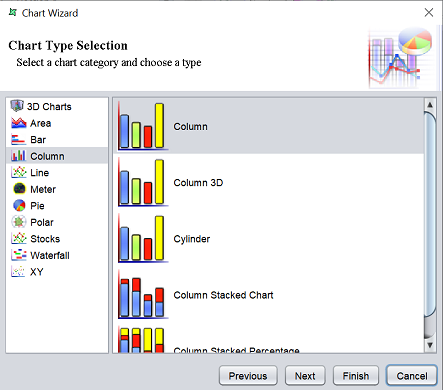
The left panel displays the type of chart and the right panel displays the options available for the type selected. Select as desired and click on the “Next” button to set up the details for the chart.
The last page allows you to select the details for the chart selected.
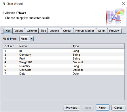
This page has several tabs:
| Tab | Description |
|---|---|
| Key | Defines the key of the chart. |
| Values | Defines the values for the chart. |
| Column | Defines the background, XY axis labels, etc. |
| Title | Defines the title for the chart, its orientation, colour and font. |
| Legend | Defines the legend for the chart, its orientation, colour and font. |
| Colour | Defines the colour for the chart. |
| Interval Marker | Defines the interval markers. |
| Script | Defines the script for the chart. |
| Preview | Shows the chart with all settings from other tabs and previous selection. |
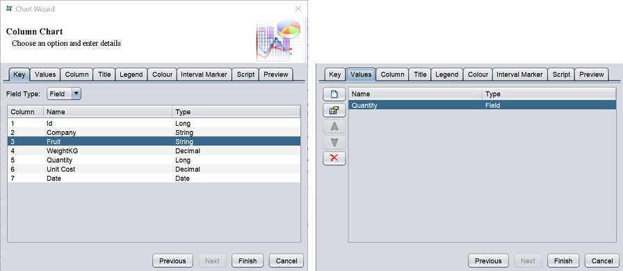
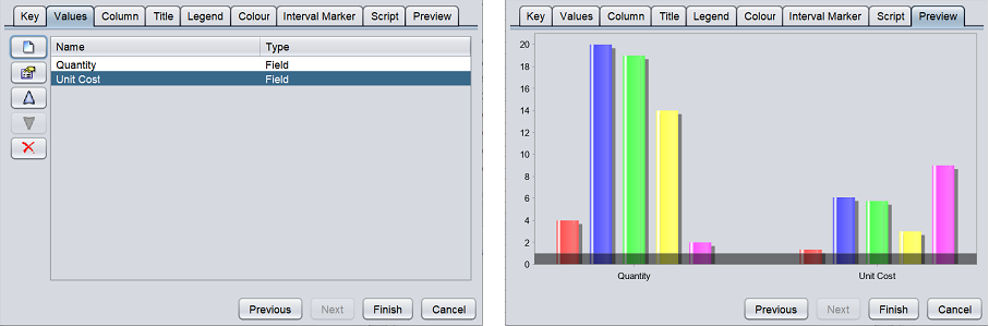
In this example, the first two tabs are mandatory to create the chart. In the “Key” tab, “Field” is selected in the “Field Type” field and “Fruit” is selected in the table below. This selects the field for the X-axis. In the “Values” tab, “Quantity” is selected, which selects the field for the Y-axis.
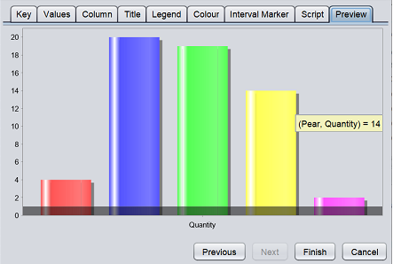
In the “Preview” tab, you can see the chart to be added onto the report. Hover over the bar and a pop-up will appear with the details of the bar.
You can add another field in the “Values” tab (e.g., “Unit Cost”) and another bar chart will be added. You will have one bar chart for quantity and another bar chart for unit cost.
The other tabs are optional. Setup the chart as desired and click on the “Finish” button to conclude the chart element. To go back to the previous page, click on the “Previous” button. To abort the action, click on the “Cancel” button.
Edit Chart
To edit a chart element in the report template, double-click on the chart element to display the “Chart Wizard”. The “Chart Wizard” is same wizard when adding a chart element.