
Checkbox
The  Checkbox element accepts boolean value fields and renders one of two images, depending on whether the value is true (“on” image is displayed) or false (“off” image is displayed). The default on and off images show the two states of a checkbox. Any images can be used to represent the alternate states (e.g., a tick or a cross, a red or green dot, etc.)
Add Checkbox
To add a checkbox onto the report, select the “Checkbox” button and click onto the location in the report where the checkbox is to be placed. A “Checkbox Wizard” will appear.
There are four tabs, namely
- Data - Selects the field from datasource as option or a script that provides option.
- On Image - Defines the “on” image when the field value is true
- Off Image - Defines the “off” image when the field value is false
- Scripts - Defines the Java scripts for “Render If”, “On Render Begin” and “On Render End”
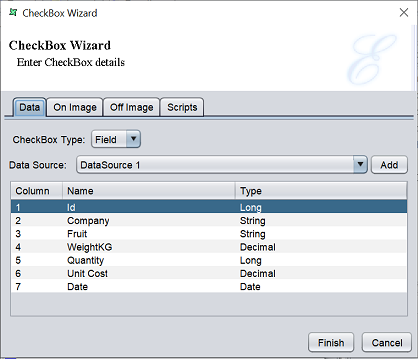
In the “Data” tab, there are two options for “Checkbox Type” field.
If “Field” (default) is selected for the “Checkbox Type” field, the following screen will appear.
Select the desired datasource in the “Data Source” field and select the desired field in the table below. This field will be must be a boolean field.
In the “On Image” and “Off Image” tabs, define the image to appear when the checkbox value returns.
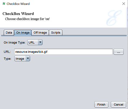
By default, a tick is defined for “On Image” and a box is defined for “Off Image”. The options for both tabs are the same.
In the “On Image Type” field, you can choose to use “Field”, “URL” or “Script”. If “Field” is selected, select desired datasource in the “Data Source” field and select the desired field in the table below. If “URL” (default) is selected, key in the URL path for the image to display in the “URL” field or click on the  button to select an image from the repository.
Edit Checkbox
To edit a checkbox element in the report template, double-click on the checkbox element to display the “Properties” dialog box.
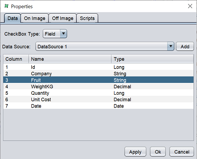
This dialog box consists of four tabs and is identical to the Checkbox Wizard.