
Data Grid
The  Data Grid element is used to display data in tabular form. It is mainly used to handle CJK and other top to bottom languages.
Add Data Grid
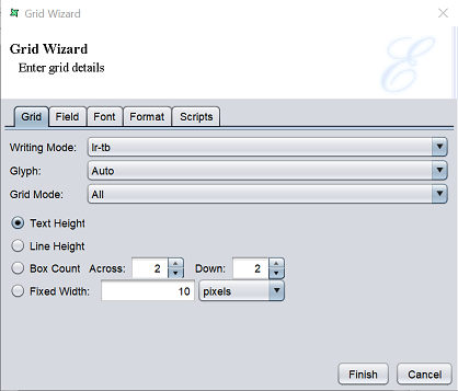
To add a Data Grid element, select the “Data Grid” button and click onto the location in the report where the element is to be placed. The “Grid Wizard” will appear.
There are five tabs. The last four tabs are similar to the Data Field element.
For the first tab, it has the following fields.
| Field | Description |
|---|---|
| Writing Mode | Defines the intrinsic direction rendering for a block of content. Default is “lr-tb”. |
| Glyph | Selects the orientation of the glyph. Default is “Auto”. |
| Grid Mode | Selects the type of grid. Default is “All”. |
| Radio Buttons | Selects one of the four radio buttons. By default, “Text Height” is selected. |
| Text Height | If selected, grid height is defined by height of text. By default, this field is selected. |
| Line Height | If selected, line height is defined by height of text |
| Box Count - Across - Down |
If selected, defines the number of boxes that fits the Data Grid element with the Across and Down fields. The value entered in the fields indicates the number of boxes to be placed across and downwards inside he grid element. |
| Fixed Width | If selected, width of each cell in the grid is defined by the value entered in the textbox. |
This property controls the intrinsic writing direction rendering for a block of content. It has four options:
| Option | Description |
|---|---|
| lr-tb | Text flows horizontally from left to right, top to bottom. Next horizontal line is positioned underneath the previous line. This mode is common in western languages. |
| tb-rl | Text flows vertically from top to bottom, right to left. Next vertical line is positioned to the left of the previous line. This mode is common in Asian writing systems. |
| rl-tb | Text flows horizontally from right to left, top to bottom. Next horizontal line is positioned underneath the previous line. This mode is common in Arabic and Hebrew writing systems. |
| tb-lr | Text flows vertically from top to bottom, left to right. Next vertical line is positioned to the right of the previous line. This mode is common in Asian Mongolian writing systems. |
This property selects the orientation of the glyph. It has three options:
| Option | Description |
|---|---|
| Auto | Glyph orientation is determined automatically based on the Unicode character code of the rendered character. |
| Inline | All glyphs are laid out top to bottom regardless of inherent direction. |
| Upright | The glyphs are oriented as if an All vertical alternates of the glyphs should be used. |
This property selects the grid mode. It has two options:
| Option | Description |
|---|---|
| All | This mode is used to achieve mono-spaced layout. Each grapheme cluster with a non-joining base character is a strip. Each non-breakable object (such as an image) is a strip. Each run of grapheme clusters with joining base characters that join to each other is a strip. |
| Ideograph | In this mode, content is divided into units called as strips. Each strip is horizontally centered within the smallest number of grid spaces that contain the strip. Each grapheme cluster with a wide base character is a strip. Each grapheme cluster with a narrow kana character as its base i a strip. Each non-breakable object (such as an image) is a strip. Other grapheme clusters are treated as a single strip bounded by the strips described prior. That single strip may be decomposed in several strips if line breaking occurs within it. The strips are arranged in the grid as follows: - Each strip corresponding to wide base character that can fit within a single grid space is rendered in the horizontal centre of the grid space. - Each strip corresponding to other characters are placed in the center of the smallest number of grid spaces necessary for it to fit. IF a line break occurs within such a strip, the strip is treated as two or more separate strips whose individual placement follows the same rules as those for a single strip. - Strips corresponding to non-breakable objects and strips corresponding to wide base character that are wider than a single grid space, are each centered within the smallest number or grid cells necessary for them to fit. |
The “Ideograph” option disables all special text justification and glyph width adjustment normally applied to the contents of the block element. If a line break opportunity cannot be found in a text run going over the line boundary, then that text run will be pushed down to the next line and the last part of the previous line will be left blank.
This property defines the block-progression value for inline boxes. Depending on the content size, one or a multiple of “line-height” will be necessary to accommodate a given inline box.
Text height is font ascent+descent where font ascent indicates the average height of the font from the baseline to up and font descent indicates the average height of the font from baseline to down. So the total height of the font is font ascent+descent.
This property defines the number of pixels taken up by a line of text, from the baseline of one line to the baseline of the next. The line height is automatically set qual to the font-height.
The Line height is font ascent+descent+leading. The font ascent and descent are as previously explained. The font leading is the distance between two lines of text. When this option is selected it will be seen that there will be an increase of one horizontal box in about fifteen with a default grid.
Edit Data Grid
To edit the Data Grid element in the report template, double-click on the Data Grid element to display the “Properties” dialog box.
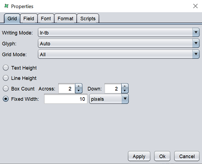
The tabs are similar to the Data Grid Wizard.