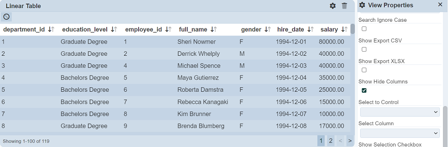
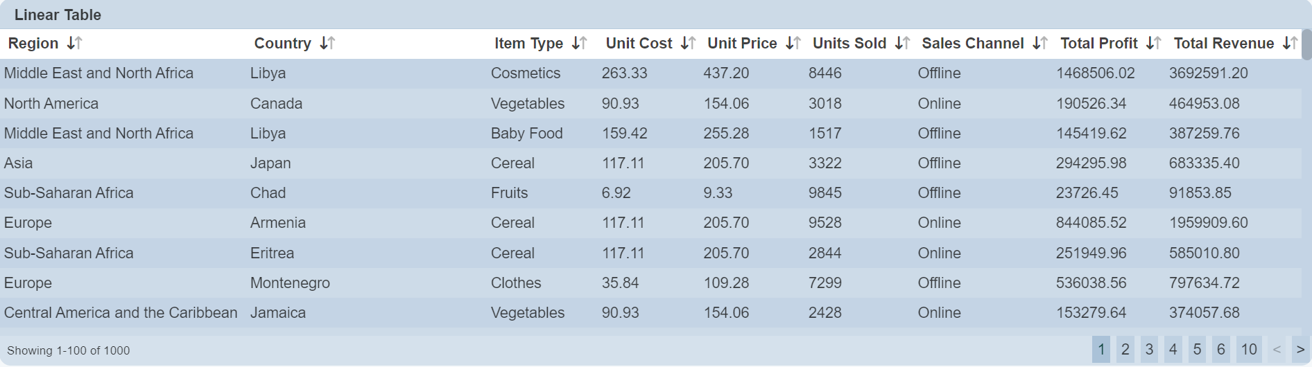
Linear Table
A linear table shows the constant rate of change between the columns and rows.
The following is a list of the fields in the View Properties box in the dashboard designer for linear table. There are some required fields to be set for each created view.
Basic Properties
The View Properties fields vary in different charts. Below are the basic properties in the View Properties box.
| Field | Description | Mandatory |
|---|---|---|
| View Type | Type of chart, table or view. | Yes |
| Title | Name of the view. | No |
| Dataset | Data used for the chart, table or view. | Yes |
| Subset | Partial data from a dataset used for the chart, table or view. | No |
The dataset and subset data derive from Dataset Management. Choose the right chart from the View Type and data points to build a view.
Other Properties
The other property fields are available to enhance the view. Below are the other properties in the View Properties box for the linear table.
| Field | Description | Default |
|---|---|---|
| Controlled By | Links dashboard controls to the view. One or more controls can be added to affect the data displayed on the view. |
Empty |
| Page Size | Number of rows to be displayed in a view at one time. | 100 |
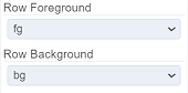
| Row Foreground | Defines the foreground colour of the rows for a specific field type through aggregation pipeline. | Empty |
| Row Background | Defines the background colour of the rows for a specific field type through aggregation pipeline. | Empty |
| Sortable | If selected, allows the column fields to be sorted. | Selected |
| Initial Sort Field | Selects a field to sort when the view is first displayed. | Empty |
| Initial Sort Descending | If “Initial Sort Field” is selected, by selecting this field will sort “Initial Sort Field” in descending order. | Not selected |
| Show Search | If selected, displays the search bar on the top right of the view | Not selected |
| Search Field | Selects a field to respond to the search. When a field is selected, only the selected field responds to the search. If none is selected, all fields can be searched. |
Not selected |
| Search Ignore Case | If “Search Field” is selected, by selecting this field, the search function is no longer case sensitive. | Not selected |
| Show Export CSV | If selected, displays the export CSV icon on the top left of the view. | Not selected |
| Show Export XLSX | If selected, displays the export XLSX icon on the top left of the view. | Not selected |
| Show Hide Columns | If selected, displays the Hide Columns icon on the top left of the view. | Not selected |
| Select to Control | Selects the filter control. | Not selected |
| Select Column | Selects the desired column to be displayed. | Not selected |
| Show Selection Checkbox | If selected, displays checkboxes in the left of the table. Select any checkbox selects all records for the value in the field in “Select Column”. |
Not selected |
| Open Links | Opens link in the field (with hyperlink set) either in the same tab (navigate away from dashboard) or a new tab. | Same Tab |
| Columns | Selects the fields to be displayed in the view. If not selected, all fields are displayed. |
Not selected |
| Maximisable | If selected, places a maximise button on the top right of the view (when not in edit mode). This will maximise the view to fill the browser. |
Not selected |
| Advanced | Add a special CSS class to the view. | Empty |
Show Search
The “Show Search” field when selected, displays the search bar at the upper right corner of the view.
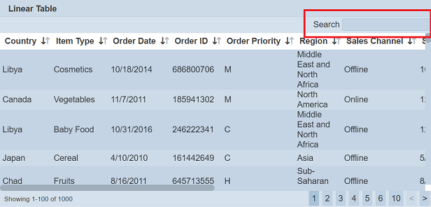
Together with the “Search Field”, user can customise the search function to search for a specific field in the table. By selecting the “Search Ignore Case” field, user can set the search to be case-insensitive.
Show Export CSV / XLSX
The “Show Export CSV” and “Show Export XLSX” fields when selected, display the “CSV” and “XLSX” icons respectively at the top left of the linear table.
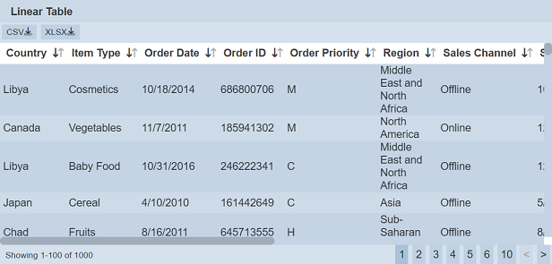
These buttons allow users to download the linear table as a CSV or XLSX file.
Show Hide Columns
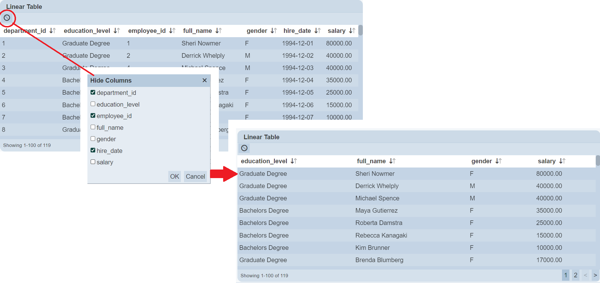
The “Show Hide Columns” field when selected, displays the  “Hide Columns” icon at the top left of the view.
Click on the icon will display the “Hide Columns” dialog box. The dialog box will display all fields in the dataset.
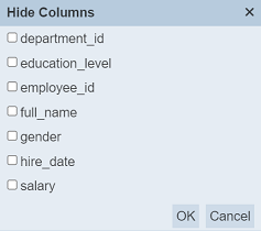
Select the fields that you do not wish to show in the linear table. Click on the “OK” button to save the change or click on the “Cancel” button to abort the action.
In the example below, the four columns are selected in the “Hide Columns” dialog box. Which means to hide these four columns in the linear table. The final table shows the data without the four columns selected in the dialog box.
Show Selection Checkbox
The “Show Selection Checkbox” field is dependent on the “Select to Control” and “Select Column” fields. Both fields must be selected in order for “Show Selection Checkbox” field to work.
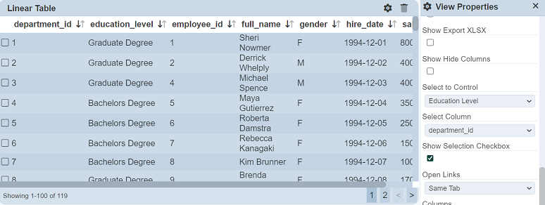
The “Show Selection Checkbox” field when selected, displays a checkbox for each record. Select any checkbox will select the records according to the field in the “Select Column”.
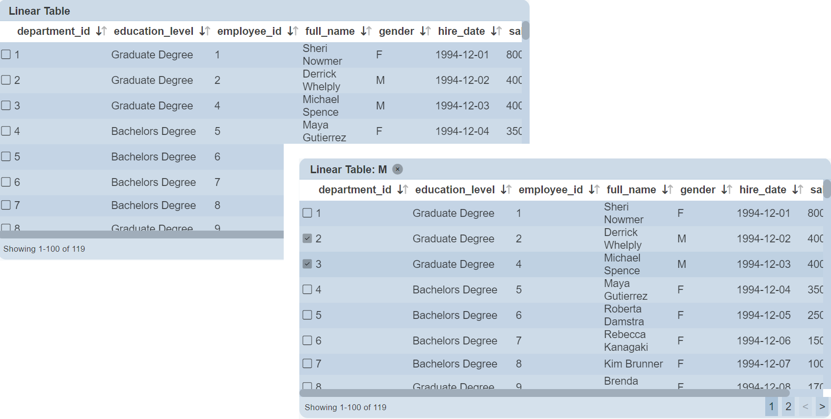
For example, the “Select to Control” selects Education Level Select Filter and “Select Column” selects gender. With “Show Selection Checkbox” selected, the checkboxes will appear at the left of the linear table. Click on the row with the value M under the “gender” column, all records with the value M under the “gender” column will be selected. To select all records with the value F under the “gender” column, click on the any row with the value F.
Column
When fields are selected for the “Columns” field, they can be further customised by clicking on the  icon next to their respective fields. The “Column Properties” dialog box will appear.
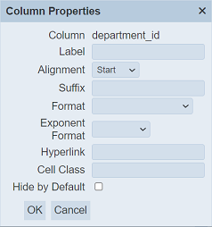
| Field | Description | Default |
|---|---|---|
| Column | Displays the name of the selected field (not editable). | Name of selected field |
| Label | Defines the name to be displayed as the column title. If not defined, the value in “Column” field is used. |
Empty |
| Alignment | Defines the alignment of the label. Options available: - Start - Centre - End |
“Start” |
| Suffix | Text to be added at the end of the values. | Empty |
| Format | Defines the format of the values. If not selected, default format is used. |
Not selected |
| Exponent Format | Defines the exponent format of the values. | Not selected |
| Hyperlink | Defines a URL link. | Empty |
| Cell Class | Customise the CSS class of the table cell. | Empty |
| Hide by Default | If selected, hide the column by default. | Not selected |
The “Hide by Default” field allows you to hide the column during initial loading of the linear table. When used with “Show Hide Menu” field in the properties, user can show or hide the hidden field using the “Hide Columns” dialog box. The hidden field will be shown as selected (i.e., hide) in the dialog box. This allows you to show a cut-down version of the table and show the columns when needed.
Examples
Example 1: Using the Columns and Initial Sort Fields
When a linear table is created, all the columns will be displayed according to the data source, which may not be desired.
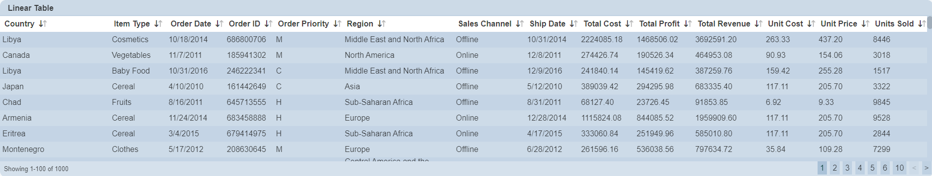
You can make use of the “Columns” and “Initial Sort Field” properties to view only some specific fields in some specific arrangement instead of all the data in the view. In this example, the fields selected in the “Columns” property: “Region”, “Country”, “Item Type”, “Unit Cost” “Unit Price”, “Units Sold”, “Sales Channel”, and “Total Profit”. Do note that the fields will be displayed in the sequence they are selected. You can re-arrange or re-order the fields by clicking on the  or
or  icon next to the desired field.
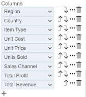
You can also make use of the “Columns” property to make further enhancements to the view. In the default view, fields with decimal values (e.g. “Unit Cost”) are not standardised, some with one decimal place while others with two decimal places. They are also left aligned, making them hard to read. You can standardise their format and right align them using the “Columns” property.
To do so, click on the icon next to the “Unit Cost” field. In the “Format” field, select “0.00”. This will standardise all values in this field to use two decimal places. In the “Alignment” field, select “Right” to right align the values. Save the settings. The values in the “Unit Cost” field are now more readable with the standardised two decimal places and right alignment. You can do the same for the other fields.
You can also set which field is to be initially sorted by defining it in the “Initial Sort Field” property. In this case, the “Country” field is selected. The final view now displays only the selected fields, the initial data being sorted using “Country”, and the fields (with decimal places) are standardised and right aligned.
Example 2: Using Row Foreground and Row Background
A linear table by default displays data in alternate grey and white rows. You can highlight some items by changing the colour of the rows using “Row Foreground” and “Row Background” through aggregation pipeline.
In the example below, three items under the “Item Type” column are highlighted. The item “Fruits” foreground (text) is red. Item “Vegetables” background is green and item “Cereal” background is blue.
To do so, first set the colours of the selected items using aggregation pipeline. In the Datasets module page, select the desired dataset and click on the  icon under the “Actions” column. In the “Edit” Panel, select the “Aggregation Pipeline” tab.
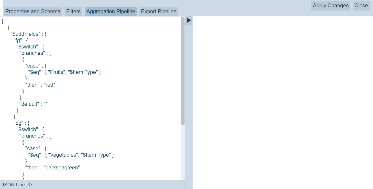
Key in the below code.
{
  "$addFields" : {
    "fg" : {
      "$switch" : {
        "branches" : [
          {
            "case" : {
              "$eq" : [ "Fruits", "$Item Type" ]
            },
            "then" : "red"
          }
        ],
        "default" : ""
      }
    },
    "bg" : {
      "$switch" : {
        "branches" : [
          {
            "case" : {
              "$eq" : [ "Vegetables", "$Item Type" ]
            },
            "then" : "darkseagreen"
          },
          {
            "case" : {
              "$eq" : [ "Cereal", "$Item Type" ]
            },
            "then" : "lightblue"
          }
        ],
        "default" : ""
      }
    }
  }
}
Select the “Schema” tab and click on the “Infer Schema” icon on the right of the tab.
Next, in the linear table properties, select “fg” and “bg” for “Row Foreground” and “Row Background” properties.
Click on the “Save” button to save the changes. The linear table now shows green background for “Vegetables”, blue background for “Cereal” and red foreground (text) for “Fruits”.
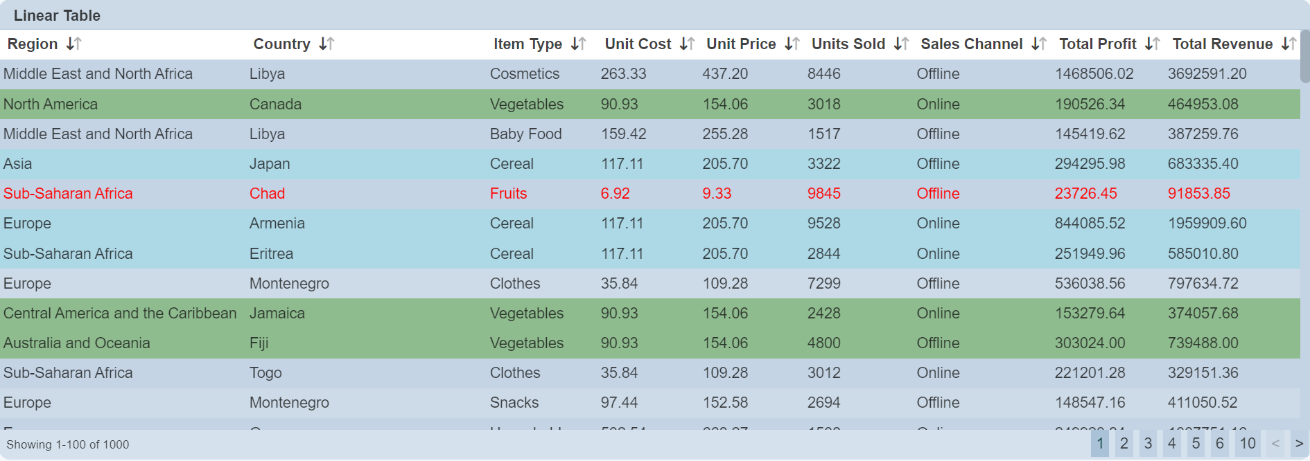
Do note that it is advisable not to show all data in the linear table when using aggregation pipeline for the foreground and background properties, as the new “fg” and “bg” fields will also be displayed.
Example 3: Using Cell Class in Columns Property
The “Cell Class” field in the Columns Property allows you to customise the CSS class of the table cell.
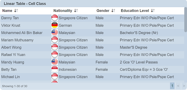
In this example, the linear table displays mock up educational information of people from several nations. You can highlight the nationalities by adding the national flags of these nations.
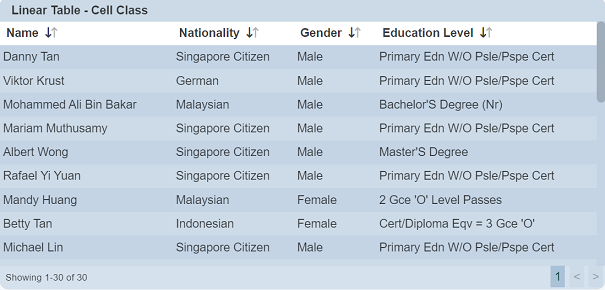
To do so, click on the icon next to the Nationality column in the View Properties to display the “Column Properties” dialog box.
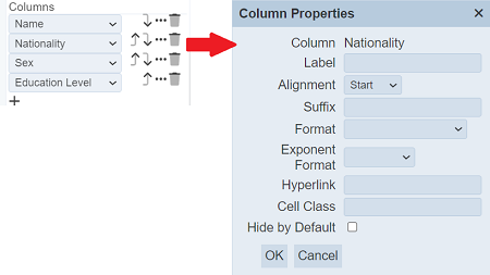
In the “Cell Class” field, key in nat-${@Nationality} and click on the “OK” button to save the change. This is to create cell classes from the options in the field “Nationality”. In this case, five different classes are created, namely nat-German, nat-Malaysian, nat-Indonesian, nat-Swiss and nat-French.
Create a nationality.css file with the following code.
.nat-Malaysian {
  padding-left: 2rem !Important;
  background:url(dashboard/MY.png);
  background-size: 28px 28px;
  background-repeat: no-repeat;
}

.nat-Indonesian {
  padding-left: 2rem !Important;
  background:url(dashboard/IDN.png);
  background-size: 28px 28px;
  background-repeat: no-repeat;
}

.nat-Swiss {
  padding-left: 2rem !Important;
  background:url(dashboard/SWI.png);
  background-size: 28px 28px;
  background-repeat: no-repeat;
}

.nat-German {
  padding-left: 2rem !Important;
  background:url(dashboard/GER.png);
  background-size: 28px 28px;
  background-repeat: no-repeat;
}

.nat-French {
  padding-left: 2rem !Important;
  background:url(dashboard/FRA.png);
  background-size: 28px 28px;
  background-repeat: no-repeat;
}
Copy the CSS file and the pictures of national flag (in this case, the *.png files in the CSS files) in the Ambience web/dashboard folder. Edit the _header.html file in the web/dashboard folder to include the CSS file as follows:
<style>
  #include dashboard/nationality.css
</style>
The linear table now displays the national flag in the Nationality column.
Do note that you may need to log out and log in again to see the effect.
Example 4: Using Hyperlink in Columns Property
The “Hyperlink” field in the Columns Property allows you to convert the column fields to a link to redirect to anther page when clicked.
It can take several forms.
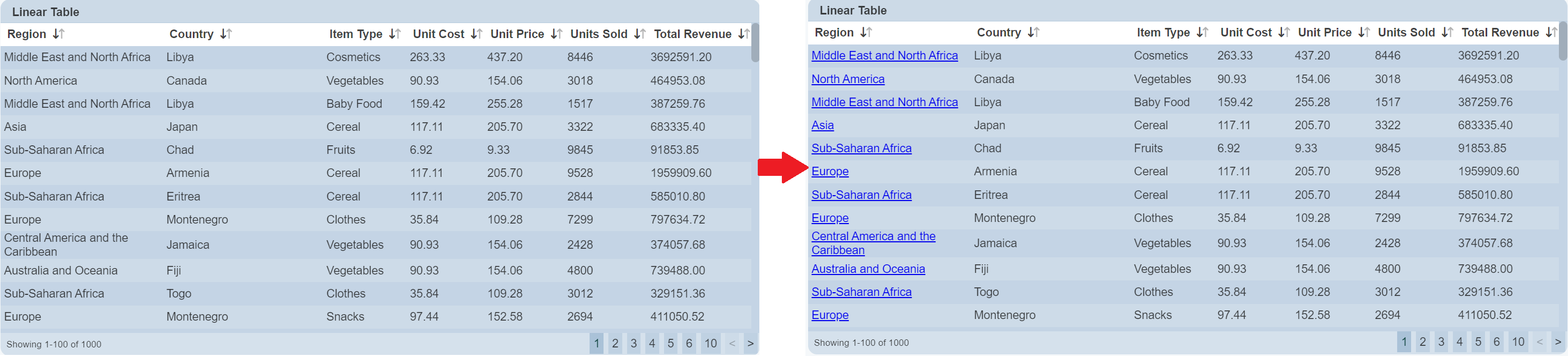
For example, if you have a fixed URL, you can use any attribute in the dataset as a query parameter. For example:
http://localhost:1740/some-module?agency=${@agencyname}
This will substitute ${@agencyname} with the value of the “agencyname” field for each record. You can use multiple if necessary.
http://www.example/com/query?agency=${@agencyname}&status=${@stat}
Alternatively, if you have a full URL as a field myurl, you can just use ${@myurl} to set the whole value.
By default, the new page will open in the same tab. To have the link open in a separate blank tab, put [_blank] on the end of the link or the name of any tab.
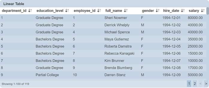
Example 5: Using Select to Control
The “Select to Control” and “Select Column” fields works together to provide selection control from one view to another. The “Select to Control” field defines the filter control and the “Select Column” field defines the field for the control in the linear table.
In the example below, a linear table lists the education level of employees in several departments. Another linear table is used to show the details of the personnel along with their education level. A select filter is used to control the list of details of personnel in the second table through the first linear table.
A Select Filter control is used to control the data between the two linear tables. The “Default Select” field is set as “None”.
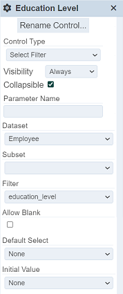
In the first linear table, set the “Select to Control” field to the Select Filter created and “Select Column” field to the desired field. In this case, the education_level field is selected. Save the changes.
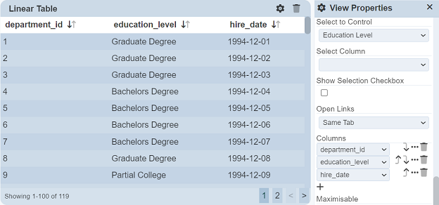
In the second linear table, set the “Controlled By” field to the same Select Filter. Save the changes.
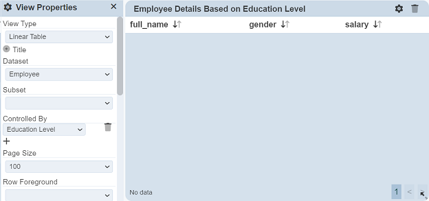
You will notice that the second linear table is now empty, as the value “None” us selected in “Default Select” field of the Select Filter. Click on any row in the first linear table and the second linear table will be populated with the details of the employee with that education level.
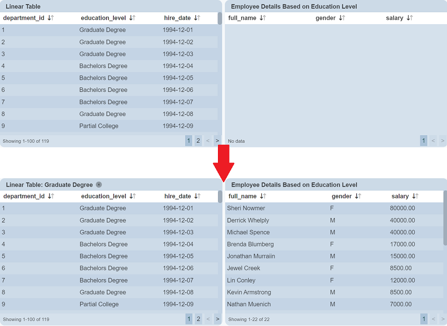
In this example, the third row in the first linear table is clicked, the second linear table then displays the details of employees with Graduate Degree.
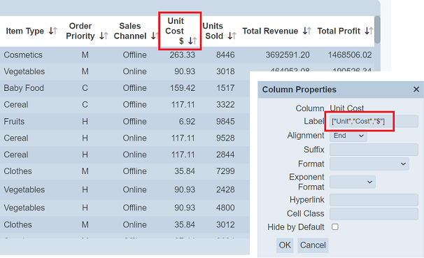
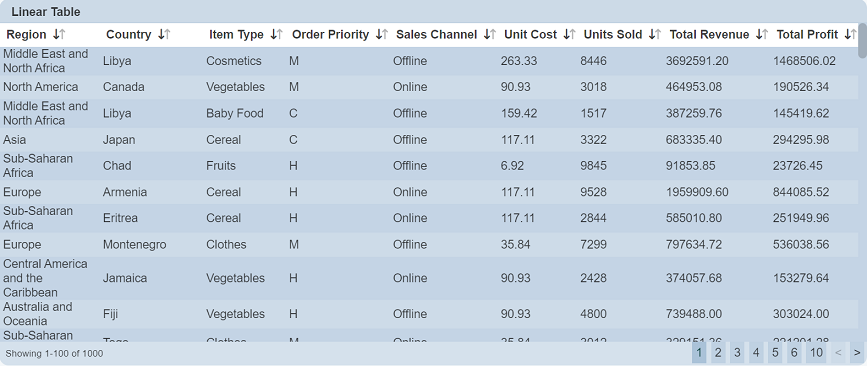
Example 6: Using String Array for Column Names
Column names are strings, which gives you only one line of description. You can use string array to define the name so that you can have multiple lines of description. This allows you to add more description to provide more clarity onto the column name. If the column name is too long, you can also use string array to break the column name into multiple lines to reduce the column width.
In the linear table below, many columns need to be displayed. Some of the column names are wide but the values beneath them are short (e.g., “Order Priority”). While other columns, such as “Region” and “Country”, where values are long, are squeezed into three lines. You can break those column names that are long into two lines to reduce the width of the column, giving other columns a wider space, making them more readable.
To edit the column names, you need to explicitly select the columns to be displayed in the linear table. This is done using using the “Columns” field in the “View Properties” dialog box when the linear table is on “Edit” mode. Click on the “Properties” icon to display the “Column Properties” dialog box. In the “Label” field of the dialog box, key in JSON string array ["Order","Proirity"].
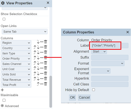
Repeat for the other columns that you wish to narrow the column space. In this case, “Sales Channel”, “Unit Cost” and “Units Sold” are edited as well. Save the changes and the linear table will now display these four column names in two lines.
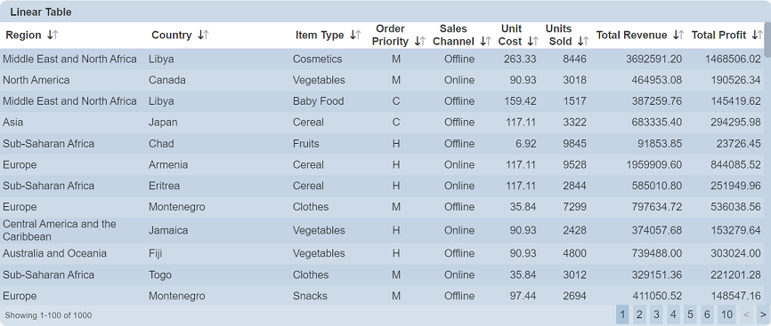
The “Region” column is now wider and its values are more readable.
You can define more than two lines for the column name.