
Dashboard Designer
Description
The Dashboard Designer allows users to customize and modify dashboards. Pages, controls, views and interactions on the dashboards can be easily set up and configured.
Dashboards are organized into pages, which may have several views in each. Controls, on the other hand, function as filters on the the data displayed.
Accessing the Dashboard Designer is done through the Dashboard Viewer. With the required privileges/access rights, users would be able to access the Designer interface of a specific dashboard.
While not part of the requirement to be able to access the Designer, datasets are very important components to building dashboards. To be able to display data on the dashboard views, the data source must first be registered on the Datasets Module. The name given to the datasets would be available as dataset options on the view properties.
Some best practices: * Data visualisations should be used to empower a specific audience and address their needs. * Provide context that produces trust, which leads to action. * Choose views that are most appropriate for specific purposes. * Keep visualisations simple and digestible.
Add Page
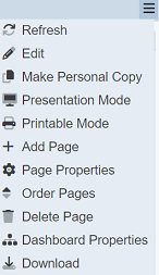
To add a dashboard page, click on the  “More Actions” button to the far right of the dashboard pages. Click on the “Add Page” option.
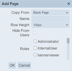
The “Add Page” dialog box appears. Select or enter the details of the page.
Input Fields
| Field | Description | Mandatory | Input Type | Constraints | Default Value |
|---|---|---|---|---|---|
| Copy From | Indicates what template the dashboard page would be based on. Selecting “Blank Page” results in using a blank canvass as a starting point while selecting an existing dashboard page would result in having the selected page as the starting template. |
Y | Drop-down list | One value can be selected. Options are: - “Blank Page” - Names of all existing pages on the current dashboard |
“Blank Page” |
| Name | Name assigned to the dashboard page that would be used as its identifier. | Y | Text field | Any text. The value must not exist in the list of page names. The value is case-sensitive. |
Empty string |
| Row Height | Defines the height of the dashboard page. | Y | Drop-down list | Available options range from 50px to 100px. | “100px” |
| Roles | List of roles that are granted read access to the dashboard page. | N | Checkbox | Multiple values can be selected. All roles are listed as available options. | None selected |
Upon clicking on the “OK” button, the new page would be added and rendered (user would be on the newly created page). Clicking on the “Cancel” button aborts the action.
Edit Page Properties
To modify an existing page’s properties, start by selecting the page.
Click on the “More Actions” button to the far right of the dashboard pages. Click on the “Page Properties” option.
The “Edit Page Properties” dialog box appears with the page’s current properties. The same fields appear, except for the Copy From field. The Row Height field in the dialog box allows you to determine the height of the page. By default, 100px is selected. You can change the value by selecting another value in the drop-down list. The same constraints in Add Page are applied to the relevant fields.
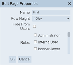
Click on the “Save” button to proceed with saving the changes made to the existing page. Clicking on the “Cancel” button aborts the action and retains the page’s properties prior to opening the Edit Page Properties dialog box.
Edit Dashboard Page Order
Changing the sequence by which the dashboard pages appear can be done while on any page. Click on the “More Actions” button to the far right of the dashboard pages. Click on the “Order Pages” option.
The “Edit Page Order” dialog box appears with the current page order displayed. The order of the pages appearing from left to right is listed on the dialog box from top to bottom.
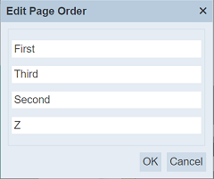
Drag and drop each desired page on the gaps between pages, on top of the first page, or after the last page to create the preferred page ordering.
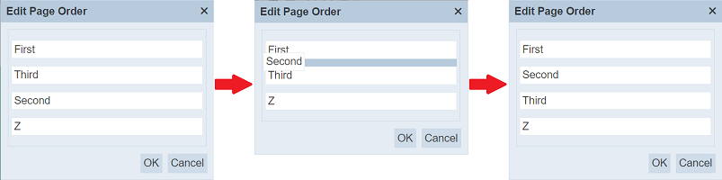
Click on the “Save” button to proceed with saving the changes. Clicking on the “Cancel” button aborts the action.
Delete Page
To delete an existing page on the dashboard, click on the name of the page to be deleted on top of the dashboard view area.
Click on the “More Actions” button to the far right of the dashboard pages. Click on the “Delete Page” option.
The page gets deleted and the user is redirected to the first page based on the sorting order. An option to undo the deletion is also provided as soon as it is deleted.
A message and a notification with an “Undo” button appears right after clicking on the “Delete Page” option.
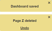
Upon clicking on the “Undo” button, the deleted dashboard is restored and is added back to the list of dashboards.
Edit Dashboard Properties
Some properties and behavior are not tied to a specific dashboard page and instead affect the entire dashboard. To set these, start by clicking on the “More Actions” button to the far right of the dashboard pages. Select the “Dashboard Properties” option.
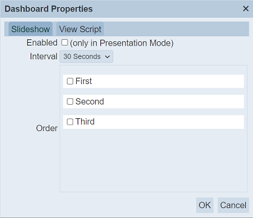
Slideshow
By default, the “Presentation Mode” only shows the currently selected dashboard page. This set of dashboard properties allows disabling and enabling a slideshow of the selected pages during presentation mode.
| Field | Description | Mandatory | Input Type | Constraints | Default Value |
|---|---|---|---|---|---|
| Enabled | Enables or disables the slideshow feature during “Presentation Mode”. | Y | Checkbox | Enabled or disabled. | Disabled |
| Interval | Sets the time interval between each displayed dashboard page. | Y | Drop-down list | Available options: 5 Seconds 10 Seconds 15 Seconds 20 Seconds 30 Seconds 60 Seconds |
30 Seconds |
| Order | Determines the page order of the slideshow and also sets which pages would be included in the slideshow. | N | Checkbox | Multiple values can be selected. | None selected |
Click on the “Save” button to proceed with saving the changes. Clicking on the “Cancel” button aborts the action.
The mechanism used for intervals is designed to synchronized across different instances, assuming that the system clocks are in sync. For instance, a 15-second interval would always start at fixed times: 00, 15, 30, and 45. This means that the slides change at the same time, across different sessions and browser tabs/windows for different users. This also results to some additional time before the first slide change. For instance, if “Presentation Mode” with slideshow intervals of 15 seconds is started on 00:00:10, the first change would be on 00:00:30. Subsequent slide changes would be made on each fixed time-based interval (i.e. 00:00:45, 00:01:00, 00:01:15, and so on).
If the user is on a dashboard page that is not included in the slideshow, “Presentation Mode” would briefly display the current page first then display the page set as the first slide according to the set slideshow page order. Otherwise, the slideshow would start on the current page, followed by the next page on the slideshow sequence.
The page ordering set in Order Page is different from the ordering set on this dialog box. Note that users who do not have access to certain pages that are included in the slideshow would not be able to view the said pages, even on “Presentation Mode”.
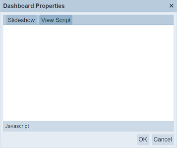
Script
Dashboard views are rendered asynchronously, so it is hard to know when a particular view has finished. Views are painted dynamically based on selections and filter changes, so any scripted alterations are lost when the view repaints. To prevent this, a script can be placed in the “Dashboard Properties” to provide two bits of information; this.event and cxt (a RenderContext).
In the example below, the code in the Script tab will replace the title in the x-axis title as “FoundIt!” when the view rendering is completed.
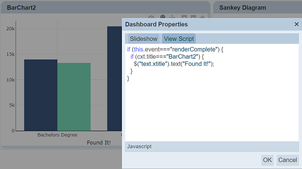
Once a view completes rendering, it executes the script. The logic in the script now runs automatically at the end of any re-rendering of this view. In the above example, only one x-axis is found. If there were several, then all will change. To limit to a single x-axis, cxt.vc.find("text.xtitle").text("FoundIt!") can be used, which will limit to the view container (vc) for the current view.
Download Dashboard
An option to download the dashboard template in JSON format is also available on the Designer. It is exactly the same download functionality described in the management module.
Click on the “More Actions” button to the far right of the dashboard pages. Click on the “Download” option.
A JSON (.json) file is downloaded into the user’s machine.
It contains the currently loaded dashboard’s configuration, including all properties, pages, controls and views. This is particularly useful for several purposes such as keeping backup copies and uploading it in the future. Filename format: \<dashboard name\>.dashboard.json
Edit Page
Customizing the dashboard’s views, layout, controls and interactions is done by one page at a time. Through editing a page, users would be able to:
- Design page
- Add view
- Copy view
- Edit view
- Copy view
- Delete view
- Configure layout
- Manage controls
- Add control
- Edit control
- Delete control
Start by selecting the page to be modified.
Click on the “More Actions” button to the far right of the dashboard pages. Click on the “Edit” option.
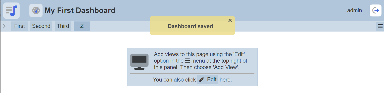
If the page is empty (i.e. it is a newly created page or all its views have been deleted), a shortcut “Edit” button is displayed on the view area.
After clicking on “Edit” option, the “design page” and “manage controls” features can now be performed.
Note that the following become unavailable while editing the dashboard page:
- Selection of other pages. Only the current page is shown.

- “More Actions” button and the options tagged to it are replaced by buttons specific to editing the page’s template.
Refer to the sections below for instructions on how to make simple changes.
Clicking on the “Save” button above saves the changes made to the page. Clicking on the “Cancel” button reverts any change done while editing the page.
Design Page
A page can contain many views. There is no limit to the number of views that can be supported on a page.
Views provide information to the users. Some views require data sources to be available in Ambience (e.g. available in Dataset Module) while some views support external sources (e.g. external sites displayed on IFrame views).
Controls provide read users of the dashboard ways to interact with the data, such as narrowing down the data.
To simplify yet still provide coverage for most of the common basic steps in designing pages, the examples in the guides below would be limited to simple chart view types (e.g. pie chart) and controls (e.g. non-ETL inject controls such as Checkbox Filter).
For the purpose of simplification, this guide starts with a blank dashboard page and control set. Existing templates are not used in this guide to provide more context. The dataset used, referred to as “Employee” dataset, is assumed to be available in the Datasets module. For convenience, the JSON file for the dataset can downloaded here: Employee dataset
To simplify this guide, it is assumed that the user is already editing a specific page.
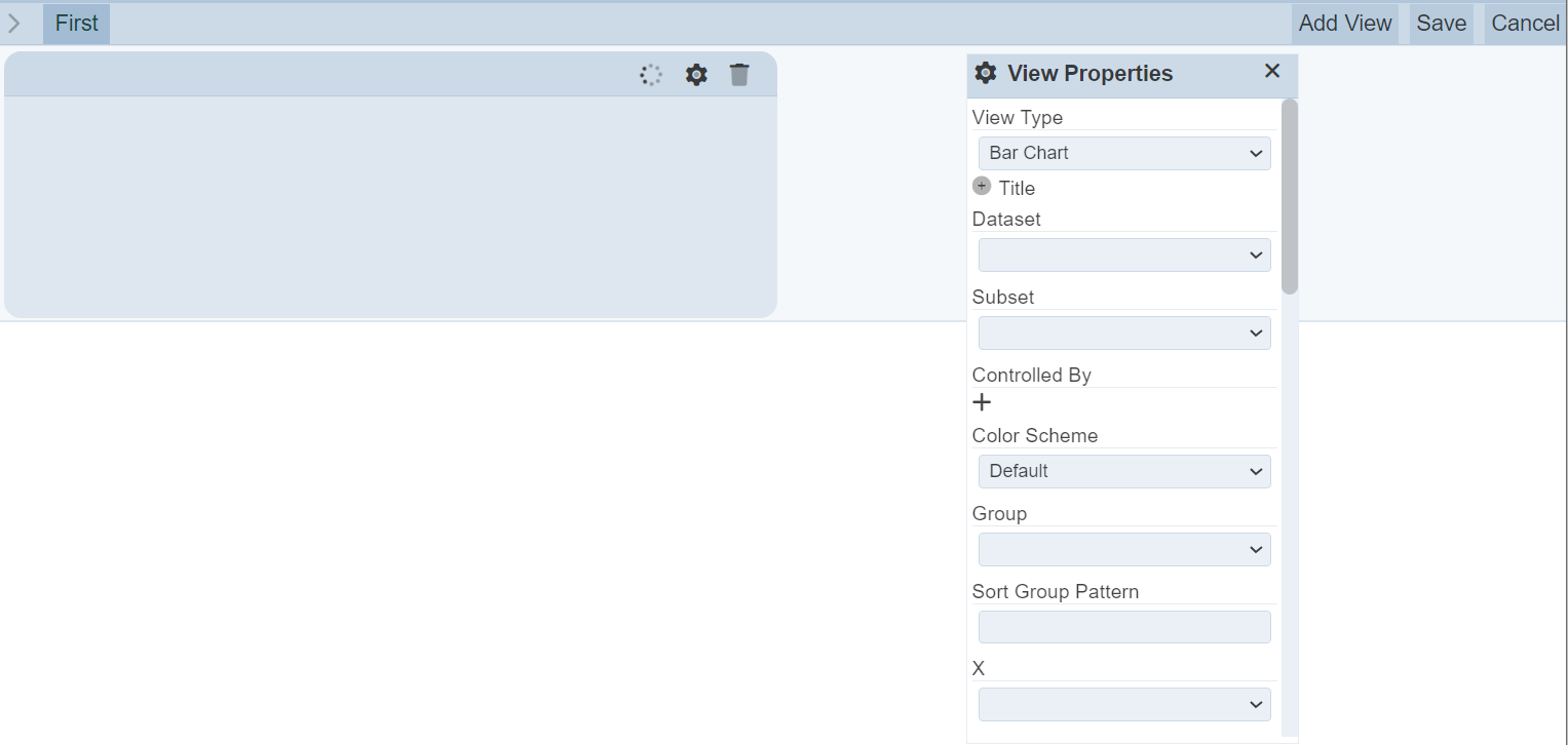
Add View
To add a view, click on the “Add View” button at the upper right corner of the page.
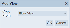
A dialog box is displayed, providing the option of copying a view template and using that as the new view’s starting point. Select the “Blank View” option.
| Field | Description | Mandatory | Input Type | Constraints | Default Value |
|---|---|---|---|---|---|
| Copy From | Indicates what template the new view would be based on. Selecting “Blank View” results in using a blank canvass as a starting point while selecting another view would result in having the selected view as the starting template. |
Y | Drop-down list | One value can be selected. Options are: - “Blank View” - Names of all views added as view templates |
“Blank View” |
Clicking on the “OK” button adds an empty view to the left side of the bottom-most view. Clicking on the “Cancel” button aborts the action.
Click on the “OK” button.
In this case, the page is empty so the empty view would simply appear on the left side. The layout mechanism is explained in the Configure Layout section.
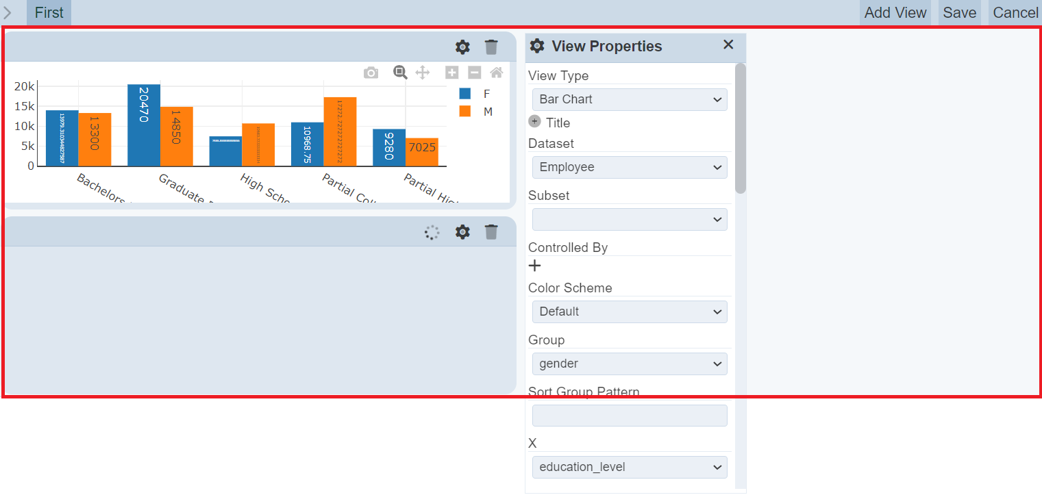
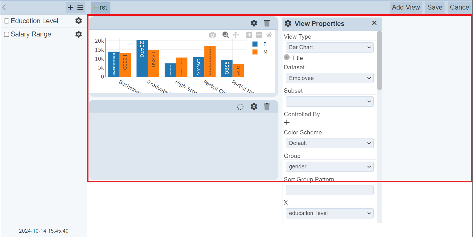
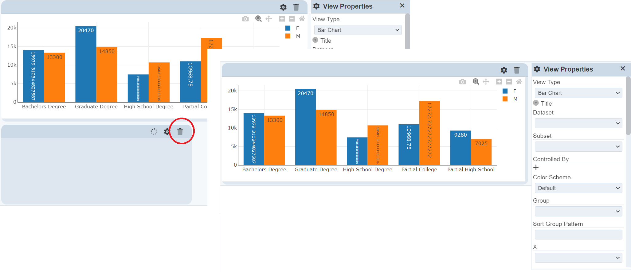
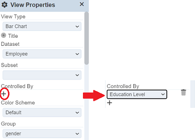
On the right side, a draggable “View Properties” panel is displayed. Once a new view is added, the View Properties panel would automatically display the properties corresponding it. This panel is draggable within the constraints of the entire dashboard area (including control panel, page and button bars). This is where the view properties are set.
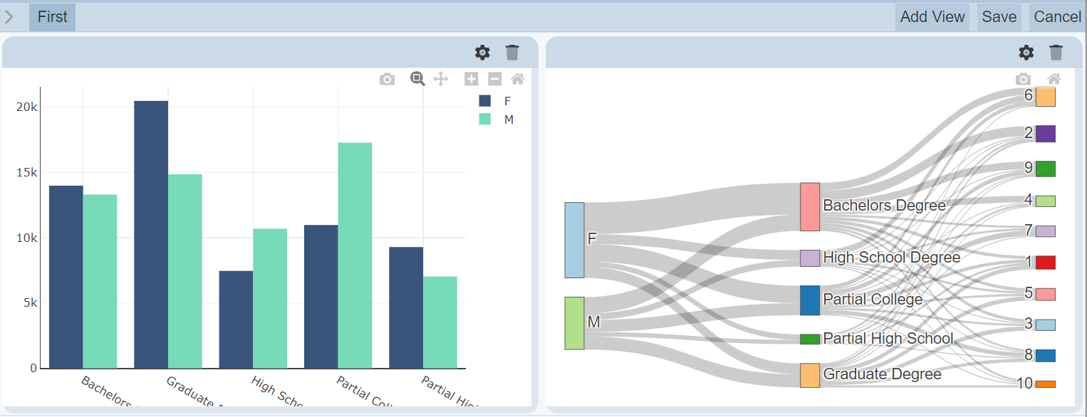
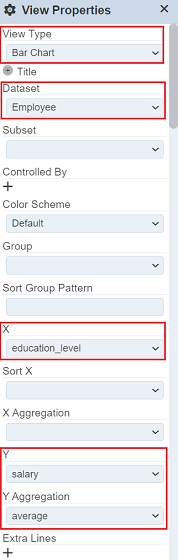
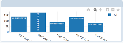
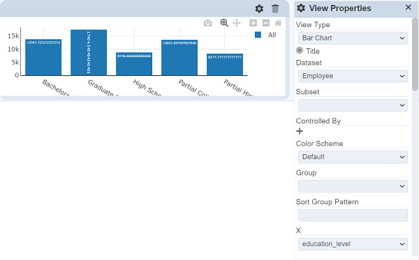
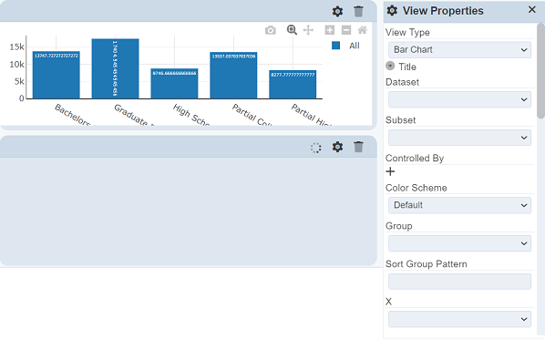
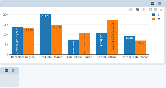
For this example, a bar chart would be created. Below are the properties that are not populated by default but are required to be manually populated to render a pie chart. The order of populating the properties are listed on the Order column below, with the first one starting at 1. Note that changes made to the View Properties panel are done live, meaning that changes are reflected immediately. Values used for the example are detailed on the Value column.
| Field | Description | Value |
|---|---|---|
| View Type | Type of chart, table or view. | “Bar Chart” |
| Dataset | Name of the dataset to be rendered. | “Employee” |
| X | Field name on the selected dataset to be used as the X values. | “education_level” |
| Y | Field name on the selected dataset to be used as the Y values. | “salary” |
| Y Aggregation | Aggregation function applied to the Y values. | “average” |
Edit View
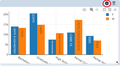
To edit a view’s properties, click on the  “Properties” button on the upper right side of the view title bar.

If the View Properties panel is closed, it would appear populated with the selected view’s properties. Otherwise, the properties and values would simply get replaced by the selected view’s properties.
For this example, there is only one view so far. To demonstrate the edit view function, simply add another view (blank view is sufficient).
The View Properties panel would automatically display the newly created view’s properties with default settings. That is, no dataset or other values selected.
To modify the first view, click on the button corresponding the view created in the Add View guide above. The View Properties panel would now display values corresponding to the first view.
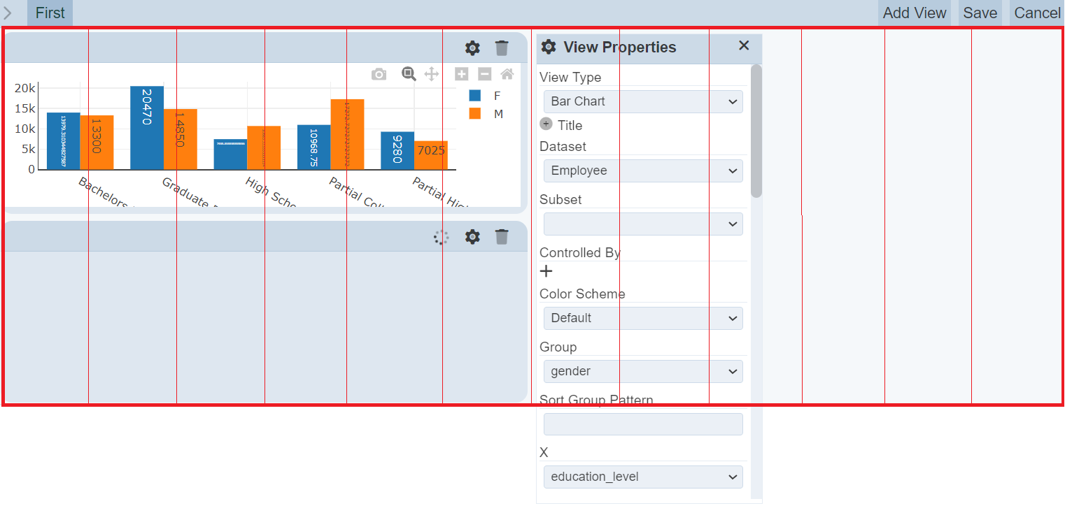
Set the following values in the properties panel to make some changes to the bar chart. In this example, data traces would be added to the bar chart.
| Property | Description | Value |
|---|---|---|
| Group | Field name on the selected dataset to be used to group data into separate data traces. | “gender” |
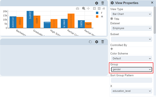
Note that changes made to the View Properties panel are done live, meaning that changes are reflected immediately.
Configure Layout
The dashboard view area occupies most of the screen, starting from below the dashboard page names and from the right of the control panel, as shown below.
The views can be dragged within the areas illustrated above. The view area follows a fixed grid layout though. The dashboard view area is divided into 12 equal grids horizontally as shown below. The width of each grid is set by dividing the dashboard area width by 12. This means that there is a maximum of 12 views that can fit into the dashboard view area horizontally.
There is also a minimum vertical length for the views but there is no limit to the number of views that can be fit vertically as the dashboard view area is designed to grow vertically.
To resize views, simply hover on the lower right edge of the view then drag the corner to expand/reduce the size of the view.
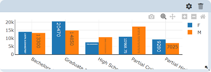
In the example below, the blank view is resized to the smallest possible size.
The views are also designed to snap to the upper-most available slot/s it could fit into. Views cannot have empty grids above unless the view is unable to fit into the available space (i.e. view width is wider than the width of the available space above it).
To demonstrate this, drag the blank view to the right, past the bar chart. Drag the view from the title bar to move the view.
While moving a view, there is a visual guide that appears to provide guidance on the movements. It does not follow the grid outlines though. Instead, it represents the location of the cursor while dragging the view.
If there is another view occupying the desired position for the view currently being moved, simply drag the view intended to be repositioned over the other view. The other view, along with the views below it (if any), would automatically get shifted below the relocated view.
Note that new views are set to occupy the left and bottom-most grid/s available that fits the new view size. If it a blank view is added, it automatically occupies the left and bottom-most 6 available grid as its default width is set to 6 grids (half of the horizontal space).
Delete View
To delete an existing view, click on the  “Delete” button on the upper right side of the view title bar.
For this example, the blank view added is to be deleted.
Manage Controls
Controls are powerful components on the Dashboard module that provide ways to control the data used on the views. The most common usage for controls is to provide data filters to the read users of the dashboard page/s. Controls are only usable on views that use data from the Dataset Module and have no use on views such as IFrame views.
To use a control, the control must be linked to a dataset by adding it to the Controlled By view property. A control can be linked to multiple views across all pages on the dashboard and a view can also be linked with multiple controls.
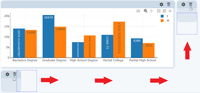
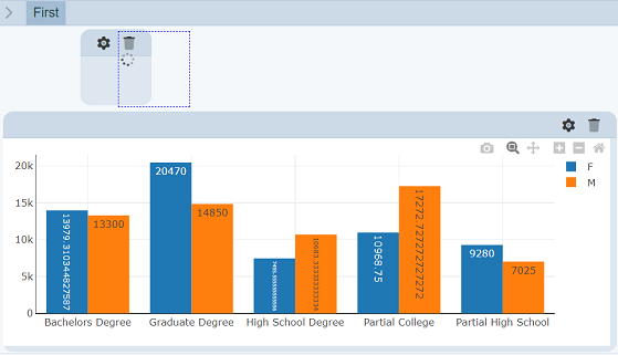
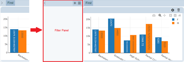
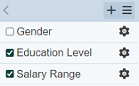
To manage the controls, open the control panel by clicking on the  “Open Filter Panel” icon to the left of the dashboard pages.
To simplify this guide, it is assumed that the user is already editing a specific page for all sections below.
Add Control
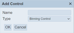
To add a control, click on the  “Add Control” button on the upper right corner of the control panel. A dialog box appears prompting to enter a unique name for the controls and to select the control type.
| Field | Description | Mandatory | Input Type | Constraints | Default Value |
|---|---|---|---|---|---|
| Name | Name assigned to the control that would be used as its identifier. | Y | Text field | Any text. The value must not exist in the list of control names. The value is case-sensitive. |
Empty string |
| Type | Indicates the type of the control. | Y | Drop-down list | One value can be selected. Available options are found in Controls | First option sorted by alphabetical order |
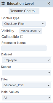
For simplicity, only filters would be used in this guide. Enter a name and select Checkbox Filter. “Education Level” is used as the name of the filter in this example. Click on the “OK” button to proceed with adding the new control. Clicking on the “Cancel” button aborts the action.
After adding the new control, the name of the control appears on the control panel. Newly created controls are added to the bottom of the list. The control properties panel also appear.
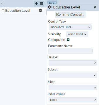
Enter the properties as listed in the table below.
| Property | Description | Value |
|---|---|---|
| Collapsible | Allows collapsing/minimizing filter options on the Dashboard Viewer. | Unselected |
| Dataset | Name of the dataset to be used. | “Employee” |
| Filter | Field name on the selected dataset to be used as filter options. | “education_level” |
| Initial Values | Sets the selected value/s as the selected option/s upon loading. | “All” |

As controls must be linked to views to be able use them, click on the button on the view to display the View Properties panel.
On the View Properties panel, click on the add button on the Controlled By property. A new row will be added. Select the control name, in this case, its Education Level.
To see how it works on the Viewer, click on the “Save” button on the upper right corner of the page.
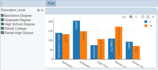
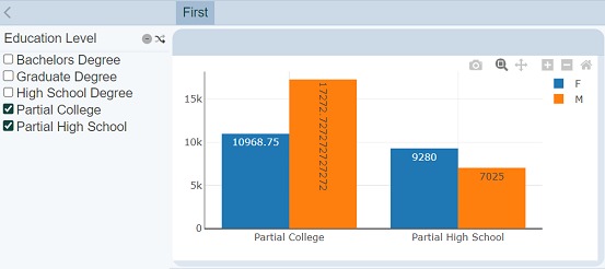
Deselect a few options on the “Education Level” filter. The view gets live updates per change made to the selected filter options.
Edit Control
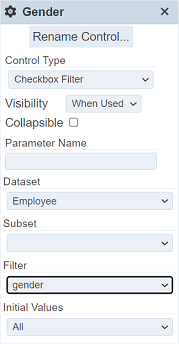
To modify a control, click on the “Properties” button corresponding the control.
The control properties panel appears with the selected control’s properties.
Modify the properties. For this example, the control would be changed to another control.
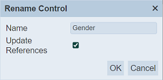
To change the name of the control, click on the “Rename Control” button on the control properties panel.
A dialog box requesting for a new name is displayed.
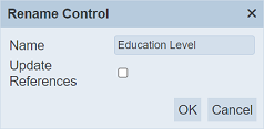
The same constraints applied to the name in the Add Control guide are applied. “Gender” is used as the new control name in this example. If the Update Reference checkbox is selected, the new name would be reflected in all views that are currently linked to the control. This means that the changes made to the control would be applied to all the views that are using it. For this example, tick select the checkbox. Click on the “OK” button. Clicking on the “Cancel” button aborts the action.
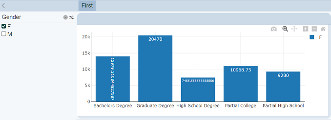
Change the Filter field to “gender”.
To see how it works on the Viewer, click on the “Save” button at the upper right corner of the page.
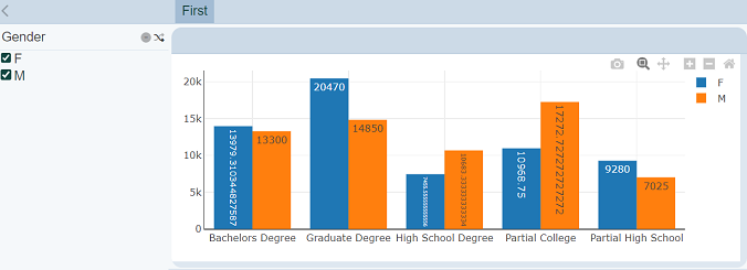
Un-select one of the options in the Filter Panel.
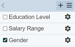
To re-arrange the order of the controls, simply select at least one control while editing the page.
Click on the “More Actions” button on the control panel, which appears when at least one control is selected. This provides options to delete or rearrange the selected controls.
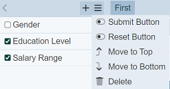
Select the “Move to Top” option to move the selected control/s to the top of the list.
Delete Control
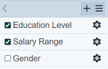
To delete a control, start by selecting its corresponding checkbox on the left.
Click on the “More Actions” button on the control panel. Select the “Delete” option.
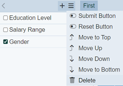
The control gets deleted from the control panel.
Click on the Save button to save the changes.
Batched Submit/Reset
By default the filters are interactive, meaning whatever changes are made to the filters will be reflected onto the views immediately. If the page has a lot of views or charts in it. Changes to the views may take some time and cause the refresh to be laggy.
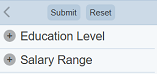
You can opt for batch submit. That is, select multiple filter settings, then submit them together as a batch. The “Show Submit” and “Show Reset” options in the “More Actions” button on the control panel allows you to perform batch submit and resets the filter settings respectively. They are disabled by default.
To enable batch submit, click on the “More Actions” button on the control panel. Toggle the “Show Submit” and “Show Reset” options.
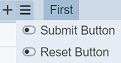
The “Submit” and “Reset” buttons will appear at the top of the panel but they are greyed out. Click on the “Save” button on the upper right corner of the page to save the change and exit the edit mode.
Upon exiting the edit mode, the “Submit” button will be enabled.
The “Submit” button allows user to submit the filter selections in batches instead of individually. The “Reset” button allows user to reset the filters to their initial settings.
Select the filters as desired. The views will not change until the “Submit” button is clicked. These two options allow users to submit filter selections in batches instead of interactive filtering when these options are disabled (by default).
There are several things to take note of:
- Leaving the page without pressing the “Submit” button is not a “Cancel”. Once you come back, the changes you had made will still be there and will be applied immediately.
- If a filter is edited, the tab is closed without submitting and reopen, the edits will be applied.
- If you switch to another dashboard page, the edits will be applied as if you has pressed the “Submit” button.
- ETag timers which fire at fixed intervals are incompatible with the batch submit.
- “Select to Control” function will probably update the filter, but the changes will not be dynamic.
- If a script to dynamically repaint a view is used, it will use the latest filters, even if the “Submit” button is not pressed yet.
- For linear tables, if you advance to page 2 after changing a filter but have not pressed the “Submit” button. the linear table will not change with the new settings.