
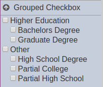
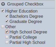
Grouped Checkbox Filter
Description
This filter control is commonly used to filter datasets based on one specific field identified in the “Filter” property. The filter has the same effect on the data as using a Checkbox Filter. The difference is in the user experience as there is a clear categorization of the options. This filter has a two-tier tree structure, using another dataset field as the root values to group the actual filter values.
This is best used for collectively filtering values on a dataset and if the filtered dataset field can be grouped using another dataset field that puts the former into mutually exclusive groups (i.e. all child options appear in only one root option). This is suitable for string-type fields (field identified for “Filter”) with not so many options that also require multiple values to be selected at a time.
Viewer Usage
There are two tiers on the filter: - root or first tier - child or second tier
Only the values on the second tier (child values) are actually being filtered. An entire group of child values can be selected collectively by selecting the checkbox corresponding its respective root option.
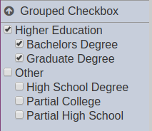
Likewise, if a root is deselected, all of its child options are automatically deselected.
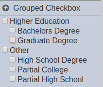
Similarly, selecting child options is also done by ticking their corresponding checkboxes. Multiple options can be selected.
Specific Properties
Below are the fields that are specific to this control:
| Field | Description | Mandatory | Input Type | Constraints | Default Value |
|---|---|---|---|---|---|
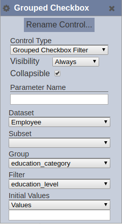
| Group | Dataset field used to group the values of the field selected in the “Filter” property. | Y | Select | 1 value can be selected. All fields of the selected dataset/subset combination. The dataset and subset (optional) must be selected first. | “None” |
| Initial Values | Determines the initial set or selected values upon loading in the Dashboard Viewer. This corresponds to the field selected for the “Filter” property. This setting is applicable only for the second-tier options. | Y | Select | 1 value can be selected. Available options are: - None (all options are deselected) - First (only the first displayed option is selected) - Last (only the last displayed option is selected) - All (all of the options are selected) - Values (all comma-separated values entered in the field that appears below this property; spaces are allowed before and after the comma) 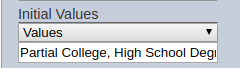 |
“None” |