
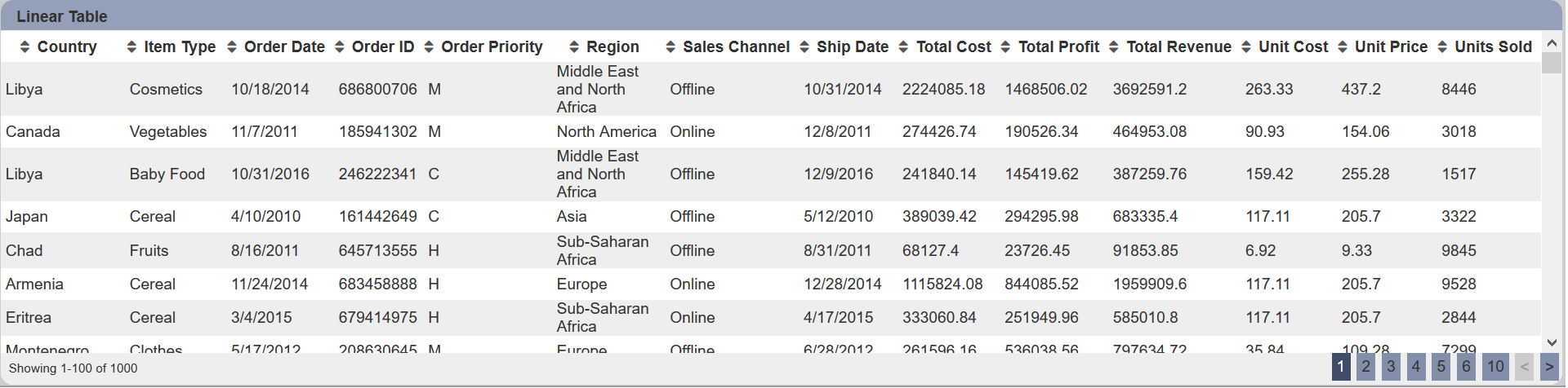
Linear Table
A linear table shows the constant rate of change between the columns and rows.
The following is a list of the fields in the View Properties box in the dashboard designer for linear table. There are some required fields to be set for each created view.
Basic Properties
The View Properties fields vary in different charts. Below are the basic properties in the View Properties box.
| Field | Description | Mandatory |
|---|---|---|
| View Type | Type of chart, table or view. | Yes |
| Title | Name of the view. | No |
| Dataset | Data used for the chart, table or view. | Yes |
| Subset | Partial data from a dataset used for the chart, table or view. | No |
The dataset and subset data derive from Dataset Management. Choose the right chart from the View Type and data points to build a view.
Other Properties
The other property fields are available to enhance the view. Below are the other properties in the View Properties box for the linear table.
| Field | Description | Default |
|---|---|---|
| Controlled By | Links dashboard controls to the view. One or more controls can be added to affect the data displayed on the view. |
Empty |
| Page Size | Number of rows to be displayed in a view at one time. | 100 |
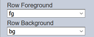
| Row Foreground | Defines the foreground colour of the rows for a specific field type through aggregation pipeline. | Empty |
| Row Background | Defines the background colour of the rows for a specific field type through aggregation pipeline. | Empty |
| Sortable | If selected, allows the column fields to be sorted. | Selected |
| Initial Sort Field | Selects a field to sort when the view is first displayed. | Empty |
| Initial Sort Descending | If “Initial Sort Field” is selected, by selecting this field will sort “Initial Sort Field” in descending order. | Not selected |
| Show Search | If selected, displays the search bar on the top right of the view | Not selected |
| Search Field | Selects a field to respond to the search. When a field is selected, only the selected field responds to the search. If none is selected, all fields can be searched. |
Not selected |
| Search Ignore Case | If “Search Field” is selected, by selecting this field, the search function is no longer case sensitive. | Not selected |
| Show Export CVS | If selected, displays the export CSV icon on the top left of the view. | Not selected |
| Show Export XLSX | If selected, displays the export XLSX icon on the top left of the view. | Not selected |
| Open Links | Opens link in the field (with hyperlink set) either in the same tab (navigate away from dashboard) or a new tab. | Same Tab |
| Columns | Selects the fields to be displayed in the view. If not selected, all fields are displayed. |
Not selected |
| Maximisable | If selected, places a maximise button on the top right of the view (when not in edit mode). This will maximise the view to fill the browser. |
Not selected |
| Advanced | Add a special CSS class to the view. | Empty |
Example 1: Using the Columns and Initial Sort Fields
When a linear table is created, all the columns will be displayed according to the data source, which may not be desired.
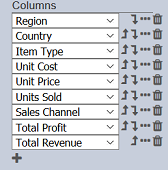
You can make use of the “Columns” and “Initial Sort Field” properties to view only some specific fields in some specific arrangement instead of all the data in the view. In this example, the fields selected in the “Columns” property: “Region”, “Country”, “Item Type”, “Unit Cost” “Unit Price”, “Units Sold”, “Sales Channel”, and “Total Profit”. Do note that the fields will be displayed in the sequence they are selected. You can re-arrange or re-order the fields by clicking on the  or
or  icon next to the desired field.
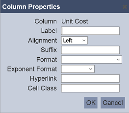
You can also make use of the “Columns” property to make further enhancements to the view. In the default view, fields with decimal values (e.g. “Unit Cost”) are not standardised, some with 1 decimal place while others with 2 decimal places. They are also left aligned, making them hard to read. You can standardise their format and right align them using the “Columns” property.
To do so, click on the  icon next to the “Unit Cost” field. In the “Format” field, select “0.00”. This will standardise all values in this field to use 2 decimal places. In the “Alignment” field, select “Right” to right align the values. Save the settings. The values in the “Unit Cost” field are now more readable with the standardised 2 decimal places and right alignment. You can do the same for the other fields.
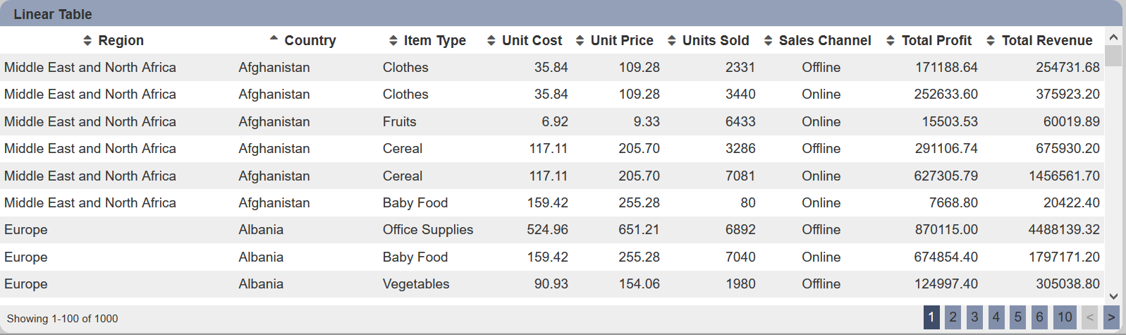
You can also set which field is to be initially sorted by defining it in the “Initial Sort Field” property. In this case, the “Country” field is selected. The final view now displays only the selected fields, the initial data being sorted using “Country”, and the fields (with decimal places) are standardised and right aligned.
Example 2: Using Row Foreground and Row Background
A linear table by default displays data in alternate grey and white rows. You can highlight some items by changing the colour of the rows using “Row Foreground” and “Row Background” through aggregation pipeline.
In the example below, 3 items under the “Item Type” column are highlighted. The item “Fruits” foreground (text) is red. Item “Vegetables” background is green and item “Cereal” background is blue.
To do so, first set the colours of the selected items using aggregation pipeline. In the Dataset Management page, select the desired dataset and click on the  icon under the “Actions” column. In the “Edit” Panel, select the “Aggregation Pipeline” tab.
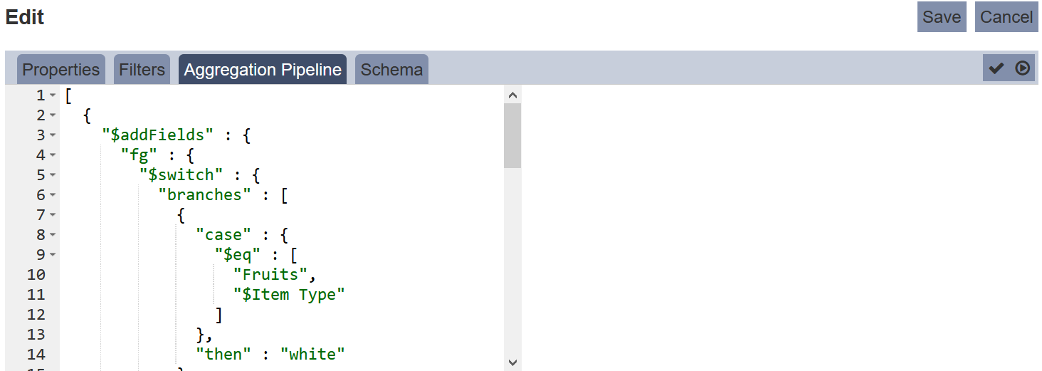
Key in the below code.
{
  "$addFields" : {
    "fg" : {
      "$switch" : {
        "branches" : [
          {
            "case" : {
              "$eq" : [ "Fruits", "$Item Type" ]
            },
            "then" : "red"
          }
        ],
        "default" : ""
      }
    },
    "bg" : {
      "$switch" : {
        "branches" : [
          {
            "case" : {
              "$eq" : [ "Vegetables", "$Item Type" ]
            },
            "then" : "darkseagreen"
          },
          {
            "case" : {
              "$eq" : [ "Cereal", "$Item Type" ]
            },
            "then" : "lightblue"
          }
        ],
        "default" : ""
      }
    }
  }
}
Select the “Schema” tab and click on the “Infer Schema” icon on the right of the tab.
Next, in the linear table properties, select “fg” and “bg” for “Row Foreground” and “Row Background” properties.
Click on the “Save” button to save the changes. The linear table now shows green background for “Vegetables”, blue background for “Cereal” and red foreground (text) for “Fruits”.
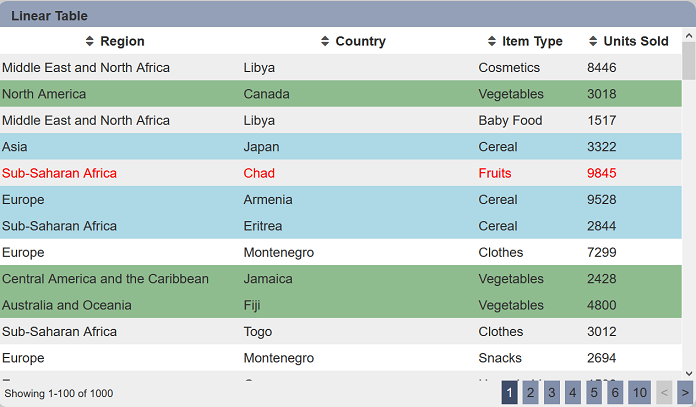
Do note that it is advisable not to show all data in the linear table when using aggregation pipeline for the foreground and background properties, as the new “fg” and “bg” fields will also be displayed.
Example 3: Using Cell Class in Columns Property
The “Cell Class” field in the Columns Property allows you to customise the CSS class of the table cell.
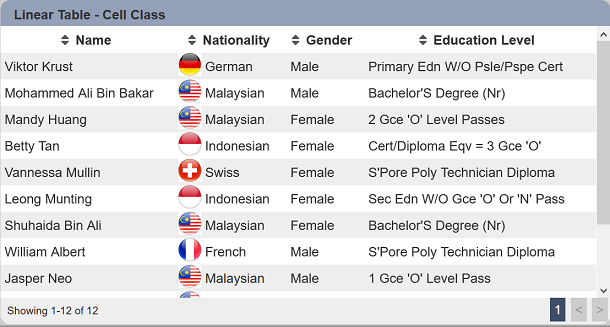
In this example, the linear table displays mock up educational information of people from several nations. You can highlight the nationalities by adding the national flags of these nations.
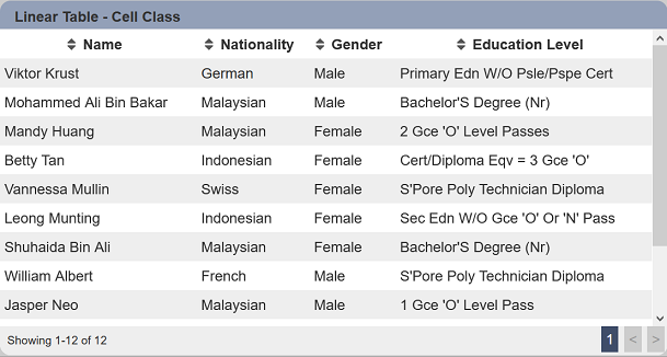
To do so, click on the icon next to the Nationality column in the View Properties to display the “Column Properties” dialog box.
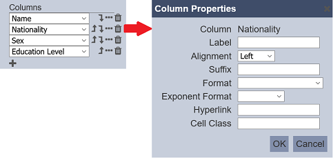
In the “Cell Class” field, key in nat-${@Nationality} and click on the “OK” button to save the change. This is to create cell classes from the options in the field “Nationality”. In this case, 5 different classes are created, namely nat-German, nat-Malaysian, nat-Indoesian, nat-Swiss and nat-French.
Create a nationality.css file with the following code.
.nat-Malaysian {
  padding-left: 2rem !Important;
  background:url(dashboard/MY.png);
  background-size: 28px 28px;
  background-repeat: no-repeat;
}

.nat-Indonesian {
  padding-left: 2rem !Important;
  background:url(dashboard/IDN.png);
  background-size: 28px 28px;
  background-repeat: no-repeat;
}

.nat-Swiss {
  padding-left: 2rem !Important;
  background:url(dashboard/SWI.png);
  background-size: 28px 28px;
  background-repeat: no-repeat;
}

.nat-German {
  padding-left: 2rem !Important;
  background:url(dashboard/GER.png);
  background-size: 28px 28px;
  background-repeat: no-repeat;
}

.nat-French {
  padding-left: 2rem !Important;
  background:url(dashboard/FRA.png);
  background-size: 28px 28px;
  background-repeat: no-repeat;
}
Copy the CSS file and the pictures of national flag (in this case, the *.png files in the CSS files) in the Ambience web/dashboard folder. Edit the _header.html file in the web/dashboard folder to include the CSS file as follows:
...
.printable-mode .full-page {
  overflow: visible !Important;
}

#include dashboard/nationality.css

@media print {
  html {
    height: auto;
  }
...
The linear table now displays the national flag in the Nationality column.
Do note that you may need to log out and log in again to see the effect.