
Pie Chart
A pie chart uses “pie slices” to show relative sizes of data.

The following is a list of the fields in the View Properties box in the dashboard designer for pie chart. There are some required fields to be set for each created view.
Basic Properties
The View Properties fields vary in different charts. Below are the basic properties in the View Properties box.
| Field | Description | Mandatory |
|---|---|---|
| View Type | Type of chart, table or view. | Yes |
| Title | Name of the view. | No |
| Dataset | Data used for the chart, table or view. | Yes |
| Subset | Partial data from a dataset used for the chart, table or view. | No |
| Key | Key groups the output into separate groups based on the selected value. | Yes |
| Value | Used as main output point. Determines the size of each portion based on the selected “Aggregation”. |
Yes |
| Aggregation | Data aggregation refers to the accumulation of the data by count, average, or summation. By default, count is selected. |
Yes |
The dataset and subset data derive from Dataset Management. Choose the right chart from the View Type and data points to build a view. Also, be consistent in using the color scheme and formatting.
Other Properties
The other property fields are available to enhance the view. Below are the other properties in the View Properties box for the pie chart.
| Field | Description | Default |
|---|---|---|
| Controlled By | Links dashboard controls to the view. One or more controls can be added to affect the data displayed on the view. |
Empty |
| Colour Scheme | Determines the color palette used for the view. | Default |
| Drill | Allows drilling down data on the selected group level. | Empty |
| Select to Control | Allows a selection made in the view to set the value of a control. Other views which are dependent on that control will then update accordingly. | Empty |
| Show | Number of portions to be displayed on the pie chart. | All |
| Text Position | Determines the position of the text to be shown in the view. | Auto |
| Legend | Chooses the chart legend visibility in the Legend properties as well as how you want to display the legend. The legend orientation displays either in vertical or horizontal order. | Selected |
| Hover Template | Customise the content shown when hovering over the view. | Empty |
| Click to Page | Adds a link to another view. | Empty |
| Click to Page Tip | Adds a brief description of the link above. | Empty |
| Maximisable | If selected, places a maximise button on the top right of the view (when not in edit mode). This will maximise the view to fill the browser. |
Not selected |
| Margins | Allows adjusting margins and padding between charts and grid. | Default settings |
| Advanced | Add a special CSS class, data script and/or layout overview to the view. | Empty |
| Config Options | Config Options consists of the following: - Scroll Zoom - allows the mouse wheel to zoom in/out of the chart - Display Modebar - controls whether the bar of icons at the top right of the chart should appear always, never or only when hovering over the chart - Hide Modebar buttons - chooses which buttons (icons) to include in the Modebar |
Default settings |
Do note that there are some weighting on some of the fields. Some properties have priorities over others. For example, the “Click to Page” property has priority over the “Drill” property, which means that if “Click on Page” is activated, you will not be able to drill down the data set in the properties. Thus, these 2 fields should not be used together.
Example: Drill Down Data
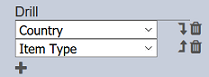
You can use the “Drill” property to view the subset of the data, and the sub-subset of the data. In this example, the view displays the pie chart by region. You may want to drill down on the countries in a particular region, and drill down further to the item types of a particular country in that region. To do so, add “Country” and “Item Type” to the “Drill” property.
By clicking on the portion labelled “Europe”, all countries in the Europe region are displayed. To view the types of items sold in a country in Europe, click on any of the countries in the pie chart. In this case, Belarus is selected and the pie chart displays all items sold in Belarus.
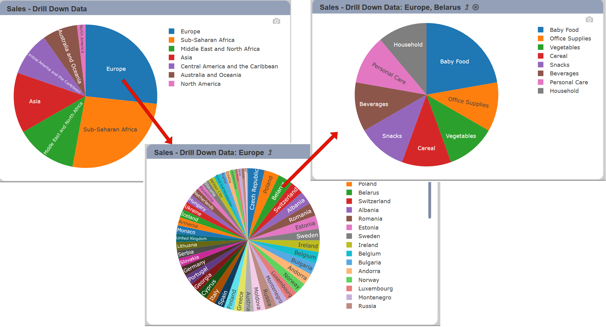
Click on the  icon on the title bar to return to the previous view or click on the
  icon to return to the main view (if available).
Example: Select to Control
You can use the “Select to Control” property to interact and control other dashboard views. In this example, there are two views, a pie chart and a linear table that uses the same dataset. You can use “Select to Control” property in the pie chart to control the content of the linear table.
To do so, first create a control filter that uses the “Region” field. In the View Properties of the linear table, select the control filter that was created earlier in the “Controlled By” property. In the View Property of the pie chart, select the same control filter in the “Select to Control” property.

By clicking on the portion labelled “Europe”, all the data in the Europe region are displayed in the linear table.

You can click on other portion in the pie chart and the linear table will display the data of the portion. To reset the selection, click on the icon in the pie chart and the linear table all data in the dataset.