
Sankey Diagram
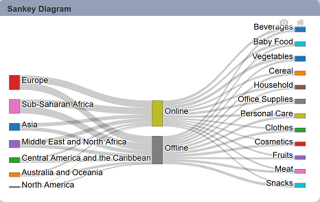
The sankey diagram is a flow diagram, in which the width of the arrows is proportional to the flow rate.
The following is a list of the fields in the View Properties box in the dashboard designer for sankey diagram. There are some required fields to be set for each created view.
Basic Properties
The View Properties fields vary in different charts. Below are the basic properties in the View Properties box.
| Field | Description | Mandatory |
|---|---|---|
| View Type | Type of chart, table or view. | Yes |
| Title | Name of the view. | No |
| Dataset | Data used for the chart, table or view. | Yes |
| Subset | Partial data from a dataset used for the chart, table or view. | No |
| Columns | Displays the flow rate between the column fields selected (minimum 2 columns). | Yes |
The dataset and subset data derive from Dataset Management. Choose the right chart from the View Type and data points to build a view. Also, be consistent in using the color scheme and formatting.
Other Properties
The other property fields are available to enhance the view. Below are the other properties in the View Properties box for the sankey diagram.
| Field | Description | Default |
|---|---|---|
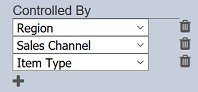
| Controlled By | Links dashboard controls to the view. One or more controls can be added to affect the data displayed on the view. |
Empty |
| Weight Column | Determines how the first column is to be sorted, based on the selected field. | Empty |
| Colour Scheme | Determines the color palette used for the view. | Default |
| Show Node Label | When selected, displays the label of the “Column” field. | Selected |
| Select to Control | Allows a selection made in the view to set the value of a control. Other views which are dependent on that control will then update accordingly. | Empty |
| Hover Template | Customise the content shown when hovering over the view. | Empty |
| Click to Page | Adds a link to another view. | Empty |
| Click to Page Tip | Adds a brief description of the link above. | Empty |
| Maximisable | If selected, places a maximise button on the top right of the view (when not in edit mode). This will maximise the view to fill the browser. |
Not selected |
| Margins | Allows adjusting margins and padding between charts and grid. | Default settings |
| Advanced | Add a special CSS class, data script and/or layout overview to the view. | Empty |
| Config Options | Config Options consists of the following: - Scroll Zoom - allows the mouse wheel to zoom in/out of the chart - Display Modebar - controls whether the bar of icons at the top right of the chart should appear always, never or only when hovering over the chart - Hide Modebar buttons - chooses which buttons (icons) to include in the Modebar |
Default settings |
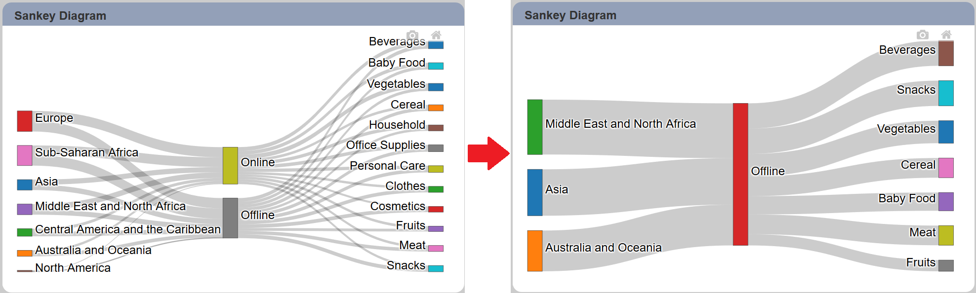
Example: Using Controlled By Field
The sankey diagram allows you to view the flow rates between fields. If there are too many flow rates, it can be confusing and hard to see the flows clearly. You can use the “Controlled By” field is to select to un-select some fields temporarily to gain better view of the flow.
Assuming the controls has been created. In the “Controlled By” property, click on the “+” icon below it and select the appropriate controls from the drop-down list.
In the dashboard, click on the “>” icon on the upper left of the dashboard to show the list of controls selected in the “Controlled By” property. Click on the  icon next to the control to display the list of fields. Select the appropriate checkboxes in the controls.
You can invert the selection by clicking on the  icon in the control. To remove all selected fields, click on the
  icon.
icon.
Click on the  icon next to the control to hide the selection. This will cause the control to revert back to the original view. To hide the controls but leaving the selection intact, click on the “<” icon on the upper left of the dashboard.