
Controls
Description
Located on the left panel on both the Dashboard Designer and Viewer interfaces, controls provide highly customizable ways of controlling the data displayed on the dashboard views.
Managing and configuring a dashboard’s controls are done through the Dashboard Designer. A control can be linked to multiple views across all pages on the dashboard and a view can also be linked with multiple controls. The guide also covers how to link controls to views.
Controls become usable, typically as interactive filters for read users, through the Dashboard Viewer.
It is optional to add controls to dashboards. Controls can be categorized into these types:
- Filter control - used to apply filters on a specific field of the dataset displayed on a view.
- Inject control - advanced feature for passing data (e.g. filter values as input parameter values) to other modules such as ETL.
- Parameter control - allows parameterisation of aggregation pipeline
- Timer control - add real-time or near real-time data updates
Common Control Properties
The properties below are those that are common to all types of controls.
| Field | Description | Mandatory | Input Type | Constraints | Default Value |
|---|---|---|---|---|---|
| Name | Name assigned to the control that would be used as its identifier. | Y | Text field | Any text. The value must not exist in the list of control names. The value is case-sensitive. |
Empty string |
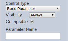
| Control Type | Indicates the type of the control. | Y | Select | 1 value can be selected. Available options are found in the sections below. | First option sorted by alphabetical order |
| Visibility | Indicates if the control would be displayed on the Viewer. | Y | Select | 1 value can be selected. Available options: - Always (always displays the control on all pages on the dashboard, regardless of usage) - When Used (only displays the control on a page if at least one view on the same page is linked to it) - Hidden (won’t be displayed regardless of usage) |
“Always” |
| Collapsible | Indicates if the control, if displayed on view mode, can be collapsed and expanded. This also acts as the “switch” to enable or disable the control. If collapsed, the control is disabled. If expanded, the control is applied. Selected options are retained when collapsing and expanding controls. | Y | Checkbox | - Enabled (minimized by default; button to expand the control is available)   - Disabled (always expanded; no option to minimize)  |
Enabled |
| Parameter | Name to be given to the parameter. If populated, the parameter name and value/s are passed to the dataset pipeline. It allows further configuration of the dataset pipeline, such as manipulating the order of the aggregation pipeline. | N | Text field | Any text. The value is case-sensitive. | Empty string |
Note that assigning the name can be done through adding a new control and modifying its name can be done through clicking on the “Rename Control” button on the control properties panel.
Filter Controls
Filter controls are typically used to directly apply field-specific filters to the dataset used by a view. The datasets used by the control and view must share the same field name to successfully integrate the filter mechanism. In other words, a filter control can filter any linked view’s data as long as the field identified on the control’s properties also exists in the datasets used by the views. In addition, the data types must also be the same to be able to effectively use the filter.
The following controls are categorized under filter controls:
- Binning Control
- Checkbox Filter
- Chooser Filter
- Date Range Filter
- Dynamic Filter
- Grouped Checkbox Filter
- Grouped Select Filter
- HH:MM Range Filter
- Mandatory Date Range Filter
- Mandatory HH:MM Range Filter
- Number Range Filter
- Pivot Filter
- Select Filter
- Stacked Bar Filter
- String Edit Filter
Below are the properties common to the all filter control types:
| Field | Description | Mandatory | Input Type | Constraints | Default Value |
|---|---|---|---|---|---|
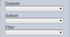
| Dataset | Dataset to be used in the filter. | Y | Select | 1 value can be selected. All enabled datasets are available options. | None |
| Subset | Subset of the dataset selected. | N | Select | 1 value can be selected. All enabled subsets of the selected dataset. The dataset must be selected first. | None |
| Filter | Field of the selected dataset to be filtered. | Y | Select | 1 value can be selected. All fields of the selected dataset/subset combination. The dataset and subset (optional) must be selected first. | None |
Inject Controls
Inject controls are not directly linked to datasets and also do not actually filter the data. Instead, they pass the data selected by the user to other Ambience modules (e.g. ETL, Reports). They are typically used in situations where simple filtering is insufficient. They are passed in document structures as child elements of $elx-etl-inject. Some common usages for this type of controls are listed below: - retrieve data from external sources (e.g. through API) through using ETL datasets that use the inject control values as input parameters of the ETL chain - apply complex logic (e.g. different data sources depending on date range supplied) to a dataset (must be done through an ETL dataset) - provide Report Module features (e.g. report generation) on the dashboard and supply parameters to it
The following controls are categorized under inject controls:
- Checkbox ETL Inject
- Date Range Inject
- Grouped Checkbox Inject
- Grouped Select Inject
- HH:MM Range Inject
- Mandatory Date Range Inject
- Mandatory HH:MM Range Inject
- Select ETL Inject
Below are the properties common to all inject control types:

| Field | Description | Mandatory | Input Type | Constraints | Default Value |
|---|---|---|---|---|---|
| Inject Field | Name used as the field name of the value entered. If used in another Ambience component, the name must match the exact name of the expected field in the other Ambience component. | Y | Text field | Any text. The value is case-sensitive. | Empty string |
Usage in ETL Dataset
To use an inject control in an ETL dataset, add an ETL chain set first. Refer to ETL Module on how to create ETL chain sets and chains.
The chain to be used as an ETL dataset must start with a “JSON Record” step, with “Merge Order” set to “Upstream overrides this”. It allows the inject control fields to overwrite this JSON record.

The value entered in the inject control’s “Inject Field” property would be used as the JSON tag.

Sample JSON record when the inject control input fields are populated:
{
"bonus":"none"
}
The JSON tag/s used in the inject control can be used like any other explicitly declared JSON tag in “JSON Record” ETL steps.
Parameter Controls
Parameter controls allows parameterisation of aggregation pipeline.
They are typically used to filter aggregated field identified in the “Filter” property and dataset property using aggregation pipeline.
The following controls are categorized under parameter controls:
Timer Controls
Timer controls provide one of the easiest ways to add real-time or near real-time data updates on the dashboard. This type of control provides a mechanism to manage when the data displayed on linked views should be refreshed/reloaded. These controls are typically hidden from the control panel.
Note that timer controls only make data refreshes on the dashboard level. It is important to note that the available data is highly dependent on how the data is obtained (e.g. ETL from external data source to MongoDB). This means that real-time rendering of data would not be achieved if only an appropriate timer control is set up; the data retrieval (e.g. ETL job), has to be done as close to real-time as possible as well.
The following controls are categorized under inject controls:
Below are the properties common to the all filter control types:
| Field | Description | Mandatory | Input Type | Constraints | Default Value |
|---|---|---|---|---|---|
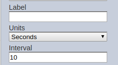
| Label | Label given to the timer. | N | Text | Any text. | Empty string |
| Units | Time unit of the interval. | Y | Select | 1 value can be selected. Available options are: - Hours - Minutes - Seconds |
“Seconds” |
| Interval | Interval of the refresh. | Y | Numeric | Any non-negative number | 10 |
Label Control
Labels allow you to group and/or segregate filter controls. It is a static display with no selections available.
The following controls are categorized under label control: