View Properties
This section provides descriptions and guides on using the available properties for each view type.
Properties determine what should be displayed on a the view and how it is displayed.
Some properties are applicable to all view types, such as title-related properties. There are also some properties that are mainly used on views that are data-dependent, such as value, group, and aggregation. There are also some properties that are specific to only one view type. All of these would be covered in the sections below.
Setting view properties is done through the View Properties panel.
Common Properties
These properties are available on all view types. These typically are not dependent on the data and are mostly related to the how the actual view container, henceforth known as a grid, should look like.
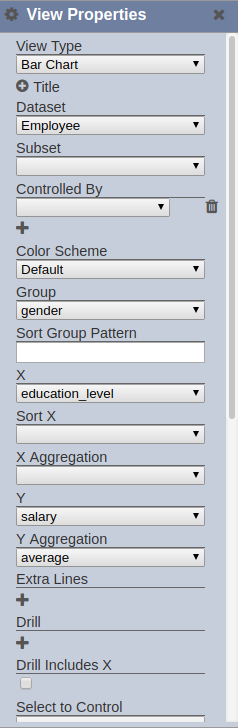
View Type
This determines what type of view would be displayed on the grid.
Below are the view types available:
- Bar (Percent) Chart
- Box Plot
- Bubble Chart
- Bubble Overlay
- Choropleth Map
- Circular Gauge
- Download View
- Dual Axis Chart
- Gis View
- HTML View
- Heat Map
- IFrame View
- Line Chart
- Linear Table
- Page View
- Pie Chart
- Pivot Table
- Radar Chart
- Row Page View
- Sankey Diagram
- Scatter Chart
- Sunburst Chart
- Sunburst Tree Chart
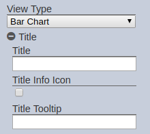
Title Properties
These properties are related to the title bar on the grid. Clicking on the expand/minimize button beside the Title label expands/minimizes the title properties.

The below properties can be set when Title is expanded.
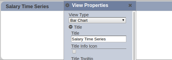
Title
The value entered in the Title property gets displayed on the grid title.
| Field | Mandatory | Input Type | Constraints | Default Value | Dependency |
|---|---|---|---|---|---|
| Title | N | Text field | Any text | Empty string | None |
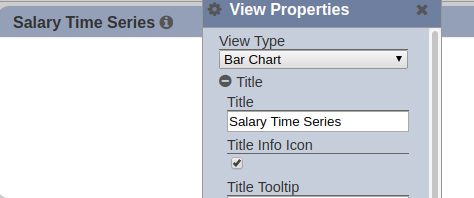
Title Info Icon
If enabled, an info icon is appended to the grid’s title.
| Field | Mandatory | Input Type | Constraints | Default Value | Dependency |
|---|---|---|---|---|---|
| Title Info Icon | Y | Checkbox | Enabled (true) or disabled (false) | Disabled | None |
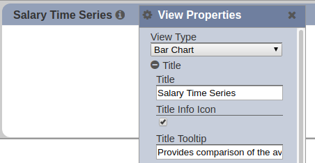
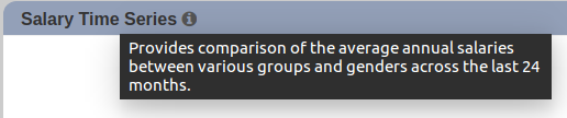
Title Tooltip
The text entered is displayed upon hovering on the title and/or info icon. Note that this is dependent on whether the Title, Info Icon or both properties are enabled. If Title is not set and if Title Info Icon is disabled, the text entered for this property would not appear.
Its effect can only be seen on the Viewer as the title bar supports other features (i.e. drag to change layout) on the Designer.
| Field | Mandatory | Input Type | Constraints | Default Value | Dependency |
|---|---|---|---|---|---|
| Title Tooltip | N | Text field | Any text | Empty string | Displayed only if Title is populated, Title Info Icon is enabled or both. |
Functional Properties
These properties are related to the actual features of the view. These properties do one or more of the following:
- link dataset/s to the view
- provide interactions on the Viewer, such as setting drill down levels
- set how the data is displayed on the Viewer
- link controls to the view
- configure look and feel of specific elements of the view, such as chart axes, legends, color schemes, and hover templates
The list of functional properties can be found here.
Margin Properties
These properties allow adjusting margins and padding between charts and the grid.
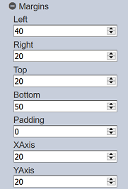
Depending on the type of view, the XAxis and YAxis may not be available.
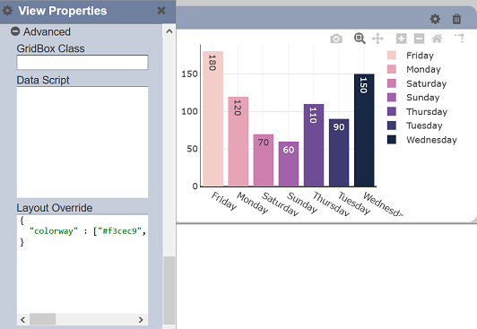
Advanced Properties
These properties allow you to add a special CSS class, data script and/or layout overview to the view, depending on the type of view.
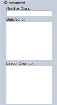
GridBox Class
GridBox class allows you to add a special CSS class to your view.
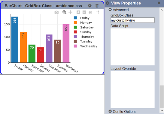
Example 1
In this example, create a different background colour for one of the view. To do this, it requires 2 steps. In the first step, locate the ambience.css file in the ./web/style/ folder and add a customized view border into the ambience.css file.
.my-custom-view {
  border: 3px solid blue !important;
}
In the second step, edit the desired view. In the “View Properties”, expand the “Advanced” property and key in my-custom-view in the “GridBox Class” field. Save the changes and refresh the dashboard page. A blue border will appear around the view.
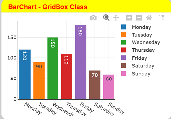
Example 2
In this example, change the title of the bar chart. To do this, it requires 2 steps. In the first step, locate the _index.html file in the ./web/dashboard/ folder and add a customized css into the _index_html file under the <style> section.
.demo .grid-box-title {
  color: red;
  background-color: yellow;
}
In the second step, edit the desired view. In the “View Properties”, expand the “Advanced” property and key in demo in the “GridBox Class” field. Save the changes and refresh the dashboard page. The title will changed to red colour with a yellow background.
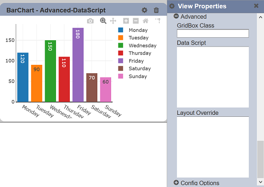
Data Script
Data script allows you to manipulate the data returned by the server before being shown in your view.
***Example ***
In this example, fix a colour of a value in a bar chart, regardless of the colour schema.
To do so, click on the textbox below the “Data Script” field. The “Edit Data Script” dialog box will appear.
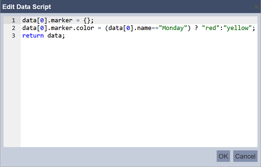
In the dialog box, key in the desired code. Click on the “OK” button to save the changes. Click on the “Cancel” button to abort the action.
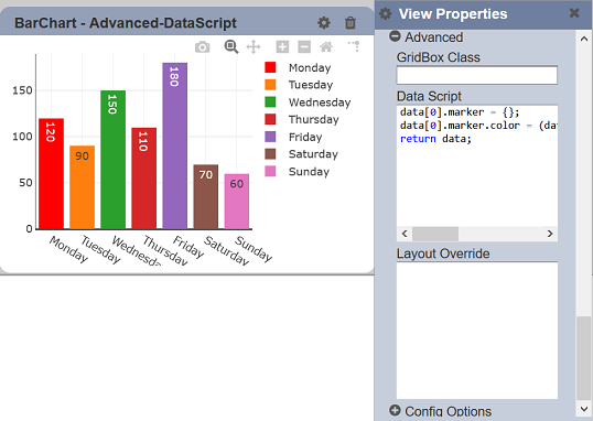
In this example, if the first data is “Monday”, it is fixed as red colour, else it will be yellow.
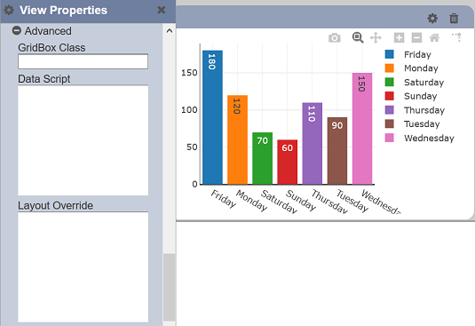
Layout Overwrite
This feature allows you to customise the layout of the view.
For example, customising the colours of the bar chart.
To do so, click on the textbox below the “Layout Overwrite” field. The “Edit Layout Overwrite” dialog box will appear.
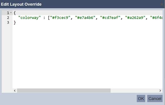
In the dialog box, key in the desired code to change the layout. Click on the “OK” button to save the changes. Click on the “Cancel” button to abort the action.