
Choropleth Map
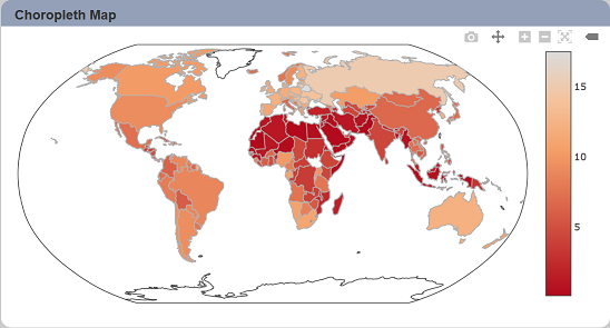
A choropleth map is used to represent statistical data through various shading patterns or symbols on predetermined geographic areas.
The following is a list of the fields in the View Properties box in the dashboard designer for choropleth map. There are some required fields to be set for each created view.
Basic Properties
The View Properties fields vary in different charts. Below are the basic properties in the View Properties box.
| Field | Description | Mandatory |
|---|---|---|
| View Type | Type of chart, table or view. | Yes |
| Title | Name of the view. | No |
| Dataset | Data used for the chart, table or view. | Yes |
| Subset | Partial data from a dataset used for the chart, table or view. | No |
| Location Mode | Determines the interpretation of “Group (Location)”. By default, ISO-3 is selected. |
Yes |
| Group (Location) | Places the output of the dataset/subset into separate groups or data traces based on field selected. | Yes |
| Value | Used as main output point. Determines the size of each portion based on the selected “Aggregation”. |
Yes |
| Aggregation | Data aggregation refers to the accumulation of the data by count, average, or summation. By default, count is selected. |
Yes |
| Scope | Selects the geographical region from the list. By default, world is selected. |
Yes |
| Projection | Selects the type of map to be displayed. | Yes |
The dataset and subset data derive from Dataset Management. Choose the right chart from the View Type and data points to build a view.
Other Properties
The other property fields are available to enhance the view. Below are the other properties in the View Properties box for the choropleth map.
| Field | Description | Default |
|---|---|---|
| Controlled By | Links dashboard controls to the view. One or more controls can be added to affect the data displayed on the view. |
Empty |
| Auto Colour Scale | If selected, the map will be the default colour scale and colour, thus the “Colour Scale” field will be ineffective. | Selected |
| Colour Scale | Customise the colour and scale to be displayed. If “Auto Colour Scale” field is selected, this field will be ineffective. By default, 6 ranges are defined. More can be added. |
Default settings |
| Click to Page | Adds a link to another view. | Empty |
| Click to Page Tip | Adds a brief description of the link above. | Empty |
| Maximisable | If selected, places a maximise button on the top right of the view (when not in edit mode). This will maximise the view to fill the browser. |
Not selected |
| Margins | Allows adjusting margins and padding between charts and grid. | Default settings |
| Geo | Shows/hides details of the map (such as, frame, coast lines and lakes). | Default settings |
| Advanced | Add a special CSS class to your view. | Empty |
| Config Options | Config Options consists of the following: - Scroll Zoom - allows the mouse wheel to zoom in/out of the chart - Display Modebar - controls whether the bar of icons at the top right of the chart should appear always, never or only when hovering over the chart - Hide Modebar buttons - chooses which buttons (icons) to include in the Modebar |
Default settings |