
Functional Properties (A-K)
These properties are related to the actual features of the view. These properties do one or more of the following:
- link dataset(s) to the view
- provide interactions on the Viewer, such as setting drill down levels
- set how the data is displayed on the Viewer
- link controls to the view
- configure look and feel of specific elements of the view, such as chart axes, legends, color schemes, and hover templates
Aggregation
This determines the operation to be applied on the values of a field. There are several variants of this property. Some are used specifically for X axis values, Y axis or radius values. Though some specific types of this property have specific contraints, the main purpose of the “Aggregation” property is to determine the operation to be applied on data.
| Field | Input Type | Constraints | Default Value | Dependency |
|---|---|---|---|---|
| Aggregation | Select | One value can be selected. Available options depend on the data type of the selected “Value” field. |
None | “X” property must be set |
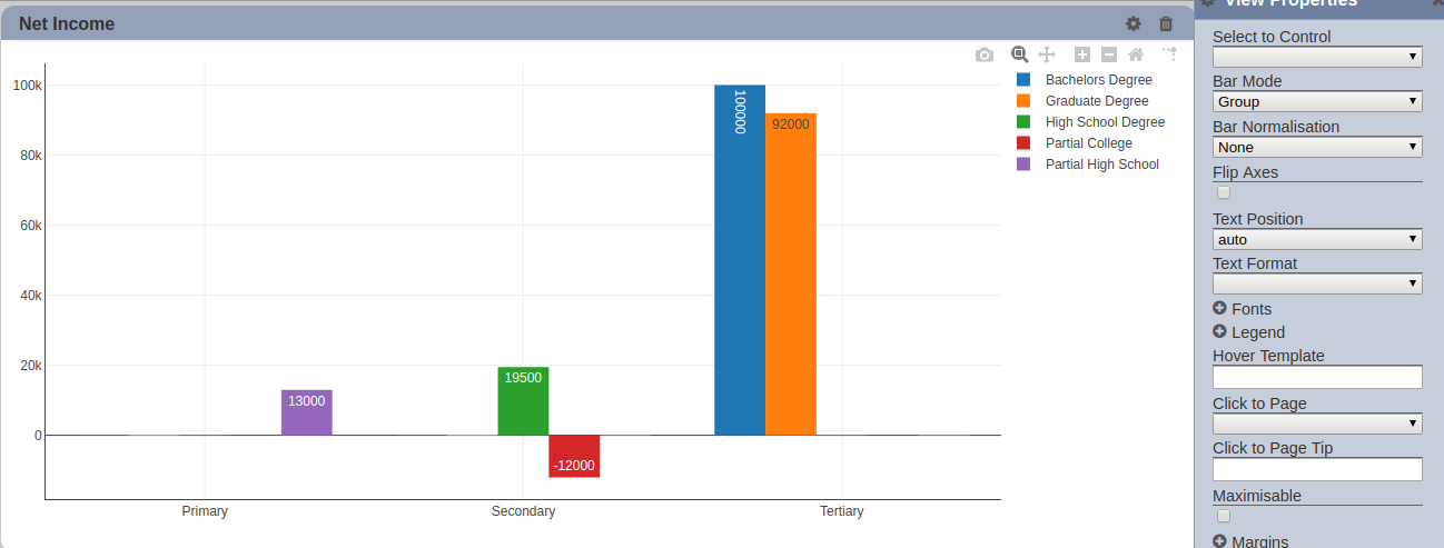
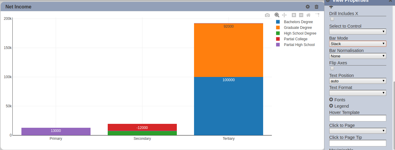
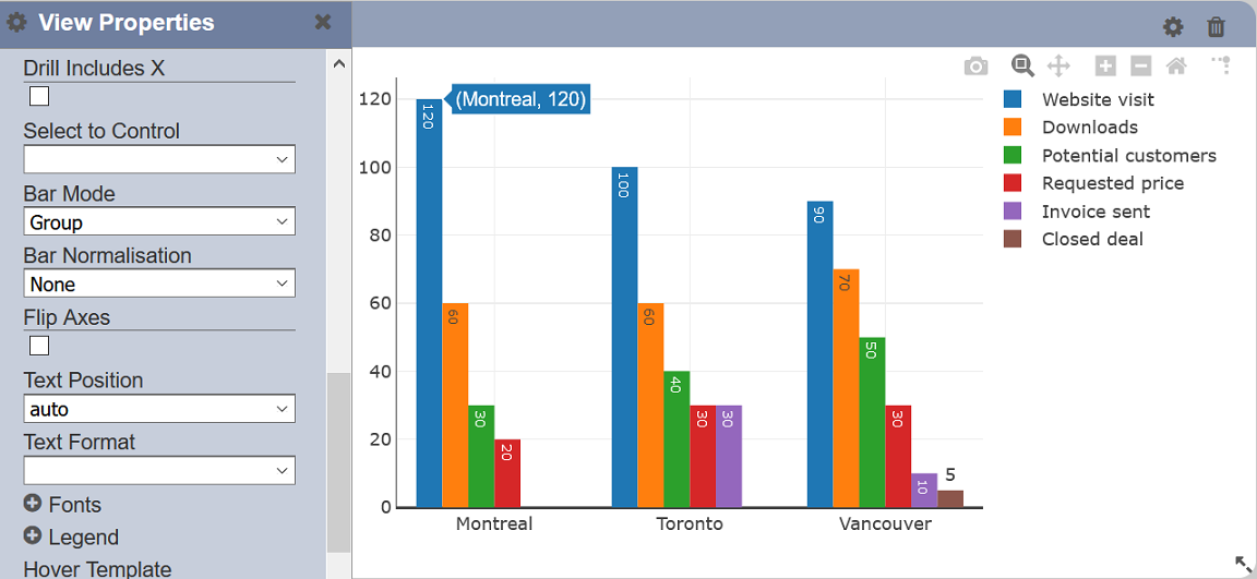
Bar Mode
This property sets the display mode of the bar chart. This property is specific to the bar chart.
| Field | Input Type | Constraints | Default Value | Dependency |
|---|---|---|---|---|
| Bar Mode | Select | One value can be selected. Available options are: - Group - Stack - Relative |
“Group” | None |
By default, it is set to “Group”, which displays all bars of each X axis as starting from 0. Below are the available options:
- Group - displays all bars starting from 0. Negative values are also displayed starting from 0, growing vertically in the negative Y axis. Each bar does not overlap the other and is instead rendered next to one another.
- Stack - displays each bar of an X axis on top of each other, with the largest values starting from the base of the Y axis (0). Bars with negative values overlap positive-valued bars on the positive Y axis plane.
- Relative - displays each bar of an X axis on top of each other, with the largest values starting from the base of the Y axis (0). Bars with negative values are rendered separately from the positive-valued bars.
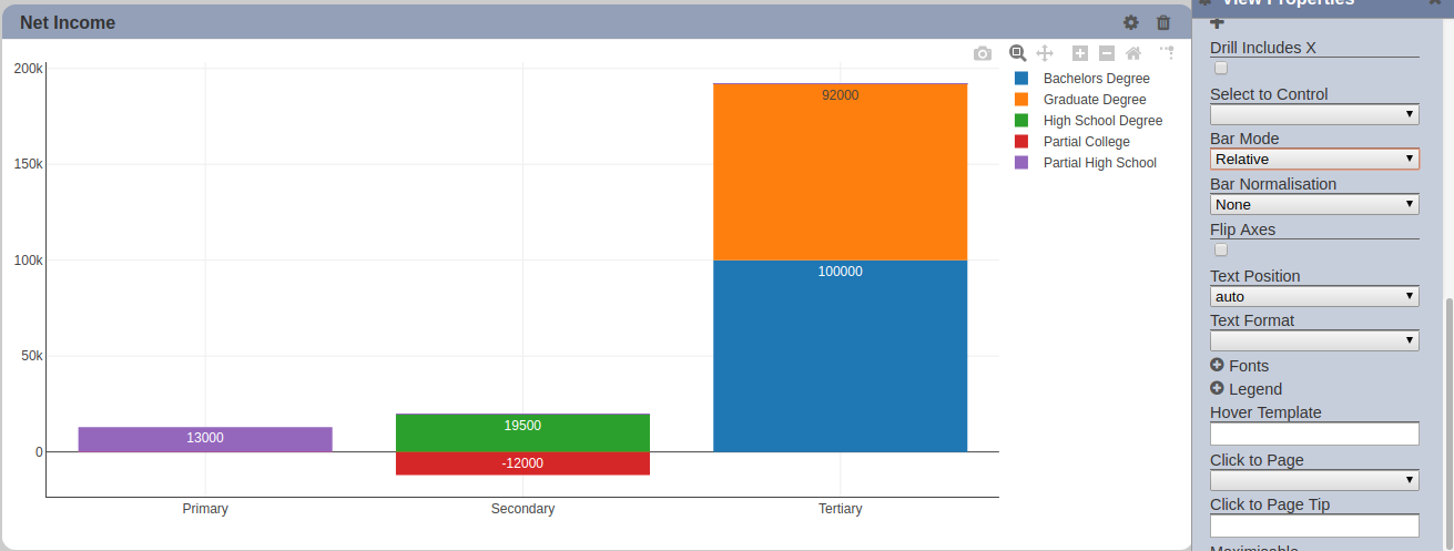
Note that setting the “Rangemode” of the Y Axis to “normal” or “tozero” makes the negative values viewable at first glance.
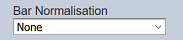
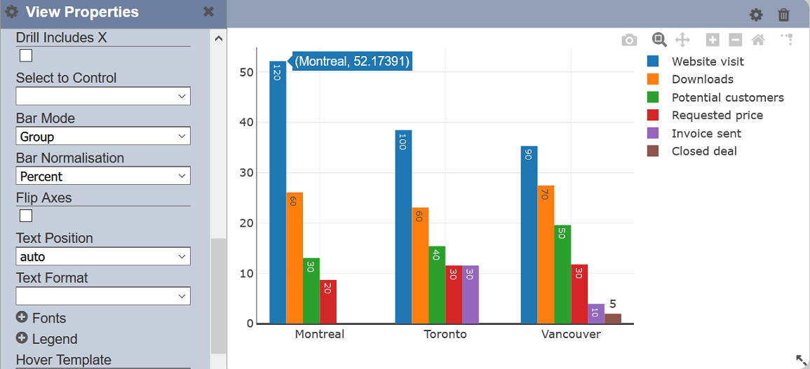
Bar Normalisation
This property allows you to choose the format of the labels in the Y axis is to be displayed, in terms on value, percentage or fraction.
| Field | Input Type | Constraints | Default Value | Dependency |
|---|---|---|---|---|
| Bar Normalisation | Select | One value can be selected. Available options are: - None - Percentage - Fraction |
“None” | None |
By default, “None” is selected, which displays the values of the field selected in the “Y” field. Below are the available options:
- None - labels in the Y axis display the values of the selected field
- Percentage - labels in the Y axis are displayed as percentage of the values of the selected field
- Fraction - labels in the Y axis are displayed as fraction of the values of the selected field

Click to Page
This property provides additional interaction with the view. This allows setting a page on the current dashboard to navigate to upon clicking on any part of the view in the Viewer. Its effect is the same as clicking on a page. This is particularly useful if the page bar is not displayed or hidden.
| Field | Input Type | Constraints | Default Value | Dependency |
|---|---|---|---|---|
| Click to Page | Select | One value can be selected. Names of all pages on the current dashboard are available options. |
None | None |
Click to Page Tip
This property allows you to add a brief description of the page you have selected in the “Click to Page” property. This property will not be effective if the “Click to Page” field is not selected.

| Field | Input Type | Constraints | Default Value | Dependency |
|---|---|---|---|---|
| Click to Page Tip | Textbox | Brief description of the page selected in “Click to Page” field. | None | Click to Page |
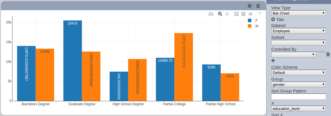
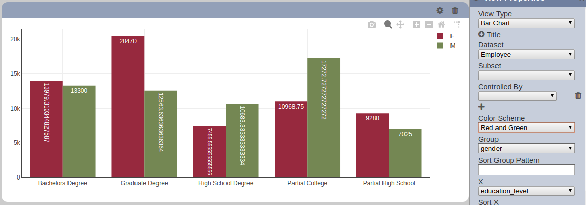
Color Scheme
Color Schemes determine the color palette used for the view. These colors are sets of pre-determined colors.
| Field | Input Type | Constraints | Default Value | Dependency |
|---|---|---|---|---|
| Color Scheme | Select | One value can be selected. Different sets of pre-set colors are available. |
“Default” | None |
Config Options
This property provides the options to configure the view.
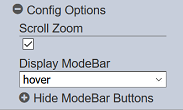
Config Options consists of the following:
- Scroll Zoom
- Display Modebar
- Hide Modebar Buttons
Scroll zoom allows the mouse wheel to zoom in/out of the chart. It is enabled by default.
Display Modebar controls whether the bar of icons at the top right of the chart should appears always, never or only when hovering over the chart. By default “True” is selected.
- False - do not appear
- True - always appear
- Hover - appear only when hovered over
Hide Modebar Buttons allows you to choose which buttons (icons) to include in the Modebar. By default commonly used icons are unselected, which means they will be displayed in the Modebar if the Modebar is enabled.
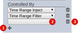
Controlled By
This property allows linking dashboard controls to the view. One or more control can be added to affect the data displayed on the view.
Depending on each control’s configuration (i.e. set to be displayed, hidden), the linked controls become usable or are activated when loading the page on the Viewer.
| Field | Input Type | Constraints | Default Value | Dependency |
|---|---|---|---|---|
| Controlled By | Select | One value can be selected per row (2). All enabled subsets of the selected dataset. The dataset must be selected first. |
None | Its available options depend on the selected “Dataset” value |
Clicking on the add button (1) adds a new blank selector to the bottom of the list. Clicking on the delete button (3) removes the row from the list.
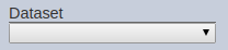
Dataset
This property links the view to a dataset (added through the Dataset Management interface). In most view types that have this property, it is required to be set in order to render the view. The data returned by the selected dataset would be displayed on the rendered view.
| Field | Input Type | Constraints | Default Value | Dependency |
|---|---|---|---|---|
| Dataset | Select | One value can be selected. All enabled datasets are available options. |
None | None |
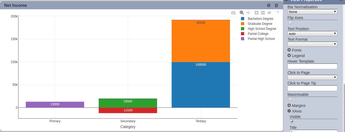
Drill
This allows drilling down data on the selected group level. Multiple fields of the dataset can be added to this property. The added fields are used to group the selected data group/trace. Each field added to this property represents one level of drill down.
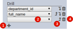
Clicking on the add button (1) adds a new blank selector to the bottom of the list. Clicking on the delete button (4) removes the row from the list. Clicking on the sort buttons (3) arranges the order of each added line. Clicking on the “Move Up” button moves its corresponding row one place above. Likewise, moving the “Move Down” button moves it one place below.
| NField | Input Type | Constraints | Default Value | Dependency |
|---|---|---|---|---|
| Drill | Select | One value can be selected (2). All fields of the selected dataset/subset are available. |
None | Dataset/subset must first be set |
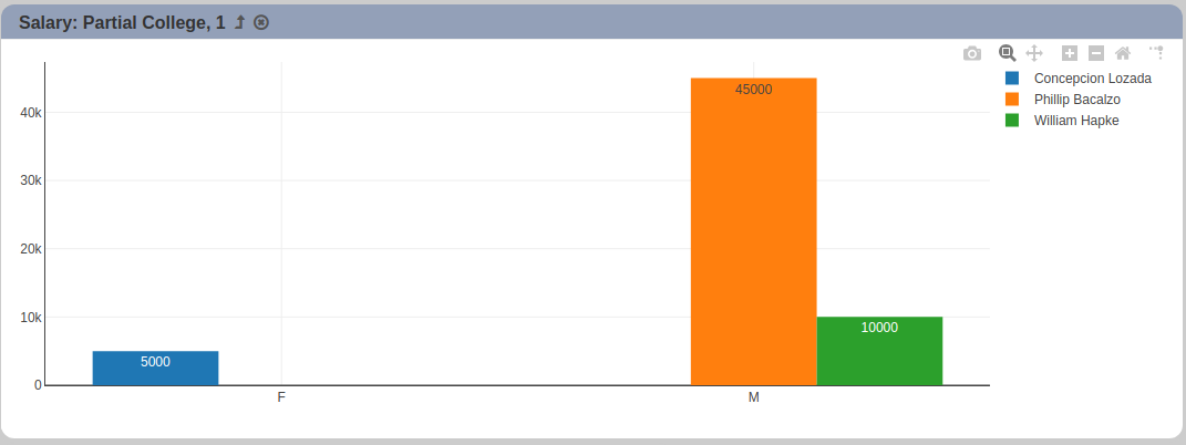
Note that the order by which the “Drill” rows appear affect the order drill down order. The ordering follows from top to bottom. If there are multiple drill down levels, clicking on a data group/trace group at the base level re-renders the view to display only the selected group/trace. The new subset is then grouped by the field corresponding to the first level of drill down. Each level of drill down would be applied on the results from its previous level.
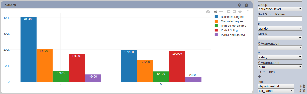
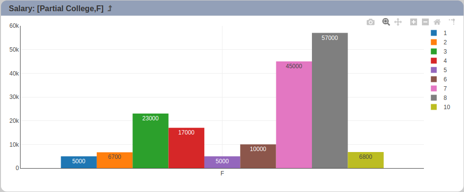
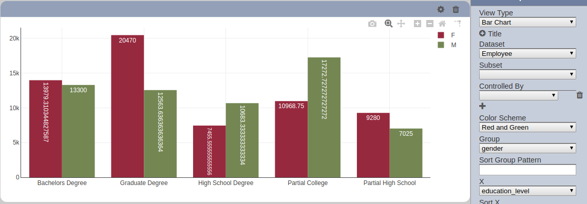
In the example above, the data is grouped by “education_level”. On the base level, data traces appear for each “education_level” (see legend).
To drill down, click on any data group/trace corresponding to the legend.
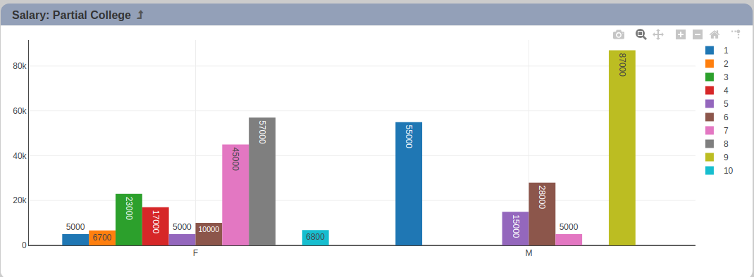
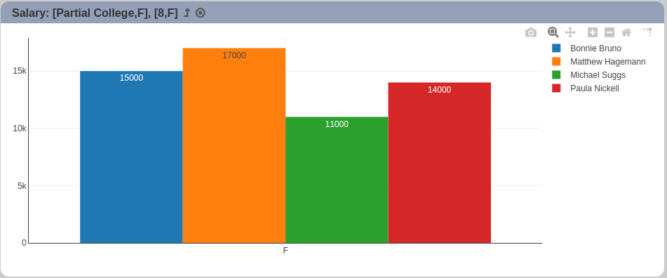
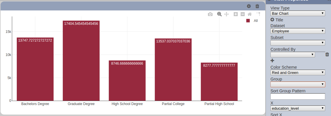
In this case, “Partial College” is selected. Only records with “education_level” of “Partial College” are rendered. The grouping is subsequently changed to the first drill down level, which is set to “department_id”. Note that the selected data group/trace is appended to the grid title.
<view title>: <comma-separated group name selected for each level>
Drilling down into more levels simply appends the current selected group name to the whatever is in the grid title.` This helps inform the user on what is being displayed.
There are drill down navigation buttons available as well. They appear after the text on the grid title. The “Go Up” button takes the user up one level. This is only displayed when drill down is done.

There is also a “Reset” button. This is only available when there is more than one level of drill down and when the user is past the first level of drill down. Clicking on this re-renders the base level. The display on the title bar is also updated, as a result.

Note that the “Select to Control” property takes precedence over this property if both are enabled. This effectively means that the “Drill” property won’t be enabled if “Select to Control” is set.
Drill Includes X
This enables drill downs to be done for a specific X value. This is also dependent on having drill downs configured (“Drill” property).
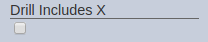
This is currently available for bar charts only.
When enabled (checkbox is selected) and if “Drill” property is set, only the selected X value of the selected data trace is re-rendered on the next level drill down.
Using the same example used in the “Drill” property, with the “Drill Includes X” property enabled, the X data displayed on each drill level is limited to the X value selected on the base level. Clicking on “Partial College” data trace for for gender “F” (X value) displays all data with “Partial College” as “education_level” and “M” as “gender”.

Drilling down to further levels changes the grouping according to the set property values, similar to how the “Drill” property works on its own, plus a fixed X value. The display on the grid title bar, appended after the grid title, if any, would also include the selected X value as an indicator of what is rendered. The format is as follows:
<view title>: <comma-separated sets of group name and X value pairing>
Each pairing follows this format:
[<group name for the level>,<X value selected on base level>]
Extra Lines
This sets additional lines over specific views. This is especially useful for setting indicators or threshold values on views. One or more can be added.
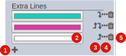
Clicking on the add button (1) adds a new blank selector to the bottom of the list. Clicking on the delete button (5) removes the row from the list. Clicking on the sort buttons (3) arranges the order of each added line. Clicking on the “Move Up” button moves its corresponding row one place above. Likewise, moving the “Move Down” button moves it one place below.
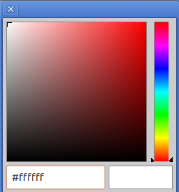
Clicking on the color picker (2) allows selecting specific colors.

Clicking on the “Properties” button (4) allows more fields to be entered.

They can be of fixed values or based on a specific field in the same dataset. Ticking on “Fixed” (7) indicates that the line should be of a fixed value. Otherwise, the line would be based on data.
| No. | Description | Field | Input Type | Constraints | Default Value | Dependency | |
|---|---|---|---|---|---|---|---|
| 2 | Color | Color of the line to be displayed. | Color picker | 1 value can be selected. Any color available. Hex color code can be entered as well. | None | None | |
| 6 | Name | Display name of the line to be displayed. | Text field | Any text | None | None | |
| 7 | Size | Thickness of the line to be displayed. | Text field | Any number above 0. | None | None | |
| 9 | Fixed Value | Fixed Y axis value of the line to be displayed. | Text field | Any number. | None | “Fixed” (7) must be enabled for this property to be displayed. | |
| 10 | Field | Dataset field to be used as Y axis values for the line to be displayed. | Select | 1 value can be selected. All fields of the selected dataset/subset are available. | None | “Fixed” (7) must be disabled for this property to be displayed. | |
| 11 | Operation | Operation to be applied on the Y axis values for the line to be displayed. | Select | 1 value can be selected | None | “Fixed” (7) must be disabled for this property to be displayed. | |
| 12 | Curved Line | Allows the line to be displayed as curved. | Checkbox | Enabled (true) and disabled (false) | None | “Fixed” (7) must be disabled for this property to be displayed. | |
Note that the order by which the “Extra Line” rows appear affect the order by which they are plotted on the chart and on listed on the legend. The topmost row is listed first on the legend. The ordering follows from top to bottom. On the charts, the topmost row is plotted first. The succeeding ones are plotted on top of it.


Flip Axes
This property allows switching the X and Y axis on display. This property is only available on the bar chart.
Normally, the X axis appears and grows horizontally while the Y axis does so vertically. This is disabled by default. When this property is enabled, the X axis would appear and grow vertically while the Y axis would do so horizontally. Effect on the chart is that the bars would look horizontal instead of vertical.
Note that all data properties (e.g. Group, X, Y) would still be populated as if the “Flix Axes” is disabled. However, display properties, such as “XAxis” and “YAxis” property sets would follow flipped chart. This means that if the “XAxis” “title” is set, it would appear on the bottom, regardless of the setting for “Flip Axes”.

Fonts
This property group sets the font size of the data point labels displayed.
| Field | Description | Input Type | Constraints | Default Value | Dependency |
|---|---|---|---|---|---|
| Inside Text Size | Determines the font size of the value labels if “Text Position” is set to “inside”. | Text | Only positive numeric values are accepted. | None | None |
| Outside Text Size | Determines the font size of the value labels if “Text Position” is set to “outside”. | Text | Only positive numeric values are accepted. | None | None |
Group and Key
The “Group” property puts the output of the selected dataset/subset into separate groups or data traces based on the field selected (e.g. group data by department). The “Key” property also groups the output into separate groups based on the selected value.
If used alone, both do the same thing. “Key” is available by itself on the pie chart.
If used together, “Group” is used to create separate data traces. “Key”, on the other hand, is used to add further categorization to the data in each data trace resulting from applying the “Group” property.
Note that only records that have the selected field are included in the data; records that do not contain the selected field are excluded.
| Field | Input Type | Constraints | Default Value | Dependency |
|---|---|---|---|---|
| Group | Select | One value can be selected. All fields of the selected dataset/subset are available. |
None | Dataset/subset must first be set. |
| Key | Select | One value can be selected. All fields of the selected dataset/subset are available. |
None | Dataset/subset must first be set. |
Depending on the view type, populating the “Group” or “Key” property may be required to render the view.
For views that have X and Y axes (e.g. bar chart, line chart, bubble chart, etc.), if no value is selected, no grouping is applied. Data would instead be plotted collectively. For instance, on a bar chart, grouping data would result in multiple bars on a single X value.
If grouping is not applied, only one bar would appear per X value.
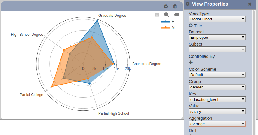
For views that support more than 2 dimensions but don’t have X and Y axes, such as the radar chart, both properties are available.
Hover Template
This property allows setting a template to be used when displaying texts upon hovering (mouse-over) the data points on the view.
The template is set to blank as a default. Default template varies per applicable view.
All values included in the data displayed on the view can be can be added to the template using variables or placeholders. This means that, for instance, on a bar chart, only X, Y, data trace names and additional fields added through the “Data Script” property can be referenced in the template. Data references and functions must follow a certain syntax:
Sample template with variable references:

Other texts that are not function-related (e.g. numeric/date formatting) are displayed as static text. Adding some basic styling or aesthetic formatting to the displayed text can be done through adding HTML tags.
HTML basics can be found in many external sources.
The views that support this property are built using Plotly. Configuring the template may require a more technical background. Additional information regarding supported hover text format can be found in the Plotly documentation, also an external source: https://plot.ly/javascript/hover-text-and-formatting/