
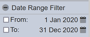
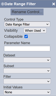
Date Range Filter
Description
This filter control is commonly used to filter datasets based on a specific field identified in the “Filter” property. This is a single-field filter that allows date range selection, which includes both start and end dates. One date picker is provided for each. There is also an option to enable and disable the start (“From”) and end (“To”) date selectors. This is suitable for date and datetime field types (field identified for “Filter”).
Viewer Usage
There are two input fields available. The “From” date picker allows selection of the lower boundary or start date while the “To” date picker allows selection of the upper boundary or end date. The values are inclusive.
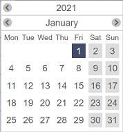
To open the date picker, click on the  date picker icon corresponding the field.
| Block | Description |
|---|---|
| Year | Top row displays the numeric value of the year. It has two icons on each side to navigate to the previous and next year, and updates the displayed calendar accordingly. |
| Month | Second row displays the name of the month. It has two icons on each side to navigate to the previous and next month, and updates the displayed calendar accordingly. |
| Days | Last block displays the days of the selected year and month. Clicking on any day on the displayed calendar sets the field value to the selected date and closed the date picker. The selected value is reflected on the displayed date label. |
If no “Initial Value” is set for the control, the “From” date is set on the first day of the current year in local time by default while the “To” date is set on the current date in local time.
The range of each date picker is dependent on the other. The “From” date cannot be later than the “To” date and the “To” date cannot be earlier than the “From” date. The most recent date that can be selected on the “From” date picker is the current value set for the “To” date. Likewise, the earliest date that can be selected on the “To” date picker is the current value set for the “From” date.
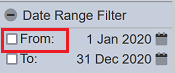
By default, the both fields are disabled. The date pickers can be used even when their corresponding checkboxes are unselected.
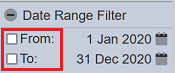
Either or both of the fields can be enabled. To enable a field, select the checkbox corresponding it. To disable a field, deselect the checkbox corresponding it.
Specific Properties
Below are the fields that are specific to this control:
| Field | Description | Mandatory | Input Type | Constraints | Default Value |
|---|---|---|---|---|---|
| Initial Values | Determines the initial set or selected values upon loading in the Dashboard Viewer. | Y | Select | One value can be selected. Available options are: - None From: First day of the current year in local time To: Current day in local time - Today From: Current day in local time To: Current day in local time - Last Week From: Today in local time minus 6 days To: Current day in local time - Last Month From: Current day in local time minus 1 month plus 1 day To: Current day in local time - Last Quarter From: Current day in local time minus 3 months plus 1 day To: Current day in local time - Last 6 Months From: Current day in local time minus 6 months plus 1 day To: Current day in local time - Last Year From: Current day in local time minus 1 year plus 1 day To: Current day in local time |
“None” |