
Label
Description
Label provides a way to help organise control filters. It is for cosmetic purposes only.
You can control the position, size and colour of the text of the label by defining them in the properties.
Viewer Usage
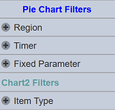
The label is displayed in the view in the filter panel portion. It is a static display, no selection is available.
It is advisable to set the “Visibility” of this control to “Always”.
Specific Properties
Below are the fields that are specific to this control:
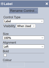
| Field | Description | Mandatory | Input Type | Default Value |
|---|---|---|---|---|
| Size | Determines the relative size of the label in the filter panel. | Y | Drop-down list | “100%” |
| Alignment | Determines the position of the label in the filter panel. | Y | Drop-down list | “Left” |
| Bold | If selected, bolds the text of the label. | Y | Checkbox | Not selected |
| Colour | Defines the colour of the text of the label. | Y | Colour palette | Black |