
Stacked Area Chart
A stacked area chart displays the evolution of the value of several groups on the same graphic. The values of each group are displayed on top of each other.

The following is a list of the fields in the View Properties box in the dashboard designer for stacked area chart. There are some required fields to be set for each created view.
Basic Properties
The View Properties fields vary in different charts. Below are the basic properties in the View Properties box.
| Field | Description | Mandatory |
|---|---|---|
| View Type | Type of chart, table or view. | Yes |
| Title | Name of the view. | No |
| Dataset | Data used for the chart, table or view. | Yes |
| Subset | Partial data from a dataset used for the chart, table or view. | No |
| Group | Places the output of the dataset/subset into separate groups or data traces based on field selected. | Yes |
| Sort Group Pattern | Sort the output based on the field selected. | No |
| X | X values be set on the X axis. | Yes |
| X Aggregation | Determines the operation to be applied on the values in the “X” field. Depending on the field type of “X”, the options available may vary. Possible options are count, average, and/or summation. |
Yes |
| Y | Y values be set on the Y axis. | Yes |
| Sort X | Sorts the X-Axis. | Yes |
| Y | Y values be set on the Y axis. | Yes |
| Y Aggregation | Determines the operation to be applied on the values in the “Y” field. Depending on the field type of “Y”, the options available may vary. Possible options are count, average, and/or summation. |
No |
The dataset and subset data derive from Datasets module. Choose the right chart from the View Type and data points to build a view. Also, be consistent in using the color scheme and formatting.
Other Properties
The other property fields are available to enhance the view. Below are the other properties in the View Properties box for the stacked area chart.
| Field | Description | Default |
|---|---|---|
| Controlled By | Links dashboard controls to the view. One or more controls can be added to affect the data displayed on the view. |
Empty |
| Range Slider | Allows user to adjust the X-axis through a slider. | Not selected |
| Colour Scheme | Determines the color palette used for the view. | Default |
| Extra Lines | Sets additional lines over specific views. This is especially useful for setting indicators or threshold values on views. One or more can be added. |
No |
| Drill | Allows drilling down data on the selected group level. | Empty |
| Time Series | Select this field if the X-Axis is a timestamp. It will produce better X axis labels. | Not selected |
| Normalised Area Chart (Percent) | Display the chart in percentage. | Not selected |
| Mode | Sets the display mode of the line chart. For example, you can show the lines with text or markers or both. |
Lines |
| Text Position | Determines the position of the text to be shown in the view (if text is selected in the “Mode” property). | Auto |
| Text Format | Sets the format of the displayed data point values. | Empty |
| Legend | Chooses the chart legend visibility in the Legend properties as well as how you want to display the legend. The legend orientation displays either in vertical or horizontal order. | Selected |
| Hover Template | Customise the content shown when hovering over the view. | Empty |
| Click to Page | Adds a link to another view. | Empty |
| Click to Page Tip | Adds a brief description of the link above. | Empty |
| Maximisable | If selected, places a maximise button on the top right of the view (when not in edit mode). This will maximise the view to fill the browser. |
Not selected |
| Margins | Allows adjusting margins and padding between charts and grid. | Default settings |
| XAxis, YAxis | Controls the axis’ title, visibility, formatting, show grid or line. | Default settings |
| Advanced | Add a special CSS class, data script and/or layout overview to the view. | Empty |
| Config Options | Config Options consists of the following: - Scroll Zoom - allows the mouse wheel to zoom in/out of the chart - Display Modebar - controls whether the bar of icons at the top right of the chart should appear always, never or only when hovering over the chart - Hide Modebar buttons - chooses which buttons (icons) to include in the Modebar |
Default settings |
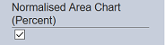
Example: Using Normalised Area Chart
This feature allows you to display the chart in percentage.
In the “View Properties” dialog box, select the “Normalised Area Chart (Percent)” field.
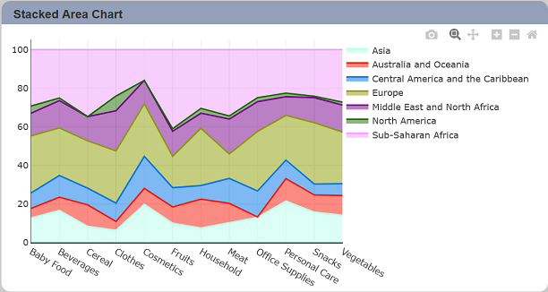
In normalised area chart mode, the Y axis scale is always 100%. Each area of colour represents one part of the whole. The stacked up height of each coloured stack represents the percentage proportion of that category.